Add depth to abstract illustrations
George Chichinadze reveals how to work quickly and create a strong sense of depth in your abstract creations.
One of the most effective ways of making your abstract illustrations stand out is to add depth.
It's a great technique for adding instant character to your work, and the resulting sense of perspective helps draw your viewer in and engage them.
There are a number of techniques for creating depth in your designs. Over the following pages I'll show you some of my favourites - focusing particularly on Illustrator and Photoshop's Ellipse and Lasso tools, and how to use drop shadows to create an elaborate, sophisticated, abstract illustration.
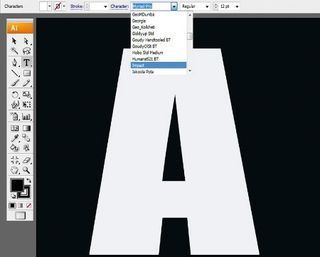
01 First, open a new document in Illustrator and give it a dark background. Then go to Window> Type>Character, select a font and type the letter 'A' in a size of your choice - the bigger the better.
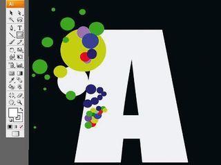
02 Create a variety of coloured circles at different sizes using the Ellipse tool, clustering some around the letterform and stacking the rest at random on it - these will be pivotal to adding a sense of depth later in the process.
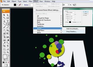
03 Once you're happy with the amount of circles, select each one and go to Effect>Stylize> Drop Shadow. I've opted for an Opacity of 57% and Blur of 5pt, but experiment with the different options until you're satisfied with the result.

04 Now that you've added the drop shadows, select all the circles and make them the same colour as the letterform (white, in this case, for maximum impact on the dark background) so that only the shadows are visible on your letter.
Get the Creative Bloq Newsletter
Daily design news, reviews, how-tos and more, as picked by the editors.
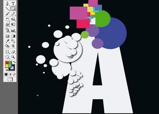
05 Using the Ellipse and Rectangle tools, start working on a new area of the letter, adding a variety of coloured shapes. Again, we will be using these to create a sense of depth, so experiment with stacking different shapes on top of each other.
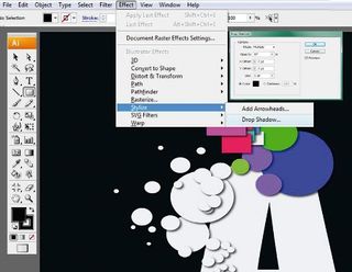
06 Now repeat step 4 on the new area, adding a drop shadow to each different shape (Effect>Stylize>Drop Shadow).

07 With the drop shadows added, select all the new shapes and change them to your background colour.

08 Next, build up a pattern of rectangles in the bottom right-hand corner of your letter, ensuring each has a different colour and size. These will lend a sense of both depth and texture to the final image.

09 Again, select all the coloured rectangles and add a drop shadow. Then select each shape and make it the same colour as the letter. Save your file.
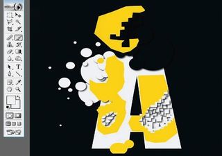
10 Next open the document in Photoshop, and use the Brush tool to blend some of the shadow areas into the letter, removing them entirely - I've highlighted where I treated my letter in this way in yellow.
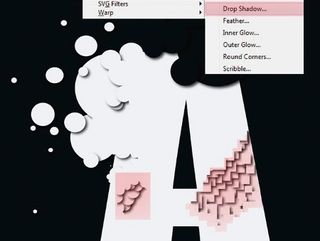
11 Now use the Lasso tool to select the patterns at the bottom of your letterform, as highlighted here.

12 Choose the Brush tool, change the Opacity to 11% and move over the selected areas very carefully, repeating two or three times.
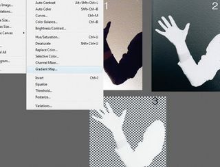
13 Using a stock image of an arm, select the colours used for your background and letterform, and go to Image>Adjustments>Gradient Map. Next, invert the arm, and delete the background using the Eraser tool.
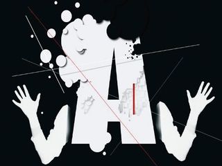
14 Place the arm on your image, copy and flip it, and arrange both. Work some final details into the piece to add interest. A simple, yet effective piece, created in next to no time.
Words: George Chichinadze
Since studying Art and Computer Graphics at the Ivane Javakhishvili State University of Georgia, George has lived in several countries, where he worked on a variety of projects before settling in Portugal. www.behance.net/chichi

Thank you for reading 5 articles this month* Join now for unlimited access
Enjoy your first month for just £1 / $1 / €1
*Read 5 free articles per month without a subscription

Join now for unlimited access
Try first month for just £1 / $1 / €1
The Creative Bloq team is made up of a group of design fans, and has changed and evolved since Creative Bloq began back in 2012. The current website team consists of eight full-time members of staff: Editor Georgia Coggan, Deputy Editor Rosie Hilder, Ecommerce Editor Beren Neale, Senior News Editor Daniel Piper, Editor, Digital Art and 3D Ian Dean, Tech Reviews Editor Erlingur Einarsson and Ecommerce Writer Beth Nicholls and Staff Writer Natalie Fear, as well as a roster of freelancers from around the world. The 3D World and ImagineFX magazine teams also pitch in, ensuring that content from 3D World and ImagineFX is represented on Creative Bloq.
Related articles
-

-

-
-

