Our Verdict
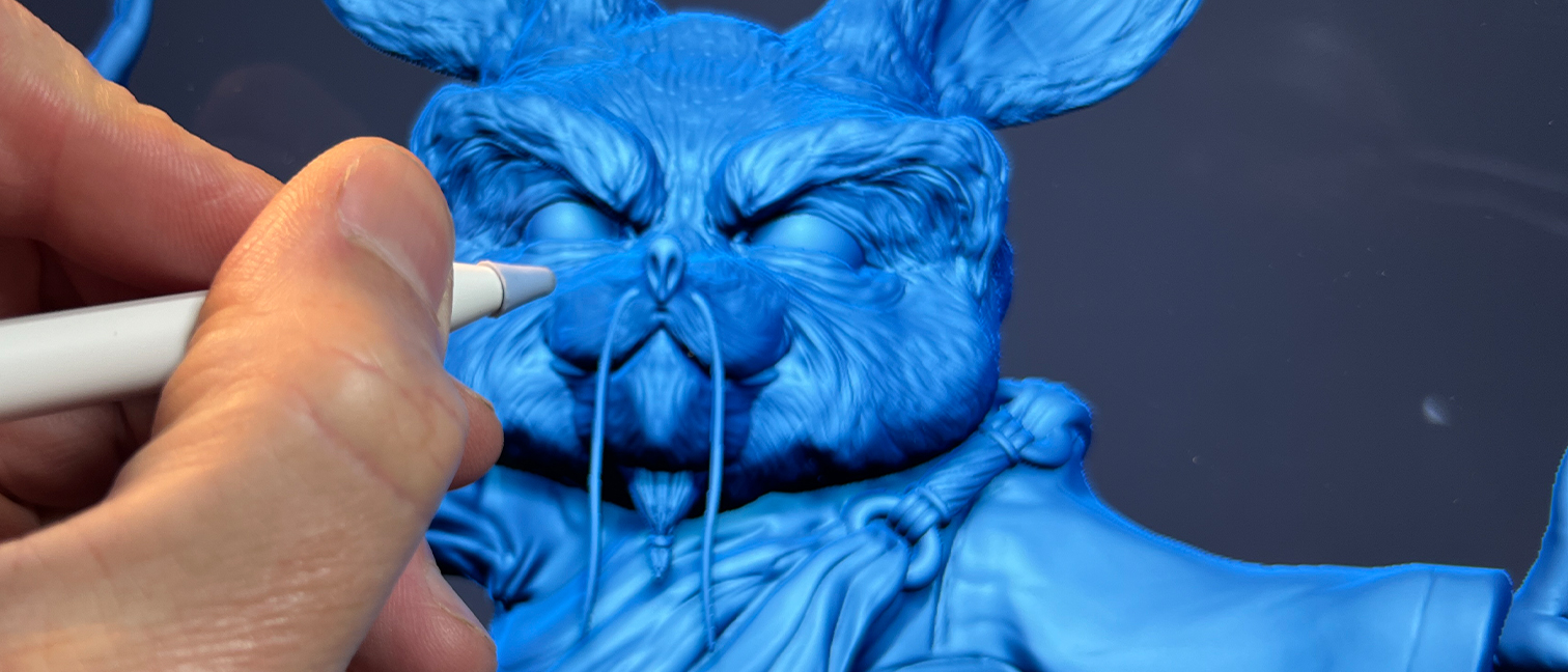
Much easier to navigate and learn than its desktop namesake, ZBrush for iPad is not a port but a completely re-written app with all of the brushes and tools I would see on the full version.
For
- Huge amount of brushes
- Same sculpting experience
- Improved UX and interface
Against
- No real time rendering
- No ZModeller or UV option (yet)
Why you can trust Creative Bloq
Price Free with in-app purchases. ZBrush Monthly $9.99; ZBrush Annual $89.99
OS iPad only (requires iPadOS 17.0 or later and a device with the A12 Bionic chip or later)
Developer Maxon
Release Out now
Features Digital sculpting and painting on a mobile device, vast array of sculpting brushes, industry standard sculpting tool and rewritten just for the iPad, customisable UI.
Finally, ZBrush for iPad has stopped being a rumour, a leak and a tease from Maxon that wowed us with 3D art made on an iPad and is now a real app. I've been using it for a number of months in beta, but before I get into stuck into my experience of using ZBrush on my iPad, it's worth remembering what ZBrush is and who, traditionally it's for, because this new release feels like it could be breaking with the software's history, to be something quite new and unique, for new and old users alike.
ZBrush was originally created by a small company in Los Angeles in the late 90’s and hasn't actually changed that much since then. Year after year Pixologic, the original developer, gave us new features bolted onto the non standard and often frustrating interface. (Read our 'ZBrush: everything you need to know' explainer for more background.)
The great thing was that it was free. I bought my first license in 2000 and never paid a penny until Pixologic was bought out by Maxon, the German based developer behind Cinema4D. Now Maxon has decided it is time to make a mobile version and enter the market dominated by Nomad Sculpt and one of their other products, Forger App.
Maxon is offering a free version with some of the higher-end tools missing and the full version is going into the Maxon store as part of the Maxon One offering and also as a stand alone subscription. This is a model that Maxon uses for Cinema4D, Redshift, Red Giant, Forger, Universe and the full desktop ZBrush.
In this review I’ll cover off some of the core features and tools of the new ZBrush for iPad, and discuss a little about what's still needed and who this kind of mobile software, of particularly this version of ZBrush, is best for.
ZBrush for iPad review: what is it?
If you're new to ZBrush, it's a digital sculpting software used for creating highly detailed 3D models. It started life as a 2.5D creative tool and evolved into a full blown digital sculpting powerhouse adding texturing, painting, a plethora of sculpting tools and eventually production features such as UV mapping and projection used in creating game assets.
ZBrush is widely used in the film, video game and animation industries for character, creature and environment creation, due to its powerful tools for handling millions of polygons on machines with limited resources.
I was lucky enough to be on the ZBrush for iPad pre-alpha team so I’ve been testing this new app for quite some months now. I’ve been training ZBrush for 25 years and the biggest single issue all users raise is how unconventional the interface is and how steep the learning curve is. This seems to have been addressed in most cases for the mobile version although it will be interesting to see what the wider digital sculpting community feel about that.
Maxon has removed some of the older features, such as the recording tools and things like markers have all gone now. Oddly 2.5D brushes are still here. If Maxon gets ZBrush for iPad right, and it’s widely adopted, I'm guessing there will be a push to retrofit the core program in this way.
ZBrush for iPad review: how is it to use?

One of the first things I noticed when using ZBrush for iPad is I no have a keyboard (unless you are rocking the Apple Folio of course) and ZBrush relies heavily on keyboard modifier keys and keyboard shortcuts.
The fix? ZBrush for iPad uses an onscreen wheel with tools assigned to shift, alt and ctrl equivalents, combined with iPad's excellent touchscreen, it's possible to pinch, swipe and rotate the sculpt directly. I pretty much stopped worrying about the lack of keys right away when using ZBrush for iPad.
Using the touchscreen, combined with Apple Pencil or the new Apple Pencil Pro, to manipulate the sculpt, is a very personal choice, and every artist will have their own options when it comes to their favourite tools, but ZBrush has tried to place the core tools front and centre (and you can customise the UI, too).
ZBrush for iPad has a more logical UI, it's a cleaner and clearer UI for sure, it’s lean and well thought out for a mobile device. It’s not a poor port from the desktop and Maxon has listened to the community to make some good changes.
ZBrush for iPad review: the tools
For me, what brings the full ZBrush experience to iPad, are firstly ZSpheres. This is a very unique way to create a sculpting armature out of spheres and then use this as your base to start sculpting on. T
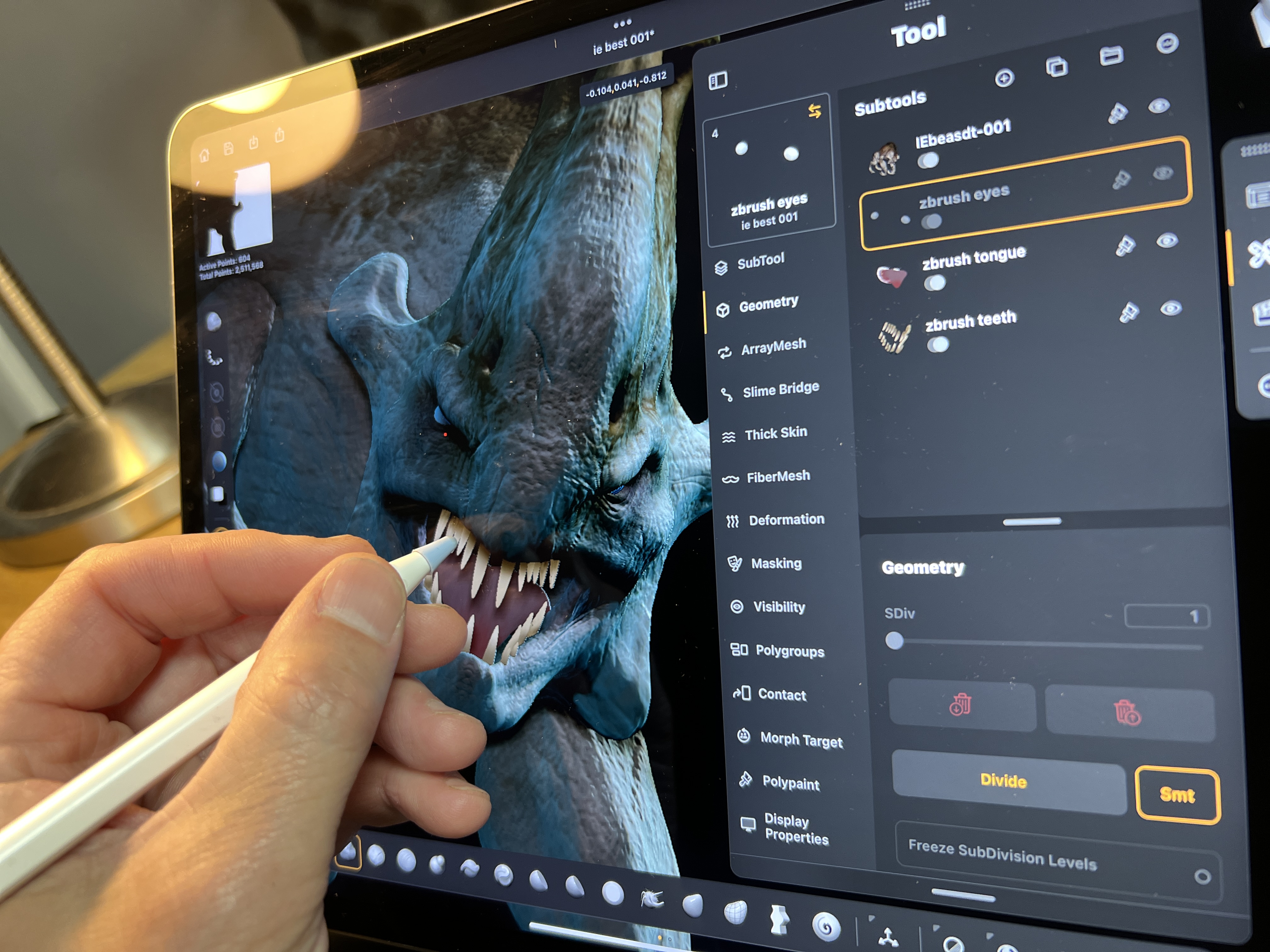
Then we have some of the more obscure features, such as Slime bridge, Arraymesh, Dynamics, Fibre mesh, the Deformation panel, Polygrouping, Polypaint, Morph targets, Masking and of course, the workhorse for digital sculptors, the Dynamesh feature.
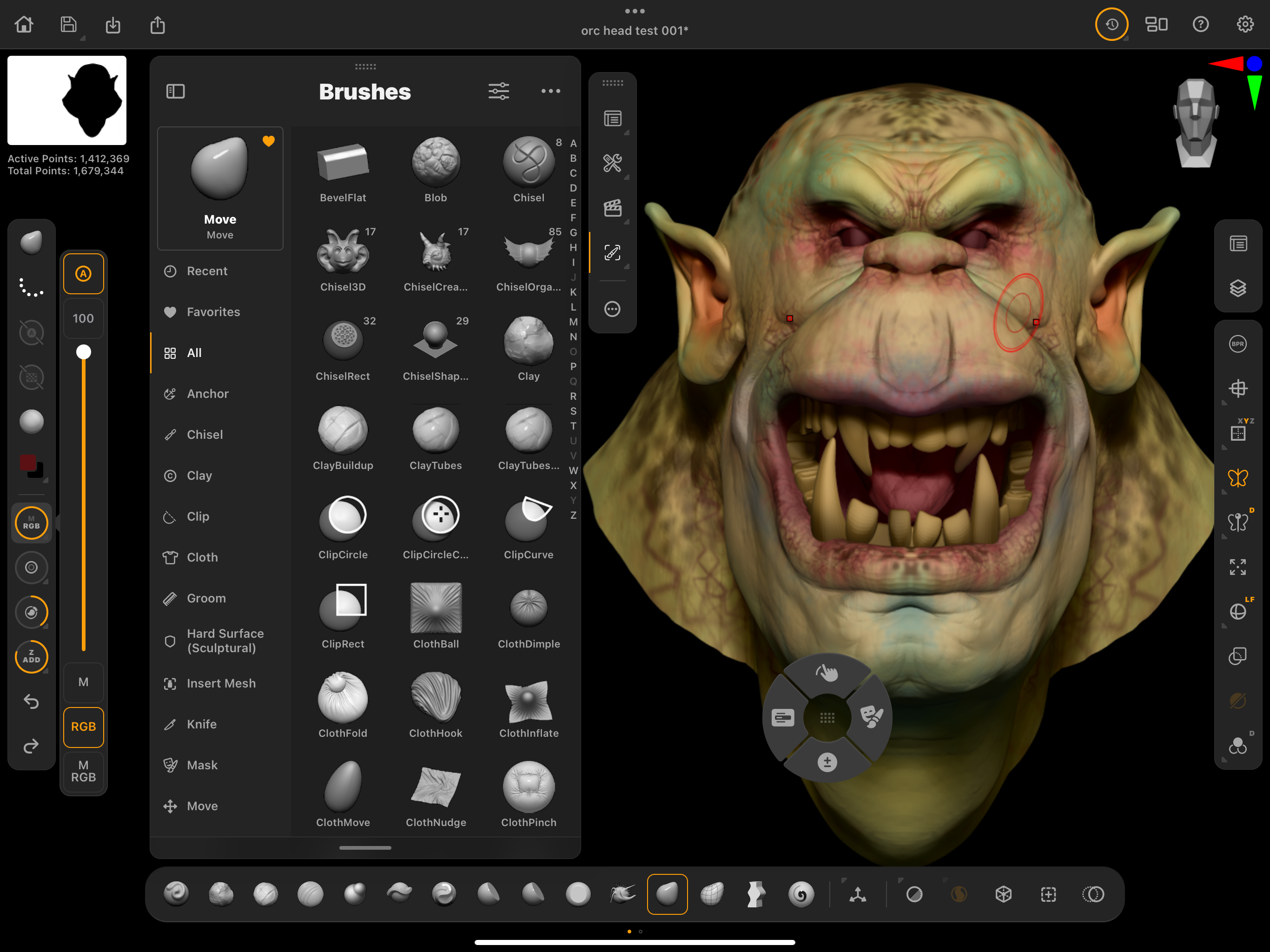
There are plenty more tools to mention that have been brought over from desktop to iPad, but my initial reaction to getting all these powerful features, some of which you only see in ZBrush, is very positive.
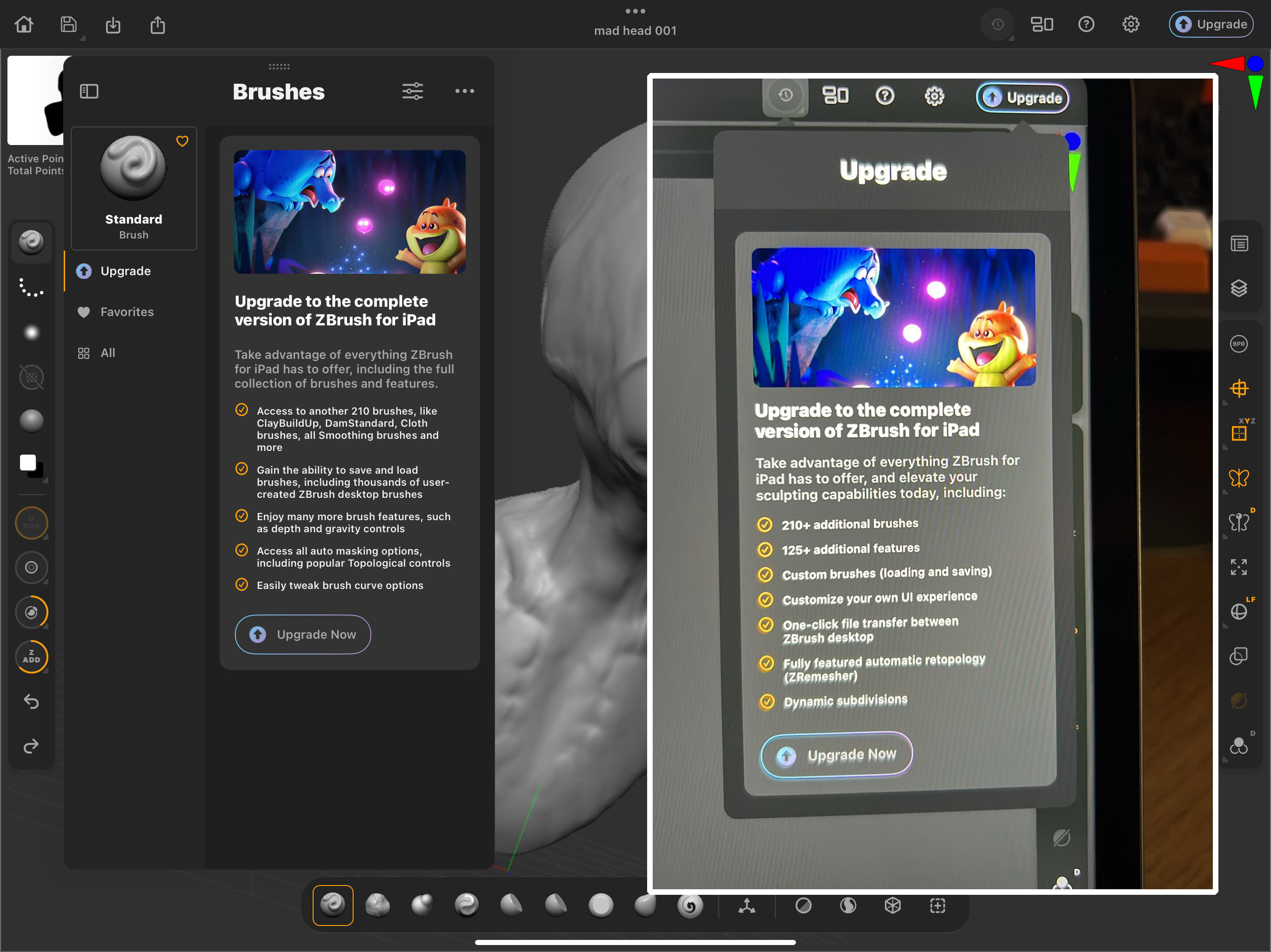
Maxon has packed in a huge list of the Brushes you would get in the parent program, which is impressive. While the free version is limited to a smaller number of core brushes, Maxon has omitted the one that I found I really wanted, the Dam Standard brush, for making creases and wrinkles. That was the first thing that would make me want to get the full subscription version. It's funny how one little tool can have that much impact. But in many ways, this is why ZBrush is so successful and means so much to 3D artists.
ZBrush for iPad review: who's it for?
So who is ZBrush for iPad aimed at? I have been considering and discussing this topic for a few years now. I believe that the first group consists of people who are new to 3D modelling or have struggled with complex programs in the past.
When you've been modelling for any length of time it's easy to forget how overwhelming it can be when you're just starting out. Trying to explain concepts like ZSpheres or Dynamesh to someone without a digital sculpting background can feel like speaking a foreign language. Mobile sculpting apps in general, while often lacking some advanced features, let beginners jump in and create impressive results with little knowledge or experience.
The second group is made up of experienced digital 3D sculptors who are familiar with ZBrush on the desktop and want a way to continue their work on the go, and seamlessly integrate what they create back to the studio. Maxon has made it a fairly seamless process with GoZ as the bridge and existing ZBrushers may well end up liking the mobile version more than the established one. Me included!
ZBrush for iPad review: what could be improved
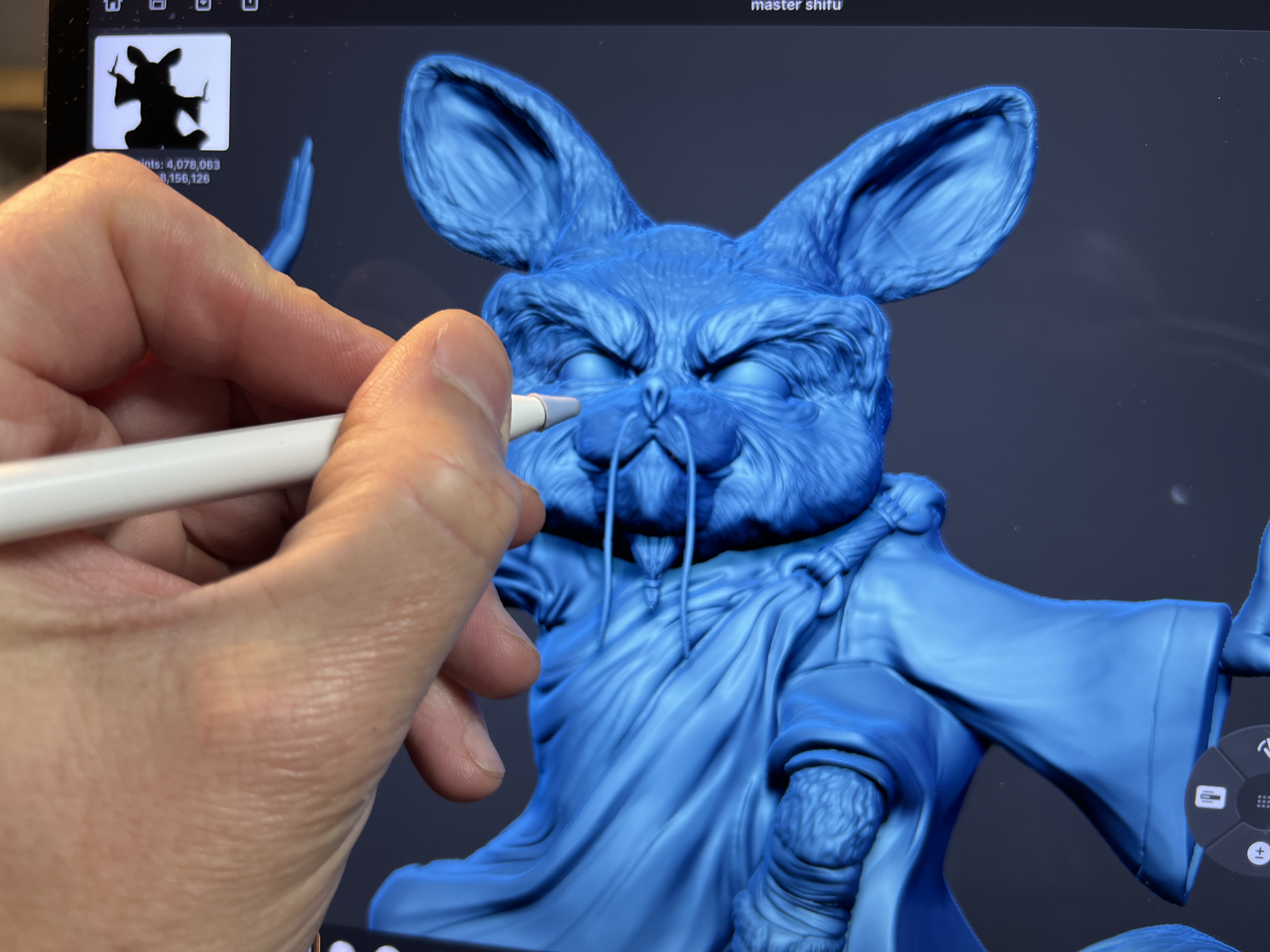
This list might change quickly or may even have changed since the time of writing. Firstly, there's no UV master that will give you a set of UV Coordinates. I use that sort of feature with almost every project, so I’d want to see that one added quickly.
Then there's ZModeller, which is also not in ZBrush for iPad either. This is the ZBrush way to do low-polygon modelling, where you can manipulate models at the component level, for example the points, edges and faces that make up your design. While this is not a huge omission for me, but something I would like to see added in the future.
The deal breaker is the lack of realtime rendering. ZBrush for iPad is going up against Nomad Sculpt and that has a BPR, realtime rendering solution with post processing akin to Sketchfab, Marmoset toolbag or even Blender Eevee. In this day and age realtime rendering is a must, and especially if you are hoping to attract artists that have only used Nomad sculpt in the last four years since it was launched. I'd suggest this would be a high priority going forward.
ZBrush for iPad review: should you buy it?
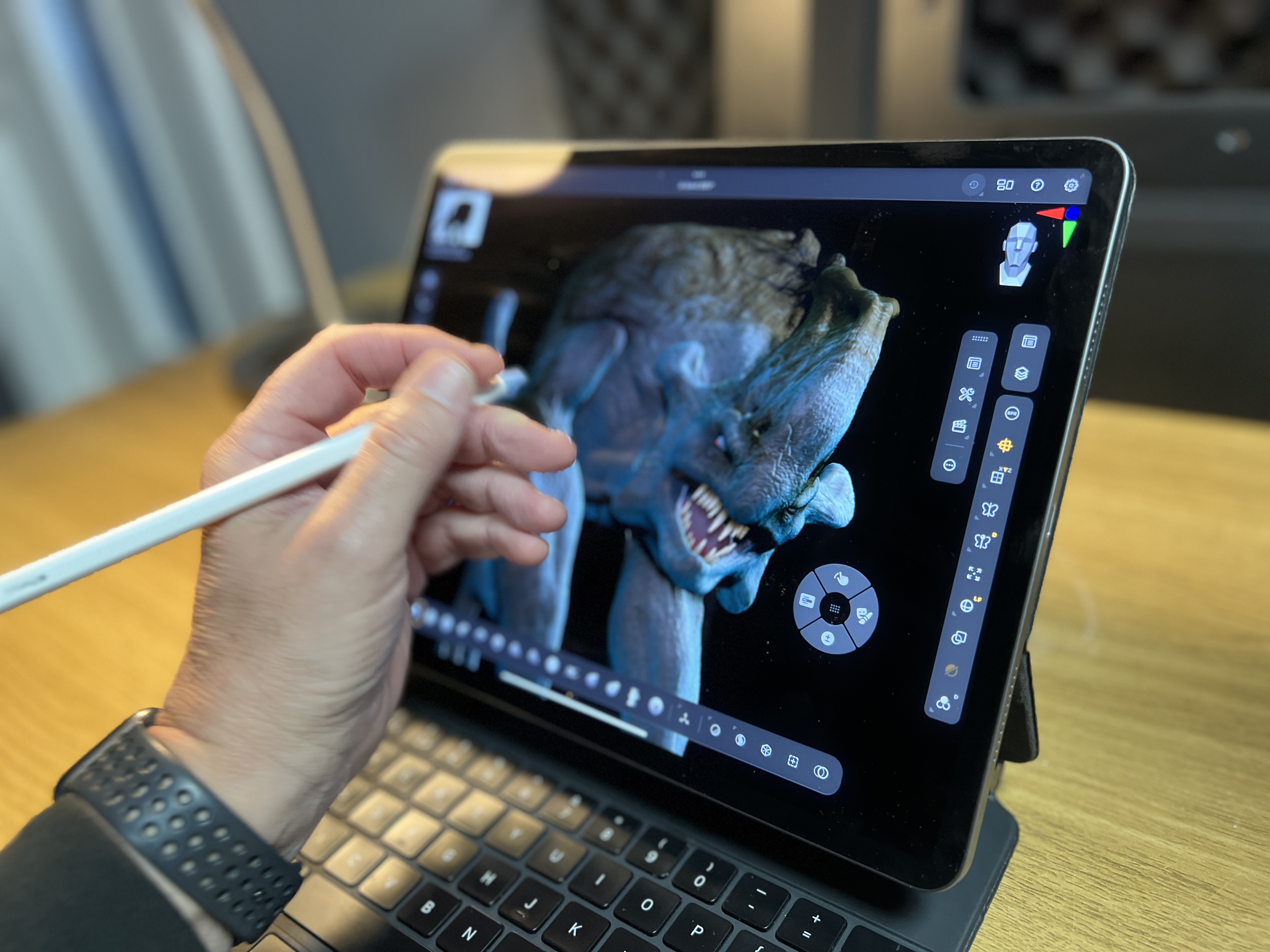
Maxon is late for sure, and Nomad Sculpt is well established with a big user base, but we finally got ZBrush working on iPad and it’s powerful; indeed it's far more impressive than I expected and packed with the same tools I use in the desktop version (if you're new to this software, our ZBrush tutorials will help get you started and can be handy for this iPad version too).
Fundamentally, ZBrush for iPad is amazing. To get ZBrush and so many of its powerful tools and features, working with touchscreen and gesture control, on iPad is fantastic. It's highly recommended and, oh yes, you finally have a justification to buy an iPad Pro.

Thank you for reading 5 articles this month* Join now for unlimited access
Enjoy your first month for just £1 / $1 / €1
*Read 5 free articles per month without a subscription

Join now for unlimited access
Try first month for just £1 / $1 / €1
out of 10
Much easier to navigate and learn than its desktop namesake, ZBrush for iPad is not a port but a completely re-written app with all of the brushes and tools I would see on the full version.

Glen runs SouthernGFX, a small Cheshire-based studio specialising in character and creature design, which creates assets for TV and film. Clients include SKY, Wacom and Oculus Medium and the studio has an impressive project list that features 3D models for Game of Thrones' house sigils. He's been using and training ZBrush for over 15 years and is a Wacom Ambassador for the UK and Ireland.
