Vintage-style pin-up character is a 3D delight
Character and lighting artist Carlos Ortega Elizalde explains the process behind his cartoon artwork A Stroke of Luck.
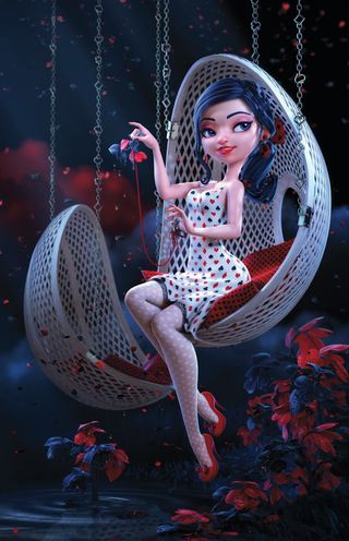
This piece took between around seven-to-nine days to complete. Lighting and rendering was done entirely by GPU, and was a very smooth process since the feedback was instant. I enjoyed the lighting and posing the most, I'd say. Creating the right atmosphere to keep a cute silhouette was a fun part.
01. A stroke of luck
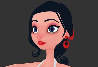
This started as a demo project that was going to be used for a presentation. I wanted to record most of the important stages of the process I follow when creating a CG still, and of course, recording your screen as you work is a great incentive to avoid distractions.
At first I was inspired by classic pin-up photos and illustrations, and my main goal was to portray a cute cartoon girl in a sexy, yet classy way. As a starting point, I did a very quick sketch in Photoshop to give myself a rough idea of posing and proportions, but in the end I changed several things and worked on a card suits theme.
02. Modelling
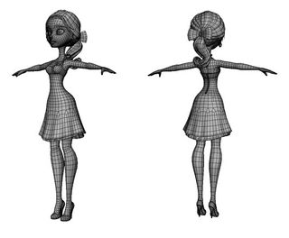
All the modelling was done in Maya. I usually start from a single plane moving points and adding edgeloops to get a basic but effective polygon flow in which I can increase or decrease the mesh resolution easily.
Arms and legs were modelled as separated objects starting from cylinders and then attached to the torso. Although the final mesh doesn't have insane amounts of detail, it was enough to get a nice joint deformation for a CG still.
03. Choosing the outfit
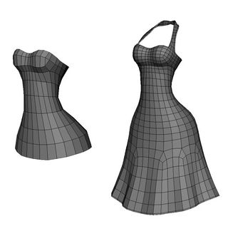
The dress was inspired by some vintage halter dresses and it was modeled using part of the torso as starting point and then extruding the hips area to complete the dress. A part I always enjoy is modeling hair, which I consider a nice and natural accessory with tons of possibilities.
It was modelled using planes by extruding its edges, blocking some primary groups to define the hairstyle and then detaching the mesh in several strands to get more variation and volume, but still keeping a cartoony look. By using planes as hair strands, the UV mapping was done in a couple of clicks using Maya's bonus UV tools.
04. Props modelling
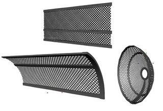
The chains and plants were modelled using the suits symbols. I created the plants stems by drawing curves and extruding planes along them. The leafs are just a symbol-shaped grid of polys. For the hanging seats I modelled a single thin plank and duplicated it several times to create a grid. Then I used a couple of bend deformers - placing one on top of other, keeping the history alive - to achieve a shell shape.
05. Texturing and detailing

I wanted a clean and simple look for the final image, most of the texturing of the dress and tights was created using tileable textures I created previously in Photoshop. The textures for the character were painted in Mudbox using the paintbrush and airbrush tools.
I painted some freckles on the arms and face using a mudbox stamp and some scatter parameters on the airbrush. I sculpted the leaf detail and painted the textures in Mudbox, then I baked a normal map for final rendering. The water ripples were sculpted on a plane, using a custom stamp and then baking a normal map.
06. Rigging, posing and expression
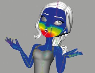
I created a simple skeleton with basic controls to pose the character, painting and cleaning some weights on elbows, knees and jaw. I also created a set of blend-shapes to create different expressions and poses. For the face expression I went for a subtle smile, which combined with a lower value of the blink shape ended in a nice flirty expression.
For the final pose, I wanted something that could evoke those classic pin-up poses - something cute and delicate yet strong and balanced. I posed arms, legs and body so the curved shapes could flow, starting from the face and ending in a graceful way with hands and feet. I did corrective sculpting on all the body and sculpted the posed dress in Mudbox, then I sent the elements back to Maya.
07. Layout of elements and composition
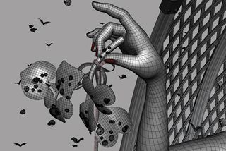
Once the final pose was defined, I blocked the camera keeping the important parts in key zones of the canvas and at an angle in which the silhouette could be readable as intended. The rest of the elements were placed to complement the flow of shapes coming from the main character and providing a solid composition to the final image. I painted waterdrops on top of the foliage using Maya Paint effects and then converted to polys. The flying particles were created by making some groups and then scattered by hand on the scene.
08. Lighting of elements and composition
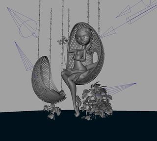
I went for a night atmosphere with cold lighting that could work
to pump up the red colours and emphasise the used patterns. The main light setup consists in a key light coming from the right side, a backlight and a rim light from the left.
The plants and background elements were lighted using independent lights by making some light linking, but maintaining a coherent direction with the main light sources. I used some important GPU based features such as indirect lighting and subsurface scattering, as well as Hair to create grass and fill the base of the plants.
09. Rendering
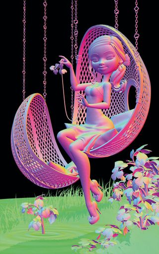
The final output of the image was 10k pixels tall and I rendered the
image in EXR format by sections, and later I did some assembling with all the tiles inside Photoshop. I rendered other useful passes such as Depth and Normals and the total render time including the passes was about 45 minutes on a 2GB card.
I used the normal pass to add small light touches to parts of the image, such as hair, legs and plants. As a final touch, I painted the background and some light beams in Photoshop, added a subtle blue fog and created depth of field using the depth pass.
This article originally appeared in 3D World issue 174.
Liked this? Read these!
- The best 3D movies of 2013
- Discover what's next for Augmented Reality
- The designer's guide to special characters

Thank you for reading 5 articles this month* Join now for unlimited access
Enjoy your first month for just £1 / $1 / €1
*Read 5 free articles per month without a subscription

Join now for unlimited access
Try first month for just £1 / $1 / €1
Get the Creative Bloq Newsletter
Daily design news, reviews, how-tos and more, as picked by the editors.
The Creative Bloq team is made up of a group of design fans, and has changed and evolved since Creative Bloq began back in 2012. The current website team consists of eight full-time members of staff: Editor Georgia Coggan, Deputy Editor Rosie Hilder, Ecommerce Editor Beren Neale, Senior News Editor Daniel Piper, Editor, Digital Art and 3D Ian Dean, Tech Reviews Editor Erlingur Einarsson, Ecommerce Writer Beth Nicholls and Staff Writer Natalie Fear, as well as a roster of freelancers from around the world. The ImagineFX magazine team also pitch in, ensuring that content from leading digital art publication ImagineFX is represented on Creative Bloq.
