“We knew it would be special”: how design team Fluid created art and ad campaigns for two decades of Final Fantasy
This decades-long partnership with Square Enix helped create a video gaming icon.
Even with the year not quite over, I can say that Final Fantasy VII Rebirth is my Game of the Year for 2024. A thrilling, modernising update to an all-time classic, it brings characters that are hugely important to me into thrilling, vivid life. It takes everything that was great about the first chapter, Final Fantasy VII Remake, and builds on it to create something sublime.
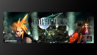
For many gamers, FFVII Rebirth feels like the continuation of a journey that began in 1997 with Final Fantasy VII, regarded as one of the best video games of the 90s, and that’s also been the case for many of the creatives behind the scenes. Design agency Fluid, based in Birmingham in the UK and known recently for its work on Deathsprint 66, designed pack art for the original game on its release for the Playstation in 1997, and this began a decades-long partnership between them and Square Enix, which continues to this day.
This year, the team at Fluid took charge of creating bespoke influencer kits for the release of Final Fantasy VII Rebirth, taking cues from the original designs of 1997 while also working to create something entirely new.
I spoke to four key team members at Fluid – lead creative Paul Whitaker, financial and operations director Neil Roddis, managing director James Glover and Digital Director Lewis Bradburn – to find out more about what it’s been like to play a part in the story of one of gaming’s most important franchises, from its launch in the '90s to present day releasing on PlayStation 5, one the best games consoles around.
Below you can read collaborative answers from Fluid Studio's Neil, James, Lewis and Paul, who took part as a team.
In 1997, was there a sense that Final Fantasy VII was going to be something special?
Massively so. We were absolutely thrilled to be working on the title and knew it was going to be one of the most exciting video games ever released. Hype around the game was huge – and when we were supplied the assets for the campaign we were so impressed with the quality of the renders; we’d never seen anything like it before and were blown away by them. At that point, we knew it would be a special job to be working on.
With FFVII the series jumped to 3D and embraced a futuristic, cyberpunk aesthetic. Was it a challenge to convey this new look while staying true to the series’ roots?
The key art had already been done at that point in time but it was very clean and simple which we really liked. We knew we’d have to produce something very special for this, and at the time bricks-and-mortar retail was the absolute king, so translating the key art into in-store point of sale was a massive responsibility.
With artwork created in Japan, we had a suite of assets supplied and a huge range of restrictions about what we could and couldn’t do artistically – a big part of the brand building was to ensure total consistency, so we had to adhere to some very tight brand guidelines. Of course, that consistency paid off over the decades as Final Fantasy grew into one of the most beloved brands of all time.
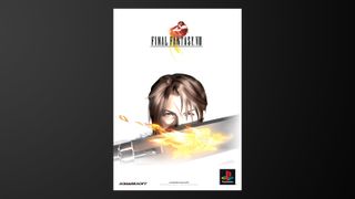
The next game, Final Fantasy VIII, was the first time that the series’ characters were realistically proportioned – how did this change inform the Fluid team’s work on the ad art?
As the direction moved towards more realistic proportions, the emotional connection between gamer and character became stronger, and I think that’s reflected in the direction of the campaign. There’s a sense of resonance and affinity which could be developed in a more meaningful way, through an emotional, evocative, simple approach.
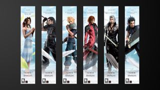
In 2008, Fluid team returned to the world of FFVII for Crisis Core -Final Fantasy VII-. Before, the likes of Cloud, Aerith, Zack and Sephiroth had been unknown – now, they were iconic. Did this affect how the team approached the ad art?
As the brand grew, gamers’ sense of affinity with the characters began to explode. Cloud, for example, was developing into an iconic character, and the fact they were recognisable allowed us to position them as the heroes or icons they were becoming. It was a show of faith in the characters and a testament to the growing love the passionate community had for the game.
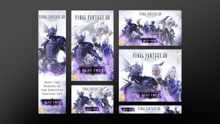
In 2020, Fluid worked on ads for Final Fantasy XIV. As this was an online service game, the ads weren’t just about getting new players, but also wooing back lapsed players. How did this alter the approach?
Our approach was to excite and entice, using a careful blend of excitement and action (providing a wide approachability and appeal) alongside teasers of features which would appeal to those already familiar with the game and its world.
The campaign deliverables included 30s, 15s, and 6s videos, HTML5 banners, cinemagraphs, and various social media skins and ads.

What was it like to return to where it all began to create Final Fantasy VII Remake Intergrade online ads in 2022??
We still find it absolutely amazing that we’ve come back full circle, 20-ish years later – it’s just incredible to be working on a franchise long-term, and a huge testament to the team and the game. As we knew the original art inside out, we took hints and inspiration from the original and updated it for a new audience.
Of course, so much has changed in the past few decades, in terms of media, production, technology and so on. So by looking at today’s trends while still retaining the essence of the brand and game colour palette, look and feel, we honoured the much-loved visual lore of the early games in a way which felt appropriate for the modern gamer.
Visually, of course, CG technology has come on leaps and bounds, as have game development and graphics, but our work was never going to be 100 miles away from the original in its essence and at its heart. In fact, our work was nominated for a Global Entertainment Award for Best Online Ad, which is an incredible accolade.
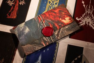
In 2023, Fluid created influencer kits for Final Fantasy XVI. How did the game’s darker, medieval aesthetic inform the choices made?
We’re creating kits for the ultimate fans, on a global stage, so always want to ensure our creations are an authentic tribute to the game. We always enjoy seeing feedback from clients, recipients and their audiences – where they notice the design, intricate details and execution of the kits – that we feel elevate our kits above the norm.
For Final Fantasy XVI, we played on the game’s medieval, swords, magic and dark fantasy themes – using tactile materials in tandem with premium production methods and hand finishing, that ensured each kit was a unique representation of this esteemed title.
A handcrafted wooden chest was the centrepiece of the kit – stained to evoke the dark storyline and presented within six faction-derived fabric bellybands, which were randomly distributed across recipients. The chest featured a 3D antique silver Ifrit insignia on the lid – whilst heat impressions, antique brass latches and hinges, aged hessian rope supports and a printed leatherette panel – revealing the key art – further evoked the medieval style.
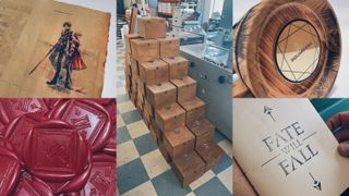
A liftout tray inside the chest contained a folded letter with keyart and marketing information – printed on burnt parchment paper, sealed with hessian string and a hand stamped diamond wax seal. The two main collectable keepsakes were held securely within a custom wooden fitment in the base: an eco-wooden tankard – hand-charred to resemble the fire and wrath of the Eikons – with stainless steel stein, laser-etched brass plaques and accompanying parchment care card; and a dark brown tarnished leatherette journal with leather ties, hand stitching, red satin bookmark, unlined milled paper and black ink stamped title page – completing the kit’s aged aesthetic. Some kits featured an alternative fitment design allowing the game pack to also be included, with others receiving a game code via email.
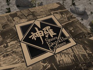
Finally, in 2024 we have Final Fantasy VII Rebirth, and another set of media kits. I love the choices made, especially incorporating the classic Shinra Electric Power Company logo. Can you take us through them?
Thank you! We looked to create a bold tactile kit – of the gameworld – that visually represented the travel into the wilderness and search for Sephiroth storyline.
As usual, we wanted the kit to be an immersive unboxing experience: a collectible keepsake with exquisite attention to detail that gave the 250 recipients insight into the game’s creation and storyline – whilst delivering kit-exclusive content, based on actual in-game items. A kit to honour both the FFVII Rebirth game and Final Fantasy franchise.
The neon sign referenced the Chocobo stop seen in the initial trailer – a key FFVII Rebirth location and reminder of how expanded the new gameworld was. We worked with a trusted sign manufacturer to determine the best realisation of the original image and also how it could be presented/protected within the kit – with the intent for recipients to feature it in their content and live streams.
From this starting point, the kit’s narrative and the rest of the content unfolded: the recipient stopping at the Chocobo Stop (neon sign), taking out our recreation of Cloud’s Seat Cushion (to recover their HP and MP) – before exploring the included postcards.
The box was the final part of the jigsaw – a rigid tray and three-part binder box, produced in brown eco-kraft paper, with a montage of imagery depicting Shinra powered locations, akin to aged postcards and conveying the game’s expanded world setting. The Shinra Electric Power logo on the lid (and game logo on the inner lid) in a tactile matt black foil, giving contrast to the monotone printed imagery.
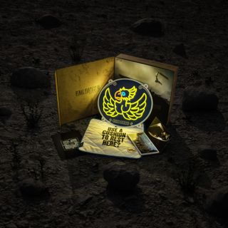
The box was embellished with an inner gatefold panel featuring localised marketing copy and stories from Creative Director Tetsuya Nomura, Director Naoki Hamaguchi and Producer Yoshinori Kitase, introducing the game and acknowledging its place in gaming lore. These three stories were randomly distributed across the recipients, to create buzz of “Which did you receive?”.
Get the Creative Bloq Newsletter
Daily design news, reviews, how-tos and more, as picked by the editors.
The kit was designed to look distressed, like it could have been found in the wilderness (of the planet) on Cloud’s travels. We also referenced the main characters being part of eco-terrorist insurgent group Avalanche – utilising an array of eco-credential materials: 100% recycled kraft paper; papers sourced from sustainable forests and/or produced using 100% green energy; recycled card; energy efficient LED neon; recyclable eco-bubble wrap; and biodegradable mailers.
Inspired by Fluid's work? Then read our insights into what makes great video game box art, and for classic game lovers read our interview with Atari's creative director Tim Lapetino on how this iconic brand was created. Also, check out our guide to the best retro consoles.

Thank you for reading 5 articles this month* Join now for unlimited access
Enjoy your first month for just £1 / $1 / €1
*Read 5 free articles per month without a subscription

Join now for unlimited access
Try first month for just £1 / $1 / €1
Jon is a freelance writer and journalist who covers photography, art, technology, and the intersection of all three. When he's not scouting out news on the latest gadgets, he likes to play around with film cameras that were manufactured before he was born. To that end, he never goes anywhere without his Olympus XA2, loaded with a fresh roll of Kodak (Gold 200 is the best, since you asked). Jon is a regular contributor to Creative Bloq, and has also written for in Digital Camera World, Black + White Photography Magazine, Photomonitor, Outdoor Photography, Shortlist and probably a few others he's forgetting.
