Developer Heart Machine
Publisher Arc Games
Release Late summer
Platform Unreal Engine 4
Formats PC (Steam), consoles TBC
Anyone who played Hyper Light Drifter fell in love with its colourful, impressionistic world rendered in tiny pixels. Our minds filled in the gaps and embellished every angular, geometric ruin and colour-washed 8-bit forest. With follow-up Hyper Light Breaker, set in a 3D open world, developer Heart Machine is colouring inside the lines for us.
Built in Unreal Engine, Breaker is a co-op rogue-lite adventure, set in the Hyper Light universe, that challenges players to hack and slash their way across its vibrant procedurally generated world. The myriad biomes and complex labyrinths familiar to Drifter fans are now rendered in greater detail, with the artistic challenge being to match players' imaginations.
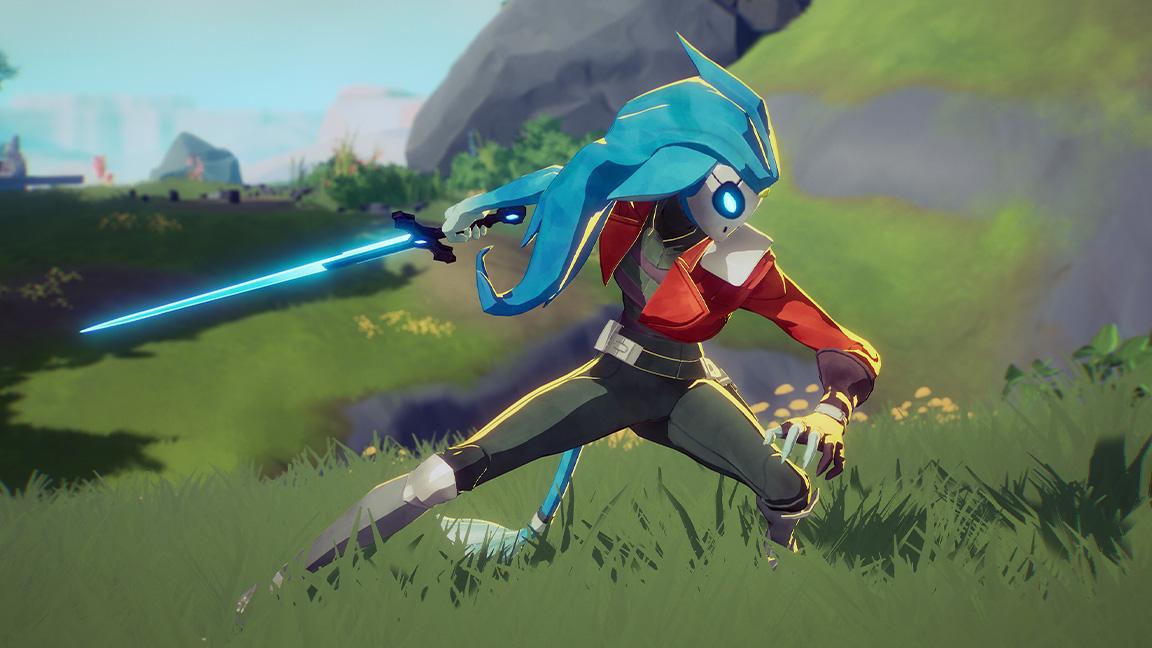
Translating the pixel art characters of the Hyper Light world into 3D developer Heart Machine has adopted the cel-shaded style familiar in games like Genshin Impact and its own release, Solar Ash. The aim? Retain the magic of pixel art's inferred detail in crisp, bold 3D.
Interpreting the pixels of Hyper Light Drifter
Principal character artist John DeRiggi tells me the challenge is not to directly recreate the old pixel art characters into 3D, "because that doesn't really work" (though some designs, such the Melee Wretch, are being remade), instead making Hyper Light Breaker came down to drawing from the "the inspirations behind what was driving Alx Preston".
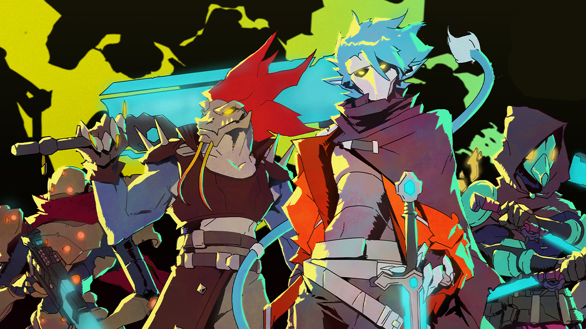
Studio founder and creator of Drifter and Breaker, Alx Preston, has been inspired by games The Legend of Zelda: A Link to the Past and the Diablo series, as well as the style of Studio Ghibli, 80s and 90s animation, such as Teenage Mutant Ninja Turtles, and anime like Evangelion. All of that came through in the original's pixel art and John's job is to translate those designs into 3D.
This became a 2D cel animation focus, which "was super important," says John. "That idea of retro, you know, cell shaded outlines, hard shading in the shadows, in the forms, and a low amount of detail. I tried to pare down and get more specific on things like shape language; what the forms actually should look like based on [Alx's] initial concepts."
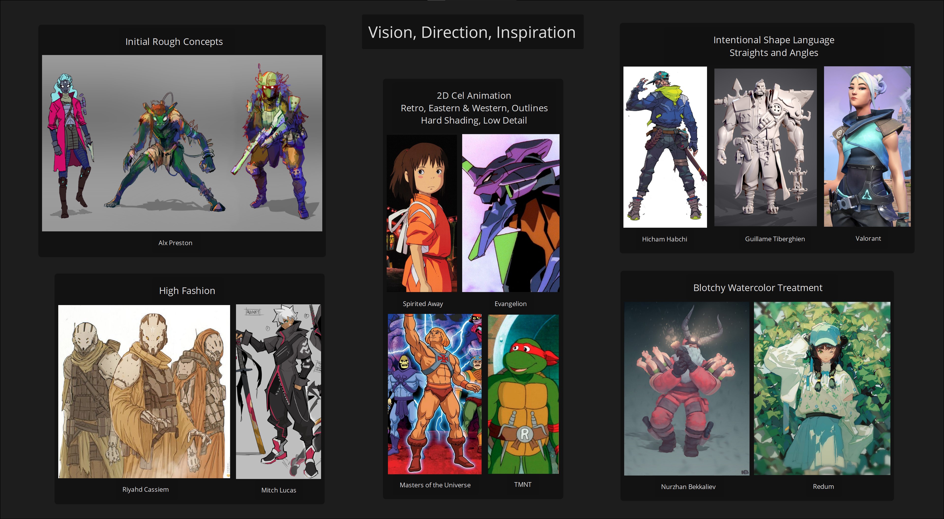
John shows me a character concept sheet (above) and points to Alx's initial designs (top left) and picks out the straight lines and angles that are crucial to the Hyper Light Breaker style. He picks out some detail, saying: "We're really pushing those straight lines on silhouettes, and even straight lines and angles internally to on the forms, that definitely has a very anime vibe, but it also creates a really nice, strong set of poses for animation."
Get the Creative Bloq Newsletter
Daily design news, reviews, how-tos and more, as picked by the editors.
The visual language of the game's concept art also draws on Ghibli and what John calls "washy watercolour". It's deft, light and feels retro while being thoroughly modern. That's not to say the art team are downgrading the visuals, instead they're using the tools in Unreal Engine to achieve a 'limited' cel-shaded style. "It's a very intentional decision to utilise technology in a very specific way," says John.
He adds: "We can throw a ton of Unreal tech at the game, but we don't really need to use it per se. We need to use it in the right way. You know, like how can we use it to get those minimal ideas across, to highlight those retro vibes?"
The art of angles in Hyper Light Breaker
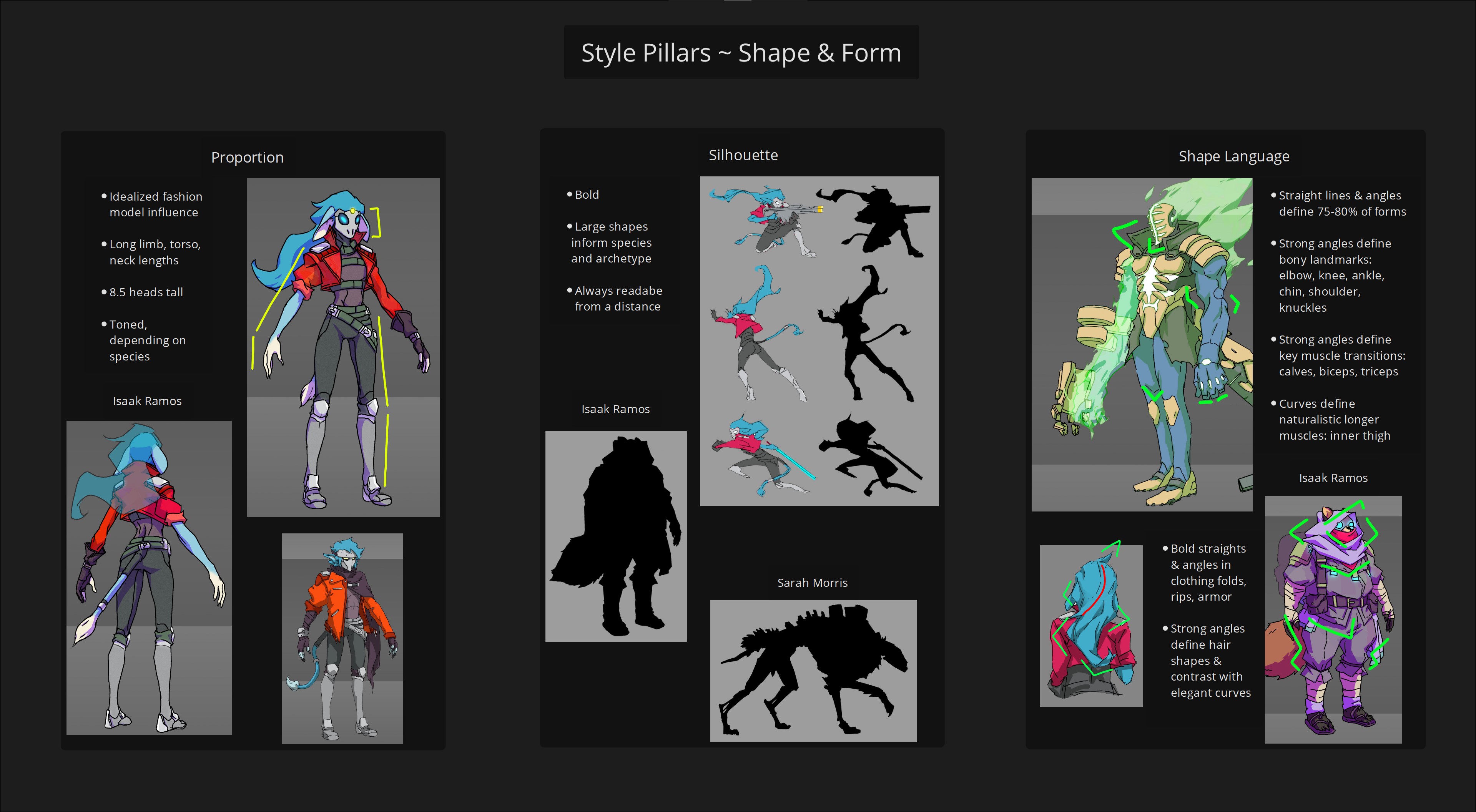
To explain the design philosophy behind Hyper Light Breaker, John shows me more character concept sheets, this time created by character concept artist Isaac Ramos that demonstrate the 'style pillars' for the characters (above).
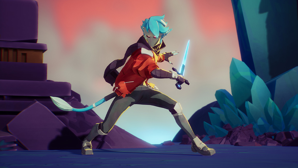
The character designs are defined by straight lines and angles, across clothes, hair and limbs. Often an angular shape is pulled out to break the silhouette, with the sharpness of the Tanu player character's hood and scarf reading clearly, but as John explains this is taken into the hard shading too.
I can see there's still small curvature in areas of anatomy, like the inner thigh and forearm, to contrast the angles of the design. "It's meant to contrast the angles, to add balance to the character," says John who also picks out the "idealised fashion model influence" of the character designs, which feature elongated limbs and shortened torsos.
The long limb style influenced the game's costume design, too. John shares how he uses fashion model images for anatomy reference when building and modelling the characters. "I had the concept up, and right next to it I had fashion model photos with limbs that were kind of matching the lengths we were going for," reveals the artist, gesturing with his hands to where the two images would sit side-by-side.
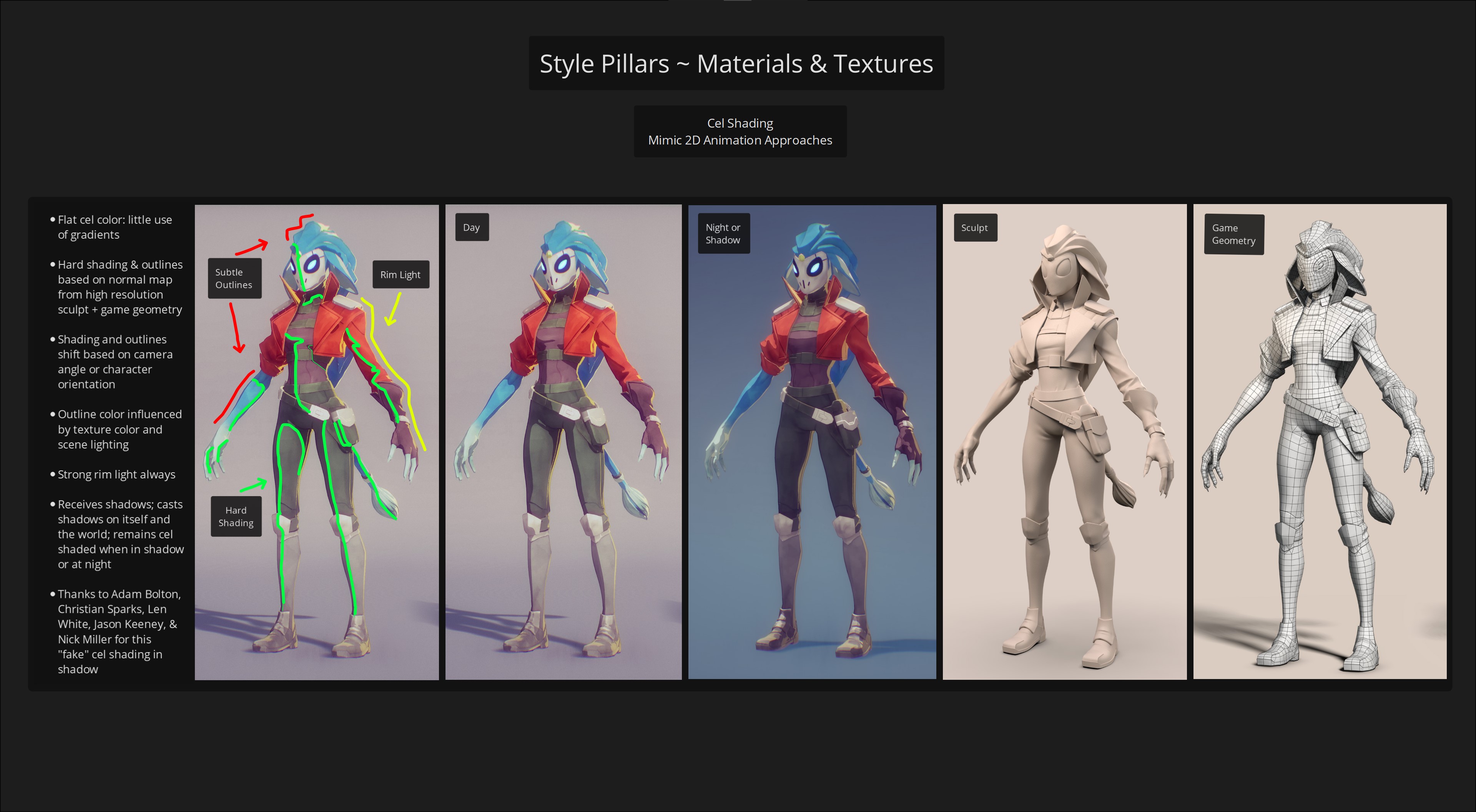
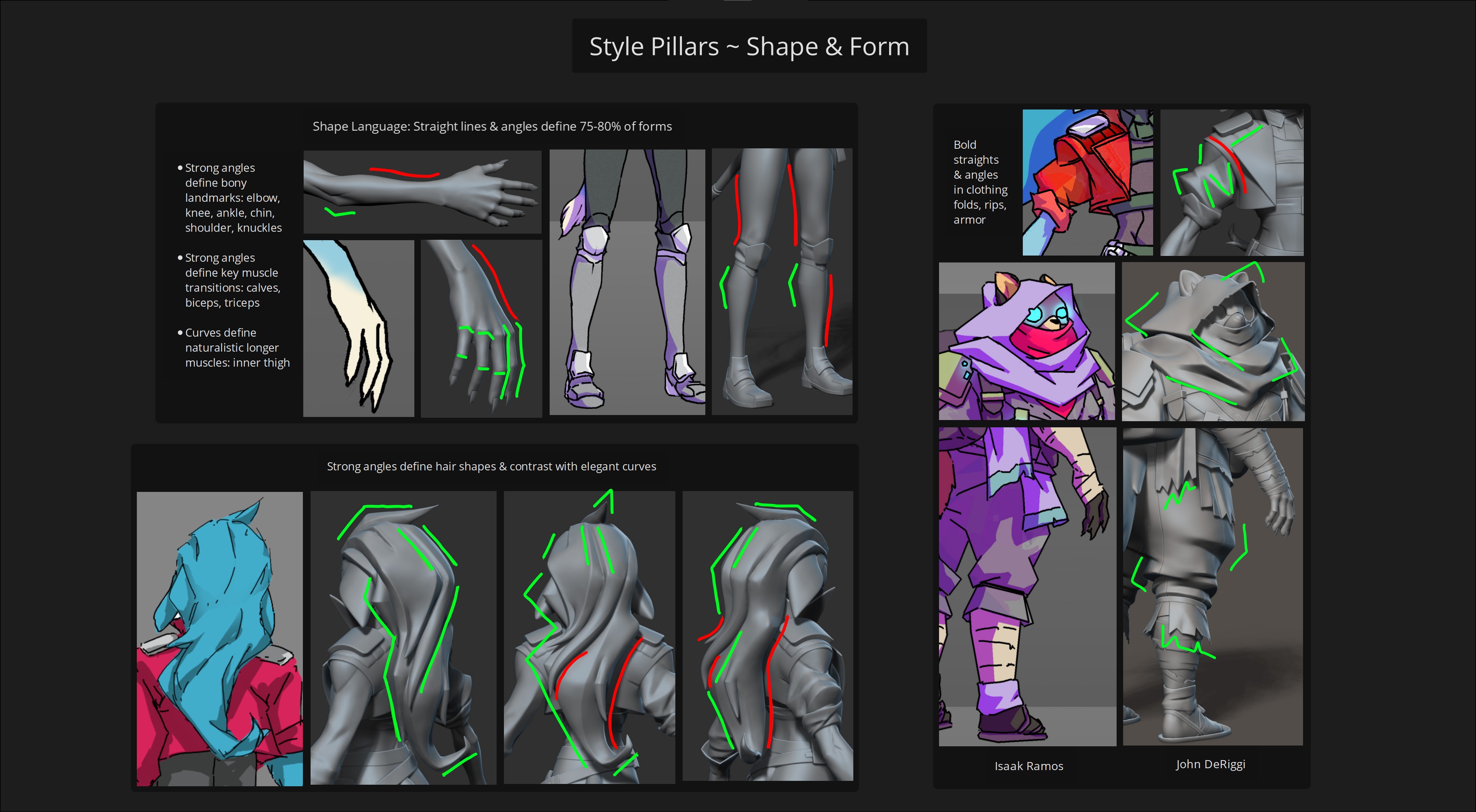
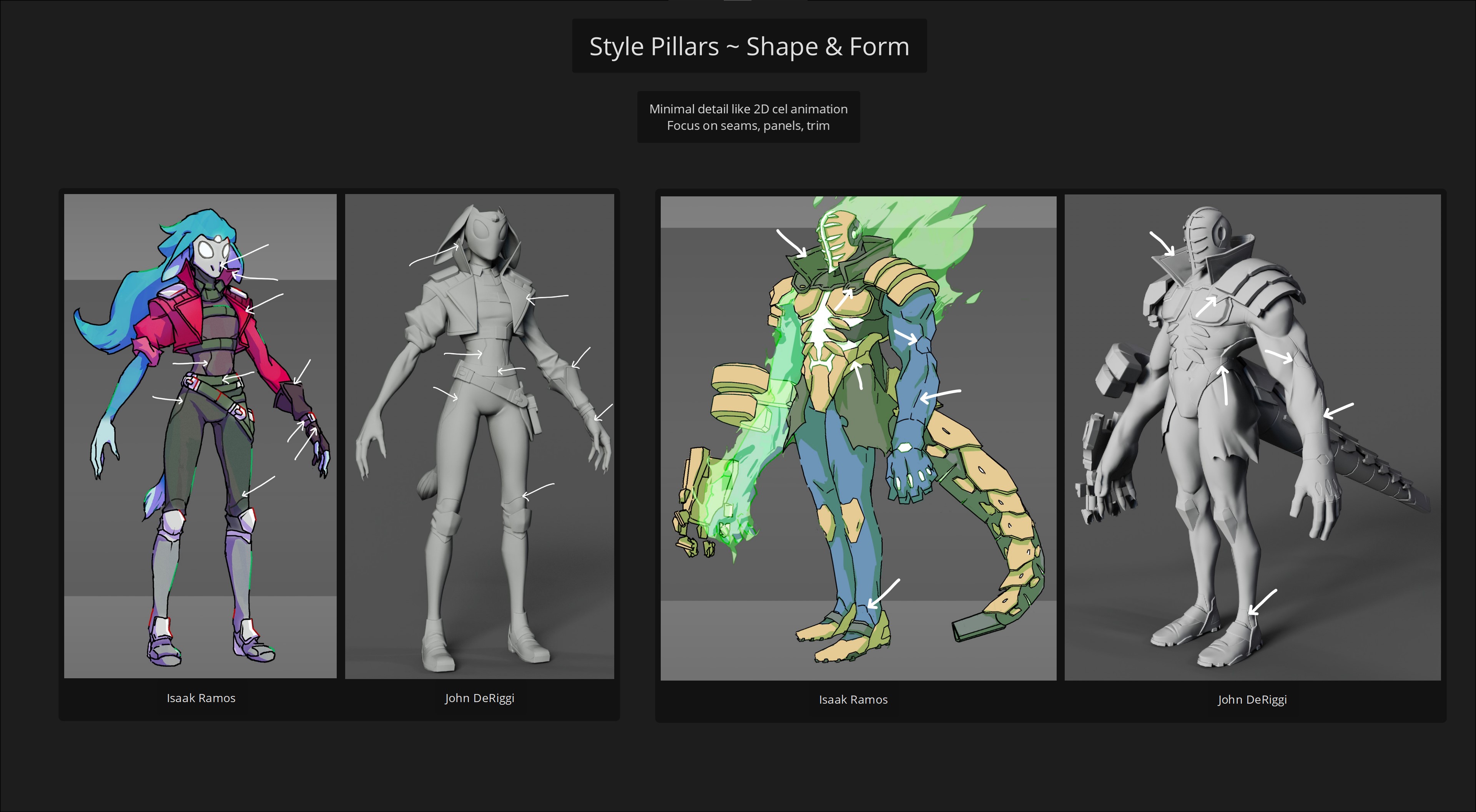
When it comes to modelling the characters the same angular forms needed to be pushed, with minimal detail in the form other than simple seams, trims and panels in the costumes. The idea is to emulate the approach to 2D animation to achieve the cel-shading look, with flat colours, few gradients; hard shading, shadows and outlines.
John explains how Heart Machine's previous game, Solar Ash, didn't use a lot of normal maps "but in this one," he says, "we wanted more control over the shading to make it feel more typically cel-shaded. So by doing the high resolution sculpt, we can really control that, […] the goal is also to keep it cel-shaded, daytime, night-time, in shadow, whatever."
This approach became very important, as under different lighting conditions the cel-shaded style would get lost, and could simply look 'flat'. This was "kind of tricky" says John, and a lot of research and work went into ensuring the cel-shaded look worked at night. He name drops the team - Adam Bolton, Christian sparks, Len White and Jason Keeney, Nick Miller - who put in the hours to ensure the models pushed the cel-shading across every night and day cycle.
Mastering the cel-shaded style
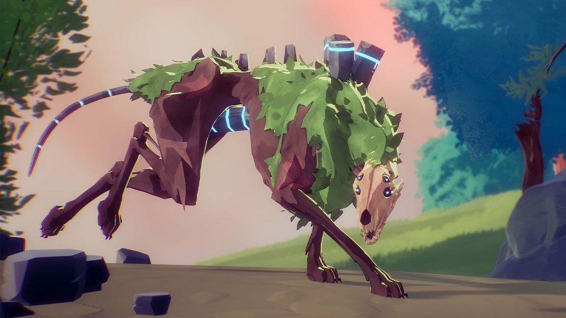
John explains: "We wanted [the game] to look cel-shaded regardless of the lighting. We wanted to feel like it was part of the world, but didn't want it to be wiped out because of that lighting. So that was definitely a struggle; in that any type of daytime light it looks great, and then as soon as it went into the shadows, it did get wiped out. That was a big challenge."
The solution was to bend the rules. "It came down to adding in 'fake lights' at night-time to keep it cel-shaded, that's why it's, like, 'fake cel shading', at night-time," jokes John. "And other games do some similar tricks too, like Genshin Impact (one of the best anime games), the characters still look cel-shaded even when a character walks into the full shadow."
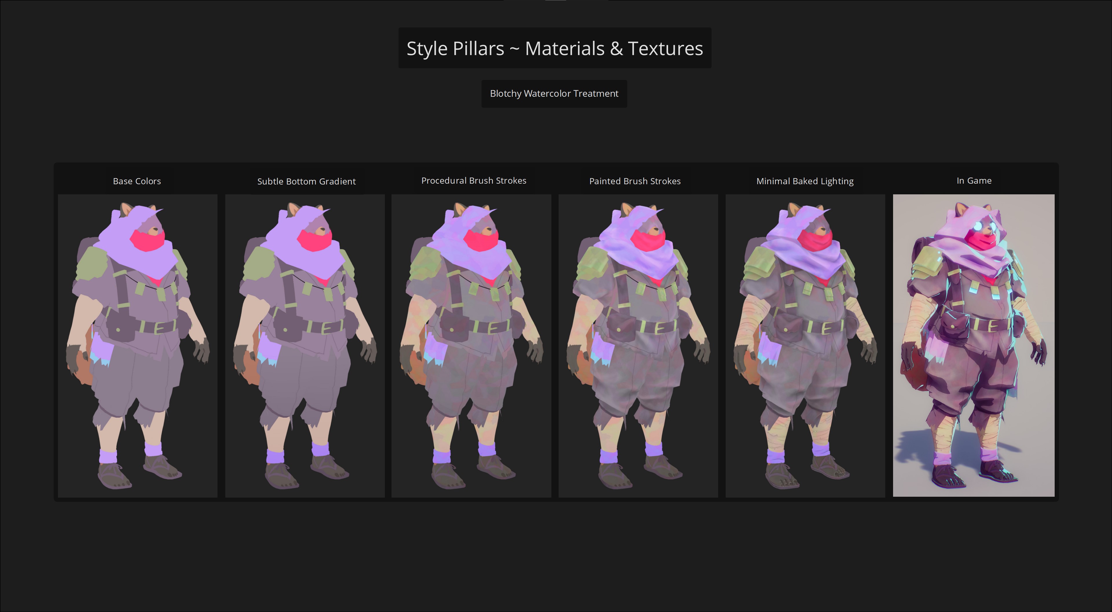
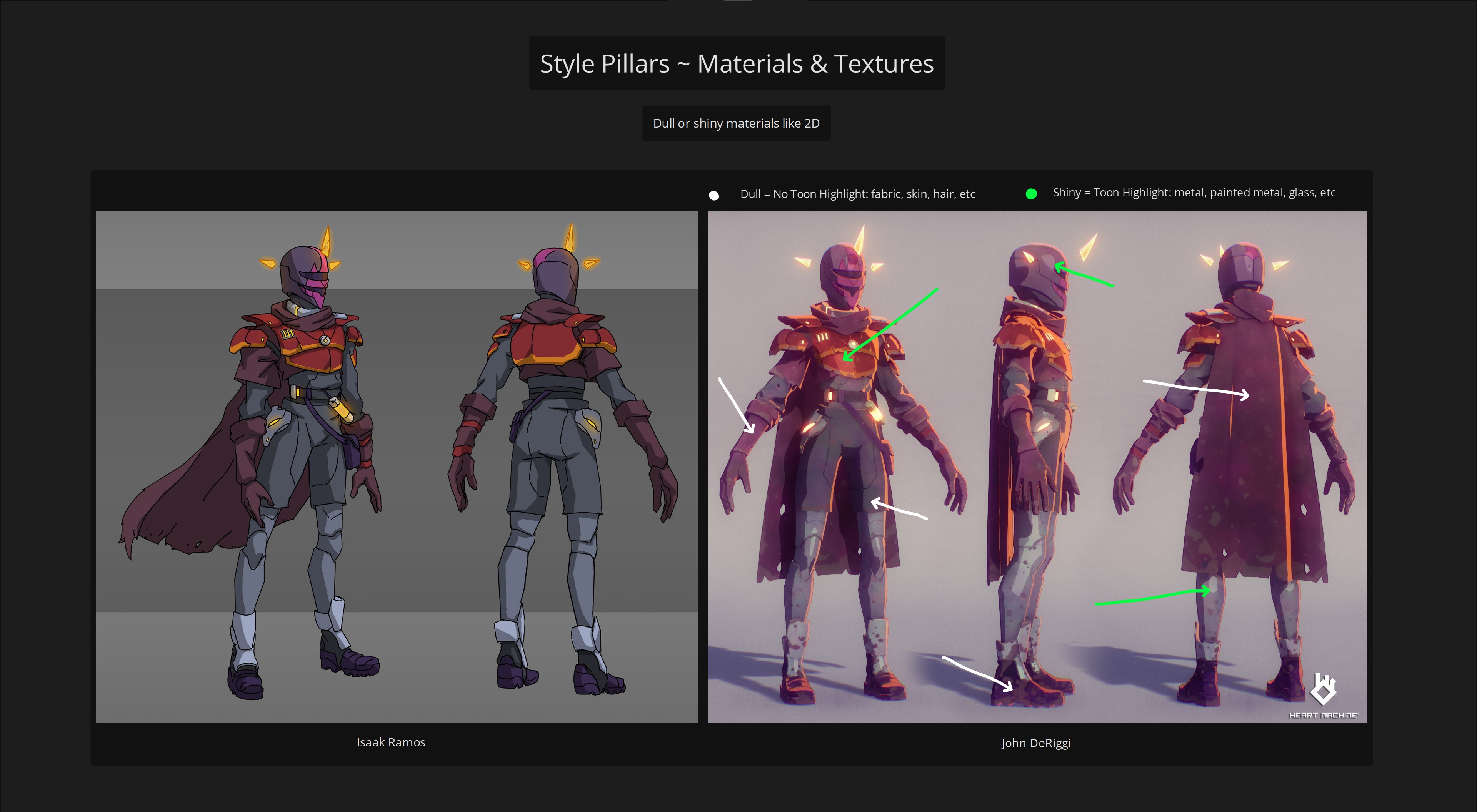
Typically, games that make use of physically based rendering will feature character models with lots of layers and detail. "So our characters are way, way, way more simple than those," says John, who details the models are created using a simple base colour, then a subtle gradient, procedural brushstrokes and hand painted brushstrokes, before finally baked lighting. "You combine that with the cel-shading material in-game, with the rim light and the outlines, and you're getting the final Breaker look," he says.
There are some areas where material differences come into play, but do so without destroying the 2D style. John explains this comes down to "shiny or not shiny" to keep it as simple as possible to retain the cel-shaded feel. "If it's shiny, it gets a highlight. If it's dull, it has nothing," he laughs.
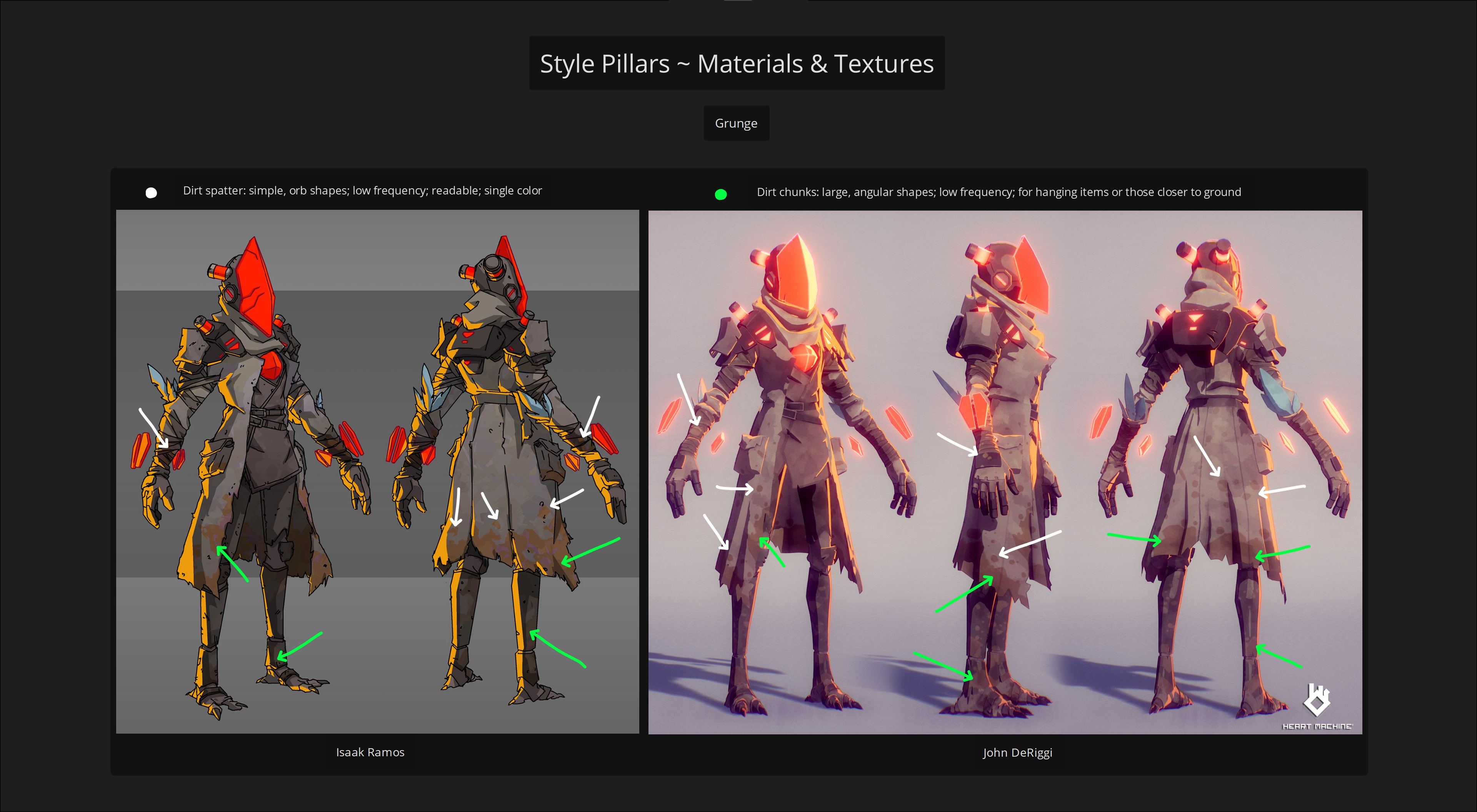
The sense I get is a need to withdraw when the desire to fill in the gaps occurs, and in many ways achieving the cel-shaded look of Breaker recalls the pixel art style of Drifter, if not directly but in principle. It's a style that can be easily broken, which is why even when painting in the grunge and dirt textures on the characters John urges caution (the concept art is on screen every moment he paints to ensure accuracy), because "we really want to hit those pillars".
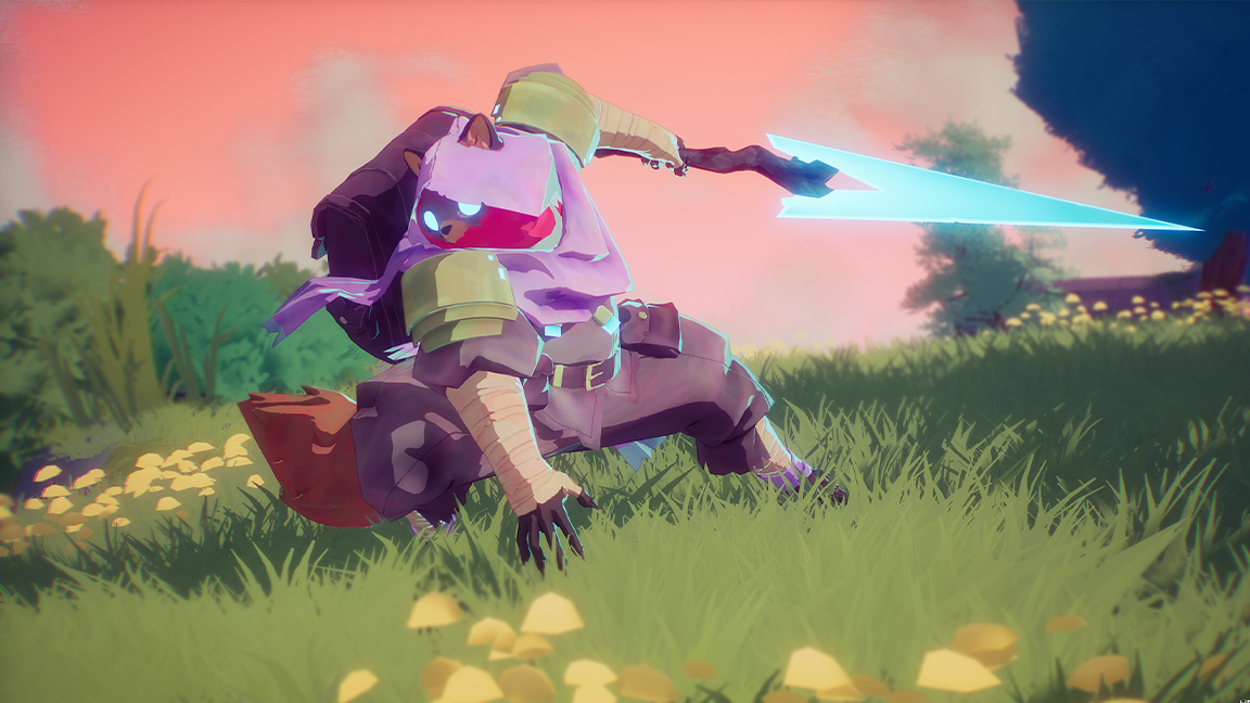
There's a clear connection, artistically, between the design of Hyper Light Breaker and its pixel art prior, Drifter, that the team at Heart Machine is keen to maintain. And it's a thin, slim fine line that could be overstepped at any moment. I get the sense creating the character concepts and models for Breaker is one of restraint; forms, such as folds in clothing, are limited and restricted to core shapes, they're few and far between but also bolder, harder and larger… "crisp," says John.
He points out character models in Hyper Light Breaker are 22,000 triangles - which is considered "low" compared to modern games. "It's small because it's intentionally optimised to be that way," says John, adding: "We didn't need a ton of geometry to make these shapes read, but we needed intentional geometry."
We could push around and play with those retro influences, and that was just super exciting
John DeRiggi, principal character artist, Heart Machine
He explains: "There's a lot of intention in the geometry with triangles, where we're using those edges to match up with the folds. So that geometry, plus the sculpt itself, coming through in a normal map, that's what's getting, literally, those hard, shaded forms in the cel-shading to happen. Without that, you would have a less optimised mesh, and you might not have those hard shaded forms read as quickly during an animation."
In hindsight, there isn't such a big leap from Hyper Light Drifter's pixel art to Breaker's 3D approach, both share a love of retro, 2D animation and both allow the player's imagination to add detail and build a story. And there's a game wedged in the middle, Heart Machine's Solar Ash, which is the connective tissue between both Hyper Light games - sharing a similar 3D cel-shaded style and love of watercolour-washed Ghibli and fizzy 80s anime nostalgia.
Finally reflecting on seeing Alx's art and pitch for Breaker, John says: "I thought this is an opportunity to use all of that inspiration to tell this unique Breaker story in ways that we could push around and play with those retro influences, and that was just super exciting for me".
Hyper Light Breaker releases on PC via Steam later this summer, with console versions for PS5 and Xbox X/S possibly later (unconfirmed but previous Heart Machine games released on current consoles). Read more on the Heart Machine website and wishlist on Steam.

Thank you for reading 5 articles this month* Join now for unlimited access
Enjoy your first month for just £1 / $1 / €1
*Read 5 free articles per month without a subscription

Join now for unlimited access
Try first month for just £1 / $1 / €1

Ian Dean is Editor, Digital Arts & 3D at Creative Bloq, and the former editor of many leading magazines. These titles included ImagineFX, 3D World and video game titles Play and Official PlayStation Magazine. Ian launched Xbox magazine X360 and edited PlayStation World. For Creative Bloq, Ian combines his experiences to bring the latest news on digital art, VFX and video games and tech, and in his spare time he doodles in Procreate, ArtRage, and Rebelle while finding time to play Xbox and PS5.
