Wipeout meets Ghost in the Shell in the new game's 'graphic realism'.
(Image credit: Bungie)
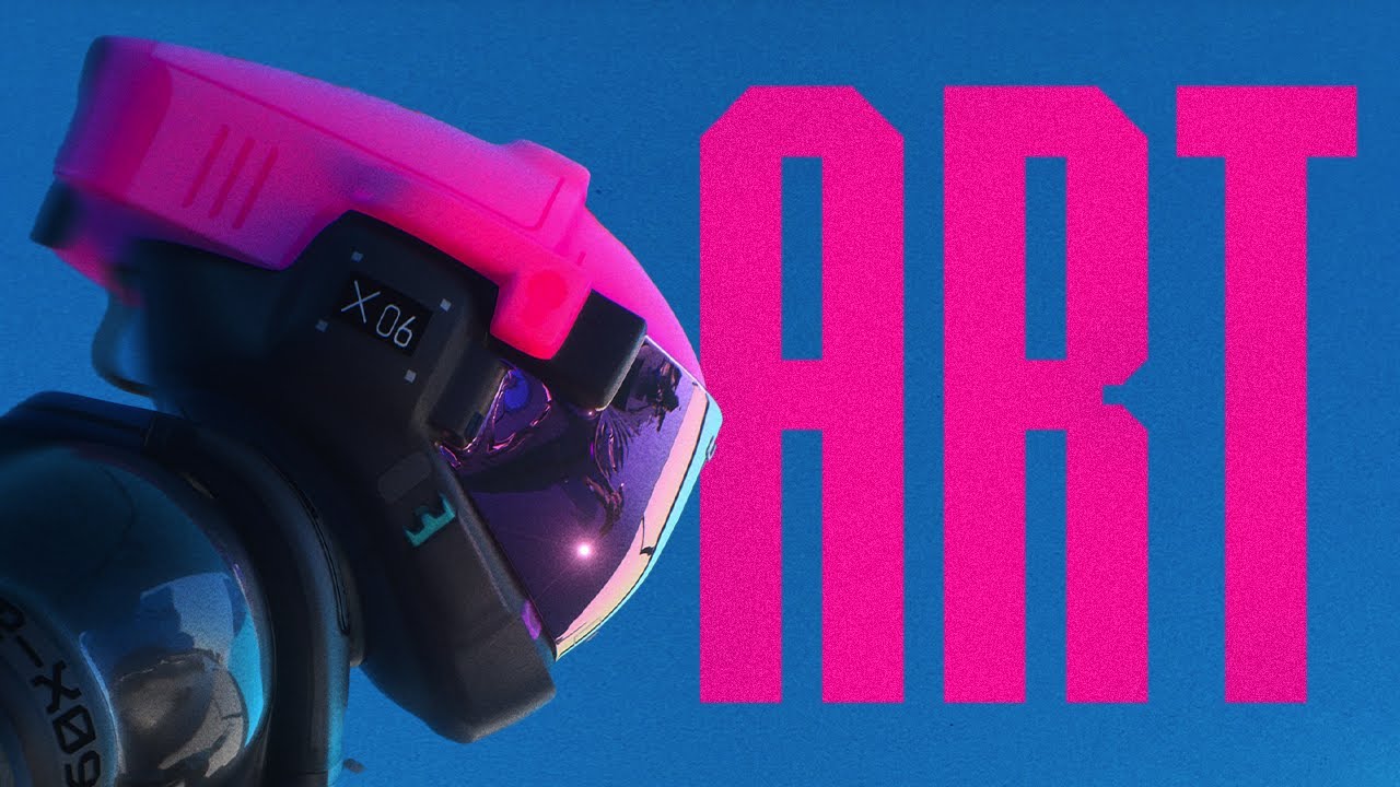
As we reported yesterday, the bold art direction for Bungie's new Marathon game is causing some controversy. The vibrant palette and glitchy UI design influences is dividing opinion among fans.
Some see the style as a breath of fresh air that could bring new life to hero shooters, particularly as Marathon will be a rare extraction game available on consoles as well as PC. But others see it as too much of a departure from the grungy style of the original Marathon games from the 1990s.
What's the thinking behind the art style? Art director Joseph Cross has already explained his approach in a social media post, where he described the new Marathon art style as "Graphic Realism" (see our pick of the best game development software if you're looking to start work on your own project).
Latest Videos From Creative Bloq
Marathon Art Style (a short thread). First of all thanks to everyone for all the kind words and enthusiasm for the art style/direction in our announce trailer, it's been amazing to see. This was the result of many talented artists working together, with the support of an amazing pic.twitter.com/ePPi41KA6cMay 30, 2023
See more
In a post on X written back in 2023 during development of the game, Joseph says of the style: "On one side, it's about a simplified/deconstructed universal design language, strong graphic design and color statements, and limited materials. The other side is about realistic proportions & scale, implied functional & detail, and a generally grounded world."
"We're focused on creating visual "brand" of science fiction, that (hopefully) feels fresh and stands the test of time," he adds.
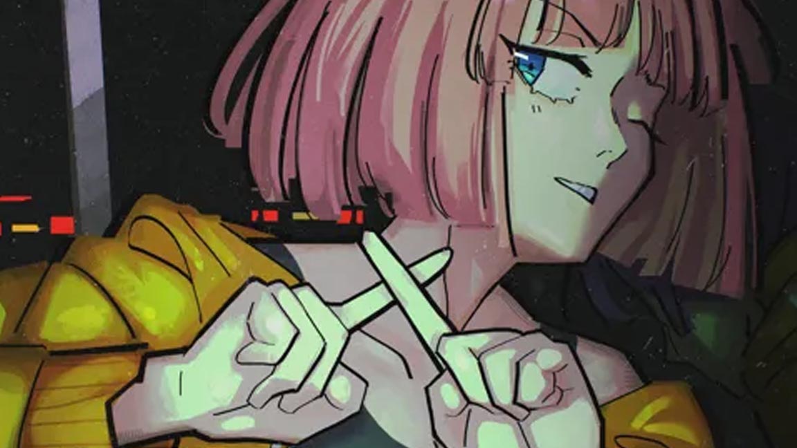
(Image credit: Bungie)
(Image credit: Bungie)
(Image credit: Bungie)
(Image credit: Bungie)
(Image credit: Bungie)
(Image credit: Bungie)
Joseph said the team looked back at games from past generations for inspiration while also looking forward. He cites influences like Metal Gear Solid 2 and the hugely influential Wipeout alongside more recent titles Death Stranding, God of War and The Last of US. He also name checks Mirrors Edge, Aeon Flux, Ghost in the Shell, Otomo, Koji Morimoto, The Designers Republic, Chris Cunningham as part of the "stew".
Joseph goes on to add: "The work of Alberto Mielgo and the affect Into The Spiderverse had on Blockbuster animation has given us a ton of strength and confidence to take more visual & creative risks. There are also a ton of influences outside of games. Product and apparel design, photography, science, conceptual art, cinematography, sports like Formula 1 and MotoGp etc. are all big sources of inspiration."
Get the Creative Bloq Newsletter
Daily design news, reviews, how-tos and more, as picked by the editors.
A Marathon gameplay trailer will be released on Saturday 12 April at 10am Pacific time. There's no news yet on the possible release date or price. The game will be released for PlayStation, XBox and Windows but not Mac this time around.
Joe is a regular freelance journalist and editor at Creative Bloq. He writes news, features and buying guides and keeps track of the best equipment and software for creatives, from video editing programs to monitors and accessories. A veteran news writer and photographer, he now works as a project manager at the London and Buenos Aires-based design, production and branding agency Hermana Creatives. There he manages a team of designers, photographers and video editors who specialise in producing visual content and design assets for the hospitality sector. He also dances Argentine tango.
You must confirm your public display name before commenting
Please logout and then login again, you will then be prompted to enter your display name.