Terrifying trailer reimagines Hellraiser franchise
How Paul Gerrard and Joel LeLièvre create an epic tone and grand reimagining of the Hellraiser universe.
On the back of Clive Barker's announcement in October 2013 that he was writing a script to reboot the Hellraiser franchise, filmmaker Mike Le Han, Hollywood concept artist Paul Gerrard and VFX artist Joel LeLièvre put together an impressive concept trailer for the pitch.
"VFX and CG played a huge part in getting this fan-made pitch from concept to completion," says Paul. "We pulled in resources from all over the globe: people such as Andy Sharrat, Trevor Storey, Glen Southern, Gurmita Singh and Ciarán Wright built 3D assets, and studios Shade VFX and Fugitive came on board to help. Mike Le Han did VFX work. Finally, Joel pieced the scene together and gave it life using CG.

"For the proof of concept we wanted to present Hell on a biblical scale. In the trailer we showcase the new Pinhead design, and then we pull back to reveal a vista of bodies and Paul's version of the Leviathan god in the background.
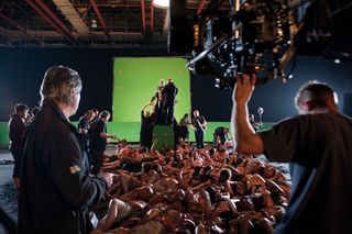
"On a tight budget, we decided that the best course of action was to use greenscreen and CGI. The goal was to create blockbuster-style visuals, with quality over quantity. It is meant to be a teaser; a showcase of what could be if we had studio backing."

What we did right
01. We had clearly defined ideas about what we wanted to achieve
Joel LeLièvre: From the start, Mike’s idea for the crowd shot was straightforward - create hundreds of moving bodies, and make it look as cool as possible! When I was brought on board, there were loads of amazing concept images that Paul had been working on, so getting the look and feel for the scene was simply checking out the library of images he sent me. That saved time when it came to the lighting, rendering and compositing; when we decided on the final look.
02. We mitigated a tight budget with careful use of computer graphics
JL: From the VFX of the Lemarchand's box in the opening scene to the composited multiple layers of bodies in the second shot, and the Hell platform behind Pinhead, it all worked just as expected. We then have a pull-back shot of the Garden of Sin aka The Sea of Bodies. Originally we where going to composite plates of real people for this shot, but even the 100 people that turned up on the day were not enough to portray a convincing 'sea' without it looking too duplicated. And so the CG version was given the go ahead.
The challenges
01. The crowd shot required multiple bodies and specific software to be made
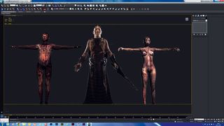
Paul Gerrard: The biggest challenge for the crowd shot was to find a way of creating multiple bodies that would allow for quick updates and revisions. Our goal was to create over 600 bodies that needed to be moving for a full 30 seconds, so there could not be any noticeable jumps in the animation; it had to loop seamlessly.
We ended up using XMesh in 3ds Max to create a loopable asset of 20 or so bodies. We cached them out, then read them back into another 3ds Max scene where we used multiple XMesh loaders with random cache offset values. This enabled us to populate the scene with hundreds of bodies, with all the animation loopable and seamless.
02. Creating the Hellish structure, Leviathan, in the background
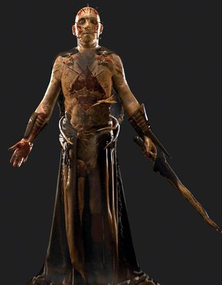
PG: The other challenge was portraying Pinhead and Leviathan - the structure behind Pinhead - convincingly using CG. As the Leviathan was to be a static object in the distance, we decided to use a 2D cutout then spend time created a CG version of Pinhead for the pull-back.
In hindsight, due to the lighting and angle of the shot, we should have flipped that - instead creating a solid 3D structure for the light to bounce off the Leviathan and using a simple cutout for Pinhead. The Leviathan is so far in the background that we could have got away with that. In practice, it was a case of 'build it and see how it looks', with the dynamic lighting and grade going in last.
If we were to do it all over again, I would certainly flip those construction techniques as the Leviathan looks somewhat flat. It works, but not as well as it could have done.
Lessons learned
The project was a great experience in building tools and workflows, and we hope to use the techniques learned on future projects.
We learnt that pulling in resources from all over the globe has its downsides, though: keeping track of the workflow was one, and maintaining solid deadlines was another.
Keeping the project moving forward was also troublesome, as you cannot expect people who are working for free in their spare time to work to your schedule; you have to work to theirs. No matter how dedicated and driven the project leaders are, if paid work comes in for your team members they must take it.
Projects like this get put on the back burner all the time, and it's unfair and unrealistic to think otherwise. You have to adapt and change your plans accordingly in order to keep moving forward.
Words: Paul Gerrard and Joel LeLièvre
This article originally appeared in 3D World issue 179.

Thank you for reading 5 articles this month* Join now for unlimited access
Enjoy your first month for just £1 / $1 / €1
*Read 5 free articles per month without a subscription

Join now for unlimited access
Try first month for just £1 / $1 / €1
Get the Creative Bloq Newsletter
Daily design news, reviews, how-tos and more, as picked by the editors.
The Creative Bloq team is made up of a group of design fans, and has changed and evolved since Creative Bloq began back in 2012. The current website team consists of eight full-time members of staff: Editor Georgia Coggan, Deputy Editor Rosie Hilder, Ecommerce Editor Beren Neale, Senior News Editor Daniel Piper, Editor, Digital Art and 3D Ian Dean, Tech Reviews Editor Erlingur Einarsson and Ecommerce Writer Beth Nicholls and Staff Writer Natalie Fear, as well as a roster of freelancers from around the world. The 3D World and ImagineFX magazine teams also pitch in, ensuring that content from 3D World and ImagineFX is represented on Creative Bloq.
