This stylised music video feels like a moving painting
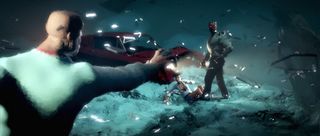
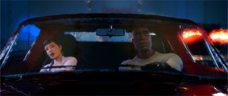
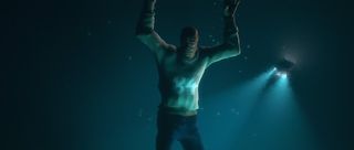
Colorbleed craft an action-packed CGI mini-movie for Mr. Probz new single, I'm Right Here, the unique style of which gives it the feel of a moving painting.
Netherland-based studio Colorbleed is best known for creating the super-popular, humorous and chaotic Mac 'n' Cheese animations. But its latest offering proves it can do much more than just comedy shorts.
A tale of love and tragedy, the team brought Dutch hip hop artist Mr Probz's new single I'm Right Here to life with a unique visual style that gives it a feel of a moving painting. Here, we speak to Colorbleed manager and technical director Roy Nieterau about how it was made...
Q: How did the brief come about?
"Mr Probz contacted us about the possibility of an animated music video. For I'm Right Here, he wanted to create an animated story that fitted the song. From the beginning we were involved with the storyline and we came up with a couple of concepts and settings."

Q: Did you have a lot of artistic freedom?
"Yes, especially as Mr Probz really wanted something unique and original. He was very enthusiastic about our work and our project workflow, which I think is one of the main reasons he left us with so much freedom.
"It was great to get that kind of confidence from him, but it also raised the bar for us to impress every step of the way. We really worked hard, pushing the technology to fit the art style we designed for it."
Q: What was your design approach?
"We worked together with illustrator Joeri Lefévre when designing the characters and sets. We then grabbed the things we liked most about his artwork and we started merging his style with what we could do in 3D.
Creating a universe where everything is like a big moving painting really forced us to think outside the box
"The style we went for put a lot of stress on our ideas from a 3D technology point-of-view. We had experience with staying away from the classic 3D look and going more painterly, as in our animated short Mac 'n' Cheese. But creating a universe where everything is as if it's like a big moving painting and still allowing our artistic freedom really forced us to think outside the box."

Q: What was the inspiration behind the look of the video?
"Focusing on a video that empowered the song was the biggest source of inspiration. Also, illustrator Joeri Lefévre has an amazing painted art style. When doing the first drafts of the storyboards we already found out that a lot of what he puts into his art really fitted the song.
Illustrator Joeri Lefévre has an amazing painted art style
"Working closely with him allowed us to tweak his artwork to our render style. But even better it allowed us to quickly gain tips on how we could make the painted render style closer to his artwork. This collaboration (among with the other artists we were fortunate enough to work with on this project) was really what pushed the limits of the project, especially with the tight eight-week deadline."

Q: How difficult was it to create the look in 3D?
"We have a great in-house rendering and compositing artist that is extremely creative when designing a new art style. This time, again, he was able to make a small proof of concept of the requirements he needed to get to the final result. The most tricky part was that it involved a lot of set-up for entire scenes. His test worked on a single object, but we had to do complete 3D scenery.
"I ended up creating a plug-in that allowed us to transform our 3D rendered geometry into the painty pattern you see in the renders. Along with a toolset that easily allowed us to increase and reduce the amount of paint streaks, but also the size (or even the pattern or anything)."
Q: What software was most useful?
"Our core application is Maya. But we also work with ZBrush, Fusion, Photoshop and they are all essential products. It might be worth mentioning that the pipeline we've set up really did help us out with this project, so I can't skip mentioning Python and C++."

Q: What was the most technically impressive aspect of this project?
"Getting the style that we aimed for efficiently and easy to set-up, and tweak in such a short turnaround time would be one of our bigger technical achievements. We had eight weeks in total - three-and-a-half weeks in we had our first proof of concept.
"Then the biggest problem was tackling how to apply the idea to all the scenery, which wasn't easy. Even though they call me the geeky tech guy for this stuff and always expect stuff to run and work in the end it was really great to see the team effort that went into every step of the process."
Liked this? Read these!
- Top free 3D models
- Best 3D movies of 2013
- Blender tutorials: ways to create cool effects

Thank you for reading 5 articles this month* Join now for unlimited access
Enjoy your first month for just £1 / $1 / €1
*Read 5 free articles per month without a subscription

Join now for unlimited access
Try first month for just £1 / $1 / €1
Get the Creative Bloq Newsletter
Daily design news, reviews, how-tos and more, as picked by the editors.
The Creative Bloq team is made up of a group of design fans, and has changed and evolved since Creative Bloq began back in 2012. The current website team consists of eight full-time members of staff: Editor Georgia Coggan, Deputy Editor Rosie Hilder, Ecommerce Editor Beren Neale, Senior News Editor Daniel Piper, Editor, Digital Art and 3D Ian Dean, Tech Reviews Editor Erlingur Einarsson and Ecommerce Writer Beth Nicholls and Staff Writer Natalie Fear, as well as a roster of freelancers from around the world. The 3D World and ImagineFX magazine teams also pitch in, ensuring that content from 3D World and ImagineFX is represented on Creative Bloq.
