Real-time artwork: 15 top tips and techniques
Digital artist Antony Ward’s expert tips will help you in the creation of your next real-time masterpiece.
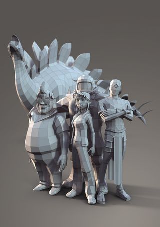
The enhanced power the next generation of gaming brings also means the scope of projects expanding, putting more pressure on the teams behind them. Richer worlds means more content, which in turn will make you busier.
Here, I share a selection of tips to help you focus your modelling and texturing skills on the areas that matter, while also sharing a few tips to help speed up your workflow.
01. Know your limits
When creating assets for film or TV you are usually encouraged to use higher resolution models and textures to enhance the detail and visual impact. This is possible because the only limitations come down to the systems you are working with, and the impact at render time. When it comes to real-time art, before a single polygon has been created you have to consider the game you're making, the target platform and how many polygons, pixels and texture passes it can handle.
A mobile device, for example, will be more restrictive than a PC or console, meaning your overall budget is much tighter. This will also affect the textures you create as some platforms or game engines may not be able to handle normal maps or even specular maps. It's with these lower end platforms that you will have to be a little more creative in your polygon and pixel placement.
02. Maintain clean topology
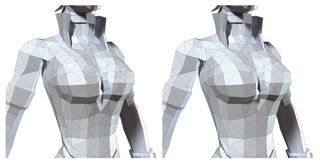
Building a model by haphazardly throwing polygons around may get the job done, but at what cost? Care needs to be taken about the placement of each triangle or quad, ensuring the surface of the model is kept clean and tidy. A structured edge flow will ensure the geometry will deform correctly. It will also make life easier when the model comes to be UV mapped and textured.
03. Deforming certain areas
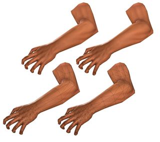
When working with a small number of polygons it's important to place them in sensible areas, not only to be economical, but also to enhance performance. Areas which are to deform more than others, like the face and hands, will need more time spent on them in order to make them ready for movement.
When working on a face, refer to the actual facial muscle structure, and mimic these in your topology, so as it deforms, the model's surface will bulge and pinch in the correct areas. With the joints and fingers, ensure each pivot point on the mesh holds enough geometry so it can confidently handle being bent and compressed.
Using too few polygons will cause the areas around the joints to collapse in on themselves, or deform in an unconvincing way, which will essentially break the illusion of life you're trying to convey. If you are unsure how an area will look when deformed, don't be scared to quickly apply a skeleton and test it.
04. Optimise your UV layout
The next stage is texturing, but before that comes the all-important UV layout. There are ways you can make the most of the pixels you have if you consider your approach.
Ask yourself: "Can an area simply be mirrored so each side occupies the same UV space? Are there any potentially hidden areas which need only a tiny UV shell? Could an area of flat colour or minor detail also work with a much smaller area on the page?" Considering these will free up precious space on your texture page.
05. Prioritise your UV space
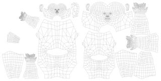
Arranging your UV layout is like solving a puzzle: All the shells must fit into a perfect square while also making sure there is the least amount of wasted space possible. While doing this, you must also prioritise your page by deciding which UV shells need more space than others.
A main character, for example, will have many periods where the camera is close to their face, so this area should have more UV space to enhance the texture detail. So it's at this stage you need to know how the asset will be used.
06. Bake textures to save time
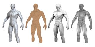
You are probably working to a strict schedule so feel you are balanced on a tightrope between maintaining a high quality of work and keeping your time in check.
During the early development of an asset you can speed up your workflow by allowing the application you are using to bake out key textures for you. A quick diffuse, normal, cavity or occlusion map can be used to give you a head start, enhance your texture page, or even as a guide.
07. Visualise the model
Keep visualising your model as it would be presented in game. If the character will only be seen from a certain angle, or the vehicle is
always far from the player's camera, referring back to this view will help to keep you focused on adding detail to the areas which actually need it.
There's no point spending time building an anatomically correct ear, when it will only ever occupy a few pixels on screen. These precious polygons could be used to enhance an angular curve on the rim of a hat instead.
08. Watch your seams
Working in Photoshop can be a great way to generate textures quickly and easily, but eliminating texture seams can be near impossible when working on two dimensions. You can spend an age trying to line up pixels or blurring the edges of your shells to hide the seams, but there is an easier way.
There are many applications available that offer 3D painting, where you take a model and physically paint the textures onto its surface. Working in applications like this will firstly highlight any obvious seams on the model and could also offer a Clone tool, (or something similar), which will allow you to simply blend them out of existence.
09. Enhance your normal maps
Baking high-resolution details onto a lower-resolution model in the form of a normal map is nothing new, and has been practiced now for many years. This bluish texture, although odd looking, holds essential lighting data which turns each pixel into a surface normal.
Once baked though, your normal map doesn't have to remain here. Using a basic greyscale height map along with some simple conversion tools, you can enhance this initial normal map further with essential surface details. This approach can help give your model greater detail with very little effort and without increasing your texture budget.
10. Paint details in 3D
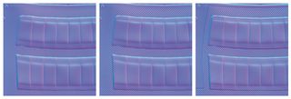
Painting detailed areas of your texture can be hard to do in a standard 2D application. Adding stripes to a shirt, for example, can be near impossible to do on a flat unfolded and uneven UV surface. This is where a 3D painting tool, like 3D-Coat, can save you time.
Working in 3D means you can avoid the hassle of constantly considering the UV layout, as you can work over what would be troublesome areas intuitively and seamlessly. A good app will enable you to paint normal map data, diffuse and even specular data, meaning you can enhance the colour map and the surface detail too.
11. Use reference
Reference is essential no matter what you do. Building a car? Then some good photos will guide you with every detail. How about a bat? Again, photographs will ensure your imagination doesn't lead you astray.
You can also bring photos into your texture pages. Sometimes a well-adjusted photo can add that extra level of realism and detail to what was previously a bland texture.
12. Blend your texture shells
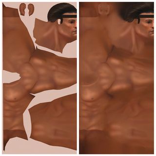
Your focus has been on the contents of each UV shell and the pixels within them, which is ideal as these are the areas which will actually be seen on the geometry. Problems will arise, however, if this texture is manually reduced to save memory or mipmapped in code, meaning texture bleeding occurs. This is where the colours from the empty areas of your page begin to creep inside each shell, so in the game the UV seams around your model become obvious and ugly.
There are a few approaches to eliminate this issue, but my favourite is a plug-in called Solidify. Once installed this will take the pixels around each UV shell and blend them into the empty UV space, so no matter how much the page is reduced, you will never see a seam.
13. Seamless is godliness
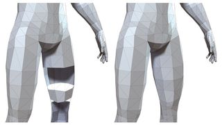
There isn't a right or wrong way to approach building a game model, and every artist will have his or her own techniques. What you don't want to do is have a resulting model made of separate, or even overlapping sections. Not unless the game engine or design specifically asks for it.
It's usually good practice to keep your model as a single seamless mesh. So you should combine those meshes, delete those underlying polygons and weld the edges of your geometry together. Not only will your lead artist be happy, but whoever has to rig the character and battle with the weighting will be your best friend.
14. Check your backfaces
You have a problem. You're baking out your various maps, but there are areas of the resulting textures, which are black, or just don't look right. And there are stubborn hard edges on the model, which won't go away. You've adjusted the settings and checked the UVs, but nothing works.
At this stage you should check your model's normals and the direction they are facing. If you have been working with a model where one side was mirrored to generate the other, chances are the normals may have been inverted too. Quickly enable Backface Culling on your viewport and disable any double-sided settings you have on the model. This will then highlight any areas which are flipped as they will appear as holes in the model, making them easier to fix. Problem solved.
15. Don't reinvent the wheel
This may be the final tip, but it's probably one of the most important when it comes to speeding up your workflow. All you have to do
is remember the three Rs: recycle, recycle and recycle! Don't waste time rebuilding everything from scratch, not unless you feel you need to because the original asset is now outdated, or can be dramatically improved upon.
If, for example, you have a great head model in your library, reuse it when you start a new project. Chances are you will spend less time reworking this mesh into a new shape than you would if you built it from scratch. If you're confident enough you can also do this with base textures and also the UV unwrapped models, saving you even more time in the long run. Keep everything and buy a bigger hard drive, just in case!
Words: Antony Ward
Antony Ward has been provoking pixels since the early 1990s. In that time he has worked for some top studios, written books and created tutorials. This article originally appeared in 3D World issue 177.

Thank you for reading 5 articles this month* Join now for unlimited access
Enjoy your first month for just £1 / $1 / €1
*Read 5 free articles per month without a subscription

Join now for unlimited access
Try first month for just £1 / $1 / €1
Get the Creative Bloq Newsletter
Daily design news, reviews, how-tos and more, as picked by the editors.
The Creative Bloq team is made up of a group of design fans, and has changed and evolved since Creative Bloq began back in 2012. The current website team consists of eight full-time members of staff: Editor Georgia Coggan, Deputy Editor Rosie Hilder, Ecommerce Editor Beren Neale, Senior News Editor Daniel Piper, Editor, Digital Art and 3D Ian Dean, Tech Reviews Editor Erlingur Einarsson, Ecommerce Writer Beth Nicholls and Staff Writer Natalie Fear, as well as a roster of freelancers from around the world. The ImagineFX magazine team also pitch in, ensuring that content from leading digital art publication ImagineFX is represented on Creative Bloq.
