Pixar creates new lighting tools for Monsters University
To honour the saturated look of Monsters, Inc, yet give lighting artists new, faster physically-based lights for Monsters University, Pixar went back to school to create new lights, shaders and tools.
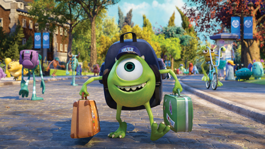
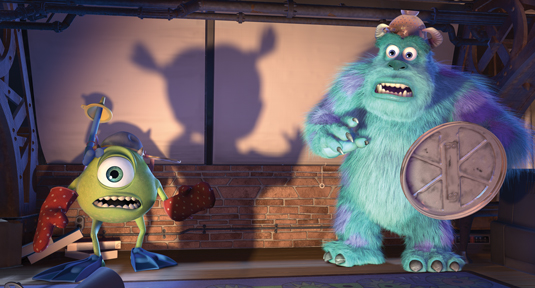
They may be masters of the late-night fright, but even the most naturally scary monsters have to go to school to perfect their art, as we learn in Pixar's latest animated feature Monsters University.
The movie takes up the story before one-eyed Mike Wazowski came to work at Monsters, Inc as assistant to his best friend James P Sullivan. In turning back the clock to our favourite monsters' student days, we not only get to watch them grow up but also see how the ability to make animated features has grown.
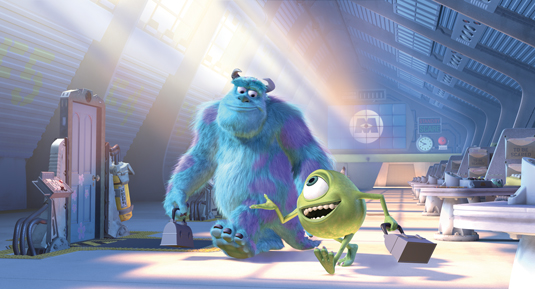
The 2001 film Monsters, Inc was Pixar's fourth feature film. It featured 50 characters - an extraordinary number at the time, made more remarkable by the fact that the lead character, Sulley, was furry. The film required more computing power to render than Pixar's previous three films combined, even though the studio had populated its render farm with 3,500 processors.
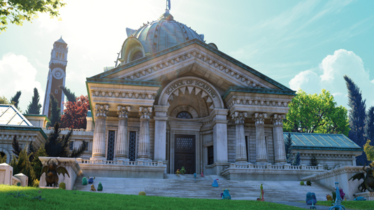
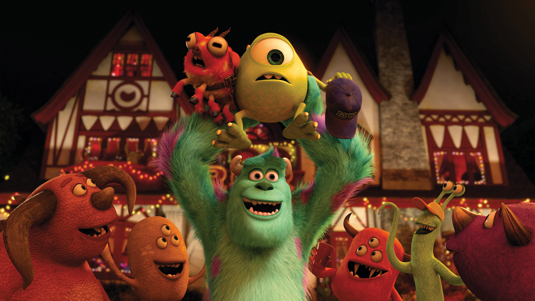
Times have changed. 12 years later, Pixar's 14th feature Monsters University takes place on a college campus populated with 400 monstrous students. Many of them are furry, and the majority have an odd number of legs, arms and eyes. They hang out on the campus lawn, attend classes and sporting events, and inhabit 'monsterised' buildings. It's a world the artists working on the 2001 film might have imagined, but would not have been able to create.
To make Monsters University, Pixar doubled its render farm, which now boasts 24,000 processors. Despite this, it still took 100 million CPU hours to render the film. Even with today's fast processors and parallel processing, each frame took approximately 29 hours to render.
It's a world artists working on the 2001 film might have imagined, but wouldn't have been able to create
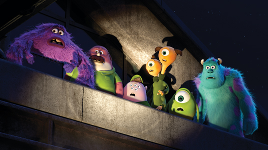
In addition to the increased complexity in character and environment design, one reason for the increased rendering time was lighting. "We used global illumination on everything," says Jean-Claude Kalache, director of photography for lighting. "We have real, golden light coming into the bedroom windows when the monsters wake up in the morning."
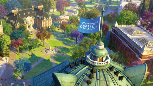
Lighting was a major theme in the film. "We wanted to capture the colourful, saturated world we had in Monsters, Inc," says shading and lighting art director Dice Tsutsumi. "Monsters, Inc had a signature light with the morning sun hitting the building. In this film we were able to choreograph lighting to have the main characters interact with the light.
Get the Creative Bloq Newsletter
Daily design news, reviews, how-tos and more, as picked by the editors.
We wanted to capture the colourful, saturated world we had in Monsters, Inc
"It's really exciting for someone designing light and colour. On this film, we could plan ahead. We could have temporary lighting for camera and animation. That was astounding." But graduating from the lighting system used on Monsters, Inc to the sophisticated, physically-based lights used in Monsters University was a challenge.
Early days
To light the original film 12 years earlier, the lighters often worked in a text editor. "A large part of our job was fairly technical," Kalache says. "It made lighters think about every action and do a lot of pre-planning. Before you could light a shot, you would do a mental exercise to decide where you would write a script. To create shadow map rules, we edited files. Having to use that process was an obstacle for someone who was artistic or expressed themselves through imagery."
Moreover, the lighting system was cumbersome. "Many actions that should have been accomplished in one or two steps took many steps and sometimes multiple tools," Kalache says. "It was challenging. So coming out of Monsters, Inc, I pitched the idea to the studio that we needed better and simpler tools. We needed a new paradigm."
The result was new a lighting workflow within the studio’s proprietary software Marionette with a simpler, more intuitive layout, put to the test first by the lighters on the 2006 animated feature Cars.
"The edict for the new design was that anything that could be done in one step should be," Kalache says. At the same time, the team also thought about how to make the way in which the lights worked simpler. "We had a lot of features built into how our lights work," Kalache says. "We thought about lighting with one feature, not 10 or 20. So we created a modular tool into which we could plug in features. That made the lights more interesting and lightweight."
We thought about lighting with one feature, not 10 or 20
Lighters could, for example, create one type of shadow and have 20 lights share it. "Or we might create a component, such as a barn light, that we'd put in the world somewhere and have all the lights affected by it," Kalache says.
Lights, camera, action!
With the new tools and workflow, the lighters created area lights, dome lights and skylights. Pixar uses PR RenderMan, and the version they used at the time didn't include sophisticated raytracing. This meant area lights acted like area lights but the shadows acted like deep shadows, and dome lights used ambient occlusion rather than accurate shadows.
"You would imagine that if the sky was brighter on one side, you'd have sharp shadows on that side," Kalache says. "But that wasn’t the case. Occlusion tends to be uniform from all sides. We knew that when speed became less of an issue we’d move to raytracing.
"Everything we were doing was a Band-Aid. We had a big interest in raytracing - we refer to it as the 'ground truth' - but the problem was always speed and complexity. We would develop lights to work better and more efficiently, but the next movie we'd work on would make the lights more complex or slower."
The team tried using raytracing for shadows, occlusions and global illumination using point-based illumination - point clouds. "That pointed us in the right direction but it was still too many steps," Kalache says. "So we asked the RenderMan group if they could automate point-cloud generation, but the more we worked with them, we realised that it is still not the 'ground truth'. It also came with side effects. Every time we got one step closer, there were three different ways to get to that step."
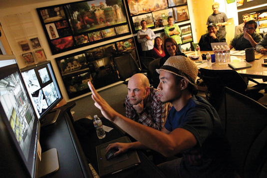
As work on Monsters University began, Kalache decided the time was right to fully implement raytracing. "10 years later, the mission was the same," he says. "Simplicity. Less is more. I believed we could do more visually with fewer lights. At the end of the day, we wanted to put a light in the scene and have it work. That was the dream. I said to the studio, 'Let's put the right group together. Give us six months.'"
10 years later, the mission was the same. Simplicity. Less is more
In that group were Bill Reeves, a computer graphics pioneer (who, alongside John Lasseter, received an Oscar for Tin Toy, and Technical Academy Awards for inventing particle systems and the development of Pixar’s Marionette system); two-time Sci-Tech Award winner Christophe Hery; software engineer Jacob Kuenzel; technical director Chris King; software engineer Davide Pesare; supervising technical director Guido Quaroni; and character shading and paint artist Peter Sumanaseni. The high- powered group accomplished the goals that Kalache had set out and more.
"In the past, we'd set up the camera and point clouds," Kalache says. "Now, we have raytraced irradiance and it works in subsurface scattering. We turned on everything. Christophe Hery was the main architect behind the raytraced lights and global illumination. We raytraced hair, grass and vegetation in Monsters University. Pretty much everything. It just works."
While working at Industrial Light & Magic, Hery had begun migrating to raytracing from point-based rendering, for which he and Pixar's Per Christensen had received a Scientific and Engineering Award in 2010. It was his second award from the Academy of Motion Pictures Arts & Sciences. In 2003, he received a Technical Achievement Award for developing subsurface scattering techniques used to render skin in translucent materials. He joined Pixar as a global technology and research technical director in June 2010.
"In my interview, JC [Kalache] said Pixar wanted to simplify their approach to lighting," Hery says. "They had brought in scenes from Toy Story 3 to benchmark, and the scenes had 100 lights with 30 that represented the sun, each done in its own way. They had to cheat the lighting on a per-shot basis.
"I was strong in my opinion that they should move to importance sampling. But there was one issue: I had no idea how to do hair with raytracing using importance sampling and physical models. When they hired me, they put me on Monsters University. Hair became a major research project for me."
The goal was to provide an efficient system that worked with RenderMan’s raytracing software and integrated physically-based shaders (materials) and lights to let artists light a scene quickly and easily. "We wanted to get 95 per cent of the shot in a more natural way without cheating," says Hery. "Then we could still control what was going on."
Importance sampling helped achieve that goal. "Imagine you have a dome light, an environment map, with some hot spots in it," says Hery. "The most common example is an environment of Grace Cathedral by Paul Debevec, which has light fixtures on the ceiling and stained glass window.
"If you used an ambient occlusion method, you would spread rays in all directions and many of those rays would go into black regions without light. To increase the number of rays hitting lights, you must increase all the rays. With importance sampling, you send rays only where there is illumination. You can do that with all the lights and also the BRDF [a bidirectional reflectance distribution function that defines how light reflects from an opaque surface], sending more rays where the response on the material is the highest."
With importance sampling, you send rays only where there is illumination
So Hery proposed completely new lights and a new model for surfaces that was both energy conserving and could be importance sampled. The result was six new types of lights: dome lights, rectangular and spherical area lights, a disk, a distant light and a portal. "The portal is to have light enter through a window or door," Hery says. "It's a means to accelerate the importance sampling. The rays go to that region first, not everywhere around it."
Rather than direct light from point lights, everything could be a source of secondary light. It was a fundamental change in the way the artists approached lighting and shading, and all the BRDF models had to be rewritten.
"I explained that the language in the lighting tool had to change," Hery says. "We wouldn't be positioning point lights. We'd position a light, specify its size and properties, and potentially put a texture map on it. Before, they would tweak specular properties, highlights and the roughness of materials independently of reflectivity. But with physically plausible shaders and materials, specular and reflectivity is one property.
"The roughness of the material controls the blurriness of reflections. At first, they thought this meant I'd suppressed a parameter they could tweak. I'd say, 'You really don't want to tweak that because it won't work across shots, it will be unpredictable, and it is not physically accurate.' When you have surface shaders that are grounded in physics, you can go from shot to shot without too much tweaking."
To produce a final colour for the pixels in an image, an integrator - a mathematical algorithm - reconciles the response of the BRDF and the lights. "I wrote a series of integrators, each dedicated to their own light transport, and because they were co-shaders I could refine them at will without breaking the assets," Hery says. "Then we changed the interface in the lighting tool to support all that, make it work with global illumination, and make that efficient with raytracing."
Cartoon lights
The new lights and shaders work within the modular toolset Pixar had created. Kalache calls the six new lights "smart lights" and simplifies the description to sky, square, sphere, disk, sun, and window. "The cool thing with our modular lights is that you can create lights you haven’t imagined," Kalache says.
The cool thing with our modular lights is that you can create lights you haven't imagined
"But the problem was that we spent too much time creating lights. Instead of lighting the scene, we were having too much fun putting modular lights together. Today, these new super smart lights work out of the box very well."
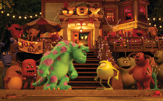
"It's true that we used a lot of rays and a lot of compute power," Hery says of the time it took to render. "But the goal wasn't to reduce render time. The goal was to make the user experience faster. So, in the end, I think we were successful."
Kalache agrees: "Our lighters used to spend 70 per cent of their time as engineers," he says. "Now, they spend 60 to 70 per cent of their time as lighters. They can light quickly and accurately, with proper shadows. We ended up with physically real and completely tweakable lights." In other words, the best of both worlds: real lights that can be art-directed to work in a cartoon world.
Words: Barbara Robertson.
This article originally appeared in 3D World magazine.
Liked this? Read these!
- Hands-on review: 3ds Max 2014
- 25 top free 3D models
- Blender tutorials: ways to create cool 3D effects

Thank you for reading 5 articles this month* Join now for unlimited access
Enjoy your first month for just £1 / $1 / €1
*Read 5 free articles per month without a subscription

Join now for unlimited access
Try first month for just £1 / $1 / €1

The Creative Bloq team is made up of a group of art and design enthusiasts, and has changed and evolved since Creative Bloq began back in 2012. The current website team consists of eight full-time members of staff: Editor Georgia Coggan, Deputy Editor Rosie Hilder, Ecommerce Editor Beren Neale, Senior News Editor Daniel Piper, Editor, Digital Art and 3D Ian Dean, Tech Reviews Editor Erlingur Einarsson, Ecommerce Writer Beth Nicholls and Staff Writer Natalie Fear, as well as a roster of freelancers from around the world. The ImagineFX magazine team also pitch in, ensuring that content from leading digital art publication ImagineFX is represented on Creative Bloq.
