How the new RoboCop suits were designed
RoboCop is back sporting not one, but two brand new suits. Here, Framestore VFX supervisor Rob Duncan reveals the secrets behind the new designs.
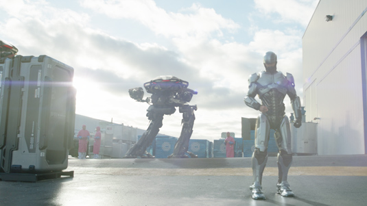
Groundbreaking in its practical and digital effects at the time, the classic 1987 action film RoboCop has been brought back to life in a spectacular reboot, accompanied by some seriously impressive VFX.
The new movie called for the talents of many visual effects vendors, including multiple award-winning studio Framestore. Responsible for over 600 robot and bullet-filled shots, including bringing Detroit cop Alex Murphy's new suits to life, the team was lead by VFX supervisor Rob Duncan.
In this interview, he tells us a bit about the magic behind the the CG mastery in the new film and who he thinks is the ultimate robot.
You helped bring the Robocop suits to life. Did you have much input into the designs?
There was a conceptual illustration of the ideal suit proportions, and then there was the reality of the practical suit. Our job was to find the right balance between the two.
Was the groundbreaking magenta and steel blue-effect painting technique used on the original RoboCop suit difficult to recreate in CG?
What a great question! It was indeed a huge challenge to mimic the look of the practical suit, since we often only wanted to replace parts of it and retain the rest from the live action footage. Matching the shape of the suit was the (relatively) easy part, since we had scans of the suit and lots of photographic reference. On top of that, we had all the live action plates to cross-check against.
It was a huge challenge to mimic the look of the practical suit
However, the colouring of the suit turned out to be much harder than anticipated. At first glance it seemed as if the suit had pearlescent qualities, like one might find on a car with a metallic paint finish. But it turned out that in reality all the subtle accents were baked-in to the suit and did not actually move as the light changed, or as the viewer changed perspective around it.
After quite a lot of trial and error, I had the bright idea just to get in contact with Legacy Effects who created the practical suits - they were very helpful and laid out, step-by-step, the exact process they went through when painting the suit, even going so far as to quote the specific shades used to add dirt to the suit. This made it easier to distinguish between a natural shadow and a smear of grime collecting in a corner of the suit.
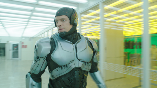
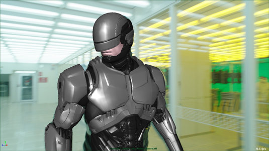
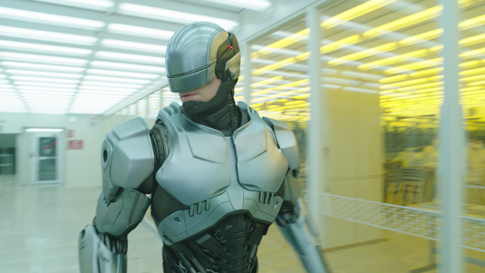
What's the major difference between the two suits from a design point-of-view? And which do you prefer?
There is more bulk and more working mechanism on show with the original suit. The all-black suit is more streamlined.
It’s impossible to forget the original movie, so I would always prefer the classic suit. I think the updates that have been made to it are very respectful, yet bring it up to date with how we now view the near-future.
Which was your favourite sequence to work on and why?
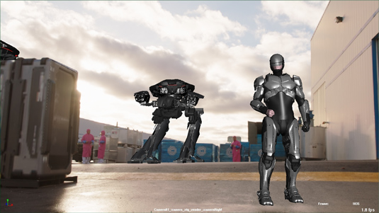
As a self-contained entity, I like the opening sequence in Tehran, because we had the chance to see the EM-208s and ED-209s in action, working together in a high-pressure situation.
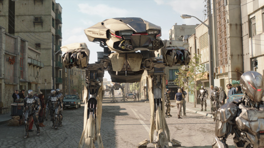
And which was the most challenging?
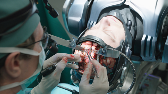
It would have to be the disassembly scene, where Dr Norton (Gary Oldman’s character) reveals what is left of Alex Murphy inside the Robo suit. Not only did we have to completely reconstruct the lab environment (to erase Joel Kinnaman below the neck), but we had to come up with a semi-plausible way to dismantle his body and keep it interesting over an extended single shot.
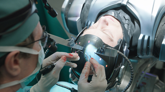
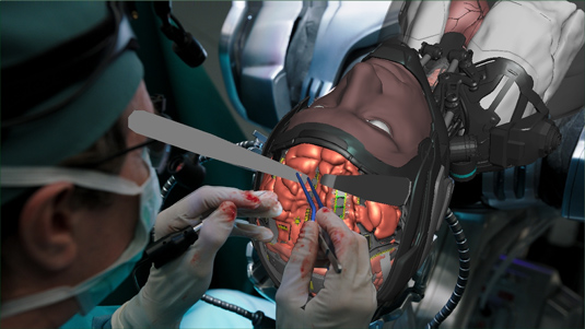
Were any groundbreaking techniques or processes used in the remake?
Almost groundbreaking was the use of Arnold (renderer) for our CG lighting. Gravity was the true pioneer in this area, and we adopted the parts of that workflow that related to what we were doing on RoboCop.
Because Arnold calculates CG lighting in a physically-accurate way, it looks very realistic much earlier in the process, which frees up the artists to make more creative choices.
You guys also worked on the ED-209s. How did you build on the original designs?
You can’t beat the original design because it was a major part of the success of the original movie, but if it had just been copied over into the new film it would have looked a little too cute and cuddly.
In the intervening 25 years we have probably all seen images of militaristic hardware which looks sharper and more angular, and so the new design fits in with the current paradigm.
The original film features some fantastic stop motion work. Was there much of a mixture of effects in the shots you worked on?
With a reality-based (well, almost) movie such as RoboCop, it is important to blend the vfx shots seamlessly with the surrounding live action. Therefore there are very few shots which are fully-CG. And even those shots which would qualify as fully-CG will usually have a significant photographic component by way of textural information.
I'm a big advocate of shooting as much in-camera as is possible, which would include shooting live action elements separate from the principal photography and compositing them together later with CG lighting and FX. I consider all the different techniques as being part of a spectrum - different tools from the toolbox - all of which might be employed in a single shot.
Was there any part of you that was apprehensive about working on the remake of such an iconic film?
No, I am completely fearless.
Who, in your opinion, is the ultimate robot?
So far, it would be the T-1000 from Terminator 2 - but I’m very much looking forward to 2015 when I hope my most favourite android, ever, will make an appearance on the big screen . . . The Vision.
What would your dream robot sequence be to supervise?
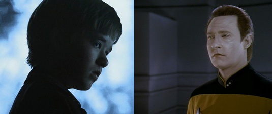
David from A.I. Artificial Intelligence, versus Lt. Commander Data from Star Trek: The Next Generation. Guaranteed to be the least violent robo-fight ever, more likely to talk each other to death. I don't think there would be any winners, only losers (including us, the audience).
Liked this? Read these!
- The 10 best 3D movies to look forward to in 2014
- Help yourself to these free 3D models
- Check out these inspiring examples of 3D art

Thank you for reading 5 articles this month* Join now for unlimited access
Enjoy your first month for just £1 / $1 / €1
*Read 5 free articles per month without a subscription

Join now for unlimited access
Try first month for just £1 / $1 / €1
Get the Creative Bloq Newsletter
Daily design news, reviews, how-tos and more, as picked by the editors.

The Creative Bloq team is made up of a group of art and design enthusiasts, and has changed and evolved since Creative Bloq began back in 2012. The current website team consists of eight full-time members of staff: Editor Georgia Coggan, Deputy Editor Rosie Hilder, Ecommerce Editor Beren Neale, Senior News Editor Daniel Piper, Editor, Digital Art and 3D Ian Dean, Tech Reviews Editor Erlingur Einarsson, Ecommerce Writer Beth Nicholls and Staff Writer Natalie Fear, as well as a roster of freelancers from around the world. The ImagineFX magazine team also pitch in, ensuring that content from leading digital art publication ImagineFX is represented on Creative Bloq.
