Make your type stand out
Alex Gill reveals how to quickly create 3D type using Photoshop and Illustrator
The relationship between type and image is widely regarded as the foundation of effective graphic design. No matter how good an image is, this relationship will make or break a piece of work. However, it’s often overlooked. If you want to communicate with your audience, why not make your message really stand out?
In this walkthrough I will show you how to use a combination of basic tools and techniques in Photoshop and Illustrator to create a 3D typographic piece with real impact. We’ll also look at some subtle lighting techniques to create extra depth within the type, which you can then experiment with in your own work.
I find it’s very important to stay organised when working. Keyboard shortcuts, folders and clearly named layers will help to improve your workflow and, ultimately, save you a lot of time.
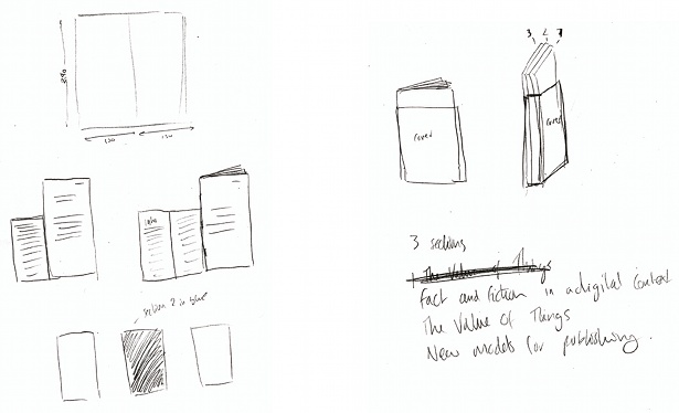
01 First, we need to create the two elements of type that we’re going to eventually work on in Photoshop. Open up a document in Illustrator – a landscape A4 page is fine. Pick a suitable phrase or word and your desired font, but try to keep it relatively simple. I’m going to use ITC Serif Gothic and the phrase ‘Give it some depth’.
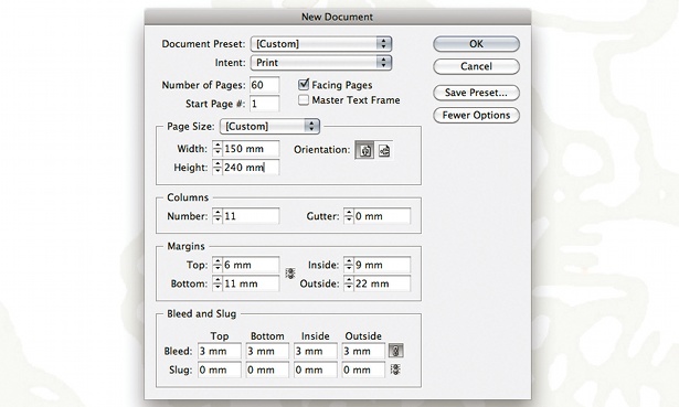
02 Arrange the type as desired, and adjust the kerning and leading to enable each letter to breathe. We now need to turn our type into paths. Select it and go to Type>Create Outlines. With the elements still selected, group them into one object. Change the colour to a mid to dark grey – I’m using hex code #7A7A7A.
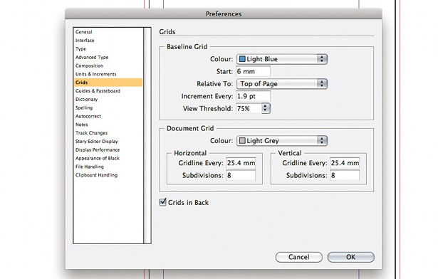
03 Select the outlined text and go to Effect>3D>Extrude & Bevel. You can use the settings pictured here or experiment with your own. To enable us to edit the type further, navigate to Object> Expand Appearance. Take the Direct Selection tool and, holding down Shift, select the face of the type only, cut it (Ctrl/Cmd+X) and create a new layer named ‘Face’. Then go to Edit>Paste in place, group it and lock that layer.
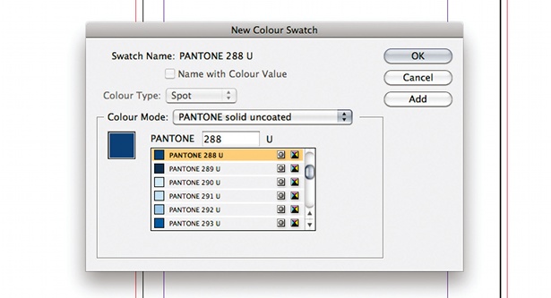
04 While the Face layer is locked, select the 3D elements of the text and use the Pathfinder panel to unite them into one element. We now have what we need to take into Photoshop, so open background.psd. Copy the Face layer from Illustrator, paste it into your Photoshop canvas as a smart object and label the layer. Repeat this with your 3D layer and position it below the Face layer. The layers may be slightly out of line, so zoom in and adjust accordingly.
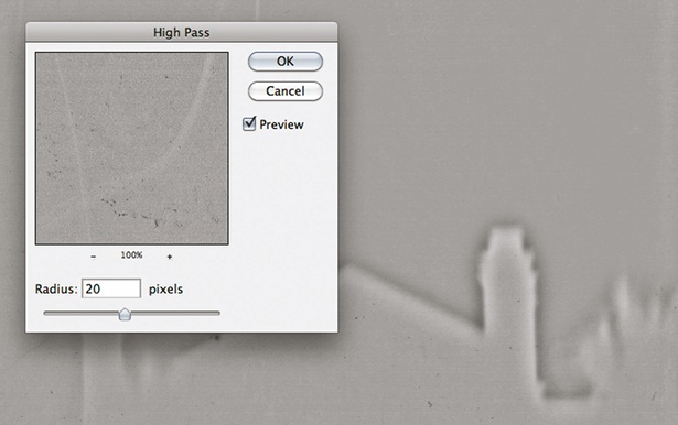
05 Drag your 3D layer to the folder icon at the bottom of the Layer panel and name the group ‘3D’. With your 3D layer selected, click the ‘Create new fill or adjustment layer’ icon in the Layer panel, select Solid Colour and use #303030. Next, hover between the colour fill and 3D layer, hold Alt/Opt and click. Your colour fill should now only affect the layer below it.
Get the Creative Bloq Newsletter
Daily design news, reviews, how-tos and more, as picked by the editors.

Thank you for reading 5 articles this month* Join now for unlimited access
Enjoy your first month for just £1 / $1 / €1
*Read 5 free articles per month without a subscription

Join now for unlimited access
Try first month for just £1 / $1 / €1

The Creative Bloq team is made up of a group of art and design enthusiasts, and has changed and evolved since Creative Bloq began back in 2012. The current website team consists of eight full-time members of staff: Editor Georgia Coggan, Deputy Editor Rosie Hilder, Ecommerce Editor Beren Neale, Senior News Editor Daniel Piper, Editor, Digital Art and 3D Ian Dean, Tech Reviews Editor Erlingur Einarsson, Ecommerce Writer Beth Nicholls and Staff Writer Natalie Fear, as well as a roster of freelancers from around the world. The ImagineFX magazine team also pitch in, ensuring that content from leading digital art publication ImagineFX is represented on Creative Bloq.
