How the UN's hunger campaign ads were made
Platige Image explain how they created two inspiring animations for the United Nation to raise awareness of global malnutrition.
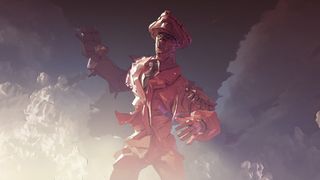
Creative agency Platige Image recently created two VFX-filled spots to raise awareness for the UN's Zero Hunger Challenge.
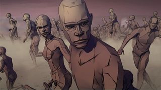
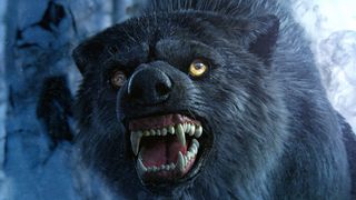
These were two completely different projects. The first, Hunger is a Monster, depicts a Little Red Riding Hood scene, albeit much more sinister. The other, Hunger is a Tyrant, is a heavily stylised, toon-shaded production, which depicts hunger as a ruthless tyrant, destroying everything and everyone in its path.
Here, we speak to the spot's directors, Marcin Filipek and Damien Nenow, about their production.
Hunger is a Tyrant - Damien Nenow
Q: How did the project first come about?
"The UN was looking for couple different animation directors around the globe. They had an intriguing project of 'Zero Hunger' campaign, which was to build of couple short animated spots.
"After seeing my short animated film 'Paths of Hate' they decided to honor me with a privilege of directing Hunger is a Tyrant. They contacted our studio, we gathered our jaws up from the floor and found some space between our commercial projects. Cooperation started!"
Paths of Hate - Damien Nenow
Q: Did you have a lot of artistic freedom?
"We had all the freedom an artist could wish for. This was the kind of project you dream about after years of animating 'talking yoghurts' for ads...creative challenge for a noble and important goal. The UN had a general idea for the spots. They wanted each of them to be narrated by a different celebrity. They also had scripts ready.
"Our part was to design a way of depicting each story. And it was entirely up to us to decide the technique, form, narration style, means of expression and symbolics. The UN loved the ideas we presented, so we did it!"
Q: What was inspiration behind the stylised look?
"I decided to have it stylised in almost the same way that Paths of Hate was. This way of depicting serious, dynamic and action packed stories proved to be 'attracting attention' to say the least. And this was crucial for this campaign. Visually strong content that people will share.
I'm a huge fan of less literal, more surrealistic use of 3D animation
"Also, I'm a huge fan of less literal, more surrealistic use of 3D animation. Having it stylised helps here a lot. Stylisation, especially comic-book-like gives us a gigantic arsenal of measures to play with. Surrealistic measures that simply does not fit to photo-realistic imagery. Stylisations help to emphasize expression and dramaturgy. This is of paramount importance when comes to tell the story, full of symbols and allegories in only 30-seconds-long format."
Q: What 3D software did you use? What programme was the most useful?
"3ds Max, Mudbox, RayFire, with Blade and Motion Builder for mocap data.
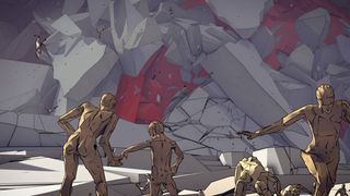
RayFire was invaluable - it destroys everything
"RayFire was invaluable! It gave us impressively rich effects in almost no-time. Production timing for the project was extremely tight, to put it mildly. We knew that the only way to have it done in time was to have it based on something automatic - simulated. Cloth... Fumes... or destruction. RayFire destroys everything. Weapon tailor-made for our master dictator!"
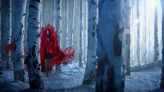
"After completing the Hunger is a Tyrant spot, the UN asked the Platige team to create another. Lead by director Marcin Filipek, the team put together Hunger is a Monster, for which they create a version of Little Red Riding Hood. And it turned out nothing like the well-known childhood fairy tale we're all familiar with."
Hunger is a Monster - Marcin Filipek
Q: Talk us through the brief...
"It wasn't too detailed. We were supposed to create strong images of personified hunger as a monster. As for the visual part, screenplay, direction, the whole language of the movie, I was given a lot of artistic freedom."
Q: How did the stylised look of the spot come about?
"I wanted to create strongly stylized image. I thought of working with live actress but that didn't mean I wanted it to be realistic. I wanted to show the painting-like images, to emphasize its intensity. The combination of all above should cause anxiety and fear."
Q: What 3D software did you use? What programme was the most useful?
"Maya, 3ds Max, Yeti, Arnold, V-Ray, FumeFX, Krakatoa, ZBrush, Mari, Nuke, After Effects and Optical Flares.
"For me it was FumeFX and Krakatoa, because most of the shots are packed with simulation."
Q: What was the most technically impressive aspect of the project?
"Putting all the pieces together, combining different techniques and programs. We had parts of material prepared with help of different softwares. Our biggest challenge was to unify them and put all the pieces together in compositing."
Liked this? Read these!
- Top free 3D models
- Best 3D movies of 2013
- Blender tutorials: ways to create cool effects
Have you seen any inspirational 3D work recently? Let us know in the comments...

Thank you for reading 5 articles this month* Join now for unlimited access
Enjoy your first month for just £1 / $1 / €1
*Read 5 free articles per month without a subscription

Join now for unlimited access
Try first month for just £1 / $1 / €1
Get the Creative Bloq Newsletter
Daily design news, reviews, how-tos and more, as picked by the editors.
The Creative Bloq team is made up of a group of design fans, and has changed and evolved since Creative Bloq began back in 2012. The current website team consists of eight full-time members of staff: Editor Georgia Coggan, Deputy Editor Rosie Hilder, Ecommerce Editor Beren Neale, Senior News Editor Daniel Piper, Editor, Digital Art and 3D Ian Dean, Tech Reviews Editor Erlingur Einarsson and Ecommerce Writer Beth Nicholls and Staff Writer Natalie Fear, as well as a roster of freelancers from around the world. The 3D World and ImagineFX magazine teams also pitch in, ensuring that content from 3D World and ImagineFX is represented on Creative Bloq.
