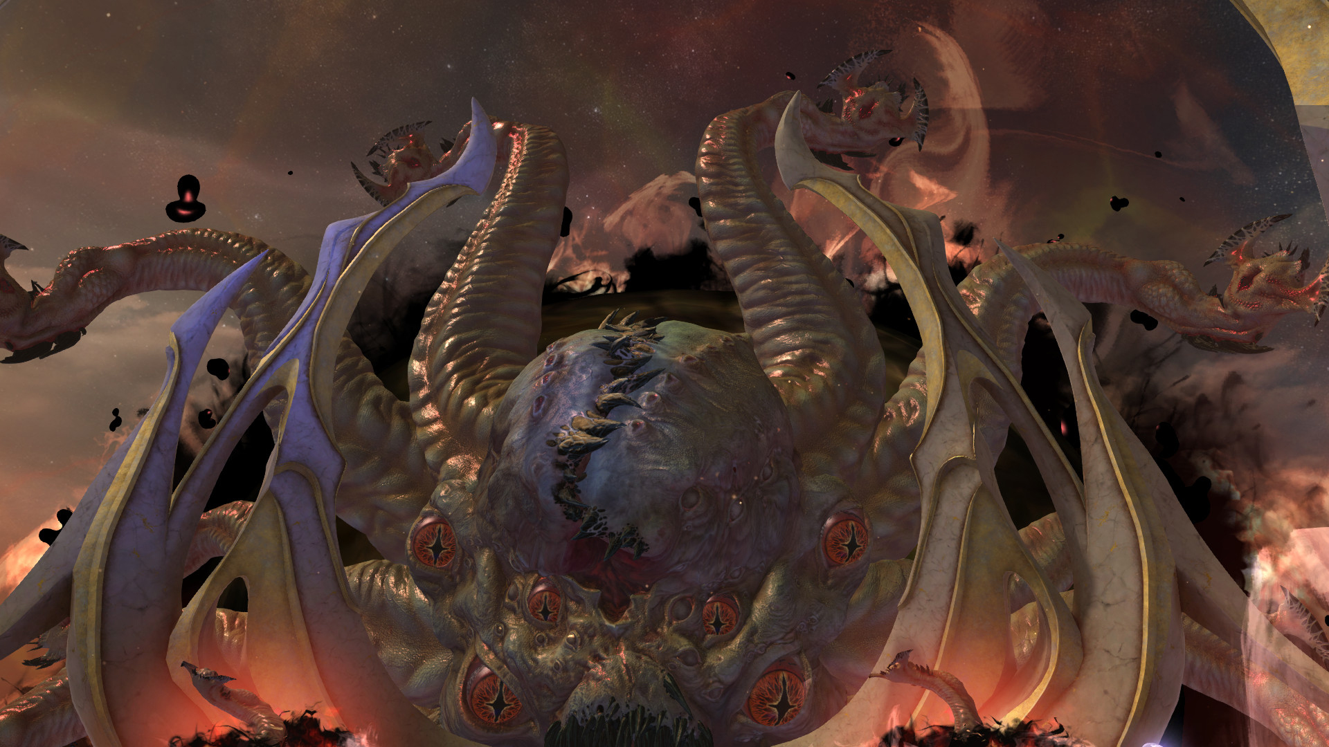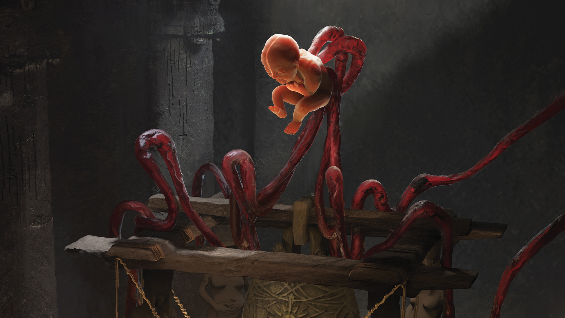
Being able to create well thought-out environment and prop concept artwork is a super valuable skill for video game production. During my experiences in the industry – working as an artist for clients such as Bandai Namco, Grinding Gear Games and Marvel – I’ve found that using a high-fidelity 3D workflow offers the other art teams a close idea of what the work will look like when it reaches the final product.
When creating a concept, it's important to not only undertake plenty of research, but to make decisions about how the world your design exists in would affect its appearance. This could be factors such as: what materials and tools would most likely be used for building it? Is there a commonly used visual motif in the world’s cultural history?
If you’re building your own personal world, then you don't need to have all the answers, especially as worldbuilding can be daunting, and every creation is an opportunity for exploration. But these are nonetheless good topics to think about thoroughly, and it makes a huge difference in the believability of the final design result.
In this tutorial I’ll be showing you my process as I create a dark fantasy concept of a sacrifice ritual to a goddess, set in Rituals of Malah, a personal world I’ve been building. (For more Blender tips, check our collection of essential Blender tutorials to help refine your skills).
01. Begin with a basic blockout
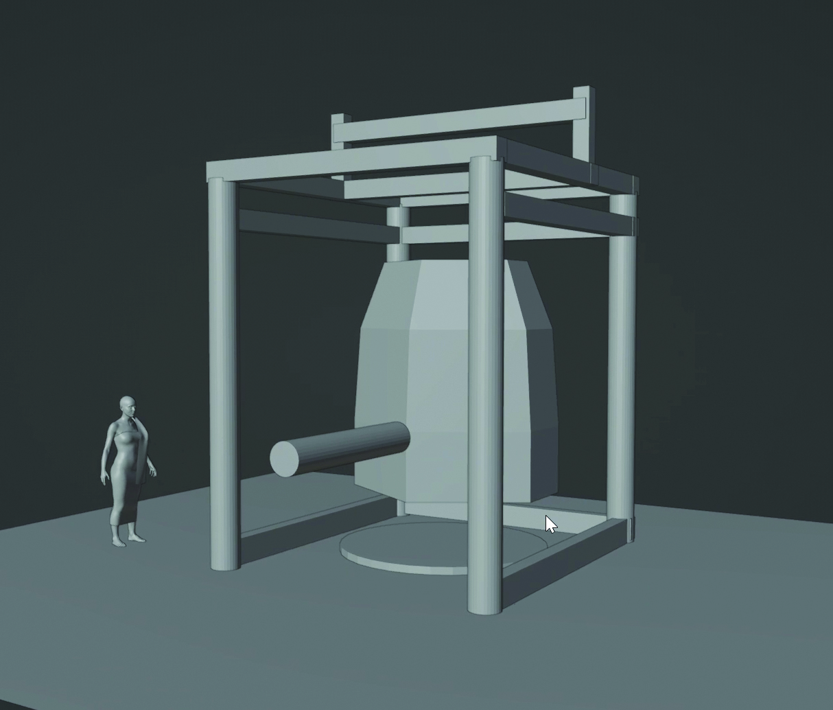
Sometimes the most difficult part is starting, especially when faced with Blender’s default cube. The best thing is to just dive straight in without thinking too much and create a super basic blockout. In this environment, the main focus was to figure out what was going on with the main ritual and the structure of this bell, so I just blocked that part out first. I also made sure to add in a human model for scale; even if you change it later, it helps give a better sense of grounding in the world.
02. Discover the power of a sketch-over
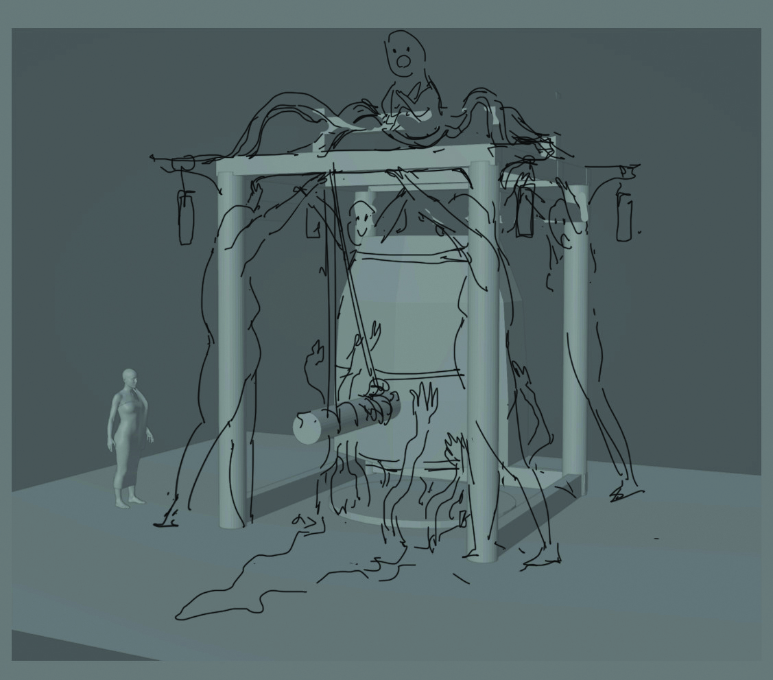
At this early point, it’s beneficial to screenshot your blockout, do a sketch, and compile notes based on all your research and gathered references. This drawing shouldn’t necessarily be neat, as the ultimate purpose is to freeflow and break out of the 3D ‘boxiness’, creating a plan that will make the rest of the process much more straightforward. For your notes, a few concise bullet points of parameters goes a long way to staying focused on your desired final design. If I’d stuck to 3D only, I definitely would have struggled to create something that felt interesting.
03. Flesh out the main shapes
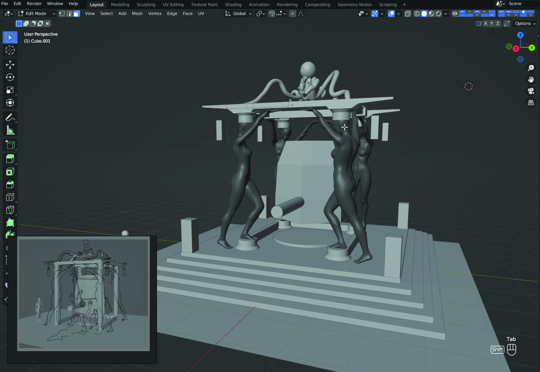
Now you have your sketch plan, it’s time to make the changes. I adjusted the proportions of the model, and added in some of the medium shapes I drew in my sketch, such as the four statues holding up the bell structure. This can be done by posing DAZ models and blocking in proportions for the baby goddess with spheres. I also added in basic structures for the surrounding environment such as pillars, walls and a roof.
04. Sculpt in detail
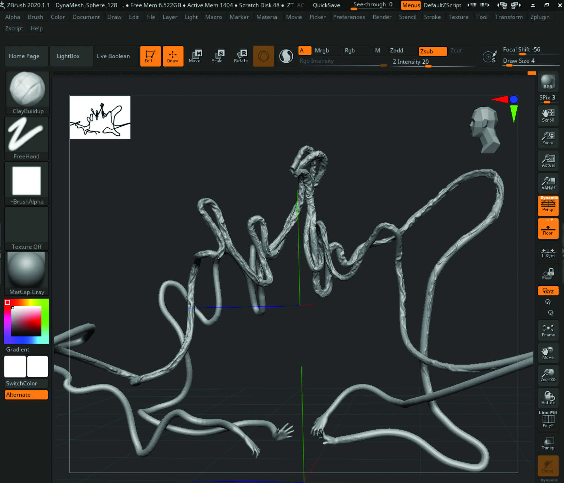
Start to give more life to the blockout by taking the models into ZBrush and sculpting in detail. This gives a more handcrafted look, allows you to add in some surface texture detail, and creates more organic-looking shapes. As an example here, I’ve taken the blockout of the blood energy veins that I created with curves and hand models, joined it together as one object, and DynaMeshed it and sculpted from there. I do the same with some of the other elements, such as the statue pillars.
05. Utilise heightmaps for the details
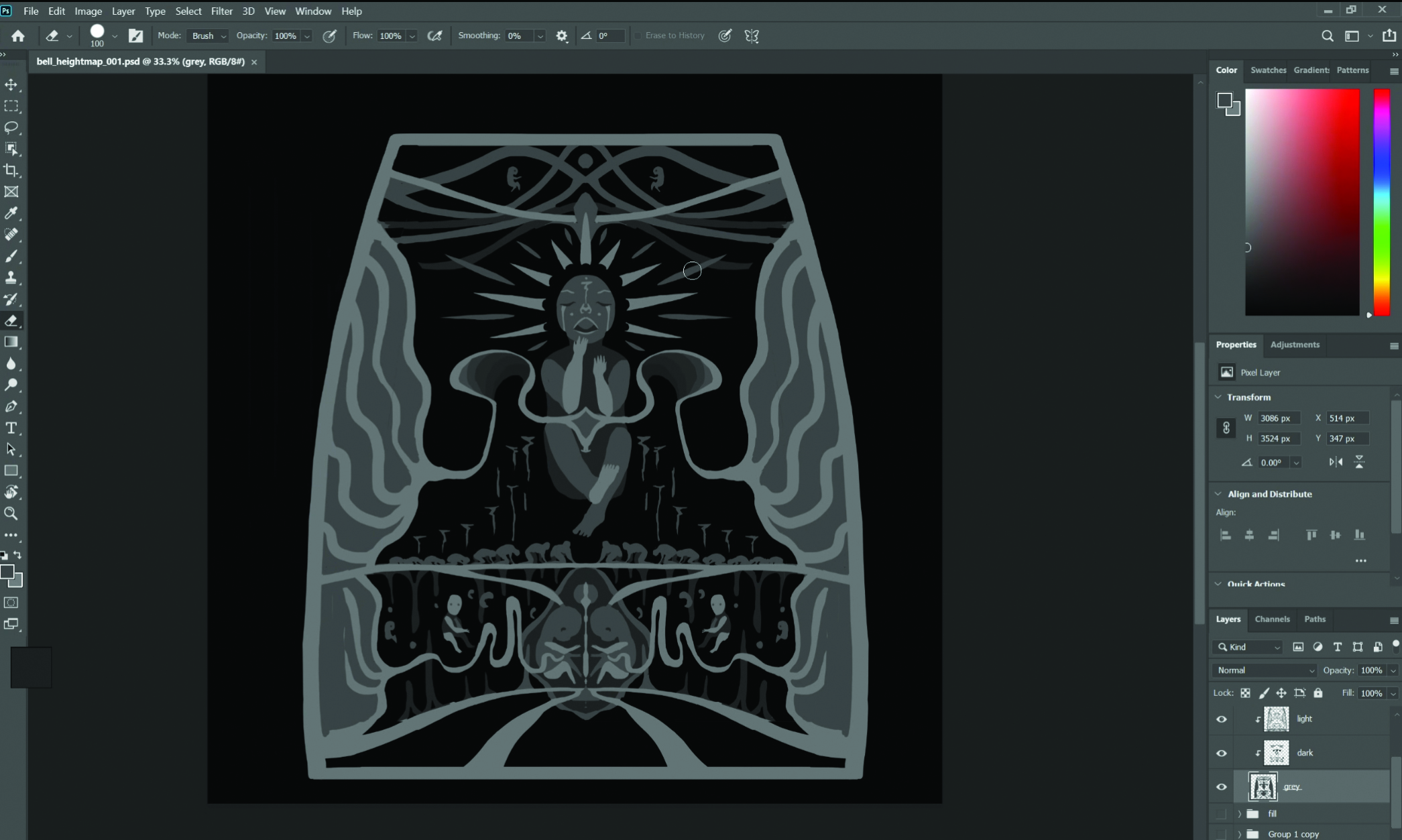
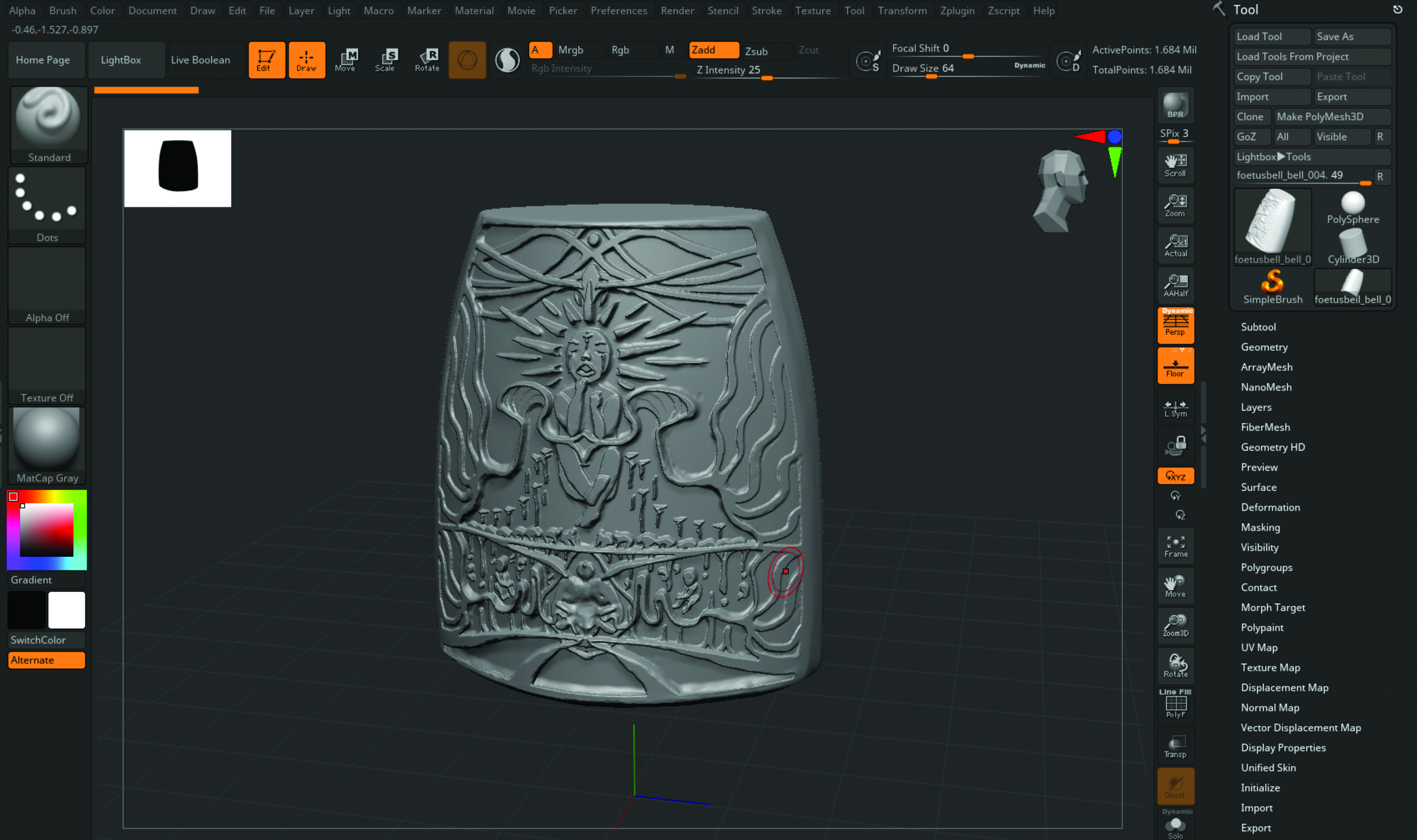
Creating a custom heightmap may seem like a lot of work, but it makes a big difference at the end for a unique look to the prop. It helps with adding depth to the history and lore behind your environment. Create it in Photoshop, first making a sketch, then filling in value shapes on a black background. The lighter the value, the more height. After this, apply the heightmap in ZBrush by importing the alpha and setting Brush Stroke to DragRect. Lastly sculpt the edges to take away the sharpness and give it more wear.
06. Give the scene an organic feeling
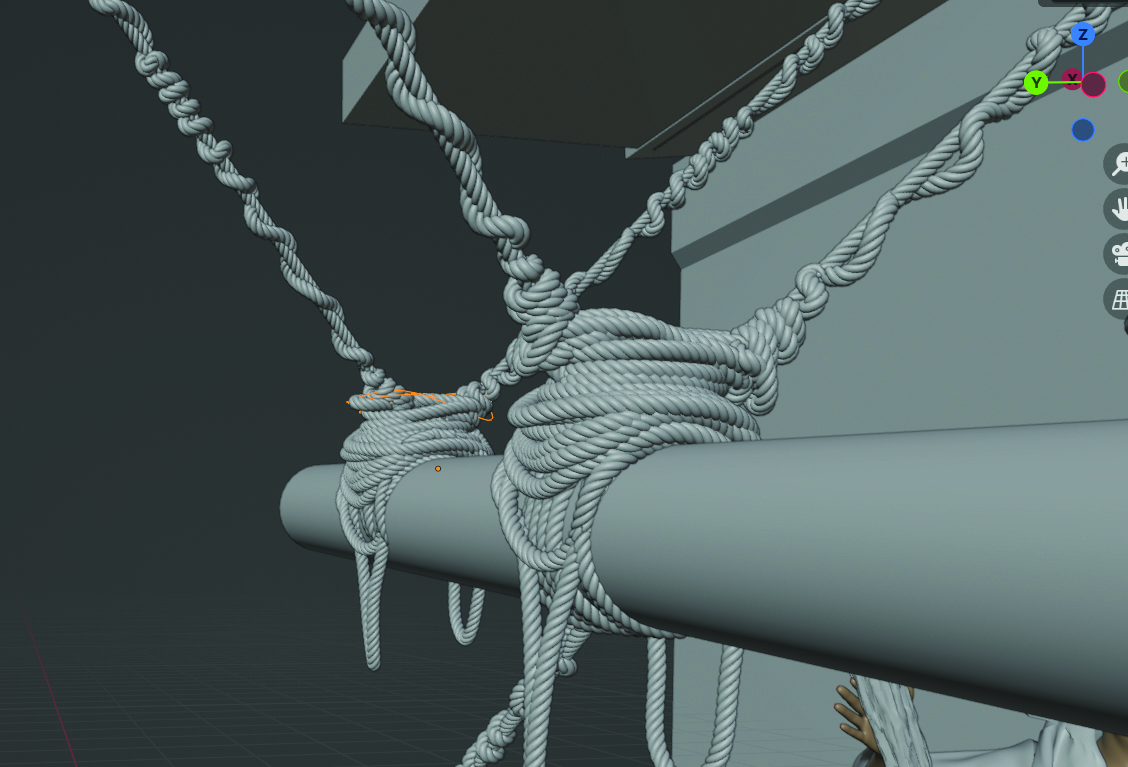
When using heavy 3D in concept art, it can be beneficial to break up all the hard-surface shapes and textures with more organic elements and shapes, especially in a fantasy setting. A great go-to for this is cloth or rope elements, which can also add extra interest and a human touch. Spending a bit more time on adjusting a rope so it slacks and tightens in a believable way is definitely worth it.
07. Add decals
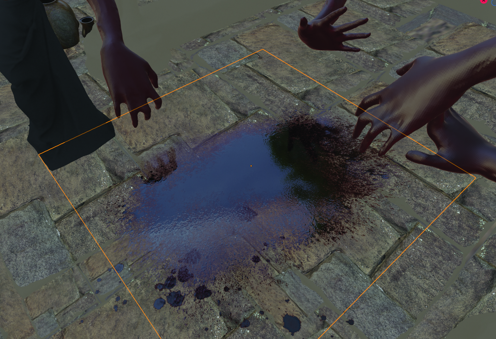
For certain elements, decals can be perfect for adding the kind of details you need. In this case, I wanted to add some blood patches to the scene, so I imported decals from Quixel Megascans and placed them appropriately. You can use Shrinkwrap here to warp it around objects, or the DECALmachine add-on to insert them easily.
08. Light and render
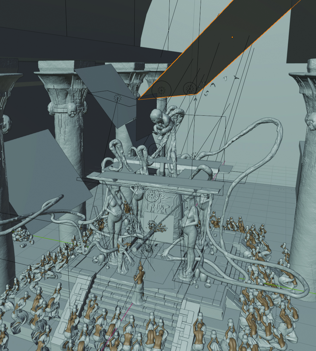
The lighting in this scene was quite complex, as there was both the activity with the humans at the bottom of the image, and the goddess on top of the bell structure. Balancing the amount of light across the different areas required some back and forth making value overpaints in 2D, and using planes as light blockers to direct the light. I also used volume scattering as it creates a more atmospheric and realistic feeling with the way the light bounces around the scene. For rendering, I use Cycles and rendered various passes such as Ambient Occlusion, Mist and Diffuse Direct.
09. Complete 2D touch up and finishing
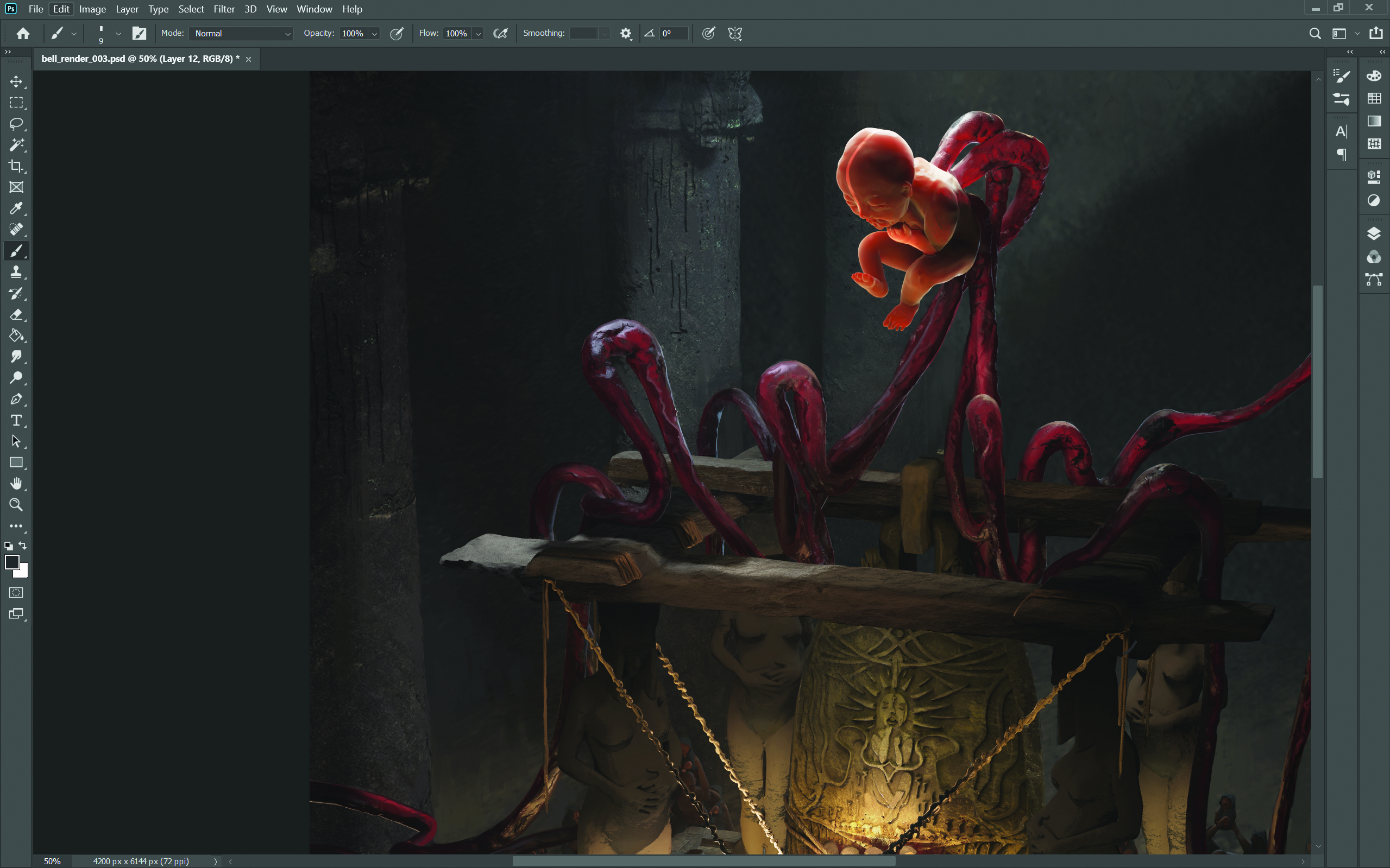
Finally, take the 2D render and all the passes into Photoshop. I overlay the Ambient Occlusion and Mist passes on a low transparency, and add value and colour adjustment layers. I then paint over the render, fixing any mistakes, and give the final scene a more illustrative look rather than pure 3D.
This content originally appeared in 3D World magazine, the world's leading CG art magazine. 3D World is on sale in the UK, Europe, United States, Canada, Australia and more. Limited numbers of 3D World print editions are available for delivery from our online store (the shipping costs are included in all prices). Subscribe to 3D World at Magazines Direct.
Get the Creative Bloq Newsletter
Daily design news, reviews, how-tos and more, as picked by the editors.

Thank you for reading 5 articles this month* Join now for unlimited access
Enjoy your first month for just £1 / $1 / €1
*Read 5 free articles per month without a subscription

Join now for unlimited access
Try first month for just £1 / $1 / €1
Kay is a freelance concept artist based in Tokyo. She has contributed to various AAA and VFX titles over the past five years.
