How to texture a model in Maya
Antony Ward uses a sci-fi mech model to present a complete guide to adding surface information.
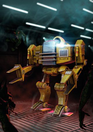
There is no denying that a beautifully constructed model can be both impressive and inspiring. The ability to create something from a handful of vertices and ploygons is a true skill.
What some artists struggly with is the idea of taking this model a step further, bringing it to life with colour, surface detail and specularity. The thought of painting texture maps, especially if your 2D skills are a little rusty, can be daunting, but they needn't be. Over the course of this Maya tutorial, we will explore how to take a model of a futuristic space dock loader and fully texture it, readying it to be rendered.
You will explore UV mapping, texture baking and generating a basic texture pass before you go further and spoil the clean, showroom finish with dirt, damage and the odd splash of alien ooze.
01. Choose your route
Having your model built is only the first stage and unfortunately you can't rush ahead and begin painting your textures yet. Before any paint, dirt, rust or alien fluids can be applied, you must first add UV mapping data to each model. This will help dictate where each pixel will lie across the surface of the model so you know exactly where you are going to be painting.
Before you begin to UV the model you have a decision to make. To Smooth Mesh or to Smooth your mesh. A tricky but crucial decision.
Using the Smooth Mesh option will give your model the illusion that it has been subdivided - much like when using Subdivision Surfaces. This route will also keep the polygon count low and manageable.
Applying a Smooth operation to your model effectively bakes these subdivisions into the topology. This approach will make UV mapping easier, but at the cost of increased topology and a much larger file size.
Get the Creative Bloq Newsletter
Daily design news, reviews, how-tos and more, as picked by the editors.
For the purpose of this tutorial we will focus on the Smooth Mesh route, as it's a little trickier to work with when UV mapping.
02. Planar projections
Rather than use an automatic mapping system to give your initial layout of UVs, focus on planar projections to start off. This will give you much more control over the first stages of your UV layout.
When working on a the Loader’s lower thigh, for example, generate a planar projection from the side, then select the polygons where the texture is stretched and project again from the front. You don’t need to create fixed projections from all angles, just the most important.
Once those are generated, it’s then time to define the major UV seams, which should be placed in hidden areas, and then to use the Unfold UV tool to spread out the UV shells, making them more evenly spaced out.
Using the Unfold Constraints, first horizontally and then vertically, is a good way to start relaxing each UV shell while preventing it from collapsing in on itself.
03. Unfolding UVs
Let me guess: your UVs aren’t unfolding as planned and instead are deforming in an unpredictable and horrible way? This is down to the use of Smooth Mesh, which Maya currently doesn’t play well with when generating sensible UV layouts (among other things). There is however a quick way to get around this problem.
With the initial UVs applied, before you use the Unfold UVs tool, duplicate the model and move it to one side so you can focus on it without getting distracted by the rest of the Loader.
What you can do now is apply a single Smooth to the model, effectively following our earlier Plan B.
Baking just a single subdivision into the mesh will give you more topology to play with, meaning the Unfold UV tools will start to behave.
At this stage you could choose to keep the subdivided model and delete the lower version, but if you want to retain the more economical option simply use the Transfer Attributes tool to copy the fixed UVs from this model back to the original.
04. UV shells
With the process repeated for each element of the model, you now need to arrange the UV shells so they fit neatly onto each texture page.
For something like the Loader, you can’t fit everything onto a single page as there wouldn’t be enough space to correctly texture each element. A sensible option would be to multiply the texture page into two and assign the torso to one page, and the limbs to another.
If you want to be more economical you could simply work on one set of limbs, duplicating and mirroring them when you’re finished. This will save on texture space, and time, but it’s always good to try and make each side even a little unique.
A good rule to work to while organising your UV shells is to apply a checkered texture and then try and keep each grid section uniform in size and shape to ensure even page distribution.
05. Baking maps
You are going to linger in Maya for a little longer now, and make Photoshop wait its turn. While you have the model ready, with its UVs neatly organised, it makes sense for you to let Maya generate a few starter maps for you.
Baking out occlusion and diffuse maps will speed up your workflow while also adding more depth and realism to the textures. These starter maps are also handy to use as a guide while you are painting later, as a texture page with lots of elements can sometimes be difficult to navigate.
Let’s focus on the torso from here on so we aren’t repeating the same steps over and over. Each stage you do to the torso can be transferred easily to the limbs.
To make your life easier, combine all the elements which will be on the torso texture page, so you have a single model. Also do the same for the limbs. This means you only have two models in this scene now but don’t worry, this file can be treated as temporary - so don’t overwrite your existing save!
Baking maps won’t currently work correctly on a mesh with Smooth Mesh enabled (that’s another limitation), so you will need to quickly bake the subdivisions. You can do this by performing Modify>Convert>Smooth Mesh Preview to Polygons on each model.
06. Occlusion map
The first map you are going to bake is a lighting map, also known as an occlusion map. This will export the lighting information on the model, giving you highlights and shadows which will make the Loader feel more solid.
Before we proceed I have to say a big thanks to fellow tutor Pat Imrie for sharing this tip. Select the torso and assign a new bake set by going to Lighting/Shading>Assign New Bake Set (Mental Ray)>Texture Bake Set. This effectively tells Maya to bake out the surface information on this model.
Adjust the resolution to suit your needs, and als increase the Fill Texture Seams option. Next create a new Surface Shader and apply this to the Torso. You will be using this to gather the information which will be baked, but before you do, you need to connect a new mib_amb_occlusion node into the Out Colour tab. With that set all you need to do now is go to Lighting/Shading>Mental Ray (Batch Bake) to bake out the Occlusion map.
07. Applying colours
For the next stage you are going to bake out the colour information from the model into a diffuse map.
On a fresh version of the model, work your way around applying colours to each part. These only need to be basic shaders at this stage as all we are after is the colour information. We shall add the detail in a later stage in the process.
Remember while you are doing this you don’t need to limit yourself to each model. Experiment by applying colours on a per-polygon basis. This enables you to include extra details which may be tricky to try and draw in by hand later.
08. Duplicating and diffusing
When you are happy with the colours, bake the Smooth Mesh subdivisions in the same way you did earlier by using the Smooth Mesh Preview to Polygons tool.
You now have a source model, but for this step to work you need a model to bake the information onto. Duplicate the coloured model, applying a temporary flat grey material to the new mesh so it’s easily identifiable. With your Source and Target models ready go to Lighting/Shading>Transfer Maps to open the tool.
In here you can transfer information between two models, be that normal map data, shader data or as you will be needing, diffuse data. Select the Diffuse option and then specify your Source and Target models, along with the path and size of the texture you wish to output.
Then click Bake!
09. Texture pages
Now you have these main maps in your arsenal you are in good shape to start creating your texture pages. Take these into Photoshop and layer them up so you have a Diffuse and an Occlusion layer. Duplicate the Occlusion layer and set the first blending mode to Soft Light, and the new copy to Multiply.
Adjust the Opacity on both these layers now to around 50%.
If you now reapply these new textures back onto the Loader you will see you have the base colours and lighting completed, and it didn’t take long to do...
10. Adding textures
Your maps are off to a great start and with a few simple details, what you should be looking at is a clean, new Loader. This however isn’t what you want: this machine needs to look like it’s been used and abused in an alien-infested space station, not fresh off the production line.
With just a few textures added you can quickly dirty this machine, and with some quick painting add some wear, tear and damage to the surface. Before you move on to the actual dirt and damage, it's important to get the main details into the textures. This includes any text, logos, patterns, stickers or anything important to dictate the machines identity.
What you also need to do is draw in areas which will be recessed into the surface, like panels, controls or other technical bits and bobs. These won’t remain black however, and may not make it through to the final diffuse map. They are here to guide you, and later on you can use this layer to help build your other detail maps.
11. Blending modes
All the main areas are marked out, so now you can throw some dirt and general surface debris over the model. This is much easier than it sounds, but you will need to source some textures first.
There are plenty of websites that host good, high-resolution textures. Search out some appropriate ones that can also be easily tiled.
Overlay these onto your texture and experiment with different blending modes to get the look you are after. Each will give a different result, but Overlay, Multiply or Soft Light are a good place to start.
Dirt generally doesn’t fall onto a surface uniformally - it gathers in creases and around edges. Once you have your maps in place, go over them and gently erase some of the detail to replicate this effect.
12. Texture painting with a pen
Now you have some general dirt over your textures you can start to go in and work a little closer.
If you examine metallic surfaces, particularly ones which have a covering of paint, you will see that the worn away areas are usually restricted to the edges, or sections more exposed and likely to come into contact with the outside world. It’s now time to get your pen out and start working your way around the texture painting in these worn and chipped areas. Just use a flat colour, like grey, and almost scratch away at the surface.
For an extra level of detail why not add a slight white Outer Glow effect in Photoshop, to simulate the pale layer of paint between the surface and the metal beneath? You can even go a step further and add a darker Inner Glow for a slight feeling of depth.
13. Generating maps
Even with the diffuse map created and applied, your Loader still seems a little flat. In order for you to include some surface relief and also make those worn-out areas stand out, you will need to build a few detail maps.
The good news is these needn’t be built from scratch. You
have already been working hard on them, you just didn’t know it. If you have been sensible in your workflow and kept each Photoshop file nicely layered you can use these to help generate some nice bump and specular maps.
A bump map, or height map as it is also known, is simply a greyscale image. The colours dictate height, with white being the highest point, and black the lowest. In terms of your model, this will allow you to quickly add grooves, panels and other surface noise.
Begin with a new layer which is filled with 50% grey. This is the base line, and will act as the level where the surface is flat.
Begin duplicating the main layers, and move them over this base layer. Think about how you want these to act on the model and adjust them accordingly. As an example, take the layer you added first to mark out the panels and set it to full black. This will push these lines into the surface.
The same can be done with the hand-painted layer which added chipped paint and worn edges. This doesn’t want to be full black, however: you only want a slight recess.
14. Specular maps
The specular map works in much the same way as the bump map. Lighter areas are shinier and more reflective than darker areas. This map however doesn’t have to be greyscale if you don't want it to be, as any colour information you leave in will come through in the specular highlights. This time around you will need to almost think in reverse. The areas you want to be the shiniest, like the metal under the paint, should be the brightest on the texture so they catch more light.
In these videos we've explored a quick way to build texture maps, but as always, this is just the start. Now you have the basic process fresh in your mind, feel free to go further and experiment with different effects and layers.
Words: Antony Ward
Antony Ward has been provoking pixels since the early 1990s. He has worked for some of today's top studios.
This article originally appeared in 3D World issue 173.
Liked this? Read these!
- Create a perfect mood board with these pro tips
- The best 3D movies of 2013
- Download free textures: high resolution and ready to use now

Thank you for reading 5 articles this month* Join now for unlimited access
Enjoy your first month for just £1 / $1 / €1
*Read 5 free articles per month without a subscription

Join now for unlimited access
Try first month for just £1 / $1 / €1
The Creative Bloq team is made up of a group of design fans, and has changed and evolved since Creative Bloq began back in 2012. The current website team consists of eight full-time members of staff: Editor Georgia Coggan, Deputy Editor Rosie Hilder, Ecommerce Editor Beren Neale, Senior News Editor Daniel Piper, Editor, Digital Art and 3D Ian Dean, Tech Reviews Editor Erlingur Einarsson and Ecommerce Writer Beth Nicholls and Staff Writer Natalie Fear, as well as a roster of freelancers from around the world. The 3D World and ImagineFX magazine teams also pitch in, ensuring that content from 3D World and ImagineFX is represented on Creative Bloq.
