How to reimagine an existing character
Character artist Danilo Athayde shares his working process to create this powerful character from King of Fighters.
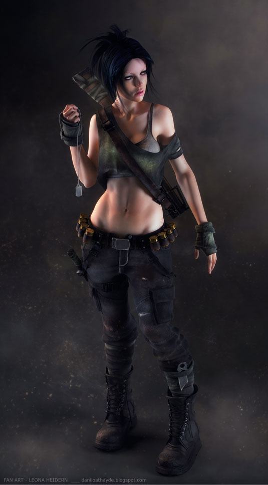
Everything about the process of producing a character fascinates me. This latest work is a fan art tribute to Leona Heidern, a character from SNK's King of Fighters series. I love everything about this character, from her physical attributes to her sense of personality. She's a beautiful, mysterious warrior woman and to show these characteristics in my piece was a great challenge.
In this tutorial, I'll reveal the process of creating my image, share elements of my workflow, detail the challenges in finishing this scene and all the things I consider important for producing good work. I will begin with the concept, because this is an important starting point for creating a good piece of work: if you don’t have a good idea, or good concept art in your mind, your work will be extremely limited. I hope you enjoy it, and you're inspired to start creating.
01. Initial idea and references
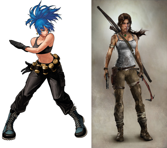
The idea here is to make my own version of a character from a classic 2D fighting game - in this case, I chose to reimagine Leona Heidern from the King of Fighters series.
I want to create a beautiful and sexy, but mysterious warrior woman. With this in mind, Naughty Dog's The Last of Us and Lara Croft from the recent Tomb Raider game are my main references.
02. Blocking out proportions and main shapes
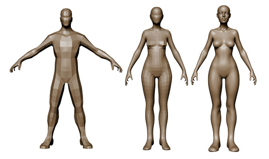
This is one of the most important steps in the process. I spend time and attention here, studying the figure's anatomy to create a solid female silhouette.
My intention is to marry a sexy pose with a serene, quiet facial expression. Turning to ZBrush for sculpting, I use a simple base mesh. I make the main shapes in the lowest subdivision level, so my attention is kept to the proportions and silhouette.
03. Sketching out the accessories
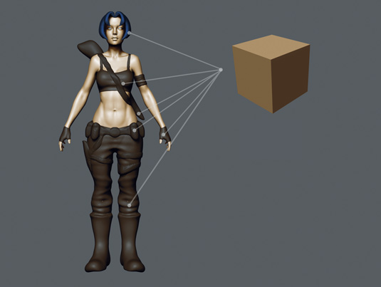
To start work on the character's clothes and accessories, I make an initial sketch in ZBrush. This way I have more freedom to work on the concept itself. In ZBrush I simply use polycubes and polyspheres as new subtools, and work in these new subtools with Dynamesh.
Get the Creative Bloq Newsletter
Daily design news, reviews, how-tos and more, as picked by the editors.
For the best results you need good reference and you need to keep comparing your work to it, so I check my work and re-examine what I’m doing as I go along. You should not be afraid to make mistakes though, and this workflow helps.
04. Topology and modelling
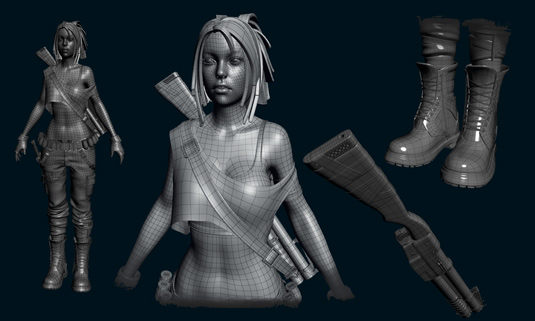
In the previous steps, I have not had to worry about the topology. At this point, I make the topology on the body and I begin modelling all the accessories and clothes in Softimage.
This is a slow process but because the concept has already been defined before beginning to model, I can take my time without worrying about 'breaking' the image. The modelling process is basically finished here, but I usually find small details I want to add afterwards - which I do using ZBrush. At the end of this stage, I start to unwrap the UVs.
05. Detailing and pose
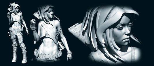
After all the polygonal modelling is complete, I move back into ZBrush to add extra details and refine the pose. This is the time to sculpt more folds in the clothing, add wrinkles, scars and pores to her skin (I use Alphas in Brushes) and then define the final shapes.
After this, I pose the character using Transpose Master. The pose is very important and my intention is always to find a pose that is sexy, but not vulgar - as if she is unintentionally attractive.
06. Using Polypaint
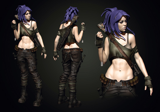
Now it's time to have fun with colour. For my textures I make a set of base colours using Polypaint in ZBrush. The choice of your colours is very important: choose more desaturated tones to achieve a realistic image.
Also, try to make your paint voluminous, clearing some areas and darkening others. Keep in mind areas of contrast, elements of wear and tear on the cloth and dirt. When I have finished, I export diffuse (colour) maps of my subtools.
07. Adding textures
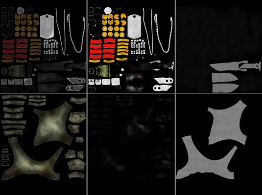
After exporting all my colour maps from ZBrush, it's time to make the diffuse maps in Photoshop. I make a mix of my colour maps and photos - metal photos for metal areas, cloth photos for cloth areas and so forth.
After the diffuse maps are done, I move on to reflect and bump maps. Finally, when it comes to creating the skin, I make subsurface maps.
08. Set the lighting
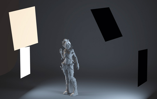
When it comes to the lighting, I use four V-Ray lights. Try to position the lights so that you get good contrast. Take into consideration the reflection of the lights on the model - here I try to create some contrast in the colour temperature of the lights.
To achieve this, I mix the light settings to set a blend of cold and warm tones. GI is turned on to make a more realistic lighting scheme.
09. Start rendering
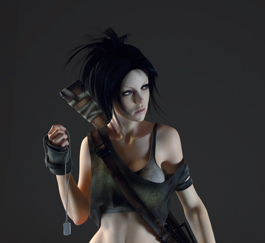
When it comes to the creating the final render, if the modelling, textures, shaders and lighting are good, the final result will be good. It's really that simple.
I use a linear workflow for my render - Gamma 2.2 in the V-Ray Color Mapping, and Gamma Correction in Textures. The final render lacks contrast and so feels a little lifeless, but these are areas I can correct in post-production.
10. Final composition

It's time to correct the image in Photoshop, to tweak any final issues. To enhance the image, I want more interesting tones, better contrast in the colours and lighting, and to add some photographic elements to help improve the impact.
I employ all of my techniques - vignette, depth of field, chromatic aberration, noise and bokeh effect - to improve the contrast and colour. As you can see, there's a distinct difference between the pure render and the final composition.
Words: Danilo Athayde
Danilo Athayde is a Brazilian character artist working at Vetor Zero studio, in São Paulo, Brazil. He began his career at Melies animation school in 2010. This article originally appeared in 3D World issue 177.

Thank you for reading 5 articles this month* Join now for unlimited access
Enjoy your first month for just £1 / $1 / €1
*Read 5 free articles per month without a subscription

Join now for unlimited access
Try first month for just £1 / $1 / €1

The Creative Bloq team is made up of a group of art and design enthusiasts, and has changed and evolved since Creative Bloq began back in 2012. The current website team consists of eight full-time members of staff: Editor Georgia Coggan, Deputy Editor Rosie Hilder, Ecommerce Editor Beren Neale, Senior News Editor Daniel Piper, Editor, Digital Art and 3D Ian Dean, Tech Reviews Editor Erlingur Einarsson, Ecommerce Writer Beth Nicholls and Staff Writer Natalie Fear, as well as a roster of freelancers from around the world. The ImagineFX magazine team also pitch in, ensuring that content from leading digital art publication ImagineFX is represented on Creative Bloq.
