How a queue of tooled-up bank robbers was created
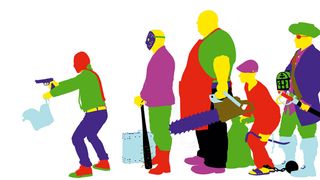
People watching was one of the inspirations for 3D artist Song Zhipeng when he created 'Next Please', a patient queue of motley mobsters.
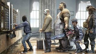
I have worked as a modeller for the past two years, and this is my latest project. I’ve created a range of good and bad characters to play parts in this robbery scene. As an artist I’m inspired by a huge variety of things, and I love people-watching because it is then that you see the real characters society has to offer.
This project was inspired in particular by watching queues and the way people behave in them. They are an everyday occurrence - at the bank, in the supermarket, at the post office - and yet each one is different and is made up of a huge variety of people.
01. Initial sketches
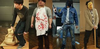
Having a good idea about what you want to do is an important part of the process. I spent some time thinking about the way I wanted the final image to look.
Queueing is something that can be seen everywhere in our daily lives, so I wanted to combine the ordinary with something that was out of the ordinary. I made some sketches and also took some photos, to determine the image and poses.
02. Modelling
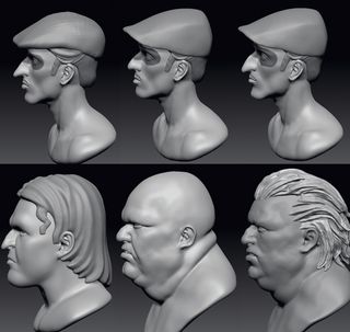
In order to improve my working efficiency, I decided to use ZBrush’s DynaMesh for my modelling. This is a fast tool because you can freely modify your model, and make subdivisions without having to worry too much about the grid.
03. Topology
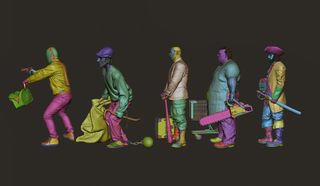
I used 3ds Max in conjunction with PolyDraw to organise the topology.
I paid particular attention to keeping the same mesh size, reducing to three-sided faces and avoid producing five-sided surfaces. I used UV Layout to split the UV.
04. Refinements
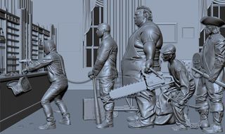
First I put them all into 3ds Max to determine height ratio and observe each character in determining the angle of the camera, to gauge the overall effect. Then each character was separately imported into ZBrush for adjustment and engraving details.
05. Texturing
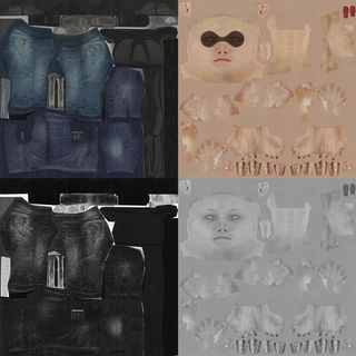
The texturing is a very important part of the process; a rich texture will add a huge amount to the model. I used Photoshop and Mudbox for painting textures and applied three different texture maps to the models: Diffuse, Bump and Specular, with the latter helping to produce the fine details on the models.
06. Lighting
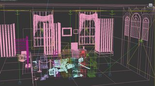
Once the mapping work is completed, I was ready to start testing the lighting. The texture is tonal and was continuously modified throughout the process.
07. Rendering and adjustment
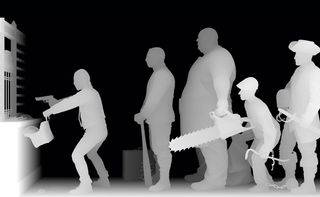
I used the final render and the layered rendered elements in Photoshop to create the final composition, adding depth of field and fog, and defining overall tone.
Words: Song Zhipeng
This article originally appeared in 3D World issue 175.
Liked this? Read these!
- ZBrush tutorials: ways to paint and sculpt in 3D
- Top free 3D models
- Best 3D movies of 2013

Thank you for reading 5 articles this month* Join now for unlimited access
Enjoy your first month for just £1 / $1 / €1
*Read 5 free articles per month without a subscription

Join now for unlimited access
Try first month for just £1 / $1 / €1
Get the Creative Bloq Newsletter
Daily design news, reviews, how-tos and more, as picked by the editors.
The Creative Bloq team is made up of a group of design fans, and has changed and evolved since Creative Bloq began back in 2012. The current website team consists of eight full-time members of staff: Editor Georgia Coggan, Deputy Editor Rosie Hilder, Ecommerce Editor Beren Neale, Senior News Editor Daniel Piper, Editor, Digital Art and 3D Ian Dean, Tech Reviews Editor Erlingur Einarsson, Ecommerce Writer Beth Nicholls and Staff Writer Natalie Fear, as well as a roster of freelancers from around the world. The ImagineFX magazine team also pitch in, ensuring that content from leading digital art publication ImagineFX is represented on Creative Bloq.
