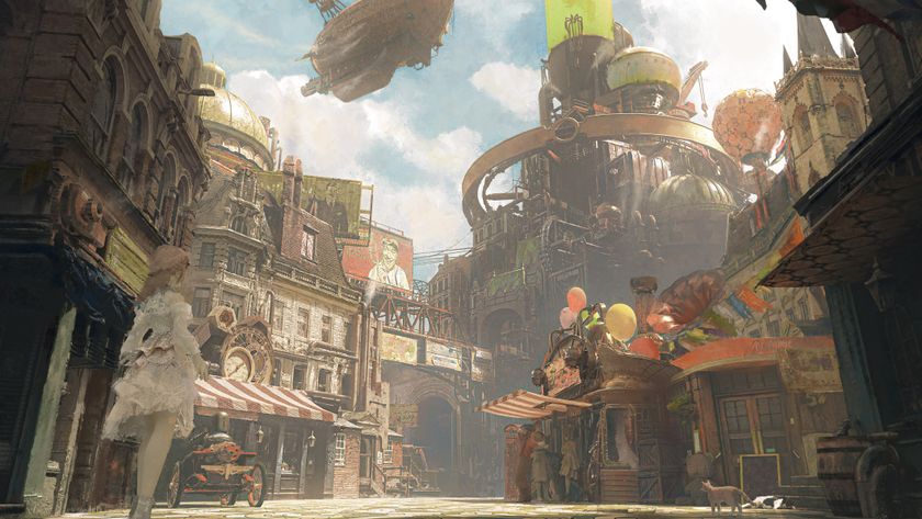
How to paint realistic creature skin textures
Discover tips and techniques used by Framestore’s creature designer and texture painter Daren Horley.

In this texture painting tutorial, I will be describing some of the techniques I use when creating realistic skin for creatures in my day job as an artist at Framestore.
I use Mari as my main paint app – it's become the industry standard – so Mari tools are what I will refer to. While this tutorial can't cover every aspect, but it is a broad overview of how I work.
I've been painting textures for feature film VFX, and previous to that television, since 1996, and my experience is in that realm, but the basic theory applies to any photoreal rendering. Rather than use one texture as an example, I'll describe the process in general terms illustrated with various different examples.
There are many rendering platforms out there, each with their own characteristics, but after having painted texture maps to be rendered with mental ray, PRMan and currently Arnold, I've found the general principles to be broadly similar.
It's always a trial and error process, to see what works and what doesn’t. But something to bear in mind is that it needs an educated guess to judge whether your texture will look as you'd planned in the render, with all the shader and lighting work in place.
What looks good in a texture map, may not be right for the shots that the asset will end up in. Having said this, it makes sense to have a texture map look as good as possible when viewed in your paint software.
01. Use reference
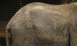
Something I tell people with great passion, is never make it up. No matter how alien your creature may be, it needs to be grounded in the real world. I have a huge library of photographic images and look at it constantly for inspiration.
Get the Creative Bloq Newsletter
Daily design news, reviews, how-tos and more, as picked by the editors.
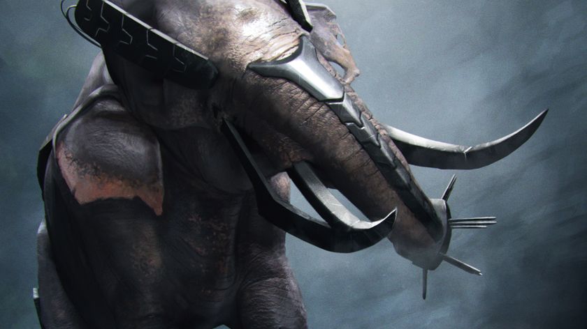
A lot of creatures will require wrinkly skin, so look at wrinkly subjects – elephants, rhinos, old people, monkeys with alopecia... all have relevance.
02. Devil in the detail
Look at the shots that your asset will inhabit and tailor your texture maps accordingly. If it's on screen for a few seconds, in the background and motion blurred, then don't waste time painting detail that won't be seen.
Remember that a turntable is great for establishing the aesthetic of your creature, but this render won't ultimately be the finished product. Put in as much work as you think it will need, add a little more for safety, and use your time wisely.
03. The UV layout
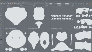
It’s important to make sure that the UV layout of your model is going to properly utilise the space of the UDIM tile. Try not to leave too much empty dead space but keep elements in a logical place, for example teeth in their own tile.
Try to have the anatomy flow across the UV layout in a logical manner. It sounds obvious, but even though you will probably be painting in a 3D space, it makes sense to still have the layout flow in case you do some 2D painting directly into the tiles.
04. Use a template map
I start the process by painting a map I call the 'template'. This map is never used directly to render with, but establishes a monochromatic description of detail that incorporates the basic layout of skin folds, scales and so on.
It provides the basis for most of the subsequent map types. I tend to make it an earthy brown tone, and is created using hundreds of photo-referenced skin pieces, composited together to flow over the model in a naturalistic way.
05. The initial map
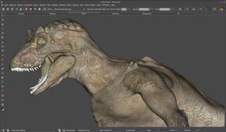
I either use Mari's Paint Through tool or I set up projection cameras and export these images to paint in Photoshop. I export an unlit COL map layer and a lit grey render to use as a guide, then I layer them with the grey lit render on top using a hard light layer.
The two images mix and appear as if you were painting in Mari’s paint buffer. Experience has given me the instinct to judge which method will work best.
06. Ataining realism
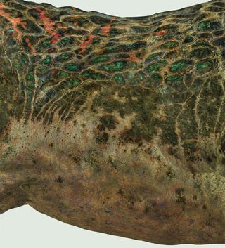
Animals get dirty, they scrape and scratch and pick up all sorts of damage, wear and tear. I paint this detail on a separate layer, using both texture brushes and photo reference applied with the Mari Paint Through tool. Never make it up.
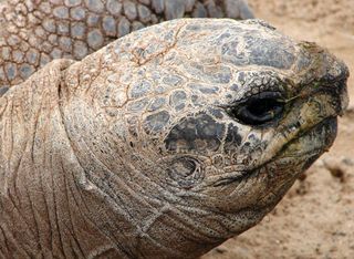
Observe all the details if you want to make it believable. For instance, look at the way a tortoise sheds skin and becomes white and flaky in the cracked/recessed areas. To become a great texture artist, you need to become familiar with the patterns that nature creates.
07. Create a bump map
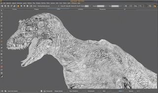
Here's where the earlier template comes in handy. I copy this channel and paste it in to a new Mari channel. Desaturate it and begin to transform it in to a bump map. It shares the same source as the Colour map, so it will match all the relevant details.
I use the Levels filter to change the contrast. Be careful the grade doesn’t crunch out detail at the far ends of the range – you don't want to lose detail in the light or dark areas. This initial grade will get you part way.
08. Tweak the map
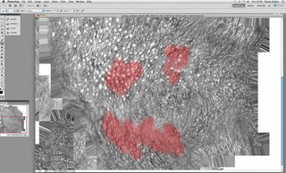
Next I use the Dodge and Burn tools to bring out the lights and darks, and eliminate the patchy variation that's inherent. I also paint a series of masks with a Soft brush to selectively grade areas.
I use Photoshop for this. I like to layer the bump map over the colour map and flick between the two to see how they relate. Some details are shared between the two maps, but some not.
09. Avoid overdoing it
Spots and blotches don't belong in the bump map, but small skin folds and cracks do. Those folds and cracks may have collected dirt and so will be visible in the colour map.
Exercise caution, you don't want a lit look, with shadows evident in the colour map. That will create a doubling up in the lighting shader and create a fake appearance.
10. Specular
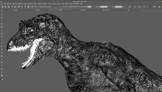
Specular and specular roughness (SPC and SPR) can both be extracted from the bump map. They will need a lot of paint attention to make them work as specular maps, but if they derive from the bump, the detail will relate.
The SPC map will need to be darker where the dirtier areas are, and lighter where the cleaner, more reflective areas are. This may coincide to some extent with the scaly/wrinkly pattern, as dirt may collect in the crevices, and the raised areas may get a buff and be shinier. It's a general rule of thumb, but you need to make judgment calls.
11. Specular roughness
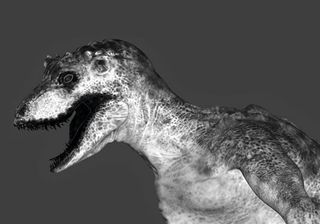
The SPR, is doing a similar thing to SPC, except the tonal values don't determine specular intensity, they denote specular highlight falloff, or softness. Black areas in the map create a tight specular hit, and white areas a more scattered, diffused specular.
Typically, the SPR will be a broader, less detailed map, as it dictates which general areas are more or less shiny – like the slobber around a creature's mouth and lips.
12. Displacement (DSP)
Sometimes, it's a good idea to create a displacement map after the texture maps are painted. This gives you free rein to paint a scale/wrinkle pattern in the bump map, drawing directly from photographic references.
Then take this map and generate a displacement map to conform to it. Using this approach will save time, and also allows a naturalistic photoreal layout of the skin's micro folds patterning.
13. Other maps

In addition to the basic set of maps, there are also sub-surface, ID masks, iridescence... the list goes on. All of these have their place: human skin, for instance, needs sub-surface to give it a translucent feel.
Skin colours change depending on how much light penetrates the skin. There’s blood in the veins and fat under the skin. These maps are less intuitive as they don't appear in a Mari shader set up, but to give a creature life they play an important role.
14. Fit for purpose
It’s tempting to paint a lot of superfine micro detail in a texture map, so it can take an extreme close-up and still hold up. This is a good thing, but you shouldn't lose sight of the bigger picture.
A texture map will also need to work in mid- and long shots. Sometimes that micro detail will disappear in certain scenes. You should take a step back frequently and zoom out to see if it's still working at a distance.
Words: Daren Horley
Originally from a traditional illustration background, Daren switched to digital VFX in 1996, and now is head of texture at Framestore, London. This article originally appeared in 3D World issue 182.

Thank you for reading 5 articles this month* Join now for unlimited access
Enjoy your first month for just £1 / $1 / €1
*Read 5 free articles per month without a subscription

Join now for unlimited access
Try first month for just £1 / $1 / €1
The Creative Bloq team is made up of a group of design fans, and has changed and evolved since Creative Bloq began back in 2012. The current website team consists of eight full-time members of staff: Editor Georgia Coggan, Deputy Editor Rosie Hilder, Ecommerce Editor Beren Neale, Senior News Editor Daniel Piper, Editor, Digital Art and 3D Ian Dean, Tech Reviews Editor Erlingur Einarsson and Ecommerce Writer Beth Nicholls and Staff Writer Natalie Fear, as well as a roster of freelancers from around the world. The 3D World and ImagineFX magazine teams also pitch in, ensuring that content from 3D World and ImagineFX is represented on Creative Bloq.
