How to master hair and fur in Maya
Digital artist Antony Ward explains how to harness Maya's powerful new tools to create this furry character.
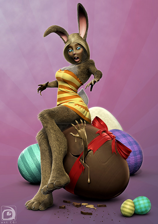
Fur and Hair are always tricky areas to attempt in 3D. They often involve complicated systems with a mind boggling amount of attributes to adjust and configure, and this is even before you consider styling and rendering.
In this workshop I want to illustrate my approach to adding hair and fur to a startled Easter bunny, and to do this I will be using xGen. xGen is Autodesk's new suite of tools introduced in the Extension release of Maya 2014.
Originally developed by Disney Animation Studios for films like Tangled and Toy Story, xGen takes the user specified geometry, repeats it in the form of instances and applies it to the surface of a model. These new instances can then be directly controlled through guides, expressions and brushes.
There are many areas of xGen to explore, and its use isn't restricted to just fluffy characters. Its instancing tools are also perfectly adapted to add foliage to an environment or even feathers to a bird. Basically anything which can be repeated over the surface of a model can be used, and with its intuitive controls you can add more variety to each instance by adjusting the size, colour and a wide variety of other attributes.
01. Building the bunny
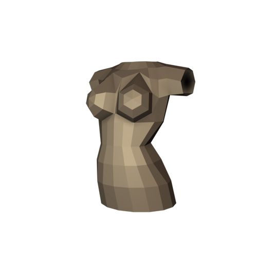
When I begin any project I asses what I can reuse and what needs to be built completely. Using a good base model can be essential to kick-start any project and can save lots of time.
This time I chose to start from scratch, and began the construction of the bunny with a handful of cylinders and spheres. These were then combined and adjusted to form the base for her torso.
02. Working in details
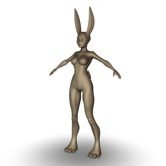
Once I had the torso I then began to form the rest of the body. After blocking in her limbs and head I then gradually added more and more detail until I achieved the final result.
Get the Creative Bloq Newsletter
Daily design news, reviews, how-tos and more, as picked by the editors.
It was important for me not to rush ahead, but work on her as a whole, with each detail pass slowly working on smaller and smaller details. This was so I didn't lose sight of the proportions, and overall topology.
03. Posing the bunny
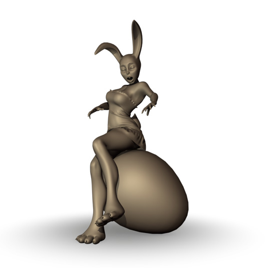
I knew the bunny needed to be posed for this illustration, and as she was symmetrical I could have chosen to leave her in the initial Da Vinci's Vitruvian Man T-Pose and then rig her for animation. This approach could mean less work later as I could focus my attention on the fur covering one side of the model and then use the mirror tools to copy the information to the opposite side.
This time I wanted the fur to have more variety, so chose to pose the bunny prior to adding the fur. This also had the added bonus of allowing me to adjust the mesh further to fix any areas of bad deformation.
04. Selecting the geometry
xGen works directly onto the surface of the model, and unlike other methods for creating hair or fur doesn't rely on the UV layout, or a complete base model to work. Instead a patch and Ptex system is incorporated here, with each attributes values being exported as a Ptex map.
With this in mind I could focus on selecting the actual polygons I wanted the fur to be applied to, so it was important that I didn't select areas which wouldn't be seen. These included the geometry beneath her dress and also areas which aren't normally hairy like her lips.
05. Defining the xGen Fur Description
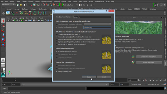
xGen allows you to create five main Descriptions, and these can sit inside their own Collections to keep things grouped and tidy. For the fur the best and most obvious choice for the bunny were the Groomable Splines.
Once applied to the selected geometry, these splines then become easily editable, posed and groomed, making it a much quicker and user friendly option for this model.
06. Setting up the description
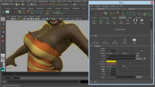
Before I started grooming the fur I needed to make a few adjustments to the default settings. The length of the fur was doubled and I also increased the density to cover more of the skin, and give me a better preview of how the fur would look when rendered.
07. Update your preview
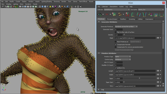
The yellow guides on the model gave me a great idea of how the fur will flow over the surface of the model, but they only actually influence the fur itself, and I couldn't currently visualise how that will look.
To see the geometry which will be eventually rendered I needed to make sure I kept updating the Preview. This tells Maya to update the geometry to match the guides, and also produces the black lines, which are the actual strands of fur.
08. Grooming the fur
Next it was time to go in and begin to style the fur. First I worked my way around the model using the Pose brush to almost flatten each strand so it followed the surface of the model, rather than stood perpendicular to it.
I also began to adjust the Taper attributes too to vary the width of each blade of fur, making them thinner the further away they were from the skin.
09. Adding length and variety
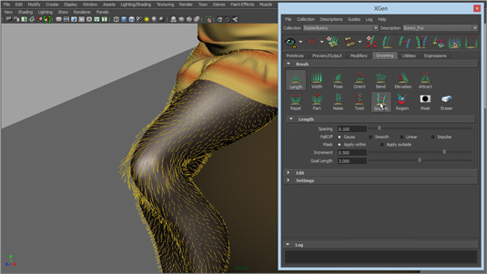
Once happy with the overall flow of the fur it was time to use some of the other tools to vary the look and style. I used the Length brush to vary the length in key areas like her knees, chest, shoulders and around her face.
The Elevate brush was very helpful in pulling any fur which was too flat, away from the surface again, something that can easily happen when using the Pose brush. The Noise brush then worked through the areas of fur which were too linear and tidy, varying the length, orientation and clumping.
10. Adding the Hair Description
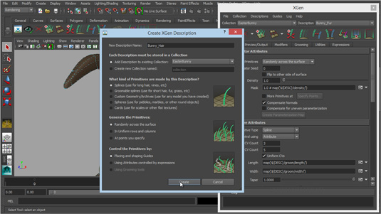
Next it was time to shift my focus to her hair. This time I selected just the geometry on her scalp and then created a new Splines based Description.
I chose this as it would allow me to easily generate longer flowing hair which I could again control with Guides rather than attributes or expressions.
11. Adding Guides
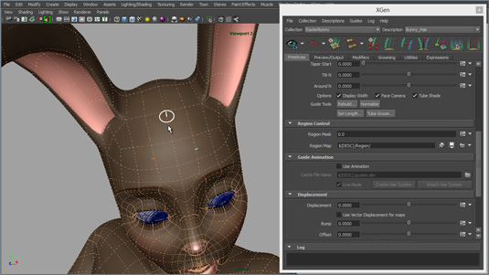
Unlike with the Groomable Splines, the Splines based Description doesn't give you any guides to begin with, instead it allows you to place only the guides you need rather than covering the entire area for you.
Initially I created three guides, one at either side of the forehead and a third a little further back, but this time in the centre of her head.
12. Styling the Guides
The initial guides were far too small so I used the Set Length option to quickly increase their size to around 0.25. Once the hair was previewed I could then see it was much longer, plus increasing the guide’s size meant they would be easier to manipulate. I could then simply select and move each guides CVs to begin posing the hair.
13. Using Utilities
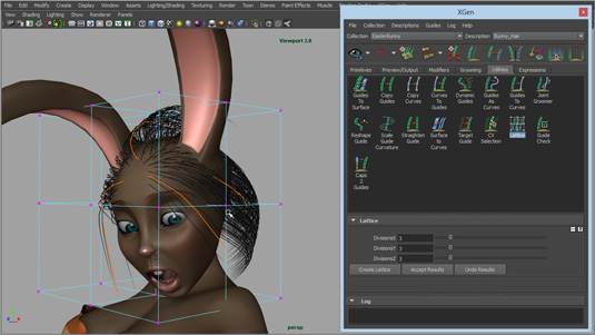
As well as using the guides to shape the hair I also enlisted the help of a few Utilities. Occasionally the CVs would be stubborn and wouldn't move, or I would need a bit more control, so the Reshape Guide tool helped here.
For a larger influence I also used the Lattice tool, which applied a lattice deformer to the selected guides so I could deform, and shape them all at the same time.
14. Adding Clumps
Once I had worked on the shape of the hair, and also added a few more guides to help style the back of her head, I could then focus more on the actual strands of hair. To help me here I used Modifiers, and one in particular was Clumping.
Rather than the hair being a uniform shape once it left the scalp, Clumping allowed me to form specified clumps which I could then control. This gave the hair more variety, and also the nice tapered look towards each clumps tip.
15. Rendering
I was approaching the point now where I needed to see how the fur and hair was looking. The default shaders were set to colour the hair white, which wasn`t what I wanted, so I changed that to brown to match the underlying texture.
I then needed to adjust the specularity as well as some of the other attributes, as well as go back and adjust the hair and furs density to get the correct look.
16. Back Lighting
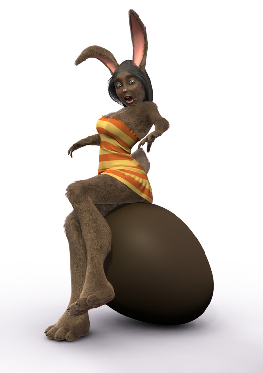
Although the fur was looking better it was still a little flat. What I like about hair and fur is the way the light behind always passes through the outer strands. I wanted to mimic this with the bunny’s fur and luckily there was a quick way to do this without complicated light rigs.
In the shader node there is a simple Back Gamma attribute, and also a Back Color. Setting the Back Gamma to 5, and the Back Color to white produced a nice effect which also helped to pick out some of the previously hidden details.
Words: Antony Ward
For over two decades Antony Ward, the director at antCGi has been provoking pixels and in that time he has worked for many top studios and written three technical manuals.

Thank you for reading 5 articles this month* Join now for unlimited access
Enjoy your first month for just £1 / $1 / €1
*Read 5 free articles per month without a subscription

Join now for unlimited access
Try first month for just £1 / $1 / €1

The Creative Bloq team is made up of a group of art and design enthusiasts, and has changed and evolved since Creative Bloq began back in 2012. The current website team consists of eight full-time members of staff: Editor Georgia Coggan, Deputy Editor Rosie Hilder, Ecommerce Editor Beren Neale, Senior News Editor Daniel Piper, Editor, Digital Art and 3D Ian Dean, Tech Reviews Editor Erlingur Einarsson, Ecommerce Writer Beth Nicholls and Staff Writer Natalie Fear, as well as a roster of freelancers from around the world. The ImagineFX magazine team also pitch in, ensuring that content from leading digital art publication ImagineFX is represented on Creative Bloq.
