How to create a Street Fighter-style CG character
CG artist Gustavo Groppo mixes life-like anatomy with exaggerated form in his version of Street Fighter character Zangief.
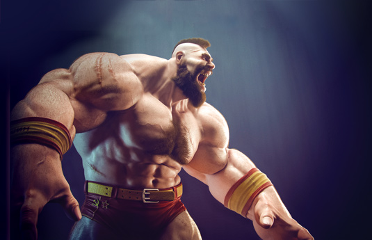
Gustavo Groppo is a 3D artist currently working for Vetor Zero, a CG studio in São Paulo, and while he's employed as a 3D generalist, his skills focus on texturing, lighting and rendering. As you can see from Groppo's take on Zangief - a character from Capcom's Street Fighter series - he's very accomplished.
"My workflow is pretty simple and traditional," says Groppo of his Zangief project, which took him 20 days to complete. "As I was doing a redesign of the character Zangief, the challenge was to keep him familiar, but exaggerate his body. I was trying to gain a balance between real anatomy and stylised shapes and volumes." Here, Groppo explains the process behind creating such a character.
01. Modelling and sculpting
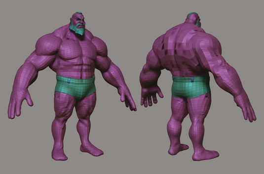
All the modelling is done using 3ds Max and ZBrush. I usually start the model by creating simple polygonal bases, but with a partially defined shape, so I can see what the final model would be like. The sculpture of the model, the definition of its volumes and proportions are done in ZBrush, using tools such as Clay, Move and DamStandard.
Article continues below02. Modelling the clothes
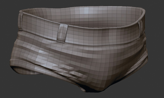
I usually begin the process of modelling the clothing from the moment I
get the shapes and volumes of the body defined. I model the clothes in 3ds Max using Graphite modelling tools, specifically the Strip and Extent tools that enable me to create polygons following the topology of my base mesh.
03. Getting the right pose
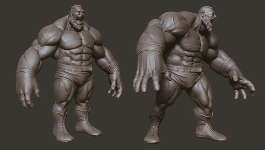
I imagine a pose that will make the character bigger, a pose that values his proportions and volumes. A fighter like this should looks as if he's about to annihilate his next opponent. I pose the character using ZBrush's Transpose Master, and then detail the volumes of some of the muscles to add realism.
04. Detailed texturing

The challenge of texturing in this project is to interpret a two-dimensional video game character realistically. I try to be as faithful as possible to the concept of the character, a Russian fighter who has scars on his body due to fighting with bears.
Therefore, I try to create a lighter skin tone that shows its naturalness. Before I start the texturing process, I split the model into three UV tiles, one for the head, one for the torso and arms, and a final one for the legs. This can be useful when painting high-resolution maps.
Sign up to Creative Bloq's daily newsletter, which brings you the latest news and inspiration from the worlds of art, design and technology.
05. Time to dip into Polypaint
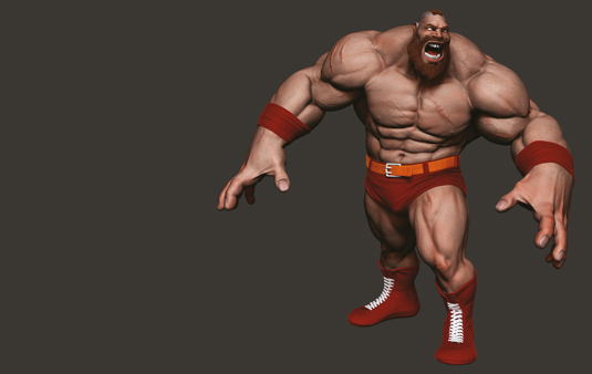
I paint the skin texture in ZBrush, using Polypaint. First I create a base colour with some shades of skin tones in certain areas and after that apply dozens of pictures of different skin types, using the DragRect stroke. With the textures finished, I export all the maps using the MultiMap Exporter in ZBrush. The textures of the clothes were done in Photoshop and 3ds Max.
06. Create the hair
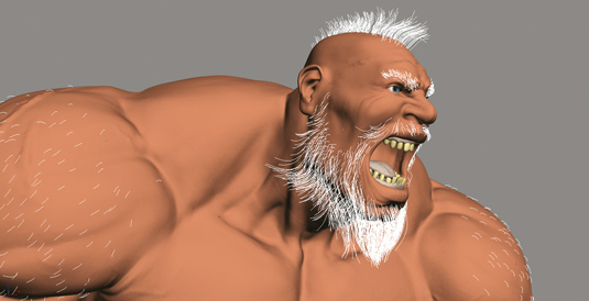
The hairstyle of this character, the mohawk and his massive beard, are unmistakable. Staying true to this concept, I try to make his body hair as realistic as possible. I use the Ornatrix plug-in, a system that has a very practical hair styler and is also compatible with V-Ray materials and renderer.
To apply the hair, I split the low-poly model in to four parts: the head, torso, arms and legs. This enables me to have more control over styling. For each part, I paint hair density maps to specify where the hair will be placed.
07. Begin lighting
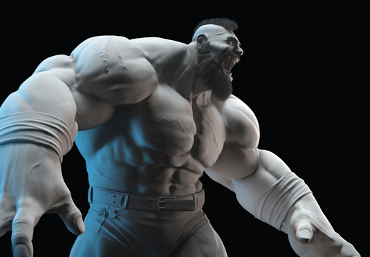
I light the scene with the plan to emphasise the volume and the
details of the model. The light consists of one haze coming from the top, two back lights that form the silhouettes and a fill light to highlight the front of the model and bring more detail to the hair.
08. Start rendering
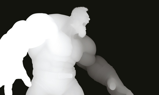
The image is output at 4k pixels wide, rendered in .exr format. I also
render other passes such as ZDepth, Ambient Occlusion and a Volumetric Light. I take all of these passes into Photoshop for some colour corrections, and then export to After Effects to add depth of field and chromatic aberration. As a final touch, I add some photo grain in Adobe Photoshop Lightroom.
This article originally appeared in 3D World issue 177.

The Creative Bloq team is made up of a group of art and design enthusiasts, and has changed and evolved since Creative Bloq began back in 2012. The current website team consists of eight full-time members of staff: Editor Georgia Coggan, Deputy Editor Rosie Hilder, Ecommerce Editor Beren Neale, Senior News Editor Daniel Piper, Editor, Digital Art and 3D Ian Dean, Tech Reviews Editor Erlingur Einarsson, Ecommerce Writer Beth Nicholls and Staff Writer Natalie Fear, as well as a roster of freelancers from around the world. The ImagineFX magazine team also pitch in, ensuring that content from leading digital art publication ImagineFX is represented on Creative Bloq.
