How to create a scene that tells a story
Sculpt a character-driven illustration with legendary digital artist and Ubisoft art director Pascal Blanche.
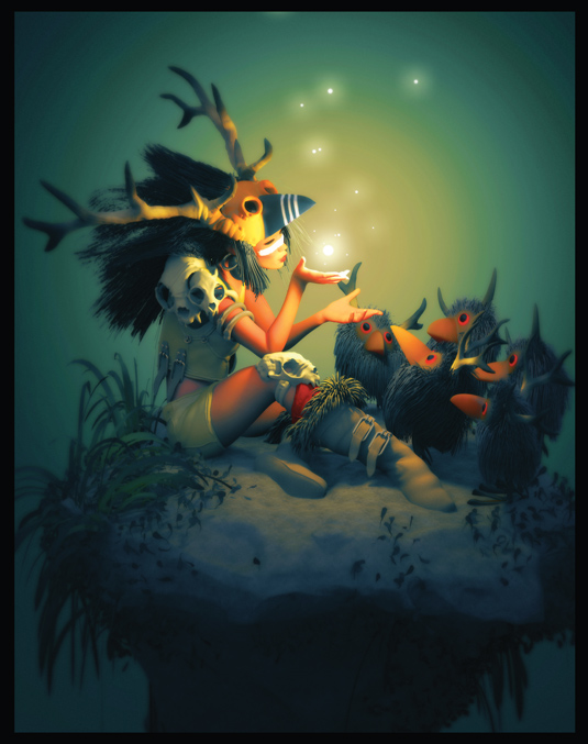
I have been creating CG illustrations for almost 15 years now, mostly for personal satisfaction and sometimes for freelancing. I am not the technical type of CG artist - far from it. When I use software, whether it's ZBrush, 3ds Max or Photoshop, I only use the basics, it is a way for me to keep the focus on the really important thing: the picture itself. In this tutorial I will describe my personal creative process.
01. Working out the idea
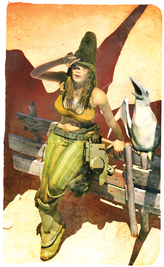
I couldn't have been more happy when 3D World asked me to create
a a Moebius/anime-themed illustration for the cover of its latest issue. I knew right away which picture I could take as base reference for the task at hand too.
My idea for the cover illustration is a take on a Hayao Miyazaki Nausicaä heroine, as reimagined by Moebius (via me!). I have always loved cross-genre art and seeing how master artists give credit to each other’s inspirational work. I feel that paying a tribute to the masters who've always influenced my work is a great thing to do.
02. Posing and framing
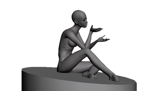
With the styles of Miyazaki and Moebius in mind, I start to work on my interpretation by blocking out my main character pose in 3ds Max using a biped rig. At this stage I also do some rough work on the camera angle. I tend to reuse my characters quite often, as it can help to save time.
The idea here is to capture a readable silhouette, and will also act as a reminder of the original inspiration. Now’s the time to create a simple block reference for the floor, to get an idea of what the overall composition will look like in the end.
03. Creating the elements
When you're happy with the pose, create a snapshot of the mesh and then export this into ZBrush. Now start to refine the proportions and body shape of the figure until you're happy that it looks the way you envisioned it.
My goal is to keep the lines simple; I don't want to go too realistic. Next I start to block out the first elements: the skirt, top, boots and socks using the extrusion method.
Get the Creative Bloq Newsletter
Daily design news, reviews, how-tos and more, as picked by the editors.
04. Adding details
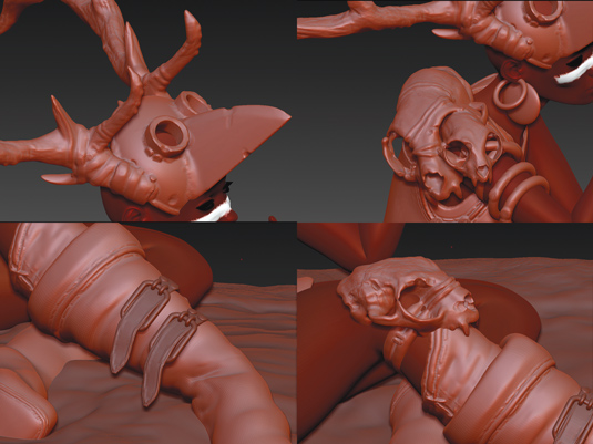
Now using DynaMesh, Clay, Dam Standard and some other brushes, add the fold and stitch details. Also create a rough shape for the mask and horns in 3ds Max and then import all of these elements together
in ZBrush. Using DynaMesh, blend the horns and mask elements (face, eyes, beak) into one merged Object, then sculpt some finer details on top.
05. Detail and pose
The remaining elements, like the skull-based shoulder pad, kneecap and buckles, are created in a similar way. Depending on the elements, I pose them right away around the model in 3ds Max (these are the elements that don't need symmetry when I sculpt) ready to import them directly into ZBrush.
06. Sculpting the hair
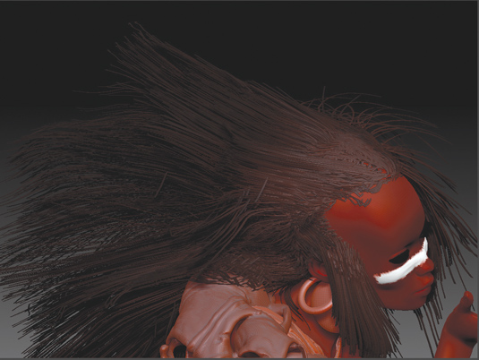
Next it's time to work on the hair using ZBrush FiberMesh. I am still not really used to this, so creating this illustration was a great opportunity to test something new. The tool is really easy to handle, from mask generated areas to the different brush types that enable you to sculpt your hairs. Have a little play with it to see what you can do. I add some fur on the boots, to balance the subject more.
07. Maintain the style
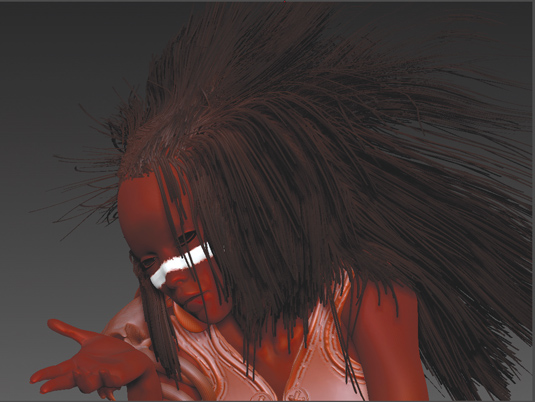
To keep a stylised look in the hair, as opposed to realistic hair, you can exaggerate the thickness of the hair strands, and also reduce their number to make sure we can see the strands clearly. Doing this saves a lot on the rendering time too.
08. Start questioning
In any illustration creation there comes a time when I like to step out of the process and look at the overall picture. I try to imagine it rendered, touched up and finished and ask myself some searching questions: Is that it? Do I like it? Am I missing something? More often than not, the answer leads to me fixing something that's a little off.
Here, for example, I still don’t really know what my character is looking at. The issue is broader, there is no real story attached to the scene.
I think that the best images are always the ones that can capture an instance, or make you wonder about the universe behind it. That is something that Moebius was very good at and something I always enjoyed in his work.
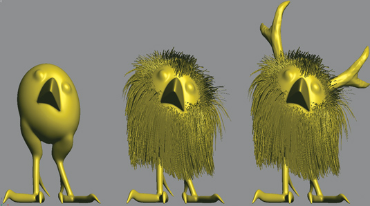
And then I get it: the mask, the hairs... I could add something there that could also be a reminder of Miyazaki's creature from My Neighbor Totoro: and that's how my little 'birds' came to life!
09. Unifying the design
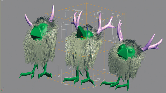
With the idea set, create a basic shape in 3ds Max. Next import this into ZBrush to sculpt on top of it, reusing the same hair strand method I used for the girl. This will accentuate their stylistic affinity, an idea that is also backed up by adding the tips of the horns from the skull/hat and reusing them on the creatures. Now the whole picture makes more sense.
An easy way to add more life to the birds is to create different poses with a simple FFD modifier in 3ds Max. To avoid too much repetition, make sure to change the shape of their horns here and there. It is these little details that count. Now's it's time to render!
10. Keyshot importing
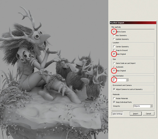
I just discovered Keyshot a few weeks ago, it's intuitive, fast, and has a nice range of accurate and realistic shaders. I usually like to have more control over my materials to tweak things here and there, but for this illustration I decide to try something new.
It took me a while to find a correct ZBrush to Keyshot import setup, but my advice if you wish to try this is to make sure you have your object aligned on Y and keep the original size.
11. Start the magic
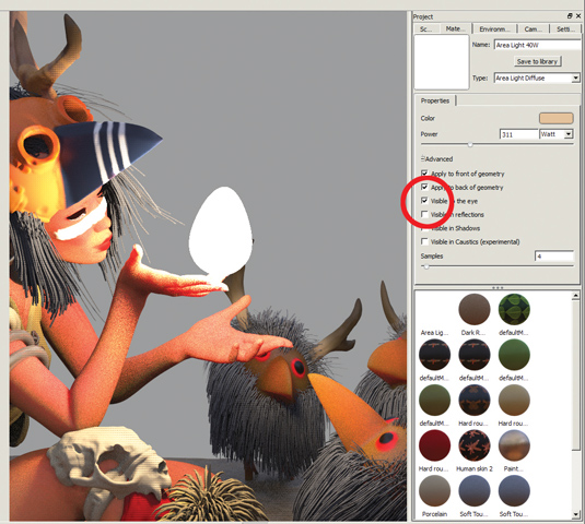
When all the objects have been imported into Keyshot, you can play around with different shader types for the hair and clothes until you get the look you're aiming for. The trick is to avoid it looking too realistic, to try to keep the style of the work in line with a Moebius/Miyazaki image.
Apply a Light shader on a simple sphere in the palm of the main character's hand to create the emissive light at the focal point on the image. One of the advanced options of this shader allows you to make the object invisible while keeping the emissive light active. In 3ds Max, set up the camera with a 200mm lens to kill the 3D perspective aspect and give the final picture a 2D feel, then hit render.
12. Keyshot samples
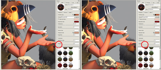
To avoid getting too much graininess in the speculars, I usually set up the samples up to 30/50 on the sliding Samples widget under Properties. While this will undoubtedly slow down the rendering time, the results will be far better and the overall finish will be worth it.
13. Photoshop touches
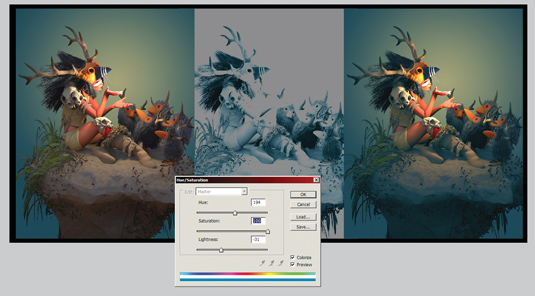
When you're happy with the final render, take it in Photoshop. I like to recolour the shadow and highlight areas to give the picture a unified look. Select the shadow areas with the Color Range tool, and copy and paste that selection onto a new layer. Using the Hue/Saturation adjustment tool rework the hue with the Colorize button on to get a monochromatic shadow pass.
14. Use a Color layer
Take the layer you just created and apply it to the main image. Use a Color layer mode to avoid strange results such as the shadows being too saturated or highlighted. Do the same for the highlight areas. I often use green and yellow for shadow and light, but it depends on the subject and mood.
15. Adding effects
Next create a duplicate of the end result on the top of the image, apply a Blur effect and erase the centre (to keep this focused) using a large diffused Eraser tool. Then go back and forth with some filter effects, such as Paint Daubs and Poster Edges to texture the edges. Tweak the colours and you're done.
Words: Pascal Blanche
Pascal Blanche is recognised as one of the most popular contemporary digital artists working today. He’s currently an art director at video game giant Ubisoft. This article originally appeared in 3D World issue 179.

Thank you for reading 5 articles this month* Join now for unlimited access
Enjoy your first month for just £1 / $1 / €1
*Read 5 free articles per month without a subscription

Join now for unlimited access
Try first month for just £1 / $1 / €1

The Creative Bloq team is made up of a group of art and design enthusiasts, and has changed and evolved since Creative Bloq began back in 2012. The current website team consists of eight full-time members of staff: Editor Georgia Coggan, Deputy Editor Rosie Hilder, Ecommerce Editor Beren Neale, Senior News Editor Daniel Piper, Editor, Digital Art and 3D Ian Dean, Tech Reviews Editor Erlingur Einarsson, Ecommerce Writer Beth Nicholls and Staff Writer Natalie Fear, as well as a roster of freelancers from around the world. The ImagineFX magazine team also pitch in, ensuring that content from leading digital art publication ImagineFX is represented on Creative Bloq.
