How to create an Orc in ZBrush
ZBrush veteran Scott Spencer reveals how to sculpt, render, composite and paint a creature from The Hobbit.
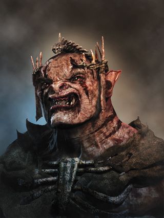
In this tutorial we will look at the process I use to design an Orc from sculpting to the final image presentation. ZBrush enables you to design fast and then render any pose for a presentation painting.
What's even more beneficial is that when a character is approved it's a simple matter to return to the model to create further views, or continue with the existing ZBrush sculpture into an animation pipeline.
01. Use a generic head
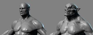
Load a human model as a base for this creature. The underlying mesh is light and easy to manipulate, and will serve as a base for shaping into the Orc. Load this ZTool into ZBrush and, in Edit mode, use the Move brush to adjust the basic shapes.
First, widen the head and jawline to break with the normal human facial proportion. This helps to convey the idea that the character is not human.
02. Importing and prepping teeth
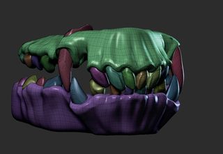
I tend to use a generic set of teeth for my models, and then reshape them rather than manually resculpting. ZBrush has a built-in mask that makes working with geometry like this very simple. With the teeth subtool selected, go to Tool>Polygroups>Auto Group.
03. Sculpting the teeth and gums
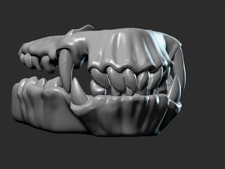
Auto Group will automatically polygroup each separate object (teeth and gums). Press Ctrl+F to see the model in Frame mode; the colour-coded polygroups will be visible. Go to Brush>Auto Masking and turn the Mask by Polygroups slider up to 100.
This will cause every brush to only affect the first polygroup it touches. Next, select the Move brush and try to shift the teeth around; it is now much easier to sculpt one tooth at a time. This is a global setting so be sure to turn the slider back to 0 when you are happy with the result.
Get the Creative Bloq Newsletter
Daily design news, reviews, how-tos and more, as picked by the editors.
04. Sculpting facial forms
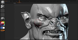
When sculpting the facial forms I rely heavily on the Move, Standard, Inflate and Claytubes brushes, and I customise my Claytubes brush
to remove the noisy surface it can create when sculpting. I also find I'm able to create more subtle forms if I turn off the Alpha associated with the brush.
With this softer brush setting, it's easier to sculpt in bony forms like cheekbones, as well as softer fleshier areas. This brush enables you to build up shapes more gradually than the default Claytubes brush, which can be a little too aggressive in its effect.
05. Presenting the character
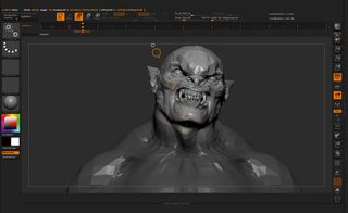
Try to avoid presenting a character in a neutral position. Adding just the slightest bit of pose to the sculpture provides an opportunity to bring out character and drama in the scene. Here we add a slight inclination to the head to bestow an imperious and arrogant attitude to this beast.
06. Start posing
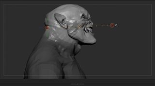
Since there are multiple subtools (body, teeth and eyes), use Transpose Master to pose the head. Under ZPlugin>Transpose Master, press the TPose Mesh button. This will collapse all your subtools into a single mesh.
Draw a mask marquee around the head (Ctrl+click and drag) and then invert the mesh mask (Ctrl+click on the background) so the head, eyes and teeth are unmasked. Press R to select the Rotate Transpose tool.
Draw a new transpose line from the base of the skull to the front of the face. Rotate the last circle on the line to reposition the head. Click inside the circle and drag to reposition the head.
07. Lighting, rendering, and setting up
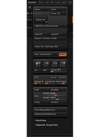
The resolution of the final image will be determined by our ZBrush document resolution. Under Document, turn off the Pro button, which disables Constrain Proportions. Set the height and width to your preferred settings. Here I set the resolution to 2640x3516, which gives me an image in portrait orientation rather than the default landscape.
If you cannot see the full document on the screen, press the AAHalf button on the right sidebar or use the Zoom button to zoom the document out to see the full image.
08. Compose the image
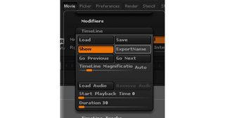
Next, compose the figure in the picture plane. Draw the model on the canvas and enter Edit mode. We want a way to store multiple positions on the canvas for future use. Turn on timeline, this enables you to keyframe the model’s position on the canvas. Now go to Movie>Timeline>Show Timeline. The timeline appears above the canvas.
09. Orient the head
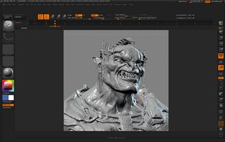
Now we can orientate the head to the picture plane; I choose a dramatic low angle. When you are happy with the position, click twice along the timeline to add two keyframes.
Now if you accidently move the model, scrubbing the timeline will restore the model position. The timeline saves with the project file, so if we need to revisit the model and render new passes later on, we can.
10. Set up the lighting
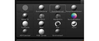
In ZBrush I use a simple key and rim light setup to define light and shadow and then use a backlight to carve the character away from the background. Open the Light menu at the top of the screen. Make sure Standard material is selected. Under the Material palette, select Basic Material 2. In the light menu click and drag the orange box on the sphere to move the light. Then place it at approximately 11:00.
11. Turning on the rim lighting
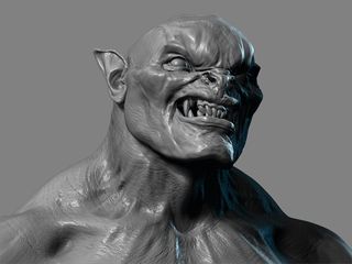
Next turn on the rim light by clicking the second light bulb icon to activate the light. Then adjust the intensity slider by raising it to 1.5. This will seem to blow out the lighting on the object, but don’t worry; we can fix that.
Click on the preview sphere and the light will be placed behind the head. You can now move the light normally, but it will light the creature from behind creating a nice sharp rim light.
12. Save a project file
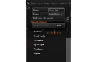
Now we want to save all these settings, position, resolution, lighting and materials into a single file. If we save a ZTool, ZBrush will not retain all the document lighting, resolution and timeline data, so we need to save a project file.
Project files retain all the current settings for use later. Go to File>Save as and save the project. You could turn off Undo History to reduce the file size.
13. Ready to render
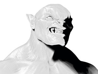
Open the Render>BPR Shadow menu to adjust the lights' shadow settings. Start with a setting of 10 and adjust it as you render. Next turn on the Acclusion button. We are now ready to render. Press the BPR button at the top right of the screen to execute the render. ZBrush will display a composited render, but we want individual render passes.
Open Render>BPR Renderpass and click each icon to export it to disk. The following files will form the basis of our image. Click each thumbnail to export with the default filename and save to disc.
14. Create custom render passes
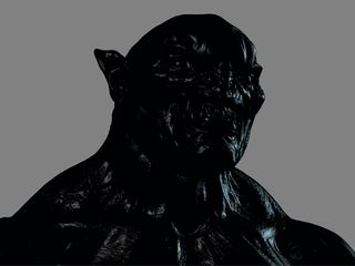
Press the Actual button to remove any zoom from the image. We
will need to manually export these next render passes and as the AAHalf is on it will export at half size rather than the required full resolution. Start by creating a specular pass.
From the left side of the screen select black as the active colour. This will cause the basic material to change to black with white highlights. This will be our specular pass in Photoshop. Export the pass with Document>Export and save as spec.psd with your other passes.
15. The matte pass
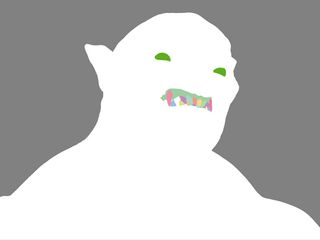
Next save another matte pass for just the eyes and other subtools, to isolate every subtool easily for painting. Select the flat colour material and at the top of the screen turn on the MRGB button.
Start with the top subtool in your subtool list and click Colour>Fill Object; this will fill the colour and material on the object. On the next subtool, change the colour and repeat the Color>Fill Object step.
16. Convert all images
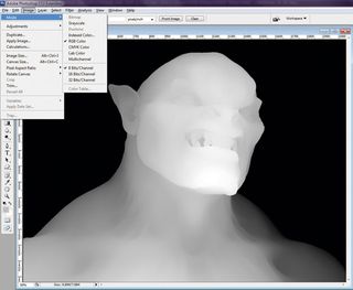
The matte can be used to Wand-select eyes and teeth from the head. Export the matte pass and save as partsMatte.psd. Move to Photoshop. We’ll use a script to automate the process of saving each file into a layer stack.
Ensure each pass is 8 bit and RGB: open them in Photoshop. Under Image>Mode change to RGB and 8 bit. The shadow pass images are set to Multichannel so convert to Greyscale first and then to RGB. Resave and close these images.
17. Move to Photoshop
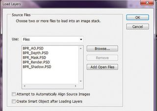
Next we can automate the process of loading them into a stack. In Photoshop open File>Scripts>Load Files Intro Stack Click the browse button and select all the render passes, and then click OK. Photoshop will automatically open and load each render pass into a layer in a new Photoshop document. Each layer will be clearly named for the source file. This is a huge time saver!
18. Arrange layers
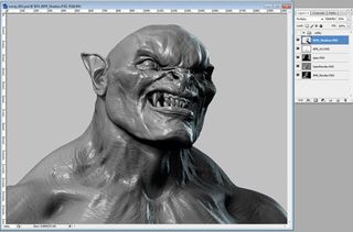
Place Matte, partsMatte and Depth at the top of the stack. Turn visibility off on this layer. Next place Ambient Occlusion and Shadow. Set the blending mode of these layers to Multiply.
Beneath this place Specular, which is set to Screen blending mode. At the bottom of the list put the grey shaded render of the head. Adjust the intensity of the shadow and specular by adjusting the layer opacity.
19. Overlay textures
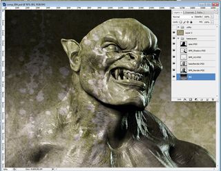
Much of the skin texture here was created by overlay textures. Rather than painting the skin textures by hand, select noisy images of dirt, skin and mold, and overlay them on the image using the Overlay and Soft Light blending modes.
Use the Ctrl+U hotkey to bring up the hue saturation menu. Adjusting the hue and saturation of the overlay images allows you to control the skin texture.
20. Use the matte layer
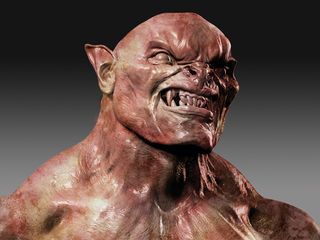
Next we will use the Matte layer to remove any texture overlays which do not cover the head. To do this, select the matte layer and use the Magic Wand tool to select the area around the head. Now select the overlay layer and press delete to remove any texture overlapping the background.
21. Add atmosphere

Create a new layer named Background and place it at the bottom of the stack. Select a light grey and dark grey as primary and secondary colours in the Color Picker.
Select the Gradient tool and enable the foreground to background gradient mode. Click and drag from top to bottom of the screen to create a gradient in the background. This suggests depth behind the creature.
22. Make a cloud layer
Now create a new layer and click Filter>Render clouds to generate a cloud layer. Dial back the opacity and scale the clouds so they create a fine mist behind the figure. This helps create a sense of depth and space, which is subtle enough not to interfere with the foreground fire.
23. Foreground layer
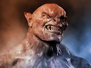
Create a new layer at the top of the stack; call it warm light. Select the Gradient tool and set the foreground to Transparent. Select an orange hue and drag a gradient from the upper left corner of the image toward the centre. Create a new layer called cool light and select a blue hue.
Click and drag a gradient from the lower right to the middle of the image. Select and group the layers and call it atmosphere. You can add another layer with clouds, to add further atmosphere. Set the opacity very low and erase out areas over the head.
24. Painting the eyes

I find when painting I have more luck creating an engaging eye when I paint the reflection and colour directly into my image rather than relying on a render and lighting model to do the work for me. I end up with a warmer, more engaging eye.
25. Add detail
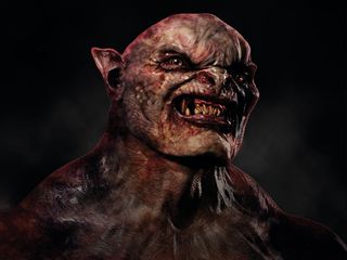
Next, collapse all the overlays into a single image. Turn off the background and atmosphere layers. Press Ctrl+Shft+Alt+E hotkey to collapse all visible layers into a new layer. Now turn the background and atmosphere layers back on.
Use the Dodge and Burn brush to punch in shadows and pick out highlights in areas you want to accentuate. Duplicate your layer before painting into it, so you can soften details with the Eraser set to a low opacity.
Words: Scott Spencer
Scott Spencer has worked extensively with ZBrush for studios and companies such as Pixologic, Gentle Giant Studios and Activision, as well as on The Hobbit at Weta Workshop. This article originally appeared in 3D World issue 178.

Thank you for reading 5 articles this month* Join now for unlimited access
Enjoy your first month for just £1 / $1 / €1
*Read 5 free articles per month without a subscription

Join now for unlimited access
Try first month for just £1 / $1 / €1
The Creative Bloq team is made up of a group of design fans, and has changed and evolved since Creative Bloq began back in 2012. The current website team consists of eight full-time members of staff: Editor Georgia Coggan, Deputy Editor Rosie Hilder, Ecommerce Editor Beren Neale, Senior News Editor Daniel Piper, Editor, Digital Art and 3D Ian Dean, Tech Reviews Editor Erlingur Einarsson and Ecommerce Writer Beth Nicholls and Staff Writer Natalie Fear, as well as a roster of freelancers from around the world. The 3D World and ImagineFX magazine teams also pitch in, ensuring that content from 3D World and ImagineFX is represented on Creative Bloq.
