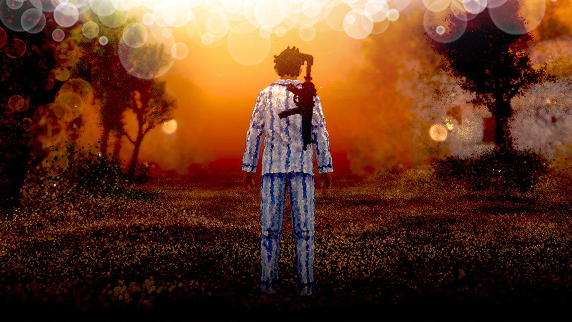
How to create a killer 3D robot
David Domingo Jiménez shows how he models, textures and lights his robotic character, Crazy.

I've always thought that personal projects must be created with the same professionalism as work projects. Using high-poly modelling, 8K texturing, realistic materials, and lighting capable of balancing the technique and the artistic qualities of the image, we can imbue a character with a personality and give the whole scene atmosphere. The lighting is also important as it helps establish the scene. My thanks go to Victor Loba for the image composition.
01. Set the concept
The first concept comes from a draft that I have in mind (I don't use conceptual art). I develop this idea using a proxy model, and also photographic references. Set yourself a workflow that will enable you to work efficiently.
My pipeline looks like this: Modelling Proxy > High Modelling per object + UV mapping > Final Modelling > UV Packing + Texturing > Shading + Lighting Studio > Final Composition + Final Lighting > Postproduction.
02. Modelling part 1

Once I have the proxy model I separately model each part, using Extrude, Bevel, Connect Edge and Shell. Each item has its own centre point relative to its geometry, respecting its topology and using progressive subdivisions.
I create the initial form using the fewest polygons possible, and then increase it later. I use Editable Poly with a Turbosmooth modifier, and Show End Result activated.
03. Modelling part 2
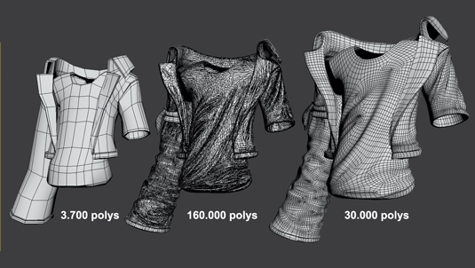
There are modelling methods that offer less tension and a lower number of polygons in the mesh, but for these illustrations I normally use a high level of subdivision. This is why I prefer the fastest method, even though it might not be the easiest one.
I used ZBrush exclusively to detail the clothes, using the Standard, Move, Smooth and ClayBuildup tools. The use of masks is also very important. I use Topogun to retopologise the mesh.
04. Begin UV mapping
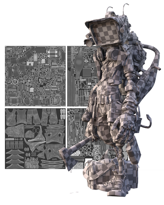
I always recommend using UVLayout for UV mapping because it's an intuitive and stable programme. In order to make the cuts it is important to remember that the fewer cuts you make, the better. I always make them in areas that are less visible to the camera.
For this project I created four maps of similar size and polygon counts, grouping them in the most compact way so that I can take advantage of the whole UV space. For me, the way the UV shells is displayed is not very important, since I always generate ID maps for the different materials.
05. Texturing
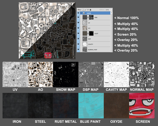
First, I generate the different maps at 8K resolution. In this case, I generated ID, AO, Displacement, Normal, Cavity and Snow maps. It is possible to get them in 3ds Max by going to Rendering>Render to Texture, Rendering>Render Surface Map; and in ZBrush, you can generate them by going to ZPlugin>Multi Map Exporter.
06. Texture in Photoshop

These maps are not just used to detail the texture, they are also very useful when itis time to work on it because you don't need to leave Photoshop. Because of this, I am able to get a complete picture of our model's volumes. The Crazy character consists of four textures at 8K, with their corresponding BMP and SPC maps.
07. Further texturing
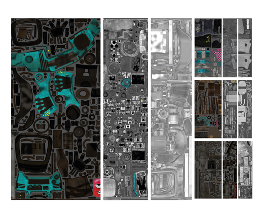
I always work with large textures, using tileable material and respecting the original format rather than reducing it, using masks to either show or hide the areas I need. For good textures you need to be creative and have the ability to work quickly - for this project, I used photographs.
I recommend using Bodypaint, ZBrush or Mari to paint over your 3D model. Adding dirt, scuffs or rips will enrich the texture, but take care not to make them look ugly: any additions must be discrete and harmonise with the base material - such as metal, oxide, sand and dust - respecting their lighting and tone.
08. Begin shading
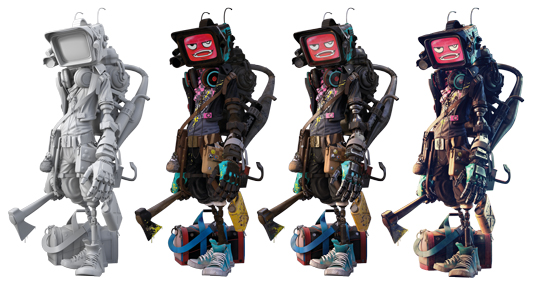
Materials give different parts of the model specific information to define them. In this illustration, I used various different metals (steel, iron, aluminium); matt and reflective plastics; and leather, cloth and rubber. All of these materials use only three maps - Diffuse, Specular and Bump - since there are no compund materials, except for the TV screen and the metal of the axe.
The different materials used are created with the lighting information provided principly for the Fresnel IOR and the information for the Bump map, but also using the detailed numeric data for the Reflection Glossiness and Fresnel Reflections.
09. Final lighting
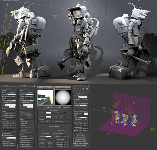
The final lighting setup for an illustration should give an insight into the character, and create the atmosphere that melds the character with the environment. For my character I want to create a confrontational atmosphere. I use night lighting, slightly lit with HDRI and enhanced by 'electric light', using VRayLights to highlight reflections and remove excessive contrast.
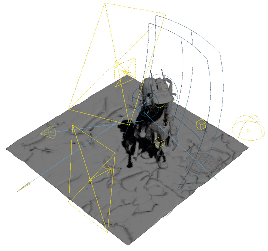
I used two SpotLights to direct the light and get an appropriate perception of the silhouette. In addition, the background has been created with VrayLightsMaterial, using texture maps for the spotlights, windows and signs of the building; and using SpotLights to light the whole scene.
10. Postproduction
This is one of the most important steps in this kind of project. I unify the tone in the scene, emphasise areas of light, correct the contrast, and set the blur in order to create a sense of depth to draw the eye to focal points. All of these steps are essential to get a good result.
Working in Photoshop, I set the Saturation, Curves and Levels, to create a bokeh blur effect. Next I adjust the render maps, including Reflection, Specular and Alpha. The result is a complex image that shows a character and conveys emotion and story. With Crazy, I get to show another part of my series and establish my artistic style.
Words: David Domingo Jiménez
Known as ddjimenez online, David Domingo Jiménez is a 28-year-old artist from Spain who currently works as a lead texture artist for animation studio Kandor Graphics.
This article originally appeared in 3D World issue 175.
Liked this? Read these!
- Discover what's next for Augmented Reality
- Help yourself to these free 3D models
- Check out these inspiring examples of 3D art

Thank you for reading 5 articles this month* Join now for unlimited access
Enjoy your first month for just £1 / $1 / €1
*Read 5 free articles per month without a subscription

Join now for unlimited access
Try first month for just £1 / $1 / €1
Get the Creative Bloq Newsletter
Daily design news, reviews, how-tos and more, as picked by the editors.

The Creative Bloq team is made up of a group of art and design enthusiasts, and has changed and evolved since Creative Bloq began back in 2012. The current website team consists of eight full-time members of staff: Editor Georgia Coggan, Deputy Editor Rosie Hilder, Ecommerce Editor Beren Neale, Senior News Editor Daniel Piper, Editor, Digital Art and 3D Ian Dean, Tech Reviews Editor Erlingur Einarsson, Ecommerce Writer Beth Nicholls and Staff Writer Natalie Fear, as well as a roster of freelancers from around the world. The ImagineFX magazine team also pitch in, ensuring that content from leading digital art publication ImagineFX is represented on Creative Bloq.
