How to create a futureproof robot design
Robots seem to have almost infinite appeal. We speak to designers from around the world about how to create a robot that will survive the test of time.
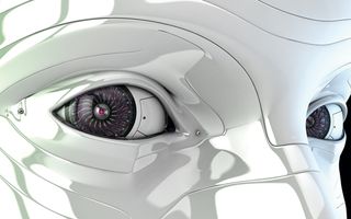
Look into the eyes of any fully rendered robot, and you'll see something of its human creator staring back at you. Robots can succeed where humans fail, continue when we get tired, and symbolise the potential of our future.
From Aristotle's musings on tools working on their own accord, to Leonardo da Vinci's robot knight, we've long been fascinated with playing God by creating perfectly functioning robots. And with a constant stream of science-fiction games and films that mix comic creations with realistic designs, robots have never been so popular or so varied.
Time to get inspired
For artists creating tomorrow's little helpers today, there's more to robots than cold metal, electrical currents and soulless movement. Filling their senses with the world around them before firing up ZBrush, the modern robot designer is as likely to include the shattered claw of a crab as the industrial tools of the city intheirmodels. For freelance 3D artist and tutor Nuttavut Baiphowongse, his doorstep is a source for inspiration.
"Living in Bangkok, I walk around this department store near my apartment, walk through the fresh seafood and meat section. It may sound funny, but here I can study form, colour, and detail. For mech designs I also visit my family factory, with its big machines for the food industry, to warm my brain in creating machine and environment designs," says the experienced designer.
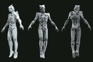
Of course, you don't need an industrial food processing plant in the family to create a striking robot. 12-year veteran artist Stefano Tsai was recently having trouble coming up with suitable feet for his Scout Robot, and found the answer staring up at him from his kitchen table. “There was an Alien facehugger toy on the table, and there was something about its legs that was perfect.”
As a ZBrush instructor Baiphowongse is in a good position to see what does and what does not work during the initial stages of design. "The number one mistake from my students is to work without reference," he says. "Find as much reference as you can before you start a project. The greater your visual library, the more designs you can make."
Like clockwork
While we all have different approaches to our art, we should all start with the basics. Quick Photoshop sketches or blocking 3D models, it's essential to define a form worth developing, worth showering with your reference material on structure, technical background, metal surface treatment, and lighting.
Get the Creative Bloq Newsletter
Daily design news, reviews, how-tos and more, as picked by the editors.
"This is the first blocking stage," says Tsai as he discusses his Robot Scout project, "working with really low polygons and done really quickly – I did the first blocking of my Scout Robot over my lunch break, for example." Keeping this stage of the process time-restricted, will also keep it basic, "making sure the bones of your robot are right."
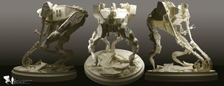
Getting the robot's silhouette at the early stage is essential. "I spend a lot of time focusing on silhouette," says Furio Tedeschi, aka Blaze, "as an exciting silhouette will lead your eye into the concept." For Industrial Light & Magic texture artist Daniil Alikov, the silhouette of his EGR-8 robot was quicker to pin down, as he was mainly working from reference materials of two birds.
"Initially I started with an egret, but then I had to borrow the legs from an emu, since egret's legs and claws are too thin and fragile to become heavy duty machinery," he says. With an overall understanding of shape, Daniil then filled disparate mechanical parts, and his EGR-8 took flight.
Let there be light
Many great robot designs are doomed to live in the shadows. Fittingly for an artist from sun-drenched Brazil, Victor Hugo is adamant on how to ensure your robot gets his moment in the spotlight.
"Lighting is one of the most important things about your model. I've seen great models with bad lighting, and you totally destroy your work," he says. "Try some light and render tests with some colour corrections to check that you're not losing volumes or your modelling work."
Lighting is one of the most important things about your model
Whether your robot is a portfolio piece or a professional commission, you don't want to sell it short. However, making the most impact doesn't always mean bleaching it out in light. "The most common mistake is to make the lighting flat," says Hugo. "Sometimes we get so excited about our work that we want to show it all in one image, and you end up using too many lights. If you want to show your modelling work, render a clay turntable. But in your final shot it's great to aim for a more dramatic feel."
Tools of the trade
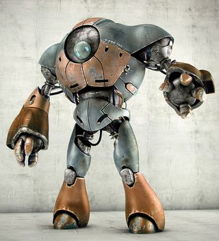
With an array of powerful software packages to hand, the combination of tools you choose to sculpt your robot are limitless. For senior concept designer Ben Mauro, ZBrush is for modelling, KeyShot for rendering, with Photoshop or details. Familiarity with software will play a part in your pipeline, but it's good to step out of your comfort zone now and again.
"For my robot Gorilla Tank I used ZBrush because I really wanted to use this as an exercise to push myself to get better at hard surface design and modelling," says Mauro adding: "I use KeyShot for rendering because it creates such nice results very easily, with very accurate materials. There's a lot of work and clean-up to be done in ZBrush to make things work in KeyShot, but the extra effort is worth it when the final results are so photographic."
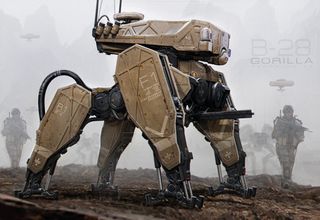
Unsurprisingly for people who spend large amounts of time working with software, some artists preference can become a passion. Paulo Dias fires up 3ds Max for polygonal modelling, even though ZBrush and Mudbox offer great tools for non-organic models. "I'm still in my comfort zone using only one software for 3D and Photoshop composition," he tells us, "for rendering I use V-Ray, which in my opinion is one of the fastest pieces of software on the market. Many come and go, but V-Ray remains."
Movement and function
If you want your robot design to stay in the viewer's mind, getting the movement and function right is essential. Is your robot defensive or aggressive? This will dictate how it looks, how it moves, how bulky or agile it is and what materials it is made from.
"Asking all these questions early on solves loads of problems," says Mauro. "A design that operates primarily in the desert and in rocky mountains will look different to something operating in dense jungle. The more questions you ask of your robot, the more things will take care of themselves."
"I think a lot about movement and rhythm when designing a new robot," says Tsai. "For example, when working on my Scout, I was looking into the movement of spiders, mantes and dinosaurs. Because it's a scout robot it has to be quiet and light on its feet, but strong. I used the spider's movement as a guideline and combined it with muscle strength of dinosaurs and the crafty look of a mantis."
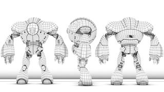
A look at any two recognisable robot designs will immediately reveal the importance of this. "Consider Iron Man and compare it with a Decepticon in Transformers," says Iranian artist Mohammed Hossein Attaran, "the differences are obvious. First, one is so neat and delicate, designed in a way that can allow it to fly freely. Yet its face has one constant expression, serving as a mask. The Decepticon is rough, full of detail and yet has all the facial expressions of a human."
Having been trained as an industrial designer, Luigi Memola constantly thinks about the relationship between the components of his robot, the material it's made from and its shape. "For the droid (Robot Runner) I chose to create a very detailed skeleton," he says. "I imagined that these shells were made from lightweight material, from a composite or plastic." Memola even made room for coloured sponsor logos.
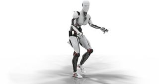
For Alikov, the functionality of a robot is actually at the heart of their appeal. "I adore watching machines like excavators, loaders, cranes, etc," he says, "I love to see how functionality makes up the design of them. I always see them as giant animals or insects building something for humans. That's why I like to make my designs functional looking."
God's clay
Dressing your robot with material detail is a complex interplay that can affect contours and proportion. "That is why the grey models always look great," says Tsai. It's not only the materials, but lighting that you need to pay attention to. "You can make a complicated model easily, but then lose all of its detail once lighting and materials change. That's why I always try and put the blocking colour and lighting into the scene as soon possible." And by creating a multi-material ball Tsai can apply this to all the elements of his scene, to help him find the best solution.
You can make a complicated model easily, but then lose all of its detail once lighting and materials change
Often depicted as purely metal, you can achieve amazing results by combining organic material with mechanics. Getting the mix of materials and texture can set your design off, or encumber it with superfluous detail.
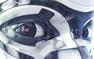
It's a fine line, says Paulo Dias: "And that's why references are so essential for us robot artists. I look at mechanical prostheses - it's fantastic how they're simplified with a harmony of light metals, carbon fibre and silicone." Even the dashboard of a car, made of metal, leather and wood, can set the artist off thinking. "The mix of materials innovates the design in any creative field."
Cool factor
In a world where the appetite for automatons is insatiable, working at having fun seems a wise move. "I made this rule to myself – every night, one concept, one new technical element, one piece of art. It means that I'm constantly engaged with the world of robots and their creators, and it means that I've added a new piece of software into my pipeline for a client in the future," says Dias.
Believable design and wisely selected materials can make your robot compelling, but you shouldn't become a slave to realism. After all, one of the most important reasons to create robots is that they're so damn cool! Having fun pushing what's expected and avoiding clichés can be as important as honing your techniques and 3D design skills.
There have never been any rules for beauty in the world, and it's amazing how far you can push a design
Robot design will always be popular because there is no wrong way of doing it. "There have never been any rules for beauty in the world," says artist Hossein Attaran, "and it's amazing how far you can push a design. Once you know the parameters that can help make a design look professional, what you can create is unlimited."
This article originally appeared in 3D World issue 175.
Liked this? Read these!
- The best 3D movies of 2014
- Discover what's next for Augmented Reality
- Download free textures: high resolution and ready to use now

Thank you for reading 5 articles this month* Join now for unlimited access
Enjoy your first month for just £1 / $1 / €1
*Read 5 free articles per month without a subscription

Join now for unlimited access
Try first month for just £1 / $1 / €1
The Creative Bloq team is made up of a group of design fans, and has changed and evolved since Creative Bloq began back in 2012. The current website team consists of eight full-time members of staff: Editor Georgia Coggan, Deputy Editor Rosie Hilder, Ecommerce Editor Beren Neale, Senior News Editor Daniel Piper, Editor, Digital Art and 3D Ian Dean, Tech Reviews Editor Erlingur Einarsson, Ecommerce Writer Beth Nicholls and Staff Writer Natalie Fear, as well as a roster of freelancers from around the world. The ImagineFX magazine team also pitch in, ensuring that content from leading digital art publication ImagineFX is represented on Creative Bloq.
