How to create an epic 3D fantasy character
Artist Jose Rodriguez channels his influences and experience to create an incredible character.
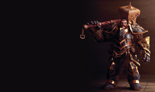
This 3D art project, called Heavy Knight, was based on a character design concept of an elite heavy knight for the universe of Twilight Monk by Trent Kaniuga. Senior character artist Jose Rodriguez spent six months on and off working on the render between freelance projects. The base was created in 3ds Max with V-Ray and then ZBrush was used to create all details for the displacement maps.
While Rodriguez says he works in a very traditional way, he often experiments, mixing techniques in 3ds Max and ZBrush to create hard surfaces for his props. Overall the artist says there are two areas to his work he particularly enjoys: "I love sculpting the high-resolution details and the compositing work to bring the picture to life."
I love sculpting the high-resolution details and the compositing work to bring the picture to life
When it comes to his influences for Heavy Knight and work in general, Rodriguez says: "The awesome work of different 2D and 3D artists is a great influence, but the best inspiration comes from the cinematic work done by some game companies, especially cinematics by Blur and Blizzard, their technical level, aesthetic and atmosphere is unique in every movie from them."
01. Creating the base
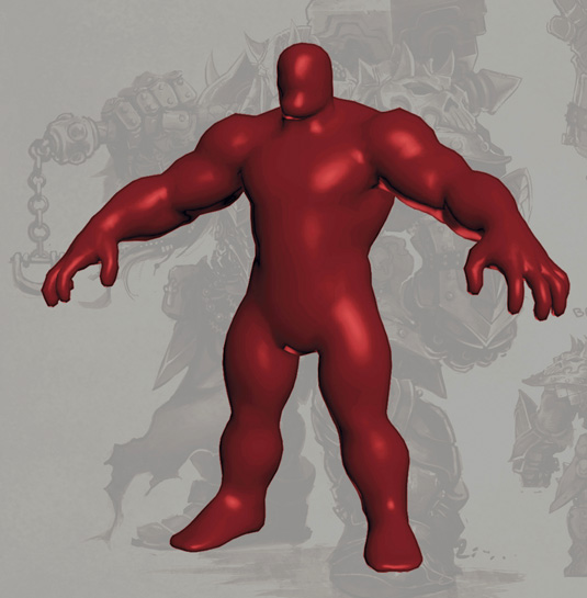
This character's armour design is highly detailed so, to be able to model every part, I need to support it over the character's body, and, for that, I had to discover the body beneath the armour. A fast drawing and a basic model helps me to understand the anatomy.
02. Working with multiple objects
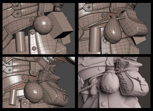
By design there are several overlapped objects in the character's waist. To work on this I created different primitives simulating the basic shape, size and position of the props, then I created a basic model for each piece and finally added the detail in ZBrush.
03. Adding details
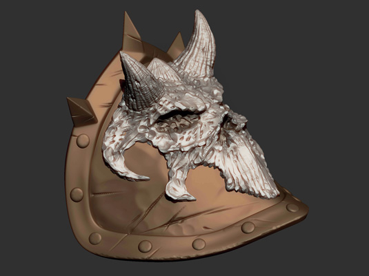
Once I have the shape and position of the shoulder pad, I add the skulls. These are modelled in ZBrush with DynaMesh and I use ZRemesher to get a basic geometry, and then I use Topogun to make a better adjustment. When I'm happy that the geometry is correct, it's time to add details like the cracks.
04. Functional geometry
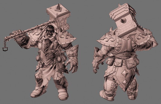
Even though the original idea was to create a still image, I always try to achieve an organised geometry that can be rigged and animated, this is a personal preference, but having that kind of geometry helps a lot in other parts of the process.
Get the Creative Bloq Newsletter
Daily design news, reviews, how-tos and more, as picked by the editors.
05. Colour study
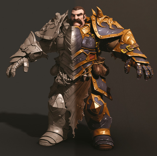
The character is a full-armour figure with a lot of different armour pieces and giving colour to a monochrome design can be a real challenge. In this case, two colours and different shadings are the key, a fast overpaint helps you to know how to place them.
06. Defining the pose
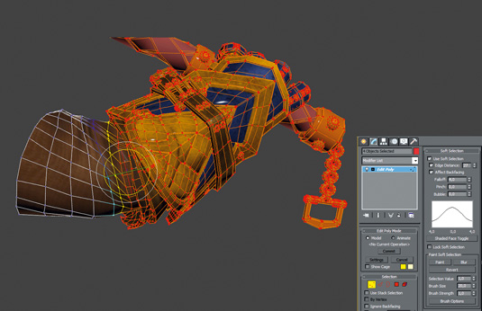
The character's pose is a rigid one as the weights are centred due to the armour's bulk. I could use ZBrush to pose the figure, but I go traditional instead. I select the armour pieces, apply an EditPoly modifier in 3ds Max, and using Soft Selection I play with the rotation and move each piece until it reaches a convincing pose.
07. Background
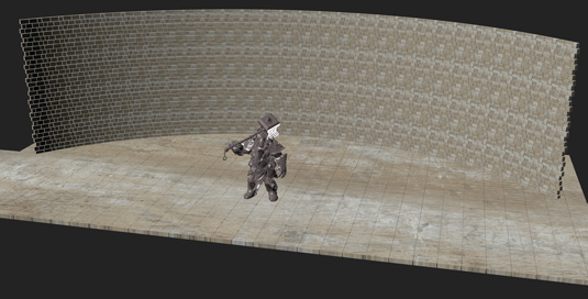
I want a simple background to give the leading role to the character. The set creation was really fast, I made a couple of bricks, frontally mapped, instanced them to create a straight wall and finally applied a Bend modifier to give it a curved aspect – something fast and simple.
08. Working the render passes
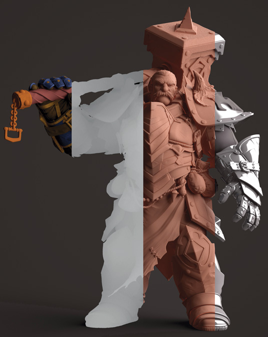
For the render stage I extracted just a few passes so that I could mask them and play around with them at the compositing stage: Shaded Diffuse for Colour and shadows; Ambient Occlusion for visual detail; Zbuffer for a depth-of-field effect; Shaded Subsurface Scattering for the skin effect and shadow tinting; and finally Reflections.
09. Compositing
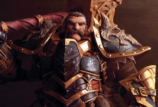
The final challenge was to drive the viewer's attention to the small head between all the metallic reflections of the armour. To achieve this I decide to separate the background from the character, I darken it and force a whitish reflection below the face.
This article originally appeared in 3D World issue 180.

Thank you for reading 5 articles this month* Join now for unlimited access
Enjoy your first month for just £1 / $1 / €1
*Read 5 free articles per month without a subscription

Join now for unlimited access
Try first month for just £1 / $1 / €1

The Creative Bloq team is made up of a group of art and design enthusiasts, and has changed and evolved since Creative Bloq began back in 2012. The current website team consists of eight full-time members of staff: Editor Georgia Coggan, Deputy Editor Rosie Hilder, Ecommerce Editor Beren Neale, Senior News Editor Daniel Piper, Editor, Digital Art and 3D Ian Dean, Tech Reviews Editor Erlingur Einarsson, Ecommerce Writer Beth Nicholls and Staff Writer Natalie Fear, as well as a roster of freelancers from around the world. The ImagineFX magazine team also pitch in, ensuring that content from leading digital art publication ImagineFX is represented on Creative Bloq.
