How to create detailed 3D environments
Discover how to create a 3D scene with drama and realism using Pixar's RenderMan.
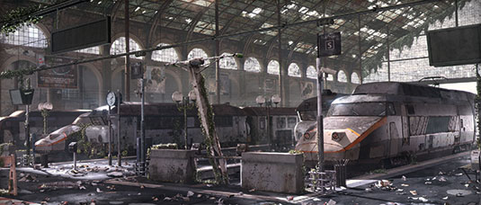
Creating any 3D art is a complex and time-consuming process, especially when it comes to 3D environments and the amount of detail needed. For this piece, my main reference is the urban photography movement called urbex. To sum up, it's the exploration of abandoned man-made structures.
I spent a lot of time online searching for good references. Looking at all these abandoned places where people used to live is amazing. The classical paintings (like Giovanni Paolo Panini's ruins paintings) apocalyptic movies and TV series also inspired me a lot – mostly The Walking Dead and I Am Legend. I really like architecture and trains so I thought about creating this abandoned train station.
I think that personal projects are one of the best ways to learn and experiment techniques
The cool thing about this kind of project is that you can really have fun with modelling, texturing and lighting, to give to your image a nice mood. I'm a big fan of hard surface modelling so I really appreciated this part of the project.
There are a lot of assets to take care of and a lot of work to do. I created this project in my spare time and I think that personal projects are one of the best ways to learn and experiment techniques. It took me about three months to complete the project.
01. References
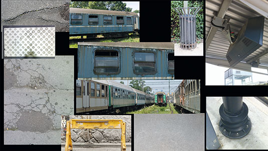
When starting a project gather as many references as possible. You'll come back to these all the time so do it well. I started collecting references about abandoned places and architectures then searched for trains and the different objects you can find in a train station.
I really recommend using the Kuadro software – a free image viewer. It allows you to place, scale, rotate as many references as you may need in your screen.
02. Layout and composition
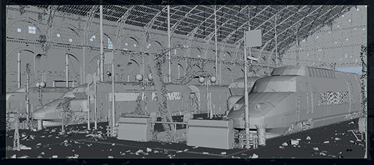
I start creating my environment illustration by placing some basic polygon shapes in my scene. You'll find doing this gives you a simple and rough idea of what your scene is going to look like.
I place the main objects and don't go too far into the modelling at this stage as I'm only looking for a rough guide to how my final composition will look. every basic mesh is going to be replaced by the final models, so there is no need to worry about topology during layout.
I always try to make every area of my image interesting when working on an environment illustration like this one; but make sure you don't get lost in the image and pay careful attention to camera placements. Though we're working in a 3D space it can be useful to employ traditional art theory on the rule of thirds and the Golden Ratio to ensure a balance to the scene.
03. The modelling stage
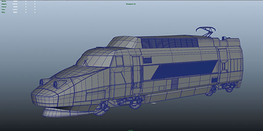
Again, go back to your references and display some on your screen. Depending on how far your object is from the camera, choose the right amount of details. Always work with real word units to avoid problems later on. I recommend using the Modelling toolkit in Maya, as it gives you access to the main modelling tools and makes you work faster. I also work a lot with shortcuts to save me some time.
04. Use paint effects for ivy
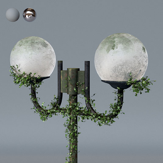
As I'm creating an abandoned place, I wanted ivy in my scene and Paint effects are perfect for this. Go to Window>General editors>Visor>plantsMesh and choose the ivy.mel. To use them, select your object and go to the Paint effects tab (Rendering mode for Maya 2015 or Modeling>Generate in Maya 2016) and click Make Paintable.
When you're happy with the look of your stroke, go to Modify>convert>Paint effects to Polygons, check Quad Output and Apply.
05. Making UVS easier
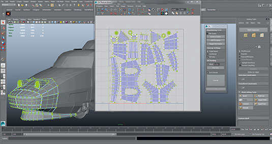
UVs are definitely not the most enjoyable part of the work but they need to be done correctly to avoid problems during texturing. I used a very cool script called XrayUnwrap, from Raylight to help me when unwrapping UVs, you can download it from the website. It's not free but it's definitely worth the money. It's the fastest tool I have ever used for UVs within Maya.
06. Lighting in Renderman
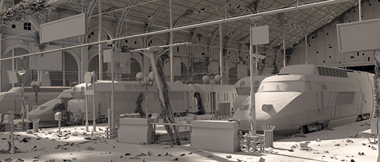
I used RenderMan RIs for rendering. I created an environment light with an HDR and placed a few more lights in the scene. As the roof is partially destroyed, I put my key light above it to get nice shadows. The Pixar standard Area light has really cool functionalities.
You can enable the barndoors to focus a bit more light in certain areas. You can also set up the component Weights to choose how much the light is going to influence the specular or the diffuse.
07. Renderman attributes
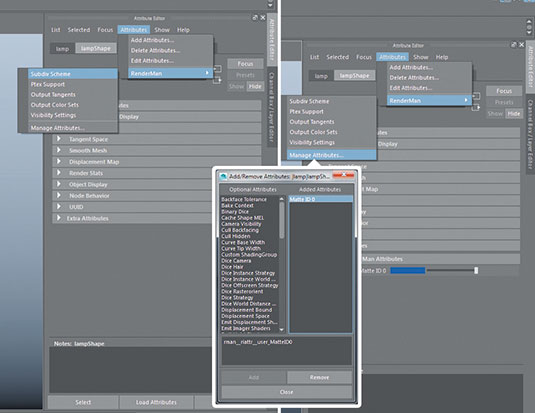
RenderMan has a lot of hidden Attributes that you can enable when you need them. For instance, instead of smoothing your model, you can add a subdiv scheme by clicking in the shelf button or by going to Attribute editor>Attributes>RenderMan> subdiv scheme. You can also add a Matte ID to your object in order to get an ID pass that you can use in compositing for isolating objects.
08. Set up the passes
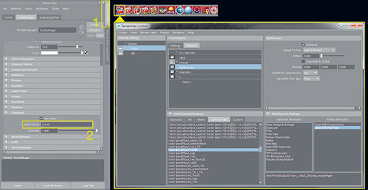
Enable the Light Groups to separate each light. select your light and go to the Advanced tab. In the Light Group field, choose a name for the Light Group (either assign multiple lights inside a group or split each light in your scene). The more you split, the more control in compositing.
When finished, open RenderMan controls and go to final Defaults settings. In the Light Groups tab, select the desired passes. Rght-click>create One Output from channels to get a multichannel eXR.
09. Split the passes in Nuke
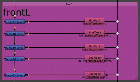
Import your EXR into nuke and shuffle the passes in order to rebuild your beauty pass. I really recommend you use Backdrop and Dot nodes in order to stay organised in your Nuke script. When it's done, adjust the intensity of the light and the specular. You can also tint your lights and speculars by adding a Grade node and adjusting the parameters.
10. Detail in Photoshop
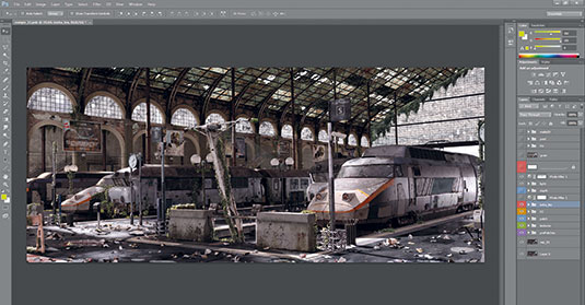
When I was happy with the look of my image in Nuke, I import my image into Photoshop in order to add more details. I start by adding more textures and dirt. I also enhance the contrast of certain areas or objects using the Matte ID I created in Maya, to create variation.
This step is important so you get a better legibility of your image. When everything is finished I add the chromatic aberration, the vignetting, and the depth of field to enhance the realism of the image.
This article was originally published in 3D World magazine issue 207. Buy it here.

Thank you for reading 5 articles this month* Join now for unlimited access
Enjoy your first month for just £1 / $1 / €1
*Read 5 free articles per month without a subscription

Join now for unlimited access
Try first month for just £1 / $1 / €1
Get the Creative Bloq Newsletter
Daily design news, reviews, how-tos and more, as picked by the editors.
