How to create a character for Kellogg's
Blackmeal explain how they designed fruity characters for the cereal giant's latest campaign.
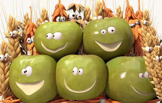
Rolling out this month, this 3D illustrated and animated campaign for breakfast cereal giant Kellogg's shows how many fruits and grains are packed into every single Nutri-grain breakfast cereal bar.
The artwork and character development are work of production house jelly London's French crew Blackmeal, who worked closely with London creative agencies Isobar and Leo Burnett in creating the lifelike characters.
The campaign, which is appearing across 1,500 screens in convenience stores, as well as OOH, print, and digital/social, is designed to be fully responsive for use across all devices. We chatted to the creatives at Blackmeal, who revealed how they went about fulfilling this top-level campaign...
The brief
"The brief from Kellogg's and Isobar was to create a bunch of suicidal fruits and cereals looking as real as possible in terms of shape and texture, and turn them into fun characters," explains Blackmeal creative director and executive producer Mael Francois.
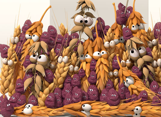
"The fruits and cereals needed to look yummy while being part of crazy scenarios, which we also needed to make as clear as possible to the public so that we get what's going on in the blink of an eye."
Interestingly, both the prints and animations needed to target the adults that buy the cereals, not the kids who eat them, he stresses.
Technical challenges
During production Blackmeal mainly used Maya to create the characters in CG, plus Arnold for rendering.
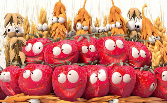
The bull (see poster below) was the only character with fur, which was created using Yeti. Compositing and print work was finalised in After Effects and Photoshop.
Challenges
The team faced several big technical challenges, Francois reveals. "The first was to figure how to give a real, fresh and yummy feel to a fruit with eyes and mouth.
"For one second we were looking at the back of the fruit and we were thinking 'this is perfect' and the next we were looking at it from the front and it didn't seem like it was working. We had to find the right balance in texture, details, colour intensity to make them work."
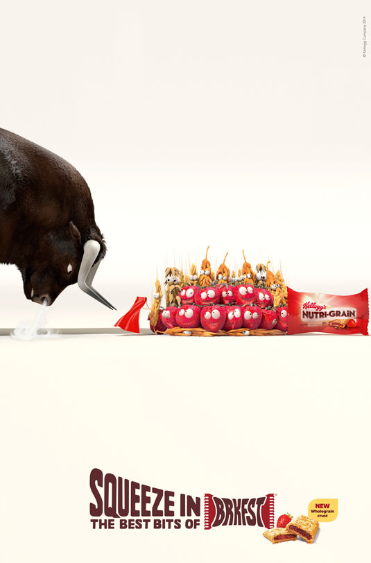
The second challenge was to differentiate the cereals among themselves, even though they had very similar textures and colours.
And the third was the sheer number on characters on screen. "While the apple scenes had 'only' 40-50 characters, the raisin concept had more than 130, which was challenging to animate and render," Francois says.
Facial expressions
The Blackmeal team worked closely with the agency to get the exact facial expressions that they were looking for, Francois adds.
"As for the character designs, we tried to stay as close as possible to the actual fruits and cereals. One of our first reference for mouth and eyes was Aardman works, we then played and built from that stage."
Kellogg's wanted the fruit to look as natural as possible – even if they are little characters with big eyes – because the Nutri-Grain bars contain real, natural ingredients. The executions tell a visual story: there is much more fruit and cereal in your Nutri-grain cereal bar than you would imagine possible.
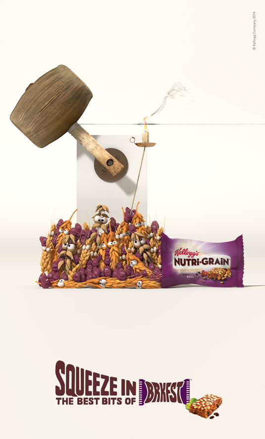
"Giving life to a fruity character is very similar to giving life to a CG human," he adds. "It's all about how you use colour and manipulate expressions in the eyes."
Colour and lighting
"Fruit is naturally very colourful, but the way the colour is shown through translucent materials and smooth lighting determines whether it looks alive," says Francois. "Using flat colours will make your fruit character look fake, waxy or worse: dead. The trick is always to find a perfect balance between translucency and vibrant colour."
"Our brief was to make the fruit and grains as realistic as possible, which meant that to make them convey emotions we had to work mostly with their interaction – how they push and squash to get into the breakfast bar – and their silhouettes.
"We had a lot of fun playing with their facial expressions as they mainly consist of big eyes and exploring how you can change the personality of a character just by opening or closing its eyes differently."
Lettering
"The typography for the campaign was created by jelly London’s star typographer Alison Carmichael, who's known for her hand-lettering and bespoke type design across many well-known brands.
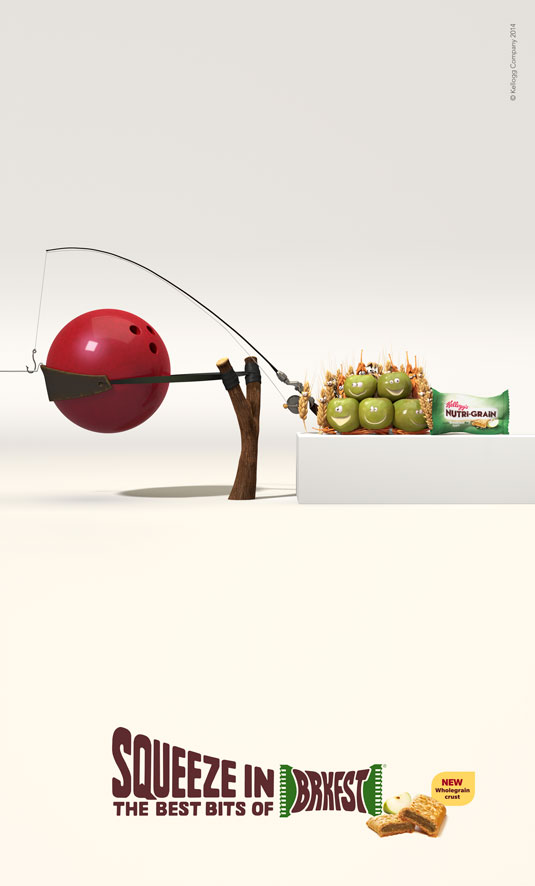
"The look and feel for this lettering is friendly and tasty, while it looks like it’s being squeezed into a Nutri-grain wrapper," she says. "Legibility for this type is very important when you distort letterforms in this way, especially since 'Brkfst' is a squeezed, made up word in itself."

Thank you for reading 5 articles this month* Join now for unlimited access
Enjoy your first month for just £1 / $1 / €1
*Read 5 free articles per month without a subscription

Join now for unlimited access
Try first month for just £1 / $1 / €1
Get the Creative Bloq Newsletter
Daily design news, reviews, how-tos and more, as picked by the editors.

Tom May is an award-winning journalist and editor specialising in design, photography and technology. Author of the Amazon #1 bestseller Great TED Talks: Creativity, published by Pavilion Books, Tom was previously editor of Professional Photography magazine, associate editor at Creative Bloq, and deputy editor at net magazine. Today, he is a regular contributor to Creative Bloq and its sister sites Digital Camera World, T3.com and Tech Radar. He also writes for Creative Boom and works on content marketing projects.
