How to create a 3D spacesuit
From sketching patterns to adding fine details, CG artist Chris Chui shares his workflow for creating authentic digital clothing.
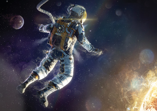
Marvelous Designer simulates clothing based on physical properties rather than being an artist's approximation or observation. It allows you to tailor clothing like a fashion designer would, without some of the real-world pains. You design or trace existing patterns and pin them to an avatar. From there you can push or pull the fabric as if it were real, to get the look you want.
The best thing is that it is all live and interactive. If I want to create a fabric hose to protect the oxygen tubes, I simply pull the hose over the tube as if putting socks on. The astronaut was inspired by some of the recent sci-fi films, such as Gravity and Elysium. The image is of an astronaut caught in the moment of an awe-inspiring view. I named the render Astral Projection because the I feel the viewer takes the position of the floating astronaut having an out-of-body experience.
Marvelous Designer's website contains some basic tutorials that I thoroughly recommend that you watch, alternatively you could look at my YouTube channel, where I'll be releasing full videos of the project.
01. Rough out the concept
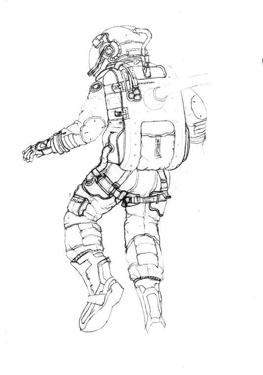
Painting concepts isn't my strength, so I like to sketch in pencil over a rough 3D model. Start by posing the default avatar and quickly make a full body suit. This way you'll have something more to begin with and can quickly find out what doesn’t work. If you're like me and drawing isn't your strength, it's still important to get rough ideas out whether or not you end up going in the direction of the sketch.
02. Lay out the large elements
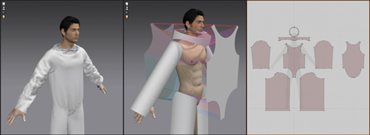
I find it easier to base my patterns on existing clothing where possible. Try Googling to find some free patterns and derive your own from things you see. When drawing your patterns try to use shortcuts to speed up your workflow. Also keep your particle distance (subdivision)
low resolution while developing your design so everything stays live and interactive.
03. Adjust hems and tailor your garment
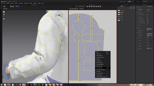
When the basic suit has been cut and sewn together, adjust its
cut and lengths. By adjusting the suit, you can make certain areas looser and tighter to better emphasise the shape of the character.
The astronaut isn't the best example to use to see this technique in action, since it's a loose sack with arms and legs, but for more form-fitting characters you might want to utilise Show Line Lengths (as in the image above) to get more precise lengths.
Get the Creative Bloq Newsletter
Daily design news, reviews, how-tos and more, as picked by the editors.
04. Choose the correct fabric for the job
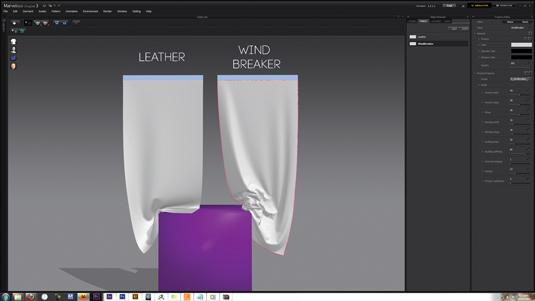
Marvelous Designer has a great selection of fabric presets, which
can be enhanced with a few tweaks. The direction you draw your patterns in Marvelous Designer affects various physical properties of the fabric, for example, how it might stretch.
Weft and warp are terms that appear often: weft corresponds to horizontal directions and warp is the vertical direction (in the 2D pattern window). To explain, the Weft Stretch setting correlates to how much your garment will stretch horizontally.
05. Add pockets and seam lines
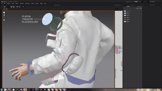
To add small details such as the pockets, start with basic shapes and adjust the cut. More often than not, I will want the fabric to interact with a hard surface object, so I do my best to approximate it.
The image above shows a frozen circle, which is the placeholder for a plasma thruster. Don't forget to adjust the fold angles (as shown in the images on the far right) because it's vital when replicating real-world seams.
06. Covering the pipes in fabric
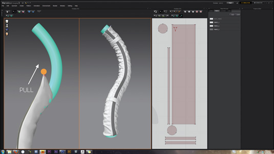
To cover the pipes in fabric, import the pipes from 3ds Max to
Marvelous Designer as an avatar. The pattern for the cover is simply a rectangle. Sew the seams together and slowly pull the cover over the pipe, as if putting on a long sock.
With the fabric fixed to the avatar you can enlarge it using the Shrinkage parameter from the Fabric tab on the right, this makes the pipe looser and creates cool folds. You can also modify various parameters to get the look you are searching for.
07. Finalise your garment
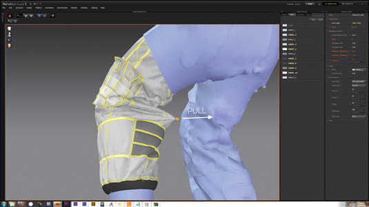
Next, you simply click and pull on the fabric as if you were adjusting
wrinkles on real clothing. Adjust the fabric until you get something you're happy with. I like to separate my project into smaller files to speed up save times and keep files sizes down.
Also, it's best practice to save iterations: doing this has rescued me more than a few times! So, once you have something you're happy with, just reduce the particle size to 1 or 2 and let it simulate for a few minutes.
08. Exporting to 3ds Max
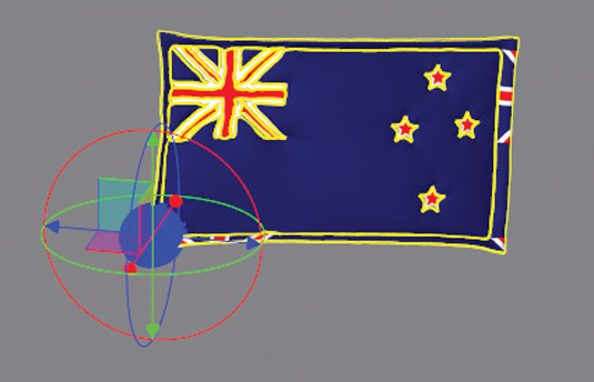
When exporting, tick Multiple Objects, Unified UV Coordinates and set the scale to inches. Doing this means that each piece of fabric will be a separate object and the UVs will be the same size overall (as shown in the image on the left).
09. Slideknit tools
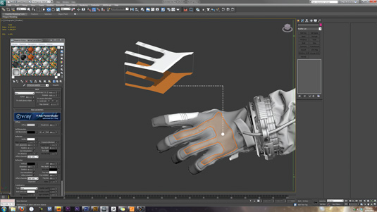
To create a protective plastic layer on the gloves, I used an extremely useful script called SlideKnit by Robin Deitch. It's similar to Monkey Labs' MLDecorate, but works in recent versions of 3ds Max.
SlideKnit enables you to take a UV mapped object and flatten it based on its UVs (as shown in the above image). This means you can build your model on a flat surface and use Skin Wrap to bind it to the flattened surface. The flattened object has a morph modifier on it, which the newly bound object follows when reset back to its pre-flattened state.
10. Finishing the modelling
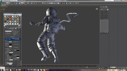
We don't have time to go into the hard surface modelling stage in this tutorial, but the techniques I use were taught to me by Grant Warwick, who made an excellent Hard Surface tutorial on the topic.
The rest of the astronaut is pretty straightforward, it's poly modelled in 3ds Max. I model everything in its posed position. I also use V-Ray fur to create the Velcro pads on the astronaut's arms and legs.
11. Shading and texturing

In this stage, I'll just touch briefly on one part of my shading process. My shaders are combinations of basic V-Ray Materials within a V-Ray Blend Material. Above is an example of all the Shaders that are combined to create the oxygen cap.
The first is the base material which the third is then blended via the second as a mask (V-Ray Dirt Material). The fourth is the extra glossy fresnel coat and the fifth is the mask for the O2 decal. The final product is the last and, as you can see, the oxygen cap now has the appearance of a little wear and tear from frequent use by our astronaut.
12. Changes before rendering

A quick note on an essential step: always mark-up your near
final renders a day later at full screen and using fresh eyes, to ensure you're absolutely happy and make improvements. I try not to over think things and pick bits that seem weird or unclear. Don't forget to show friends, family and other artists. Take their feedback on board (with a grain of salt) and stick with your gut feeling.
13. Compositing the various passes
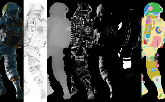
My workflow is simple, I almost always have one beauty render
where I get the subject looking as good as possible in a single raw render. I will supplement that with the various passes shown here. Note the Grunge Alpha, this is a V-Ray Dirt Material with inverted Normals and some Noise. It enables me to paint in a little extra grunge in post.
14. Final tweaks and changes
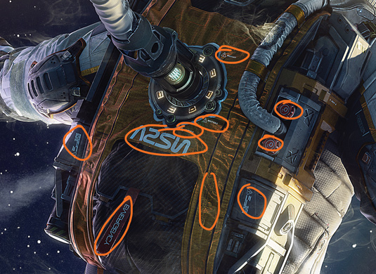
When it comes to post-production, I just try to push what would
otherwise take much longer in 3D. The render was looking too Cyan, so I pulled that back and made the white fabric more vibrant. You might notice that the whole image has been flipped. It's never too late to make a change, and in this case I loved the flipped version much more than the original.
Words: Chris Chui
Chris Chui is a New Zealand-based CG artist working in the print advertising industry. He has a keen interest in character design. This article originally appeared in 3D World issue 177.

Thank you for reading 5 articles this month* Join now for unlimited access
Enjoy your first month for just £1 / $1 / €1
*Read 5 free articles per month without a subscription

Join now for unlimited access
Try first month for just £1 / $1 / €1

The Creative Bloq team is made up of a group of art and design enthusiasts, and has changed and evolved since Creative Bloq began back in 2012. The current website team consists of eight full-time members of staff: Editor Georgia Coggan, Deputy Editor Rosie Hilder, Ecommerce Editor Beren Neale, Senior News Editor Daniel Piper, Editor, Digital Art and 3D Ian Dean, Tech Reviews Editor Erlingur Einarsson, Ecommerce Writer Beth Nicholls and Staff Writer Natalie Fear, as well as a roster of freelancers from around the world. The ImagineFX magazine team also pitch in, ensuring that content from leading digital art publication ImagineFX is represented on Creative Bloq.
