How to add textures to a basic game environment
In part two of our six-part series, Andrew Finch explains the steps to texture a professional-looking environment for a video game.
04. Finalising diffuse map

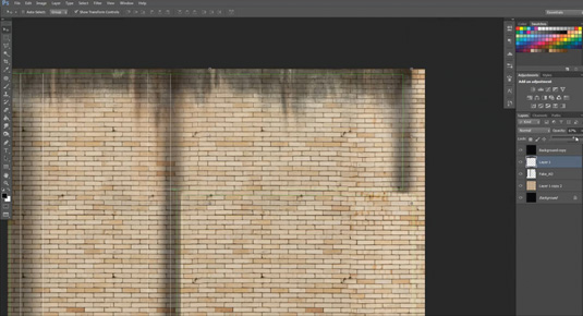
Add weathering to the wall by importing greyscale grunge maps and multiply the layer in Photoshop so they blend in with the wall texture. I like to fake ambient occlusion to some areas of the walls by painting in soft black areas and setting opacity to low, this helps to give the asset some definition when it’s baked in the engine. It's quick and dirty, but gives the effect I am looking for. Adding details like graffiti to the texture page gives it more realism.
Making a natural wall surface
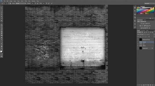
Colouring your brick work with different shades of white, grey and black will give your normal map an uneven surface, pushing and pulling the individual bricks in and out and enhancing the natural, realistic look we are attempting to achieve
05. Specular map

The specular map gives lighting information for our surfaces. The whiter the texture the more specular or gloss it will have, the darker the texture the more matte it will be.
In this example, you can see the metallic garage door will be quite a shiny surface, so it is almost completely white in our texture; the brick work would not be shiny so it is a dark grey. Keep the dirty grunge texture included as this will help to show a variation of specular levels on the surface.
06. Creating the Normal map

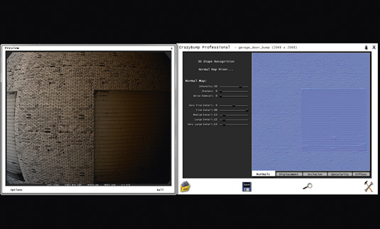
Use a greyscale version of the diffuse (height) map as a base and start to paint over light and dark areas that you want to be pushed in or pulled out in the normal map. Remove the grunge and graffiti layers from your height map, then bring it into CrazyBump.
Once CrazyBump has finish calculating the normals, turn the medium to large details right down to reduce lumpy, rounded edges; keep the fine detail high to pick out the rough concrete surface details.
Stitch tools
Stitch edge tools are very handy. Selecting an edge and clicking the Stitch tool will move and weld the correct UV cluster – perfect for manually unwrapping complex assets
Expert tip: Using the UV layer as a guide
Duplicate the UV render, move it to the top of the layer stack and set it to Colour Dodge. This provides guidelines to work with so you can correctly line up textures to the model.
Words: Andrew Finch
Andrew is a senior environment and lighting artist at Codemasters Game Studio in Birmingham. He has been in the industry for seven years.
This article first appeared in issue 188 of 3D World magazine.
Like this? Read these!
- Part One of How to create a basic game environment
- How to land your dream job in animation
- Download free textures: high resolution and ready to use now

Thank you for reading 5 articles this month* Join now for unlimited access
Enjoy your first month for just £1 / $1 / €1
*Read 5 free articles per month without a subscription

Join now for unlimited access
Try first month for just £1 / $1 / €1
Get the Creative Bloq Newsletter
Daily design news, reviews, how-tos and more, as picked by the editors.

The Creative Bloq team is made up of a group of art and design enthusiasts, and has changed and evolved since Creative Bloq began back in 2012. The current website team consists of eight full-time members of staff: Editor Georgia Coggan, Deputy Editor Rosie Hilder, Ecommerce Editor Beren Neale, Senior News Editor Daniel Piper, Editor, Digital Art and 3D Ian Dean, Tech Reviews Editor Erlingur Einarsson, Ecommerce Writer Beth Nicholls and Staff Writer Natalie Fear, as well as a roster of freelancers from around the world. The ImagineFX magazine team also pitch in, ensuring that content from leading digital art publication ImagineFX is represented on Creative Bloq.
