Creating an imagination machine for Bombay Sapphire
In its ad campaign for Bombay Sapphire, Nexus Productions captured stories about botanicals from around the world and distilled them into an exotic living machine.
Gravity Road commissioned Nexus Productions to realise its imagination machine concept for Bombay Sapphire gin. The campaign included a 20-second 3D animation for outdoor LCD screens, print ads and takeover installations in London's underground.
Gravity Road initially commissioned us to create print ads with an animated version to appear on screens at locations such as bus stops. Mark Boyd, the agency's founder and creative director, and his colleagues had already been working on the 'Imagination' series for quite some time when they came to us with this brief, and they had high expectations for the outcome.
Mark and his team approached us with the basic concept in place. This consisted of a cocktail glass filled with imagery depicting stories from around the world, with specific notes around the botanicals - the flavours, herbs and spices used to make Bombay Sapphire gin - that would together comprise the 'Imagination Machine'.
The other inspiration was Thomas Heatherwick who designed the Bombay Sapphire distillery at Laverstoke. These individual stories represented different facets of the brand's history that would be distilled down through the glass, delivering a drop of gin into the bottle at the end of every 20-second animation loop.
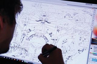
Gravity Road was very keen to create a physical 3D model - it may seem like a 2D piece, but it's really a very intricate design that was built entirely in 3D. We needed to express the beauty in these stories, and find the most imaginative way of thinking about them. Gravity Road provided us with a scamp and a wealth of information about every individual element and process.
It was our job to extract the right touches so as not to make it purely about the ingredients, but to excite and tease the audience. We had extensive discussions as we started to flesh out the content and overall composition - we did a lot of sketching during those beginning stages and many ideas were thrown out to be re-imagined.
01. Start with segments
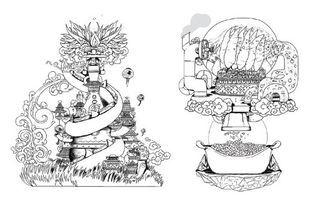
There were loads of different elements we could potentially put inside the glass, so to start with we segmented everything by writing words in separate areas. Then we put our imaginations to work - such as imagining the wildest dream of where a juniper berry might be harvested.
02. Sketch and return
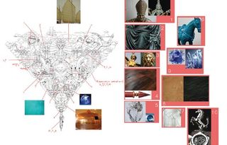
We started sketching, putting the elements together in different combinations and getting feedback from Gravity Road. We had more information than we could ever include - the inside of the glass is detailed, but it takes up a comparatively small space in the overall picture.
03. Move to 3D

It took many stages of 2D sketching to produce something we all agreed on. Once that was approved, we could start building the elements in 3ds Max and positioning them within the three-dimensional space. We took all the models and put them into a rough layout.
04. Lines of focus
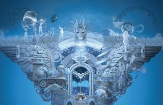
Each element had to make sense in isolation, so people understood what they saw whether they watched the full loop or not. To avoid people getting stuck in the middle of the image, we used lines like the pipes and waterfall to lead the eye down to the central point where the gin is distilled.
05. Right abstractions
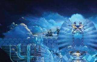
The design for the top of the glass needed to be the most ethereal, and it was this part that went through most changes. We had to figure out just how abstract to make it - too abstract and it wouldn't have worked with the rest of the image. We also experimented with steam coming out in different places.
06. Getting the blues
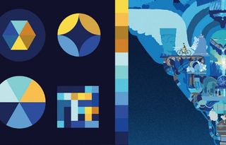
We worked with Bombay Sapphire's brand blue, using the bottle as a reference and varying the blue to emphasise details. For the bottom of the glass, we shot some caustics through the bottle to capture the effect of light as seen through gin, and transposed those onto the bottom of the image.
07. 3D layers
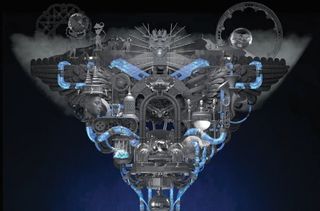
We built up the image in 3D layers to create a true sense of depth and detail. Each of the objects inside were all built in 3D but designed on planes, which is more complex than it first seems. We used Houdini for the effects and Nuke to composite, as well as Photoshop throughout.
08. Speed tests
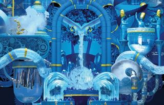
It took a long process of trial and error to find the right pace for the animations. While we needed to keep things interesting, it was also important to convey the size - things move more slowly when they're bigger, so animating too quickly would have made it all look miniature.
09. Final resolutions
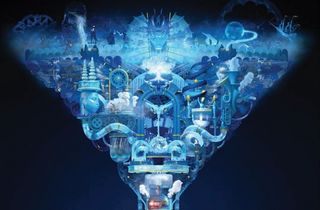
The print was created at 12k resolution. We couldn't re-render at that size for outdoor screens - it would take years - so we took that print and rendered individual animated segments in a different resolution. The end result is something of a hybrid between film and print.
Conclusion
This was a really collaborative project. We were in contact with Gravity Road throughout the process, with quite a few meetings and regular emails back and forth to get the details right and really understand the brand. We were sending work in progress across to them several times a week.
Getting the composition right was a delicate process. We wanted people to both know and question what they were looking at. The aim was to influence the viewer's idea of what they were seeing without telling them exactly what to think or pushing ideas too overtly. Each animation also needed to be self-contained, as people walking past a digital poster aren't necessarily going to stop and watch the whole animation.
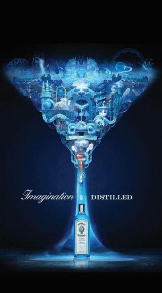
The final deliverables included cropped versions with the correct dimensions for the station takeovers, which were printed and made by Gravity Road. We also created a second version of the image for the European market with a slightly different-shaped glass. Now that the finished design is in place, we can potentially look at what else can be done with it, as the 'Imagination Machine' concept is very adaptable and should lend itself to more applications in the future.
Nexus Productions is an ideas-led, design-driven studio, and we like to combine great design and storytelling with technical expertise. Generally, we've been known for animation character work and lots of narrative-based work, so it was great to work on a beautiful, ambient, stylish piece of film for outdoor media - something we haven't traditionally done so much of. We've done design and print work outside, but it was great to work with this space and think about what could best be done with it.
Words: Julia Parfitt
Julia heads up the production team at Nexus. She's been at the company since its inception 15 years ago working on many high-profile projects, including winners of two Cannes Lions Grand Prix awards and several Yellow and Black D&AD pencils. This article originally appeared in Computer Arts issue 223.
Liked this? Read these!
- The best 3D movies coming in 2014
- Discover what's next for Augmented Reality
- Create a perfect mood board with these pro tips and tools

Thank you for reading 5 articles this month* Join now for unlimited access
Enjoy your first month for just £1 / $1 / €1
*Read 5 free articles per month without a subscription

Join now for unlimited access
Try first month for just £1 / $1 / €1
Get the Creative Bloq Newsletter
Daily design news, reviews, how-tos and more, as picked by the editors.
The Creative Bloq team is made up of a group of design fans, and has changed and evolved since Creative Bloq began back in 2012. The current website team consists of eight full-time members of staff: Editor Georgia Coggan, Deputy Editor Rosie Hilder, Ecommerce Editor Beren Neale, Senior News Editor Daniel Piper, Editor, Digital Art and 3D Ian Dean, Tech Reviews Editor Erlingur Einarsson, Ecommerce Writer Beth Nicholls and Staff Writer Natalie Fear, as well as a roster of freelancers from around the world. The ImagineFX magazine team also pitch in, ensuring that content from leading digital art publication ImagineFX is represented on Creative Bloq.
