Creating convincing 3D materials
See how different material aspects come together to produce realistic elements.
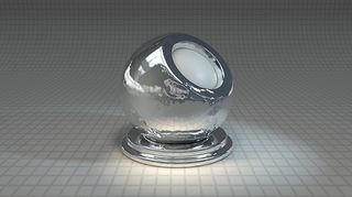
When it comes to creating convincing 3d art materials, my method deals with a few aspects of material creation that are really important to producing believable renders. The overall solution is a combination of things, but the main part would be to have a standardised method for creation that you stick to, allowing you to always work in a predictable situation. This will support your ability to recognise faults that lie elsewhere in your scene, such as lighting or render settings.
The trick here is to set up an object that can cater to different types of material, from solid surfaces to transparent or translucent ones. Usually a sphere with some detail works well and, in this example, I have a ring beneath the surface to help when working with SSS.
Other elements you will need to make this scene work are an environment, which should have something that can show in reflective materials. I actually use a combination HDRI on a sky dome as well as an image-based spot light. This means I can turn light sources on and off, which is great for when you're working with light-emitting materials.
If you find yourself working on a project that doesn't have a GI solution, you will want to switch to a procedural lighting setup
When it comes to the lighting on the scene it is more important to get simple but variable options so you can easily deal with different render requirements. For example, if you find yourself working on a project that doesn't have a GI solution, you will want to switch to a procedural lighting setup, using your host software's procedural lights, which may or may not include falloff.
These days it's more common than not that you will be using a linear workflow, but keep in mind that you may not. It's worth having a duplicate of the material setup scene for this, as turning it off will have quite a few knock-on effects for your materials.
Next, and in some ways most importantly, there is the element of scale. I talk about this a lot in my classes and training articles and it is becoming more and more important as we move to ever more physically accurate render solutions.
Set up your scene using a known scale and create your materials based on this scale. A metre is a good middle ground and caters well for everything from product design to architectural visualisation. Having a grid in your studio is a good way to help reinforce this, but keep it mid-grey to avoid it skewing your material work.
Finally there are the physical attributes. Most apps let you specify things like refractive index and Fresnel settings, and even IES profiles; so a quick search can help bring the most realism to your work.
01. Scene Basics
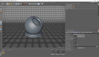
The first thing you need to do is build a scene for your material creation. I tend to use a simple cyclorama-style studio in Cinema 4D, with the grid on it for scale reference. Then you need the actual reference object. I'd opt for an adapted sphere, with an internal object and a base with sharper edges. Choose a size that's easy to work with and allows for tiling.
02. Lighting Rig
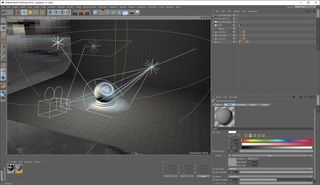
Next, you need a sky with your chosen HDRI applied. As mentioned you will probably want to set up a couple of image-based lights as well as procedural ones. Adding the image-based lights to parametric geometry will make it easy to activate/deactivate them as needed, saving on scene management while you work.
03. Render Settings
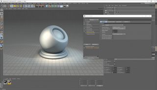
It's hard to dictate what the appropriate settings should be, but I'd suggest saving a few presets, one for each type of situation you think you might work in, such as different GI types, AO passes and even NPR types like Cinema 4D's Sketch and Toon. Working like this means you save time and retain consistency, plus you don't need to record or remember your settings.
04. Baseline Renders
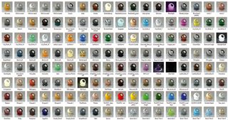
It's probably a good idea to make a library of materials, rather than creating them ad hoc, and a good place to start is with a few basic materials that you will use most often. These will most likely be metals, woods and so on. This not only means you'll have a solid collection, but also gives you a great baseline for comparison.
Expert Tip: Teamwork
If you only ever work on your own you can do whatever works for you to get the results you want, but increasingly software is requiring us to work with physical settings. This makes it easier to create photo-real results, but also means that sharing assets is more likely to result in consistency across teams and projects.
This article was originally published in 3D World magazine issue 208. Buy it here.

Thank you for reading 5 articles this month* Join now for unlimited access
Enjoy your first month for just £1 / $1 / €1
*Read 5 free articles per month without a subscription

Join now for unlimited access
Try first month for just £1 / $1 / €1
Get the Creative Bloq Newsletter
Daily design news, reviews, how-tos and more, as picked by the editors.
Rob Redman is the editor of ImagineFX magazines and former editor of 3D World magazine. Rob has a background in animation, visual effects, and photography.
