Create isometric grid-based 3D lettering
Steven Bonner shows you the possibilities of an isometric grid by creating a custom 3D typeface
Creating letters based on isometric drawing principles is the perfect way to reflect structure in a display typeface, as I discovered with a recent commission for a magazine feature on contemporary architecture.
Taking the concept further, in this tutorial I'll guide you through the process of building a grid that will form the basis of your design and then show you how to draw, colour and light your letters to create a three-dimensional architectural scene. Once you understand the basics of this technique, you can use it to quickly and easily create stand-alone pieces or intricate repeating patterns.
Click here to download the support files (2.19MB)

01 Don't dive straight into Illustrator for this. Working on an isometric grid demands precision, but you'll get a better feel for what you want to achieve much faster by sketching a few ideas out onto paper with a pencil. When we reach the steps of making your own typeface on screen, I'll show the full process on one letter only, as it's much better to experiment and come up with your own type designs.
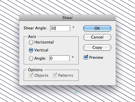
02 There are lots of ways to make your isometric grid, all of which have their own benefits. But for me, this is the simplest method: firstly, using the Line tool in Illustrator, draw a horizontal line across your page and duplicate it several times until you have a good number of lines. Now select all and double-click on the Shear icon in the Toolbox panel. Enter an angle of 30 degrees and click on the vertical axis.
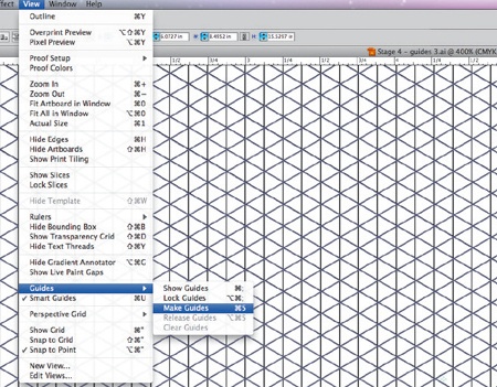
03 Next, copy and paste a duplicate in front (Ctrl/Cmd+F) and select the Reflect tool. Hold Shift to constrain the result and then use your mouse to flip the sheared lines.
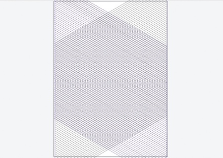
04 Now draw a set of vertical lines through each intersection until you end up with the pattern shown above. A quick way is to draw a line at either end and use the Blend tool to fill the steps in-between. Once you have your grid drawn in lines, select everything and convert all the lines to guides (Ctrl/Cmd+5) to create your finished grid.
Get the Creative Bloq Newsletter
Daily design news, reviews, how-tos and more, as picked by the editors.

05 If you haven't already, switch on Smart Guides (Ctrl/Cmd+U) and enable Snap to Point (Ctrl/ Cmd+Alt+") to help you get precise positioning. To create the letters, we'll construct a series of cubes along our 30-degree lines. Draw each side of a cube separately, working without fills.

06 Once you've drawn each side, put them together to build your first cube. Make sure you include the hidden faces, as you may want to reveal and use them later, depending on how you want your letters to look. At this point, it's worth adding some basic shading to define a light source. I've chosen to have my light source coming in from the bottom left-hand side so that my top plane is dark, the right plane has a medium gradient, and the left plane is fairly light.

07 Start to build your first letter by duplicating your cubes and repositioning them. This is where Smart Guides and Snap to Point will come in handy. You'll see that having a defined light source now helps in visualising the letters more clearly.
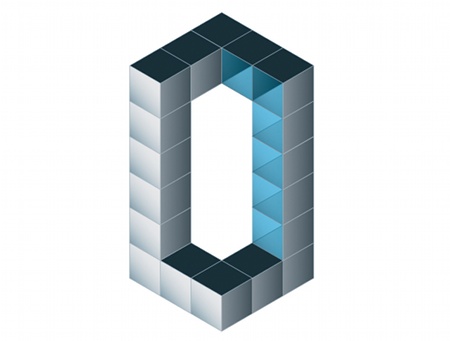
08 Once you're happy with the shape of the letter, start adding in some more advanced colour. As we're not looking for perfect realism here, you can break the rules a little for aesthetic effect. For example, I've kept a medium-to light gradient on each cube for interest, despite the fact that in reality there would only be one gradient on the whole face.
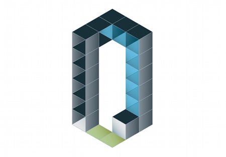
09 Now make the letters more building-like. Start by removing some of the front faces to reveal what's behind. Colour these back faces a slightly darker shade for more depth. You can also add a blue gradient and play with opacity in the Transparency palette to create windows, and add a green gradient on the bottom planes to create grassy areas. Feel free to experiment with colours and textures to create soil, paving, monoblocking and anything else you can think of. I stick with flat colour for my grass, but you could add some texture through Film Grain, for example.
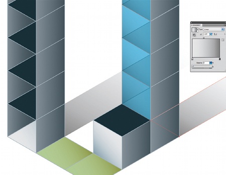
10 Once you've finished your base letter, draw in some shadows along the 30-degree grid, to indicate height in the structures. When you draw shadows, use opacity to represent a fade rather than simply fading to white. You'll gain a more natural look as well as the ability to add background colours underneath without any problems. Also remember that shadows aren't black - they're darker shades of the colour they're cast on. So if you have a shadow casting on grass, for example, it should be dark green to clear instead of black to white.
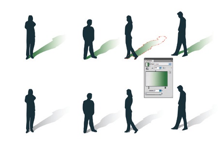
11 To give the letters some scale, we need to add another recognisable element. In this case, since we're working with buildings, it makes sense to add people into the scene. Draw some rough silhouettes and matching shadows, again on the 30-degree grid lines.
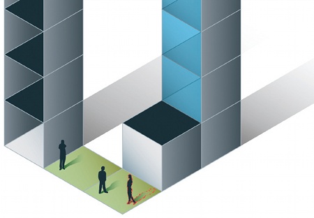
12 Once you have a small selection of figures, begin adding them into your scene. Again, make sure your shadow colouring matches, and try to place the shadows in positions that will add interest, such as inside windows and in alcoves.
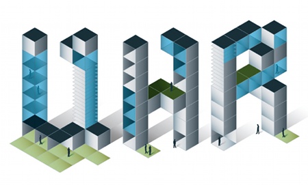
13 Carry on as you did before and start to draw the other letters. Look for interesting compositions and see if there are different ways of rendering the same letter for variation. You might also want to add a large lawn, for example, and as long as it doesn't hinder readability too much, go ahead and use it.
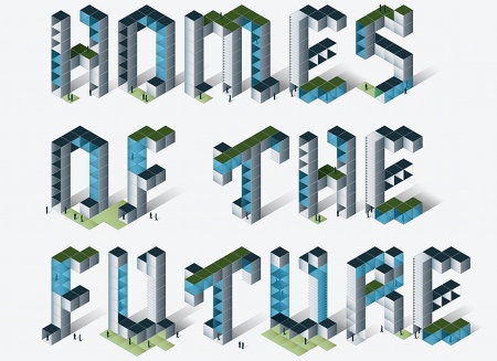
14 Once you've drawn all the letters you need, place source. I also add a light amount of Film Grain to help with the retro-futuristic feel. Then add the words you're going to illustrate and see how they look together. This is the point where you might spot that one of the letters doesn't quite work in the sequence, and is your chance to make any small improvements.
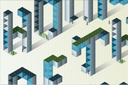
15 The final stage is to think about the composition you want in the image. In this instance, I want to carry on the isometric style, so I've arranged the letters along the 30-degree angles on my grid. This gives a cool false perspective to the piece. As before, you can experiment and arrange the words however you like - staggered, descending or straight. Play around and see what looks best. The last thing I've done is add a gradient in the background to ground the piece and accentuate my light source. I also add a light amount of Film Grain to help with the retro-futuristic feel.

Thank you for reading 5 articles this month* Join now for unlimited access
Enjoy your first month for just £1 / $1 / €1
*Read 5 free articles per month without a subscription

Join now for unlimited access
Try first month for just £1 / $1 / €1

The Creative Bloq team is made up of a group of art and design enthusiasts, and has changed and evolved since Creative Bloq began back in 2012. The current website team consists of eight full-time members of staff: Editor Georgia Coggan, Deputy Editor Rosie Hilder, Ecommerce Editor Beren Neale, Senior News Editor Daniel Piper, Editor, Digital Art and 3D Ian Dean, Tech Reviews Editor Erlingur Einarsson, Ecommerce Writer Beth Nicholls and Staff Writer Natalie Fear, as well as a roster of freelancers from around the world. The ImagineFX magazine team also pitch in, ensuring that content from leading digital art publication ImagineFX is represented on Creative Bloq.
