Building a 3D virtual studio in Unity
Discover the design process behind this virtual 3D studio environment made in Unity 5.
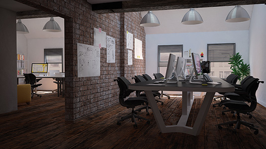
We've been using Unity to create stunning 3D art for more than five years, so when Unity 5 launched we wanted to test its new features, particularly the physically-based shader and realtime GI (global illumination).
PBR (physically based rendering) texturing is not a new concept, but we hadn't had the chance to use it in the Unity engine without using third party assets. We decided to recreate Corporation Pop's studio as closely as possible in Unity 5. Here I share our insight from the project, in which we create an online 3D virtual environment.
We started by making detailed plans of the studio using MagicPlan, so these could be transformed into 3D walls. It creates vector plans that can then be imported into Cinema 4D and extruded into walls. Unfortunately we couldn't use the app to draw the ceilings and roofs, so this was achieved by examining the building and figuring out the shapes.
To create windows, doors, staircases and the roof, we had to understand how the geometry of the building works, which involved taking lots of reference pictures. This raised some interesting features.
I'd never realised that the supporting beams I see above my head everyday are different sizes and extend through to another room, reflecting the shape of the roof.
As you move through the build you notice more of this type of detail, which raises more questions. It's vital to fully appreciate these elements of the design and build to ensure realism.
Complex texturing
Textures are probably the most important part in game engine based environments. Limited by the amount of polygons we can use, we can't use geometry to create detail, so only good texturing can fool the eye and create detail where there is none.
Our build was for desktops, however the simplified assets would also be used for an AR (augmented reality) version of the studio and VR (virtual reality) could be considered at a later stage. Therefore, by asking these questions early on we realised that while geometry should be fine across all of those versions, texturing would have to be adjusted for each medium.
Substance Designer and Painter allowed fast creation of complex texturing that would work well across various game engines. Allegorithmic's Substance Designer was used for the brick walls and wooden floor as it was vital that they were realistic, detailed and seamless.
Moving to Unity
You can't comprehend how many objects are in a room until you have to model them. We focused on recreating the most important props.
Some of them, like a tripod lamp, were fairly simple to make and texture since they consisted of primitive shapes. Others, like orange chesterfield sofas, took longer as they were vital to the final look and required much more detail.
We created a high poly version of one sofa and used it to bake a detailed normal map, which would then be used on a low poly version. We textured the sofa in Substance Painter. It has a layer system, which helped deal with the complex surface.
All of the texture channels were easily exported for use in Unity. After many tweaks to the materials, multiple light setups and a very long and frustrating journey of finding the right lightmapping settings, the result is a realistic series of props that bring to life our 3D virtual studio.
There is nothing more satisfying than having a stroll through a virtual environment you have created. But as this is such a personal project, I can't see an end to the testing and retesting of every element. I feel that this will be a continually evolving project. To see how we got this far I'll take you through the design process.
01. Study the floor plans
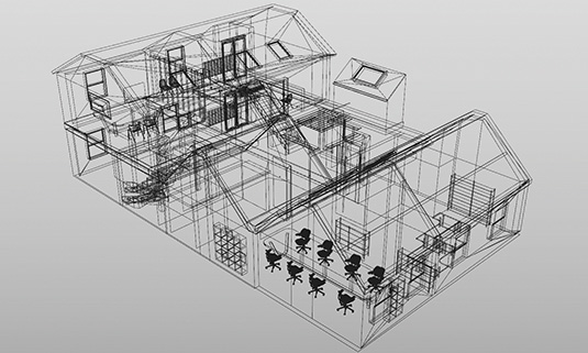
It's vital to have detailed floor plans. Our plans were very basic, so we recreated them using mobile app MagicPlan, which lets you draw plans by using a phone camera. You walk around your building and place corner points. After calibrating, the app automatically measures the distances between the points and creates vector plans which can be imported into Cinema 4D, extruded into walls and adjusted.
02. Planning and gathering references
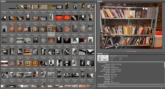
What platform is this project for? How is it going to be used? Could the assets be used in another project? What tools can I use? What are the challenges? By asking these questions it will help to solve possible problems before they occur. Start gathering reference material to make life easier. We took photos of every corner of the studio, recorded films and made early decisions on the props we would be making.
03. Modelling the building
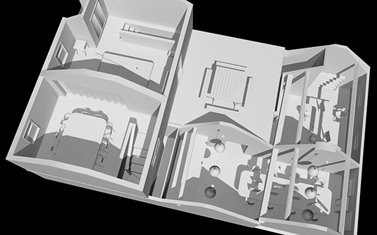
Once you have walls and a roof, add space for windows, doors, support beams and flooring. Plan how to divide it into manageable sections and how textures will work. After considering a modular approach – common in game design – we opted for a full extruded version split into floors with detached roofs, floors and staircases, as it would have multiple uses, including AR in an isometric view.
04. First lighting tests in Unity
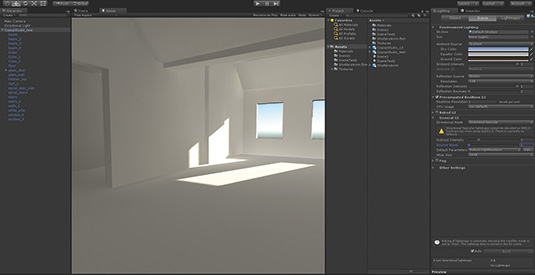
We chose precomputed Realtime GI to try Day/Night lighting, which you can't achieve with baked GI. There were issues with light leaks where the roof touches the walls, but keeping full walls instead of planes, adjusting lightmap settings and cranking up the lightmap resolution solved most of them. Use your own lightmaps instead of Unity-generated versions. Baked GI appears more stable and returns less artifacts.
05. Texturing
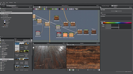
Use tiled textures for large areas. We prepared brick, wooden floor, stucco textures and roof slates in Substance Designer, which makes creating complex textures easy and allows control of each of the channels. Cinema 4D and Unity have full support for Substances. We used Cinema 4D to UV the building and assigned materials to respective parts. Once imported to Unity we replaced those materials with Substances and adjusted tiling.
06. Creating the props
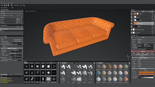
With a lot of props to create, focus on the major elements. Our Chesterfield couches were complex, so we created a high and low poly model in Cinema 4D with materials assigned to low poly versions for separate elements. We brought both into Substance Painter, baked maps onto a low poly model and textured. Some props like phones were fully textured in Cinema 4D, others use basic materials or substances.
07. Lighting and effects
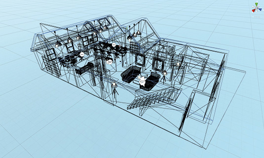
Multiple light set-ups and testing are required for a realistic effect. For areas with little natural light, we used point lights and LED ceiling lights with emissive materials. Night lighting consists of multiple spot and point lights at the light sources. Unity's sample project 'The Courtyard' offers insight to controlling the time of day cycle. Avoid too many image effects as they can impact on performance. We used antialiasing, bloom, vignette and colour correction scripts.
08. Thinking in VR
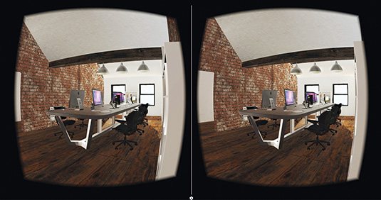
Seeing a scene in the first person perspective while fully immersed, creates new challenges and requires a different approach to the way we create virtual worlds. Realism, PBR texturing, post effects and a frame rate of 75 or more are challenging with no simple solution. We've made simple test builds for our studio, such as scale, lighting, texturing and colour intensity, and all impact how you feel in the environment.
This article was originally published in 3D World magazine issue 205.

Thank you for reading 5 articles this month* Join now for unlimited access
Enjoy your first month for just £1 / $1 / €1
*Read 5 free articles per month without a subscription

Join now for unlimited access
Try first month for just £1 / $1 / €1
Get the Creative Bloq Newsletter
Daily design news, reviews, how-tos and more, as picked by the editors.
