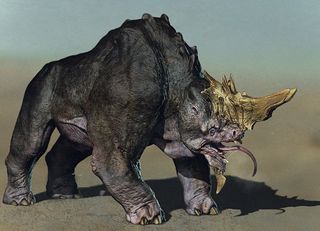
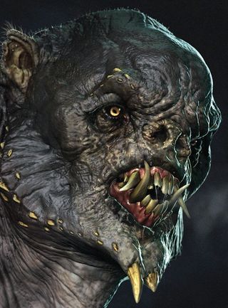
Brian Wynia on the importance of reference in creature design
Top character artist and creature designer Brian has seen – and made – his fair share of monsters over the years. We catch up with him.

If want to know how to design better creatures, Brian Wynia is the man to talk to. A senior character artist at Sony Santa Monica and a freelance character and creature designer, he's created all manner of creatures for film, TV and video games. We picked his brains for some design wisdom.
Where do you find your references?
Lately I've really enjoyed using social image sites like Pinterest, not only to gather reference but find inspiration as well. It's a great community and I have found some amazing images here. You can find some great free resources at software-related sites like Pixologic's ZClassroom. They have very good videos about ZBrush and general digital sculpting. They also have a large library of materials, alphas, and textures. It's a great place to get started.
What creature design has impressed you the most so far?
My favourite creature design of all time would have to be Ray Harryhausen's Medusa from Clash of The Titans (1981). This character still stands the test of time to me, she is a classic!
She was so interesting, the way she was animated - the combination of woman and snake, it was all executed so well. She was so fantastical yet so believable at the same time.
How far can a creature design be taken before it becomes unbelievable?
I think as long as a creature is believable and engages an audience, the design can work. When a creature is so far removed from our imaginations and seems to lack motivation or purpose, then what is it?

Can you explain you general design process and workflow?
Gather reference. This seems obvious but it is critical and, in a rush, seems to be overlooked by many. Explore your design! Either with simple sketches, speed sculpts, or quick painting. Try to get out as many ideas as possible.
Present your design in a professional and clear manner. It would be a shame to have a small image, distracting background, or cluttered composition destroy a strong design.
Words: James Clarke
This article originally appeared in 3D World issue 178.

Thank you for reading 5 articles this month* Join now for unlimited access
Enjoy your first month for just £1 / $1 / €1
*Read 5 free articles per month without a subscription

Join now for unlimited access
Try first month for just £1 / $1 / €1
Get the Creative Bloq Newsletter
Daily design news, reviews, how-tos and more, as picked by the editors.
The Creative Bloq team is made up of a group of design fans, and has changed and evolved since Creative Bloq began back in 2012. The current website team consists of eight full-time members of staff: Editor Georgia Coggan, Deputy Editor Rosie Hilder, Ecommerce Editor Beren Neale, Senior News Editor Daniel Piper, Editor, Digital Art and 3D Ian Dean, Tech Reviews Editor Erlingur Einarsson, Ecommerce Writer Beth Nicholls and Staff Writer Natalie Fear, as well as a roster of freelancers from around the world. The ImagineFX magazine team also pitch in, ensuring that content from leading digital art publication ImagineFX is represented on Creative Bloq.
