How to design a Blade Runner-style street scene
Learn how to create an atmospheric sci-fi street scene and master neon lights in this tutorial by Alex Farrell.
14. Modelling the neon
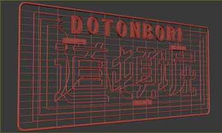
Use the Line tool to trace over any reference images of neon lights. I've included a video of the complete process of modelling a neon light from start to finish, with this tutorial. Create casings for some letters by repeating the process we went through in making the Yukon sign earlier. Mount lights on metal frames that will reflect the vivid colours. To add realism, connect all of the splines together to create one continuous light.
15. Adding light
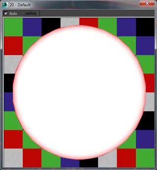
In a new Material Editor slot add a VRayLightMtl and set the intensity to 15. Add a Falloff map to the colour and Swap the Front/Side slots. We can already see the effect this will give us in the Material Preview. For a red light, set the RGB value of the front colour to 255,42,42, and the side value to 255,0,0. This will give the appearance that there is something inside our lights that provides the glowing effect.
16. Spinner modelling
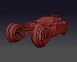
To model the spinner I used a model from the Sketchup 3D Warehouse as reference. Starting with a single plane add an Edit-Poly modifier and shift-drag edges to create new geometry and maintain a clean topology. Once a section has been modelled, add extra edge loops to keep parts of the model sharp, then add a Turbosmooth modifier and set Iterations to 2. If the scene is getting too heavy, set Iterations to 0, and Render Iterations to 2.
17. Adding decals
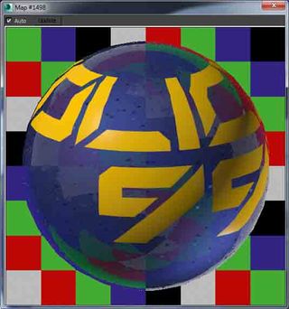
Create a VRayBlendMtl with the car paint shader in the base slot and a yellow Diffuse VRayMtl in the coat slot. In the Blend Amount slot add a black and white bitmap of your decal generated in Photoshop. Turn off Tiling in both the U and V directions and set the Map Channel to 2. Add a UVW map to the model with same Map Channel, set Mapping to Planar, go into Sub-Object mode 1 and position the decal.
18. Texturing the facades
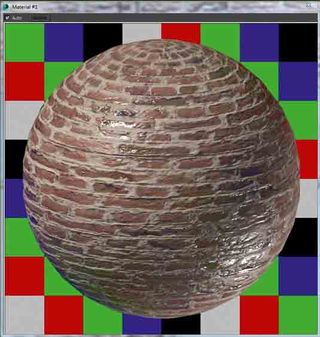
Add a tileable brick texture to the diffuse slot of a new VRayMtl, add a strong reflection map to both the reflection slot and the reflection glossiness slots, set the IOR value to 3.0. These values will make our material look wet in the pouring rain, and reflect the colour of the dark, dusk sky back to the camera. Add a bump map to add some depth to the texture, the mortar should be a darker colour than the bricks.
19. Adding dirt
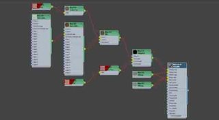
In the Diffuse slot of your brick shader add a VRayDirt map (keeping the previous map as a sub-map), and move it to the unoccluded colour slot, Right-Click>Copy this map. Create a mix map in the occluded colour slot, and paste the brick map into the Colour #1 slot. In the second slot add a VRayColor map, set to a dark brown colour. In the VRayDirt parameters set the radius value to 0.2 metres. The screen is in the Vault for more detail.
20. Render elements
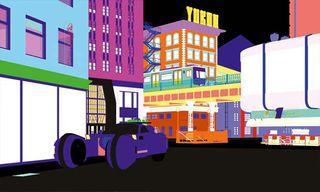
Add VRayZDepth, VRayWireColour, and VRayRawReflection to the list of Render Elements. Use a Tape Helper object in the top viewport to measure the distance between your camera and the furthest object from it. Set the z-depth Max value to this distance. To quickly select all of the glass in Photoshop, add a MultiMatteElement, tick isMatID on, and set the Material ID Channel of your glass material to 1.
Get the Creative Bloq Newsletter
Daily design news, reviews, how-tos and more, as picked by the editors.
21. Improve the reflections
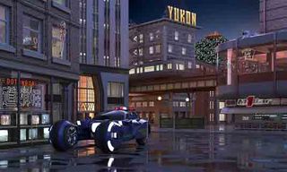
In Photoshop, use your VRayWireColour (or MultiMatte) element to select the glass in the VRayRawReflection. Create a new group with this selection pasted into a new layer. Set the Blending mode to Screen and Fill to 25%, duplicate this layer Ctrl+J and nudge it several pixels to the left/right. Doing this will give the illusion that our windows are double glazed and make the reflections a lot more convincing.
22. Adding depth
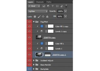
Set the Blending Mode of your VRayZDepth to Lighten, and a gradient ramp going from white to black vertically from the bottom of the mask. Add a Levels adjustment layer as a clipping mask, and move the points to control the distance and density of the fog/mist. Add a Colour Fill (again, as a clipping mask), set the Blending mode to Soft Light and set the colour to a slightly light blue.
23. Make it rain
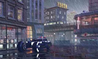
Create three new layers (Foreground, Middle-Distance, Distant), and paint rain onto them using one of the many available brushes online – I sourced mine at DeviantArt. Change the Blending Modes to either Colour Dodge or Screen, this is particularly useful for rain painted over bright areas, as it appears the drop is refracting the light, as opposed to simply being pasted on top. Add Solid Colour fill layers as clipping masks to tint your rain in specific areas.
24. Adding glows
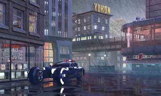
Create a new layer and fill it with solid black D, Alt+Backspace and set the Blending Mode to Color Dodge. Change to Brush B, and set the opacity to a low number, such as 10% Numpad 1. Sample the colour of a bright area you'd like to accentuate Alt+Left-Click and gradually paint in extra light. As a tip, use the square bracket keys to alter the size of your brush, so you can be more precise.
25. Add 2D elements
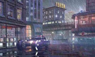
Most stock elements (such as fire and smoke) are provided against a black background. To eliminate this, set the Blending mode to Screen. I used the Optical Flares plugin for After Effects to produce the lens flares on the front of the Spinner, but Photoshop has a built-in Lens Flare filter (Filter>Render>Lens Flare). Obviously these 2D elements won't be visible in the reflections, so duplicate Ctrl+J and transform these layers V to position them correctly.
26. Final adjustments
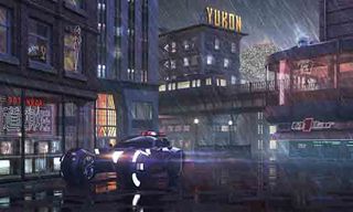
Tweak exposure by adding a Curves adjustment layer. The z-depth mist, rain, and glows we added can make our image too bright, so lower the mid-tones while preserving the white and black points. Use the Colour Balance and Hue/Saturation adjustment layers to your liking and consult the artistic reference from earlier. To sharpen the image Ctrl+A, Ctl+Shift+C, Ctrl+V. Go to Filter>Other>High Pass and set Radius to 1px, and the Blending Mode to Overlay.
Words: Alex Farrell
Alex is a 3D artist at The Neighbourhood, working predominantly in architectural visualisation. He also produces many of the scripts that the studio uses, and is heavily involved in R&D.
Win a subscription to 3D World!
What's your favourite VFX movie? Take part in our survey and you could win a subscription to 3D World magazine!
Like this? Read these
- The Cinema 4D secrets of Iron Man's interface
- Hands-on review: Adobe After Effects CC
- The designer's guide to working from home

Thank you for reading 5 articles this month* Join now for unlimited access
Enjoy your first month for just £1 / $1 / €1
*Read 5 free articles per month without a subscription

Join now for unlimited access
Try first month for just £1 / $1 / €1
The Creative Bloq team is made up of a group of design fans, and has changed and evolved since Creative Bloq began back in 2012. The current website team consists of eight full-time members of staff: Editor Georgia Coggan, Deputy Editor Rosie Hilder, Ecommerce Editor Beren Neale, Senior News Editor Daniel Piper, Editor, Digital Art and 3D Ian Dean, Tech Reviews Editor Erlingur Einarsson and Ecommerce Writer Beth Nicholls and Staff Writer Natalie Fear, as well as a roster of freelancers from around the world. The 3D World and ImagineFX magazine teams also pitch in, ensuring that content from 3D World and ImagineFX is represented on Creative Bloq.
