How to design a Blade Runner-style street scene
Learn how to create an atmospheric sci-fi street scene and master neon lights in this tutorial by Alex Farrell.
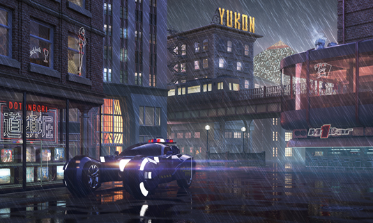
With Blade Runner, Ridley Scott created a vision of the future so rich that it continues to influence and inspire audiences some 30 plus years after its release. With the help of 'visual futurist' Syd Mead, Ridley's version of Los Angeles in 2019 is one of darkness, rain, flying cars, and neon.
Over the next few pages I'll show you how to model, texture, and light a scene inspired by this film, incorporating many of the elements it's famous for. But it's important to not just simply replicate what has been done before. There are many 2D and 3D renderings of Blade Runner's iconic locations, but we want to create something new and push our creativity.
I'll approach the scene in a way similar to an architectural visualisation project, starting with view exploration before moving to lighting, shading, then finally post-production. However, this should remain a dynamic process, for example you may alter the camera angle based on the way the lighting interacts with your scene.
I won't go over how the scene was built poly-by-poly, but I will provide an insight into my workflow, and show you how to work in an efficient manner. We won't unwrap the UVWs of a single object, instead relying on tiled textures and procedural maps.
What's your favourite VFX movie? Take part in our survey and you could win a subscription to 3D World magazine!
01. Composition reference
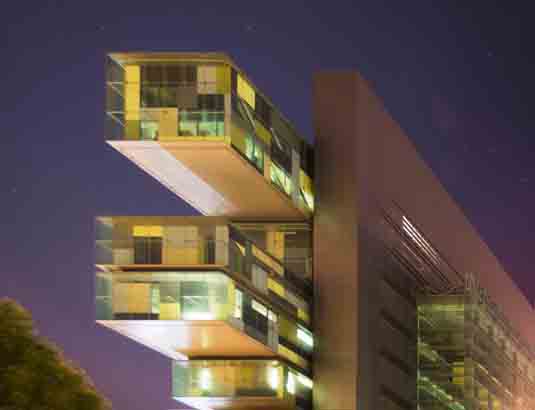
From the outset, it's fairly important to have an idea of the final image in your mind. You need to think about what it should contain, and what compositions would work best to frame those ideas. I knew I wanted a widescreen, cinematic, ground level shot, so I collected images that ticked those boxes. I took inspiration from Times Square, in particular how Broadway intersects the otherwise grid-like layout of this dense urban environment.
02. Artistic reference
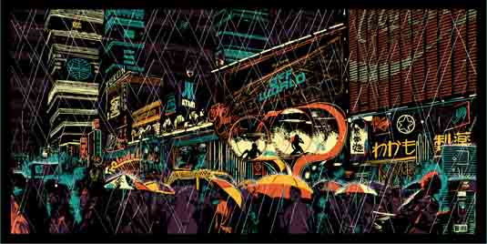
For a landscape as varied as 2019 Los Angeles, it's going to be difficult to contain every cultural influence in a single image, so take direction from what inspires you the most. I'm a big fan of art deco design, so I collected images from Google and Flickr of places such as the Carbide & Carbon building in Chicago, and the Waldorf Astoria. Even if you don't appreciate the building as a whole, you may take influence from a specific detail.
Get the Creative Bloq Newsletter
Daily design news, reviews, how-tos and more, as picked by the editors.
03. Base modelling
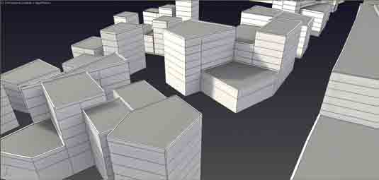
Block out your environment. In the top viewport draw a spline that will represent the perimeter of your building and add an Edit Poly modifier. Select the polygon that has been created, then select the Settings button next to extrude, in order to specify a height. Enter a value of 6 metres and click Apply and Continue. Change the value to 3 meters and continue to add floors to your building.
04. View exploration
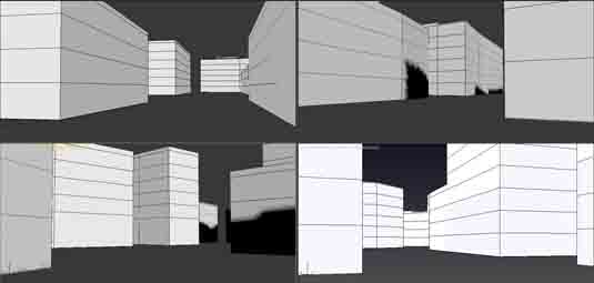
Press Alt+W while your mouse is over perspective view, to go to full screen. Use Walk Through mode (by clicking the Up arrow) to explore your newly created city, and find interesting angles that lend themselves to your desired composition. If you like a particular view, create a VRayPhysicalCamera then click and drag in the viewport, hit Ctrl+C to align the camera to your current view. Work out the pros and cons of each view, before ultimately settling on your favourite.
05. Initial lighting
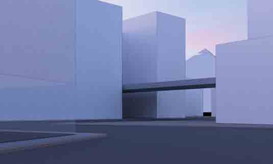
Add a V-Ray Dome Light to your scene and add a suitable HDRI map in the Texture slot. I'm using one of Peter Guthrie's HDRIs (1954 Dusk), but there are many that are freely available at noemotionhdrs.net and www.hdrlabs.com. In your V-Ray Camera, turn off Vignetting, and set the White Balance to Neutral. As a rule of thumb, for a dusk shot we should set the f-number to 8.0 and the shutter speed to 120.0.
06. Facade modelling
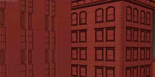
The 3 metre extrusions on the buildings we created earlier have provided an important base for placing our windows. Create extra polys in your geometry by using Connect to keep your windows equal distances apart. When creating extra edge loops for separation between the top and bottom of the windows, select the existing horizontal edges and use Chamfer. Set Segments to 2 if you'd like to retain the original edge loop to sweep additional detail around the facade.
07. Floor reflection
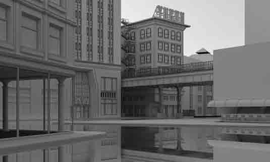
In the Material Editor create a new VRayMtl with the Reflect colour set to pure white, and Fresnel reflection unchecked. Apply this to the ground, or a VRayPlane. Create another VRayMtl with a grey diffuse colour, and name it 'override.' In your V-Ray settings, check Override mtl, exclude the ground geometry, and add our override material to the empty slot. The resulting render will provide a useful reference when it comes to placing puddles and lights later on.
08. Yukon sign
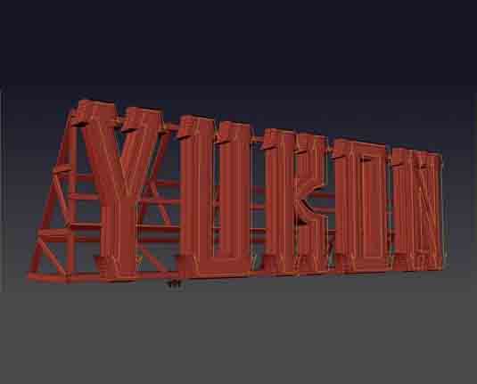
Use a Bevel modifier on a Text object to create clean 3D geometry – adding multiple levels to create extrusions. Clone this geometry Ctrl+V as a copy, and select the outermost faces which make the shape of each letter, invert the selection Ctrl+I and hit delete. Select all faces Ctrl+A and in Polygon Sub-Object mode click Flip. Create a new V-Ray Mesh Light, click Pick Mesh, then select your new geometry. Move the light away, in front of the sign.
09. Internal lights
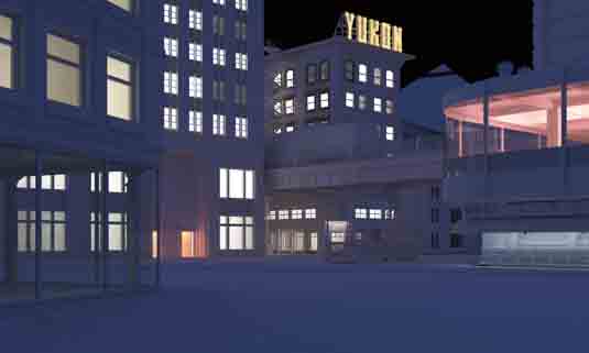
Add V-Ray Sphere Lights to the interiors of your buildings. For each building use an instanced set of lights, this way we can use the V-Ray Light Lister to quickly amend multiple lights at once. This is why we set our override material to grey rather than white, as this darker diffuse colour will in most circumstances be closer to the colour value of the final texture. Turn on Invisible and uncheck Affect Reflections in all internal lights.
10. Texturing the road
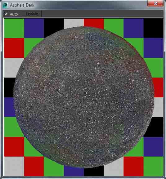
Add an asphalt texture to the bitmap slot of a new material and use Photoshop to create the relevant bump and reflection maps. The more contrast you have in each map, the stronger its effect will be. Change the blur value of each map to 0.1 to improve the texture definition in the render. As the surface will be wet, set the RGlossiness to .91, unlock the Fresnel IOR value and set that to 3.5.
11. Adding puddles
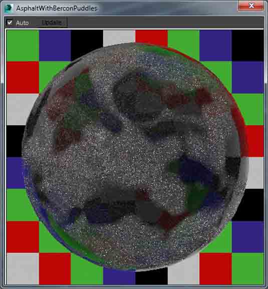
At the top level of your material create a VRayBlendMtl (keeping the old map as a sub-map) and drag-drop the base material into the first coat material as a copy. In this copy set the RGlossiness to .99 and the IOR value to 1.33. Clear any maps in the bump and reflection slots. In the Blend Amount for the coat material, add a custom map from Photoshop or a BerconNoise map that will define the placement of puddles.
12. Bridge detailing
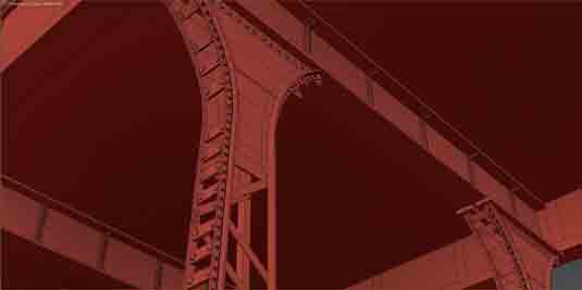
Intricate looking bridges can be created with few primitives. Create a line that will represent one of the girders and add a Sweep modifier, then set the Built-In Section to Wide Flange. Use the Array tool to cover the girder with rivets – I used spheres with Segments set to 12 and the Hemisphere value set to 0.5, to preserve the poly-count. Repeat this process for the columns, instead using Angle as the Built-In Section to connect the multiple struts together.
13. Additional detailing
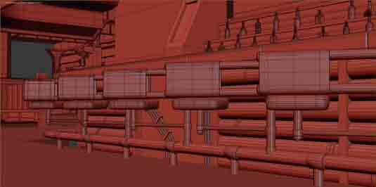
Use the Sweep modifier again to create detailed cills and trims around buildings, experimenting with custom sections and consulting the images you collected as part of the 'Artistic Reference' step. Chamfer any sharp edges to create highlights in the render, and make use of free scripts such as Welder by JokerMartini to add character to props and objects. It's this stage that will define the 'believeablility' of your image, and create interest for the viewer.
Next page: the second half of this tutorial

Thank you for reading 5 articles this month* Join now for unlimited access
Enjoy your first month for just £1 / $1 / €1
*Read 5 free articles per month without a subscription

Join now for unlimited access
Try first month for just £1 / $1 / €1

The Creative Bloq team is made up of a group of art and design enthusiasts, and has changed and evolved since Creative Bloq began back in 2012. The current website team consists of eight full-time members of staff: Editor Georgia Coggan, Deputy Editor Rosie Hilder, Ecommerce Editor Beren Neale, Senior News Editor Daniel Piper, Editor, Digital Art and 3D Ian Dean, Tech Reviews Editor Erlingur Einarsson, Ecommerce Writer Beth Nicholls and Staff Writer Natalie Fear, as well as a roster of freelancers from around the world. The ImagineFX magazine team also pitch in, ensuring that content from leading digital art publication ImagineFX is represented on Creative Bloq.
