Anamorphic typography will twist your mind
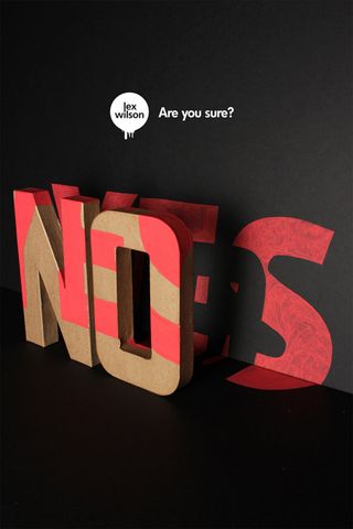
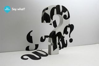
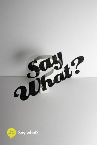
Anamorphoses is a typographic project that sees 3D typography created using 2D methods. Intrigued? Read on!
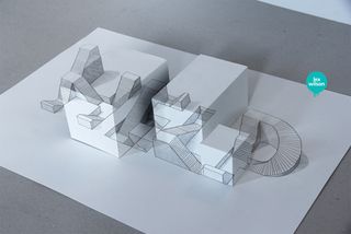
We've seen some incredible examples of 3D typography in our time here at Creative Bloq, however we've never seen it created using 2D methods. Anamorphoses is a series created by illustrator Lex Wilson that puts a new spin on perspective.
"I loved Escher when I was a kid, especially his 'Waterval' and 'Ascending and Descending' pieces," he explains. "I had some cool optical illusion books and I was fascinated with the idea that you can't always trust what your eyes are telling you. Felice Varini's work is completely mind-blowing to me - he's a major inspiration."
Using clever 2D illustrations to make the viewer think that they are in fact 3D is something that Wilson relishes. "When I first saw [Varini's] work, I was intrigued by the possibility of representing something 2D across 3 dimensions and the way in which each piece draws your body to a certain point in space where the image is finally revealed.
"I guess my 3D typography work is a reverse of that - representing something 3D in 2 dimensions. So, that's kind of like drawing something 3D in 2D, then representing that in 3D across different surface-planes."
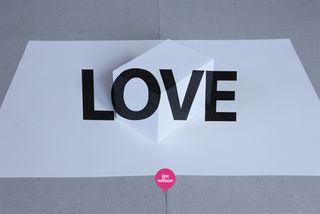
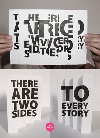
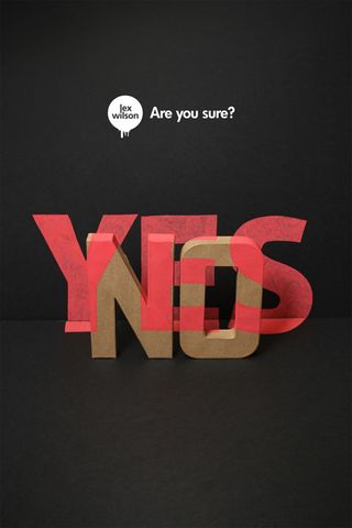
"When you look from the right vantage point it looks 2D again (but it's a 2D image of 3D typography). Written down like that, it seems quite an odd thing to be doing." Odd or not, we absolutely adore this series and can't quite seem to tear our eyes away. Take a look for yourself!
See more of Lex Wilson's incredible work over on his website.
What do you think of this typography project? Let us know in the comments box below!

Thank you for reading 5 articles this month* Join now for unlimited access
Enjoy your first month for just £1 / $1 / €1
*Read 5 free articles per month without a subscription

Join now for unlimited access
Try first month for just £1 / $1 / €1
Get the Creative Bloq Newsletter
Daily design news, reviews, how-tos and more, as picked by the editors.
Sammy Maine was a founding member of the Creative Bloq team way back in the early 2010s, working as a Commissioning Editor. Her interests cover graphic design in music and film, illustration and animation. Since departing, Sammy has written for The Guardian, VICE, The Independent & Metro, and currently co-edits the quarterly music journal Gold Flake Paint.
