Our Verdict
Blender 4.1 isn’t an exciting update but it is a very welcome one. Speed enhancements, interface tweaks, a few changes here and there to make daily tasks easier, all add up to a worthy update and one that I highly recommend to any user, new or old.
For
- Some significant speed improvements
- Interface more appealing
- Node improvements
- Import/expert now easier than ever
Against
- I still don't like that 'Y' isn't the vertical axis
Why you can trust Creative Bloq
Blender’s meteoric rise in popularity over the last few years has meant that updates are coming thick and fast, but do these just fix bugs, or do they add anything new to the mix to tempt people away from best 3D modelling software available now?
Version 4.1 doesn’t wow users with showstopping new features, rather it focuses on productivity changes, speed enhancements and some interface tweaks. This isn’t a bad thing though. I would much rather have a set of responsive, stable tools that don’t cause eye strain than a fancy new tool that I may or may not use. (This hasn't stopped Blender featuring in both our best animation software and best free animation software guides.)
For many users, much of this will go unnoticed and that’s probably a sign that Blender’s developers are doing a good job. If you find something that doesn’t sit right while you are working, it is most likely because it needs to be fixed or modernised (or perhaps you need to check out our Blender tutorials). So, what changes does Blender 4.1 bring?
New features
Getting files in and out of your chosen 3D application isn’t the sexiest of tasks but it is one that will be used every time you work on a project, so having options that make this as simple as possible is a must and Blender 4.1 doesn’t disappoint. You can now drag and drop all manner of file o=formats directly into Blender and while not all formats are supported it’s very likely they will be soon.
When it comes to saving and exporting the story is just as good, with updated options for Alembic, the trusty OBJ and the current industry favourite USD. The updates here are in both speed of execution, as well as some of the options for what gets output, like Sub-div options, Light limits and much more.
User interface changes
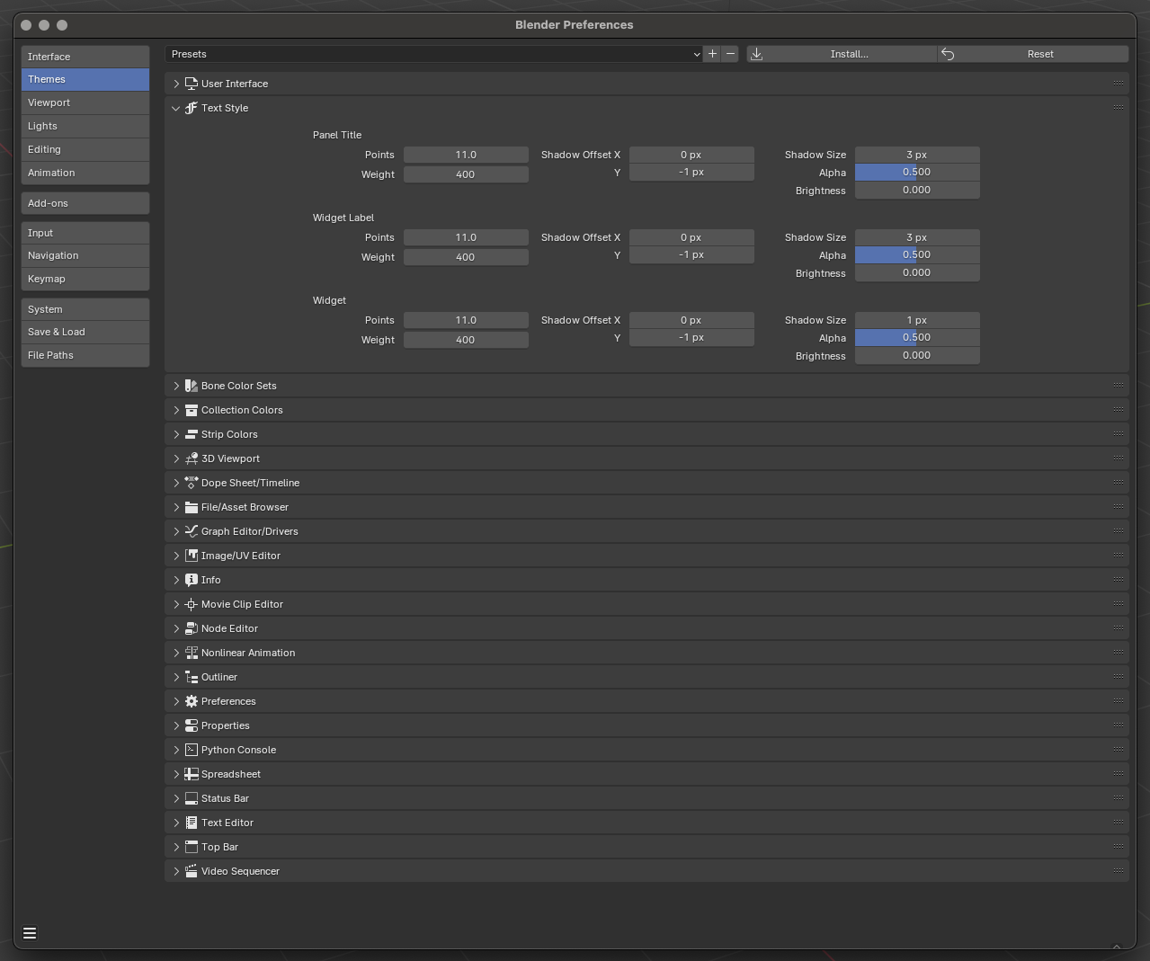
We will ignore the age old ‘is Y the up axis’ (it still isn’t) and focus on what has been changed with the user interface. There have been many small tweaks but they all add up to a slick, more responsive experience that is easier on the eye, both in terms of aesthetics and strain. Firstly font size is easily adjustable and menus look nicer and are more readable, with smooth corners and drop shadows. This may feel like a small thing and it is, except when you have been looking at it for hours, at which point it makes all the difference.
Menus with a lot of items now collapse lists as you resize a window too, yet another small but very welcome change, even though it will be rarely appreciated. The same can be said of things like changes to the outliner, where you can now double click an object to select it and any children. Opening groups remains the same but all nested items have a chevron drop-down marker, where some used to have one, while others had a carrot icon. This makes for a more consistent experience, much needed for beginners and nicer for even the established user.
Node improvements
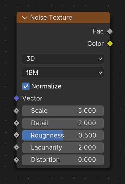
There are a few changes to the nodes system in Blender 4.1. Something that may throw off a few experienced users is that the Musgrove noise node has been canned. The functionality is there but can now be found within the noise texture node. This appears to be a simple housekeeping decision, as the options available with Musgrove were there in the noise node anyway but I can see that causing a few scratched heads.
There are some other new nodes as well, that add some extra functionality to the system, such as an active camera output node and a rotation, rotation node, that allows for a second layer of rotation value to be added to the output.
Other features
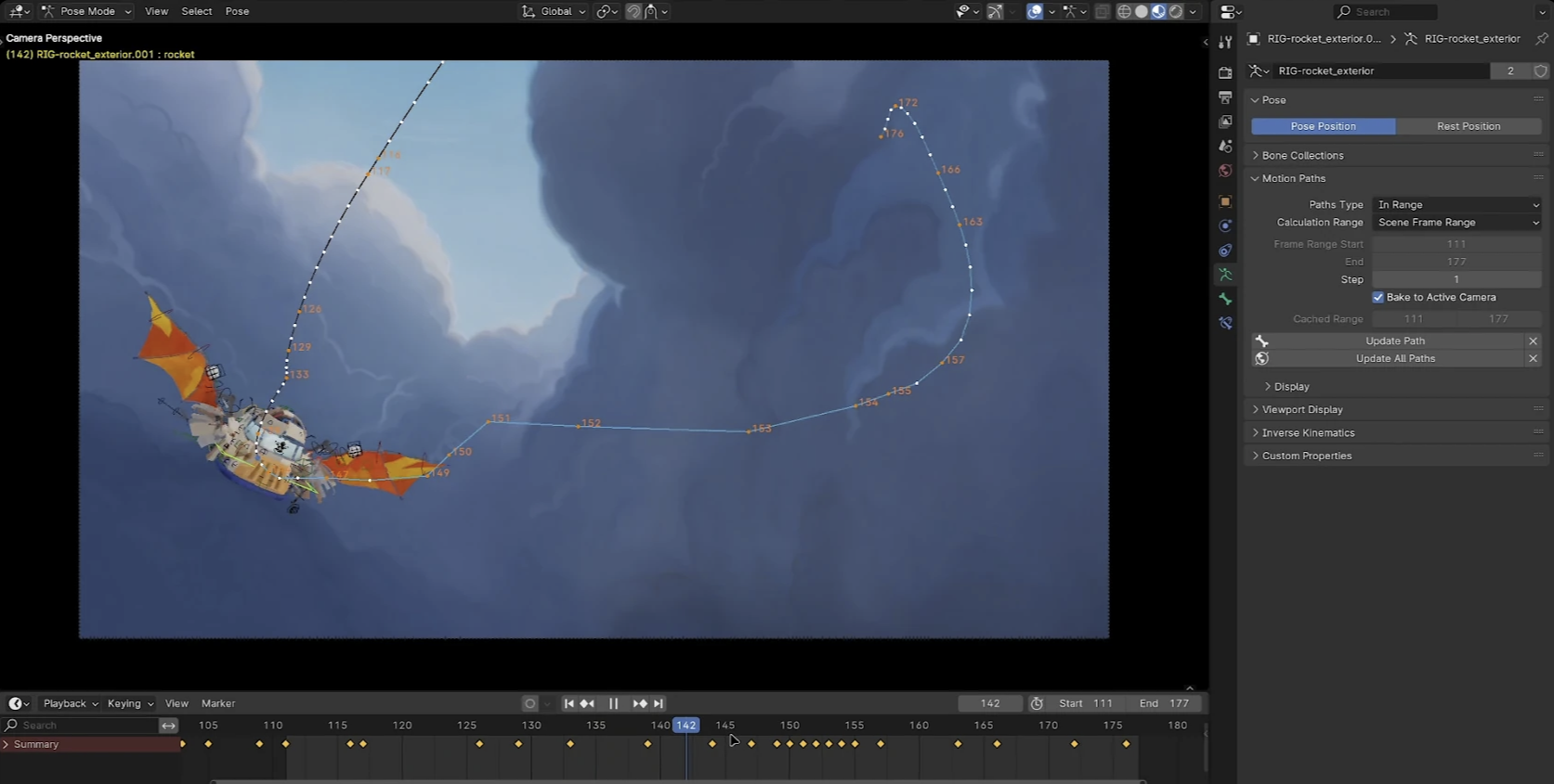
There are more changes too. As well as some changes to the video editor section, you will find some workflow enhancements to animation as well, such as the handling of dense timelines, keyframes can be locked to an axis, which is handy. You can also right click on animated attributes to show them in the graph editor. That alone is a useful time saver (even if only for animators).
Oh and motion paths can work in screen space, so you can get a better idea of your animation from the active camera view.
My favourite changes
This is an easy one for me. Yes, I get excited by new toys to play with but when I’m in production I want efficiency and as little a taxiing experience as possible, so Blender 4.1 is a great update, as it makes the GUI that little bit easier on the eye and many things that were slight annoyances before like export speeds (especially for stl files when I’m trying to 3D print a model) are significantly faster. Some streamlining to the interface and overall user experience make things easier to live with and it has to be said, Blender 4.1 has possibly the most adaptable interface out there, so making it what you want it to be is easy. Plus, it is free!

Should I download Blender 4.1?
Well, this is a no-brainer these days. Blender has always been free to use but there was always a reason to invest in a different package. Maybe that was due to support, or maybe a decision based on a more traditional interface and workflow. That is a long-gone choice now, however. Blender remains free but it offers all the functionality of the paid-for software, has an amazing community of users, many of whom will dish out help and advice and the actual user experience is fantastic.
Gone are the days of head scratching, wondering how a certain task can be performed. Blender is playing with the big boys. It offers everything from modelling, texturing, and animating you might find elsewhere but also many tools you won’t, like built-in compositing, and audio tools. The sculpting toolset which, while not quite as feature-rich as Zbrush, is excellent, has a much shallower learning curve and shares a familiar interface, making all that fine, organic, modelling a blast.
There is also an ever-increasing number of add-ons, from free to paid, that only make the prospect of working in Blender that much more enticing.
So, yes, I would highly recommend downloading Blender and making the switch.
out of 10
Blender 4.1 isn’t an exciting update but it is a very welcome one. Speed enhancements, interface tweaks, a few changes here and there to make daily tasks easier, all add up to a worthy update and one that I highly recommend to any user, new or old.

Rob Redman is the editor of ImagineFX magazines and former editor of 3D World magazine. Rob has a background in animation, visual effects, and photography.
