Unlock the organic cyberpunk visual style of Babiru in your filmmaking.
Babiru is a high-concept action feature film produced by Second Tomorrow Studios and directed by Nguyen-Anh Nguyen. The animated short film was created using Unreal Engine with the support of Epic Games, but there was also a lot of colour grading and post-production work carried out in DaVinci Resolve Studio and Fusion Studio.
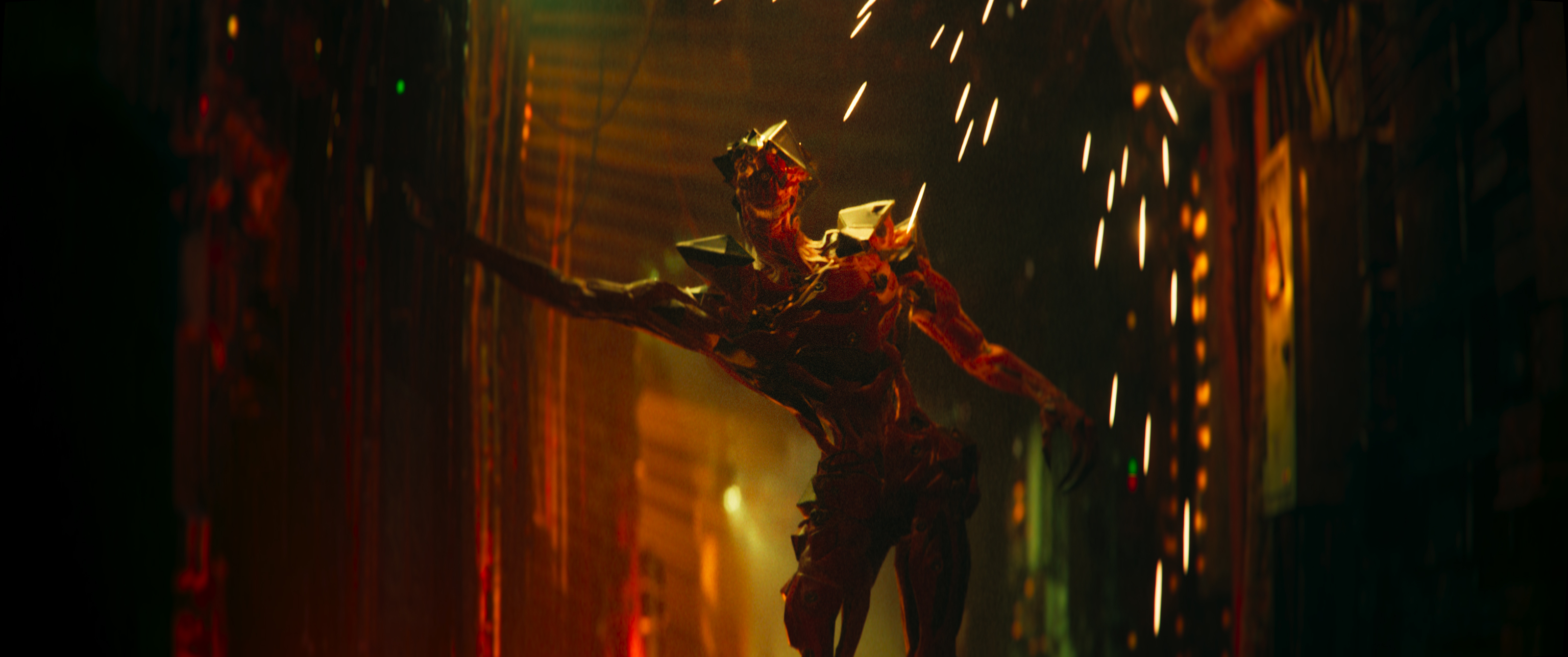
We recently took an exclusive look at how Babiru was made and you can watch cinematic short film on YouTube, then it’s well worth a watch. The colour grading was carried out by Marc Boucrot in partnership with Nguyen. Together, they wanted to enhance the visual aesthetic, making the picture feel more cinematic and organic.
Through the process, Marc put into practice a wide range of professional next-level techniques, which is why we’re so pleased he has taken time out of his busy schedule to share his top tips from the project. If you’re a seasoned colourist or just looking to get into it, I’m sure you’ll find it inspiring and informative.
For this project, all the grading work was done using DaVinci Resolve in a 4K project. The source files were .exr (zip codec) which provided all the dynamic range I needed as a colourist. Exr 16-bit files in a linear colour space (ACES) provided us with tremendous latitude to work with the image, giving us the ability to manipulate it extensively while maintaining quality. The colour space we used was ACEScct with Rec 709 output for the trailer and P3 DCI output for the final film.
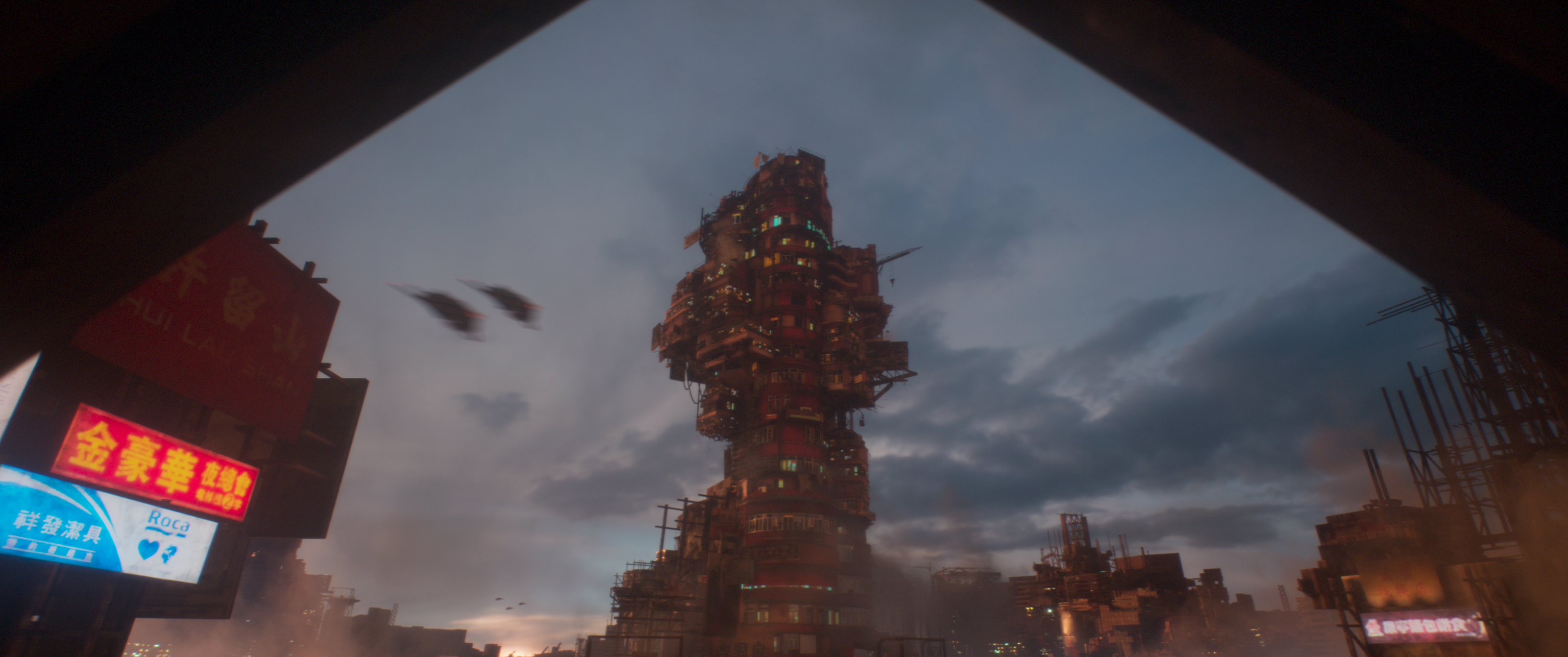
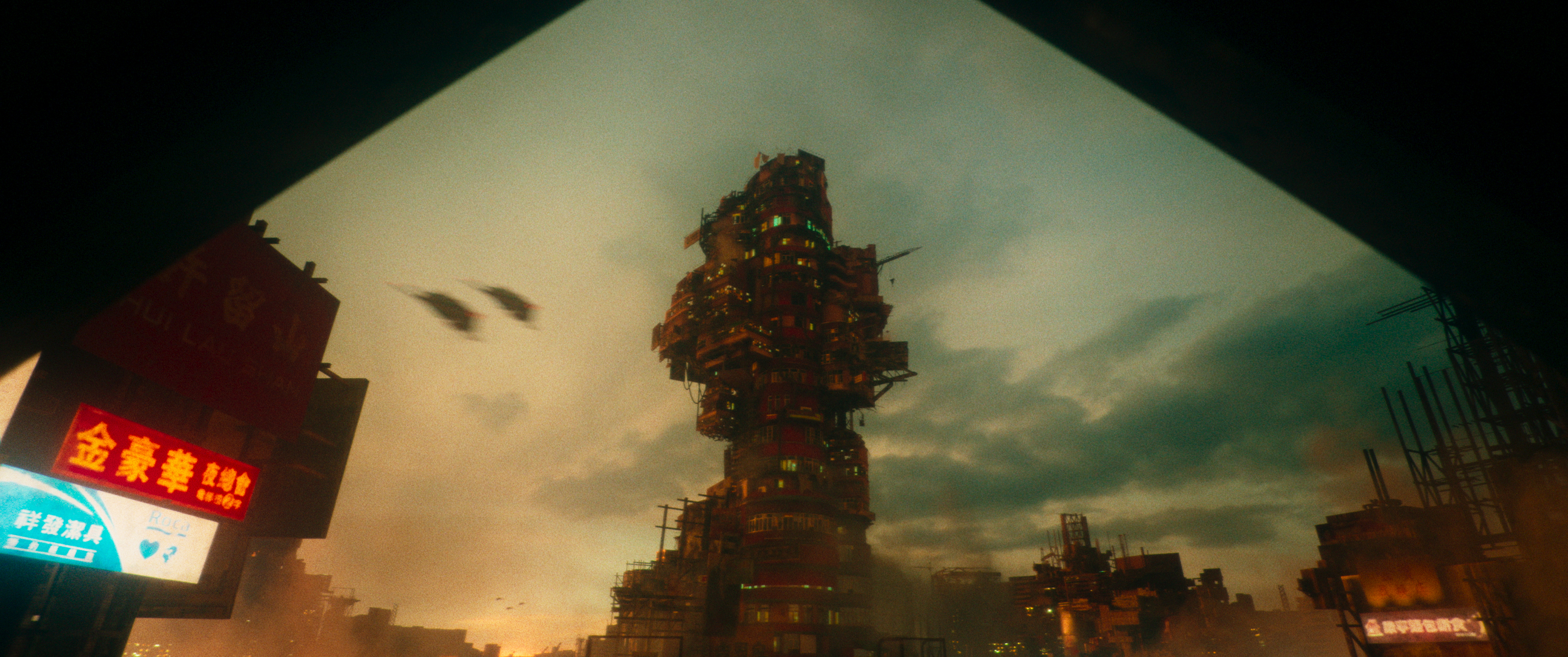
Image 1 of 2
(Image credit: Second Tomorrow Studios)
(Image credit: Second Tomorrow Studios)
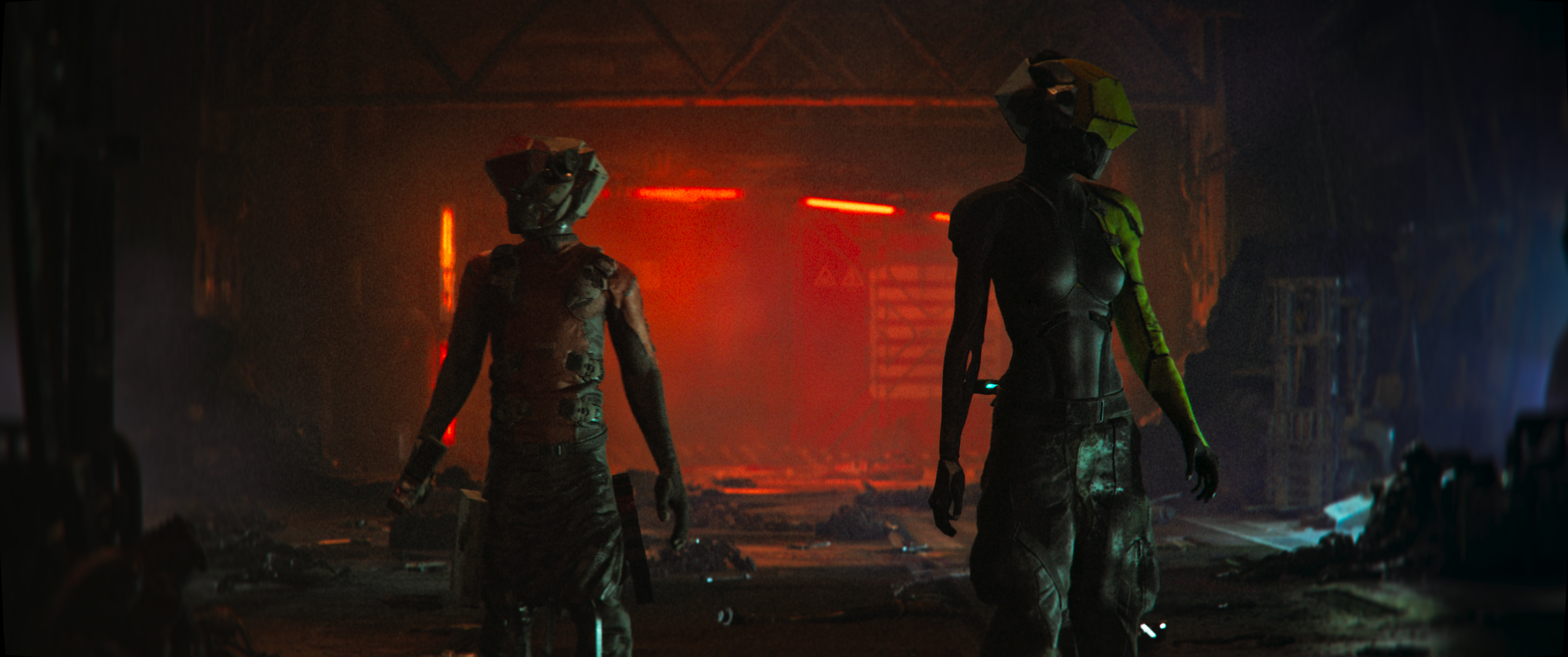
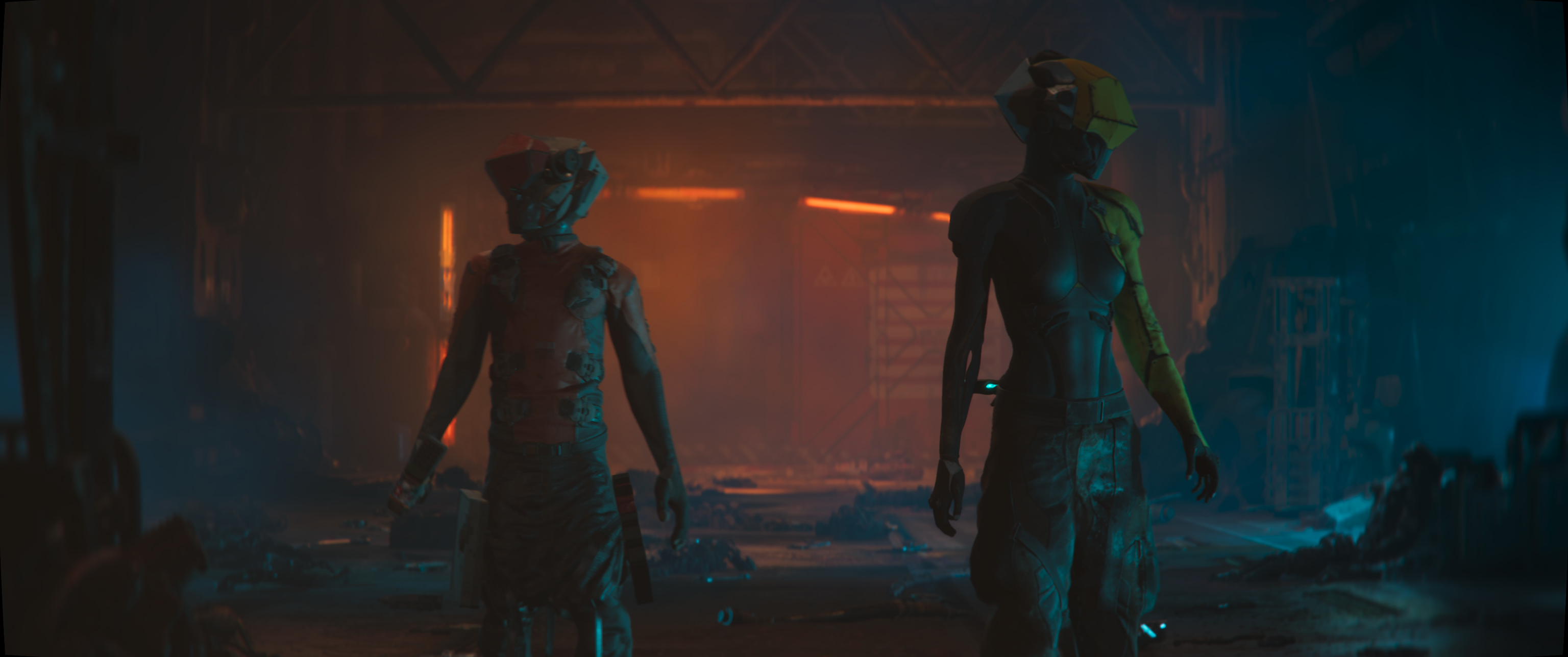
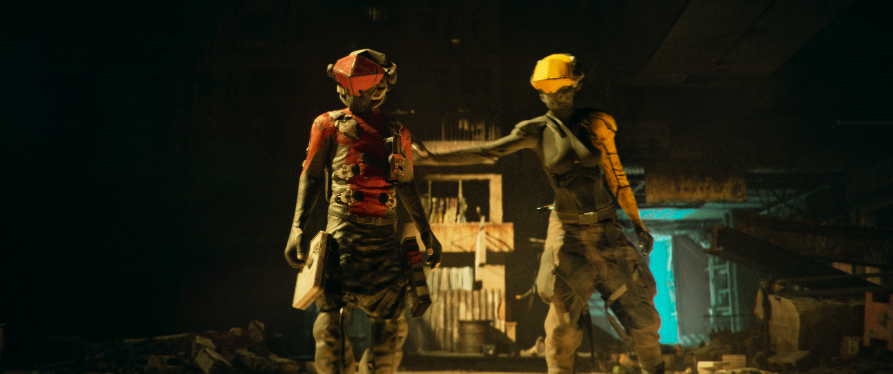
2. Colour approach
Since the film is fully CG animation, the initial imagery felt cold and heavily saturated. To counter this, we decided to go darker and reduce the gamma. We also desaturated the reds and blues, leaning more toward greens and yellows in the shadows. This created a more grounded, atmospheric feel. The lower light colour grading helped to build a moodier, less sterile tone that supported the narrative without overwhelming the viewer.
Image 1 of 2
(Image credit: Second Tomorrow Studios)
(Image credit: Second Tomorrow Studios)
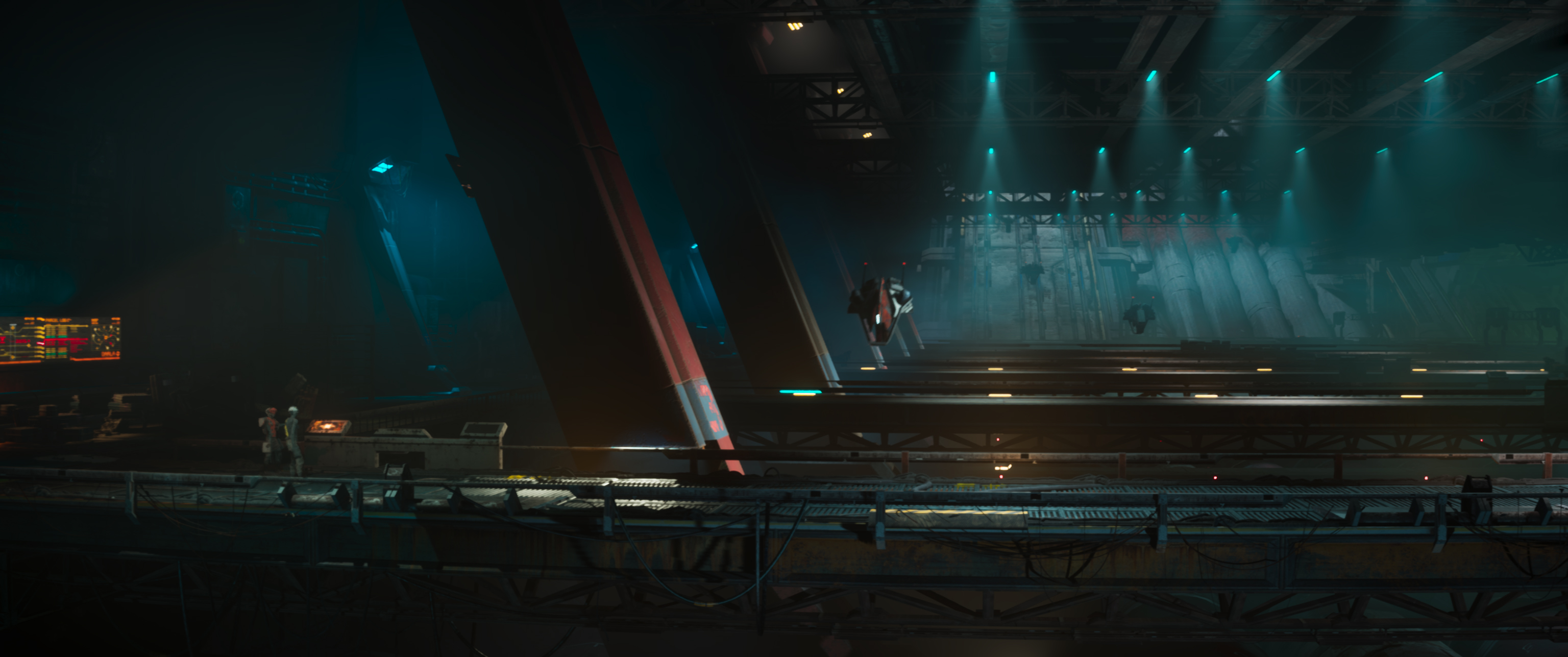
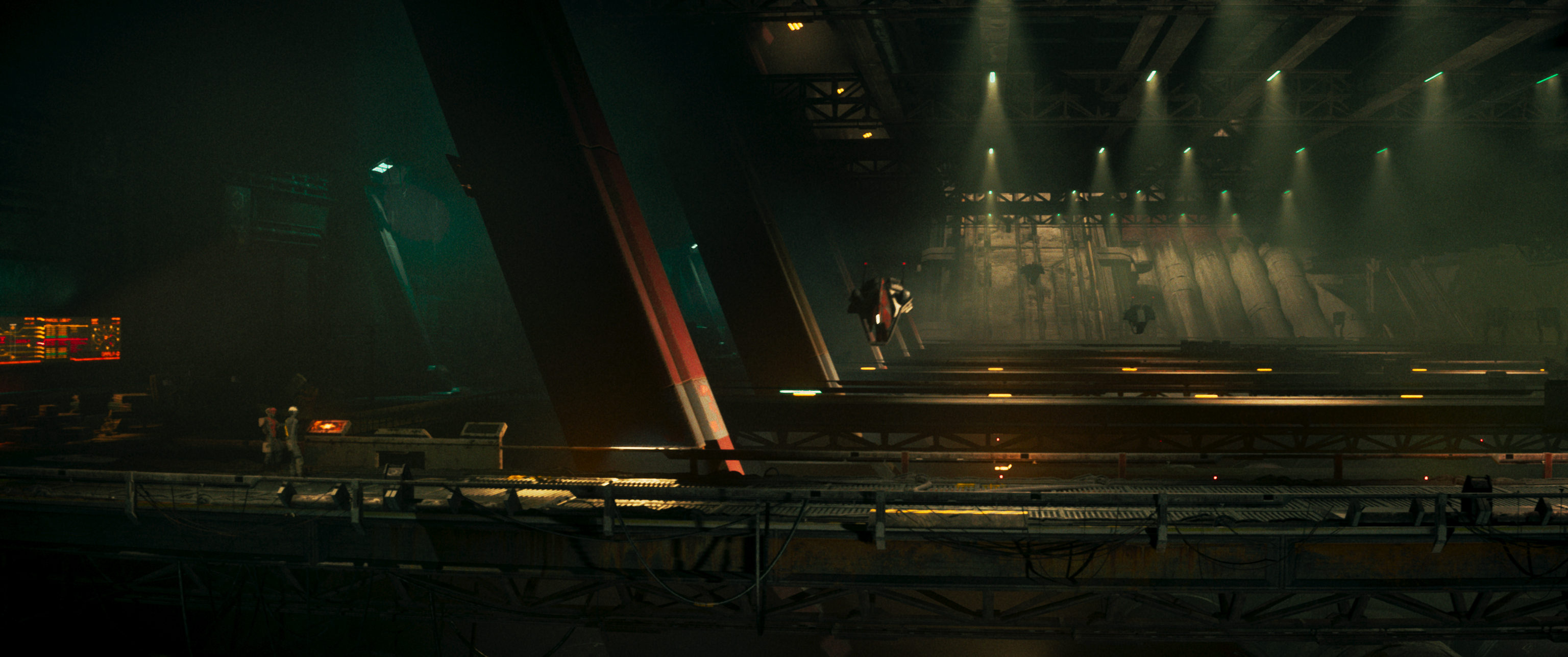
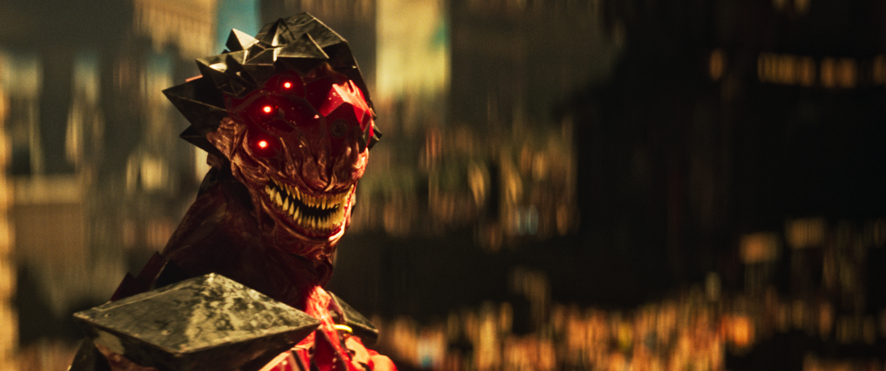
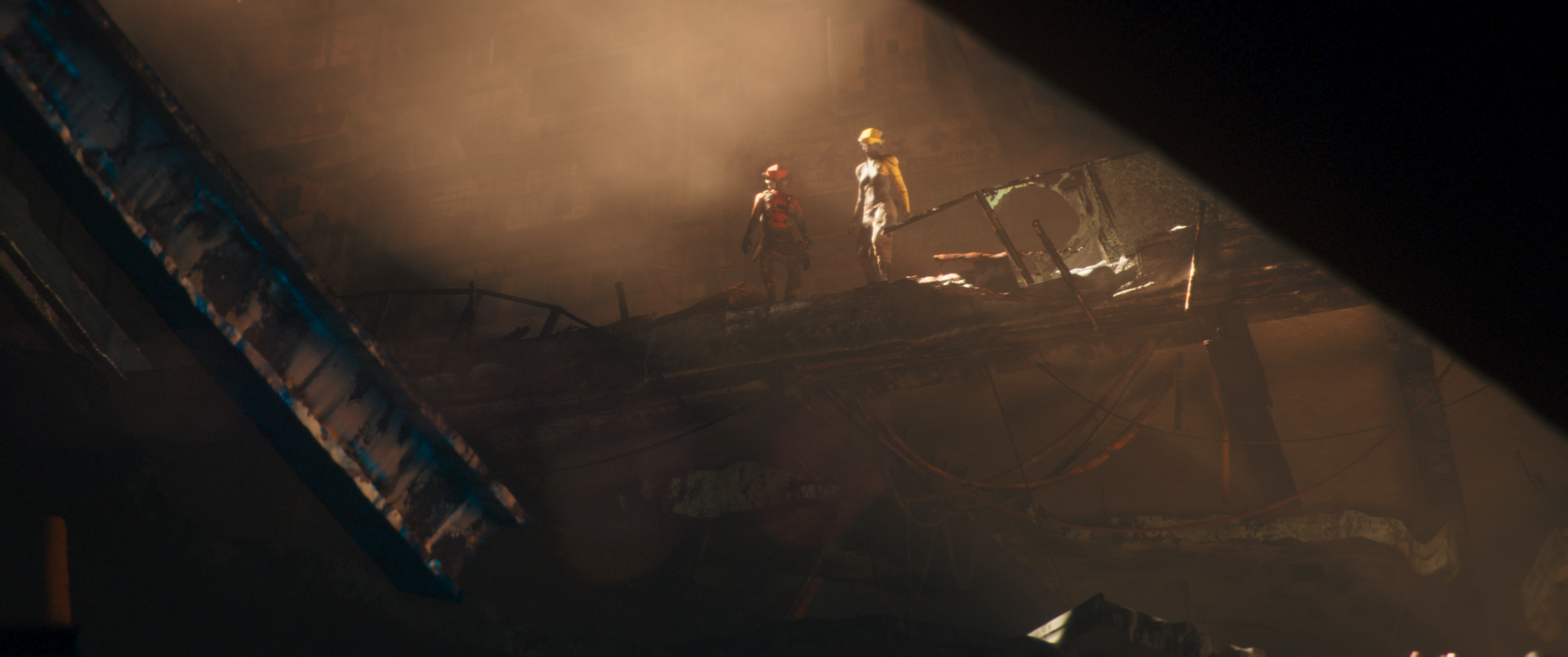
3. Texture approach
The director envisioned a more organic, realistic image – something a bit "dirtier" and less polished, as I understood it. To achieve this, my approach involved adding texture and imperfection to the imagery. I introduced a strong halation glow, noticeable grain, and subtle flickers in the highlights or specific parts of the frame. These choices helped break the overly digital feel of the animation. Gamma contrast was key in developing texture, while the mid-details tool in DaVinci Resolve proved invaluable for adding dimension and grit to the animated frames.
Image 1 of 2
(Image credit: Second Tomorrow Studios)
(Image credit: Second Tomorrow Studios)
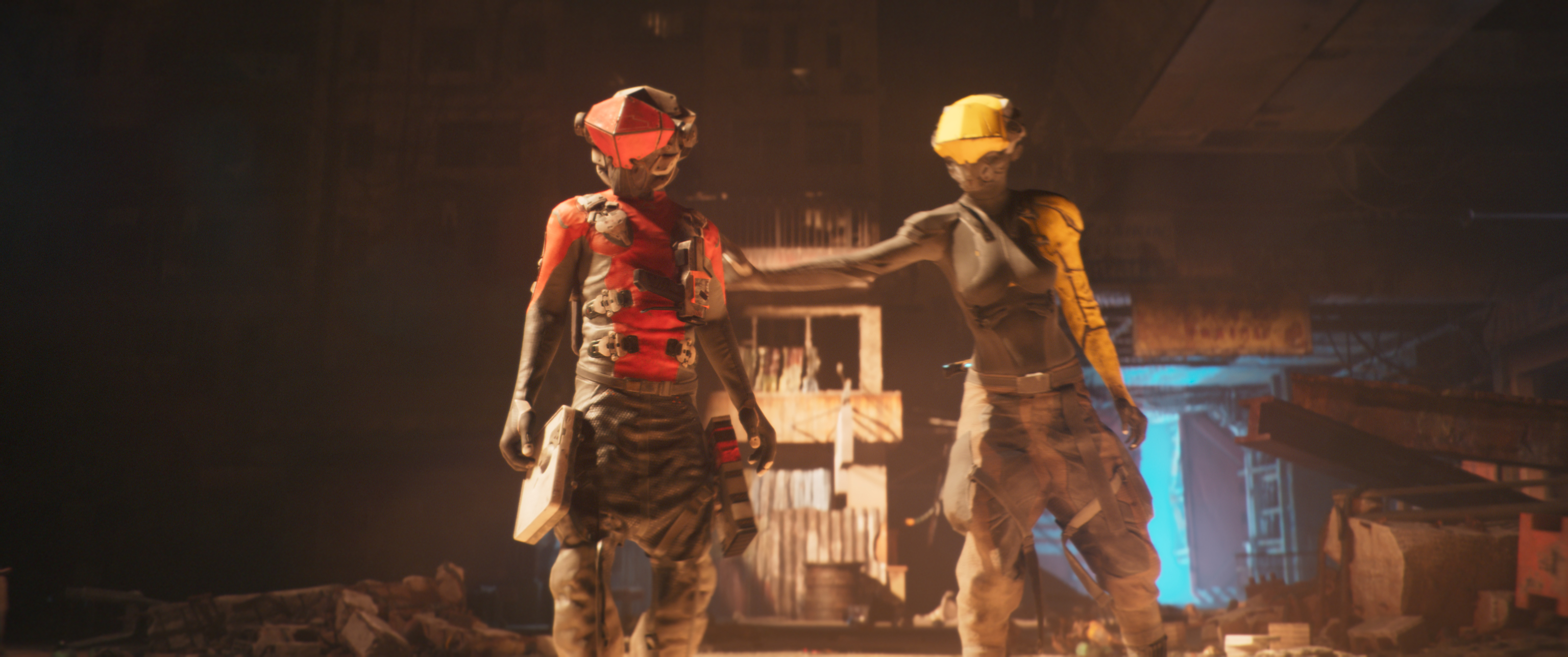
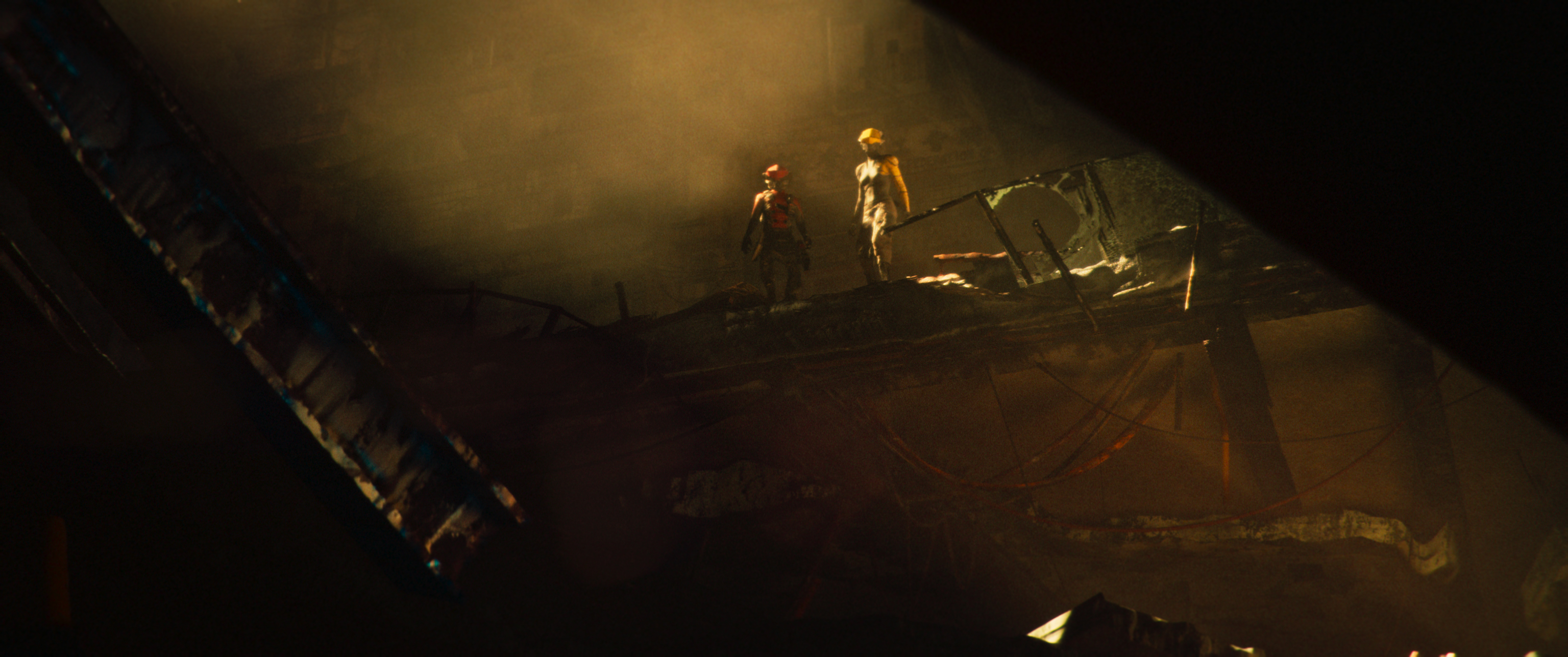
4. Double grain emulation
One unique technique we applied was the use of two distinct grain emulations. The first was a Film Grain applied primarily in the shadows and midtones to create depth and character. The second was a Film Box Grain layered on top of the highlights, along with a touch of halation for extra warmth and glow. Each shot was carefully adjusted, with grain and halation tailored individually to ensure the right balance between realism and stylisation.
Image 1 of 2
(Image credit: Second Tomorrow Studios)
(Image credit: Second Tomorrow Studios)
5. Telling a story
Ultimately, my job as a colourist is to tell the story through colours. My goal is to support the director's vision and use the tools at my disposal to amplify the emotional impact of the film. The director guides me into the world they’ve imagined, and I help bring that vision to life. It's all about translating the mood and emotions through colour, light, and texture – turning each frame into a piece of visual storytelling.
Image 1 of 2
(Image credit: Second Tomorrow Studios)
(Image credit: Second Tomorrow Studios)
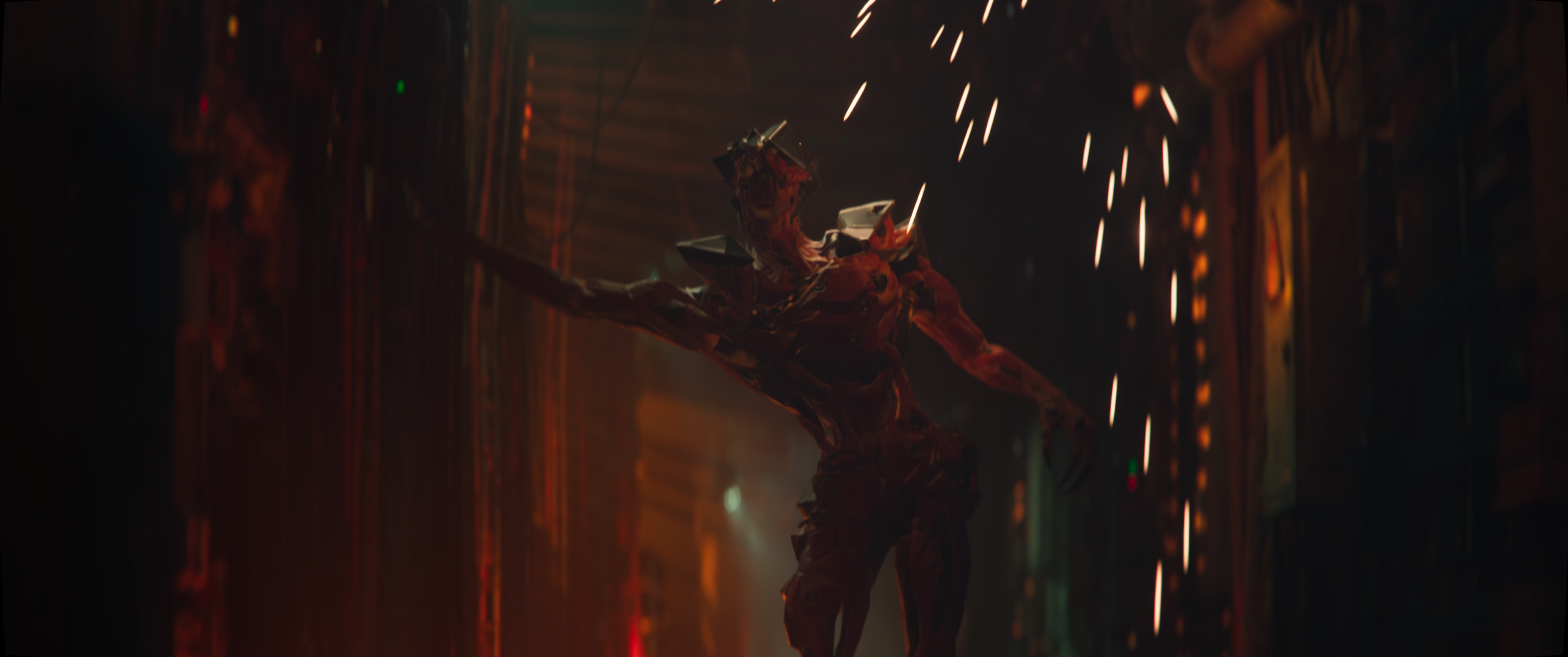
6. Balancing realism and stylisation
While creating a cinematic experience, striking a balance between realism and artistic stylisation is crucial, especially when working with CG animation. Pay close attention to how much realism you inject versus how much you stylise. In Babiru, we walked a fine line, ensuring the world felt grounded yet retaining the creative flair that distinguishes it from other action films. DaVinci Resolve’s advanced HDR tools allowed us to selectively push the stylisation without losing realism.
Image 1 of 2
(Image credit: Second Tomorrow Studios)
(Image credit: Second Tomorrow Studios)
7. Collaboration and feedback
Color grading is a highly collaborative process, especially in a high-concept film like Babiru. Regular feedback from the director, VFX supervisor, and even the sound team can provide valuable perspectives that help shape the final visual tone. Make sure to build a workflow that allows for quick iterations and smooth feedback integration. We used a combination of colour-graded proxy renders and synced remote sessions to ensure the creative vision was aligned throughout the post-production process.
Marc Boucrot is an Editor and Senior colourist based in Montreal and Paris. He is a long time collaborator of French filmmaker Gaspar Noé (Irreversible, Enter The Void, Love, Climax, Lux Aeterna, Vortex).
You must confirm your public display name before commenting
Please logout and then login again, you will then be prompted to enter your display name.