Inside the impressionistic realism of DreamWorks' The Wild Robot
Director Chris Sanders shares how the artisan aesthetic came to be.
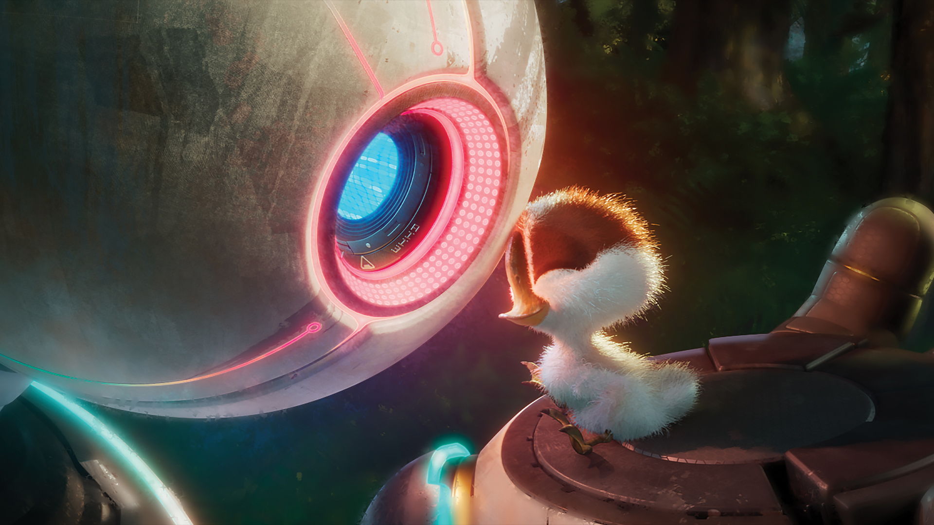
Undoubtedly it’s easier for animation studios to have an in-house style, but this isn’t the path DreamWorks Animation decided to take when adapting the illustrated children’s novel The Wild Robot by Peter Brown, where a ROZZUM unit 7134 robot gets stranded on an isolated island teeming with wildlife.
If you're a budding animator looking to kickstart your career, check out our character design tips for some creative inspiration. Looking to upgrade your kit? Take a look at our guides to the best laptops for animation and the best drawing tablets for animation.
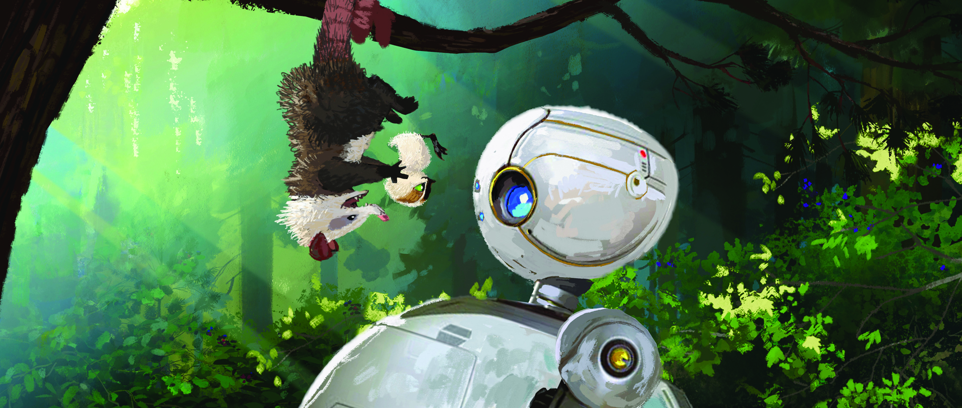
“The magic is in how every aspect of this movie, we altered the animation process to fit the style and story that we’re trying to tell,” states Chris Sanders, the film’s writer and director.
“Our animators worked closely with the rigging department. It’s something we’ve become much better at in letting the animators take the lead as far as what they need for these characters and what expressions are required.”
Being open-minded is a vital part of being a director. “I talk to animators predominantly like actors,” Sanders explains. “I’ll say, ‘This is what the scene or moment is about.’ Then their job is to solve that. I made a decision a long time ago that if somebody does something in a way that’s different than what I saw in my head, but it checks all of the boxes and gets everything that we needed, then we’re finished.”
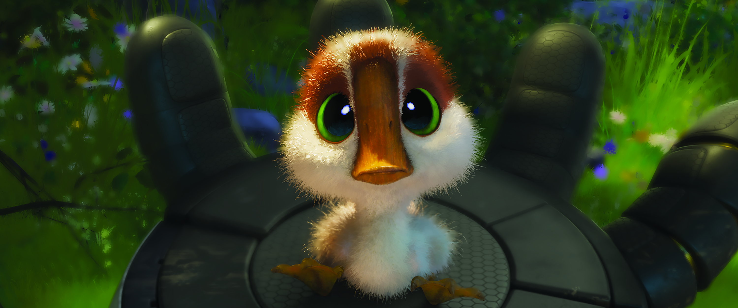
The technology and techniques were built on top of what was achieved in The Bad Guys and Puss in Boots: The Last Wish. “For the day-to-day of animation, I’m there usually to help develop and make sure that the rig and character is working, and that we’re able to hit the poses and facial expressions, combined with the way that the fur is rendering looks right,” says production designer Raymond Zibach.
“You’ve seen those other movies where they look like an oil painting being repainted every frame and it’s distracting. They let the properties of light change certain things about them. A lot of what painting is, is deciding how much you’re going to cheat where the detail is and isn’t, and how much can you let a brushstroke show or whether you need to replace that with something tighter. All of that is built into the way we surfaced our world and characters.”
Get the Creative Bloq Newsletter
Daily design news, reviews, how-tos and more, as picked by the editors.

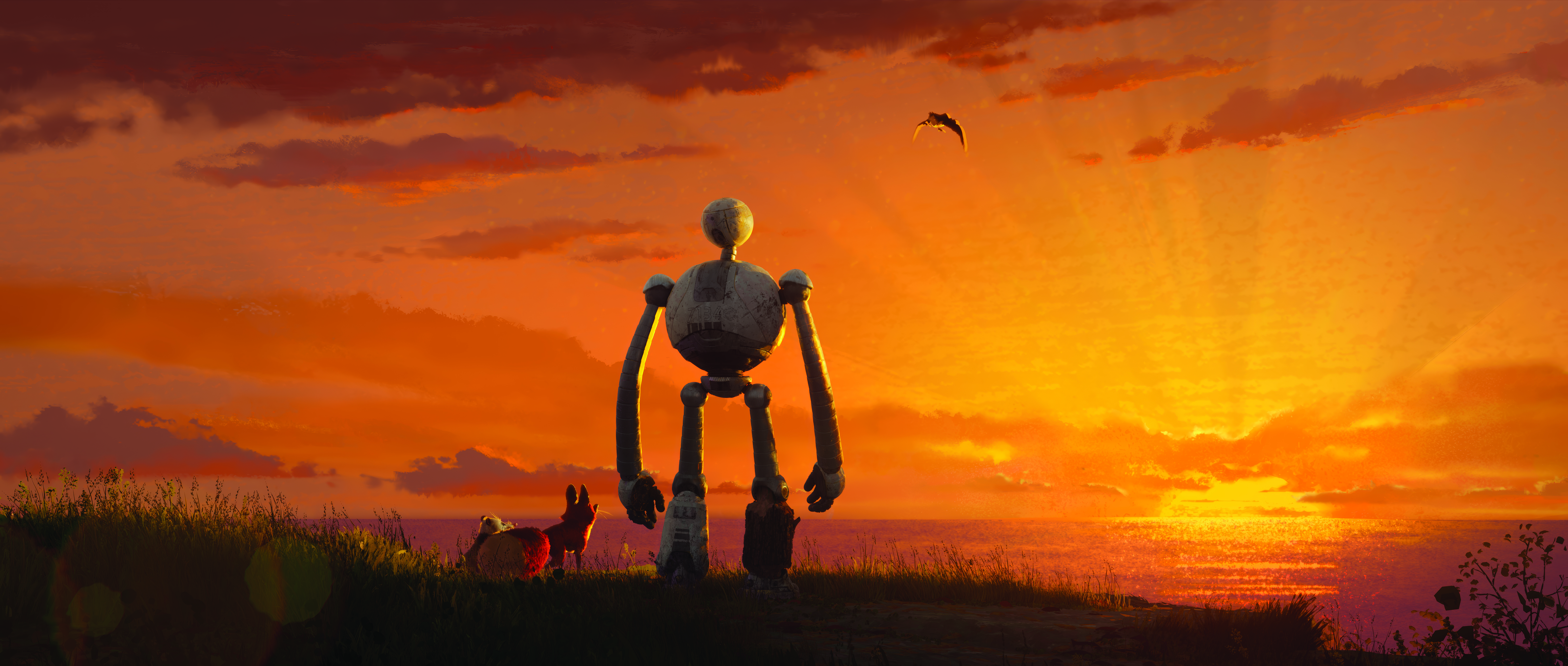
The film’s shape language is recognisable. “We didn’t want to go too stylised with our natural world,” Zibach adds. “We wanted it to be a homage to a plein air [French for outdoors] painting, but a digital impressionistic version of that. When you see a painting of nature, you can feel that love of nature. Someone is studying and trying to depict it in a way that captures the essence; that’s why this style felt like the right approach for this movie.”
There were certain parts of the story we had to clean up, and others we had to expand
Chris Sanders, writer and director, The Wild Robot
Animation is too time-consuming and expensive to have unnecessary scenes end up on the cutting room floor, which is why the narrative structure and shot design is figured out at the storyboarding stage. “My job is to translate how that book felt, as well as the actual things that happened, and we had to adjust those things,” notes Sanders. “There were certain parts of the story that we had to clean up and make simpler and smaller, while other parts we had to expand and make more of a meal of them.
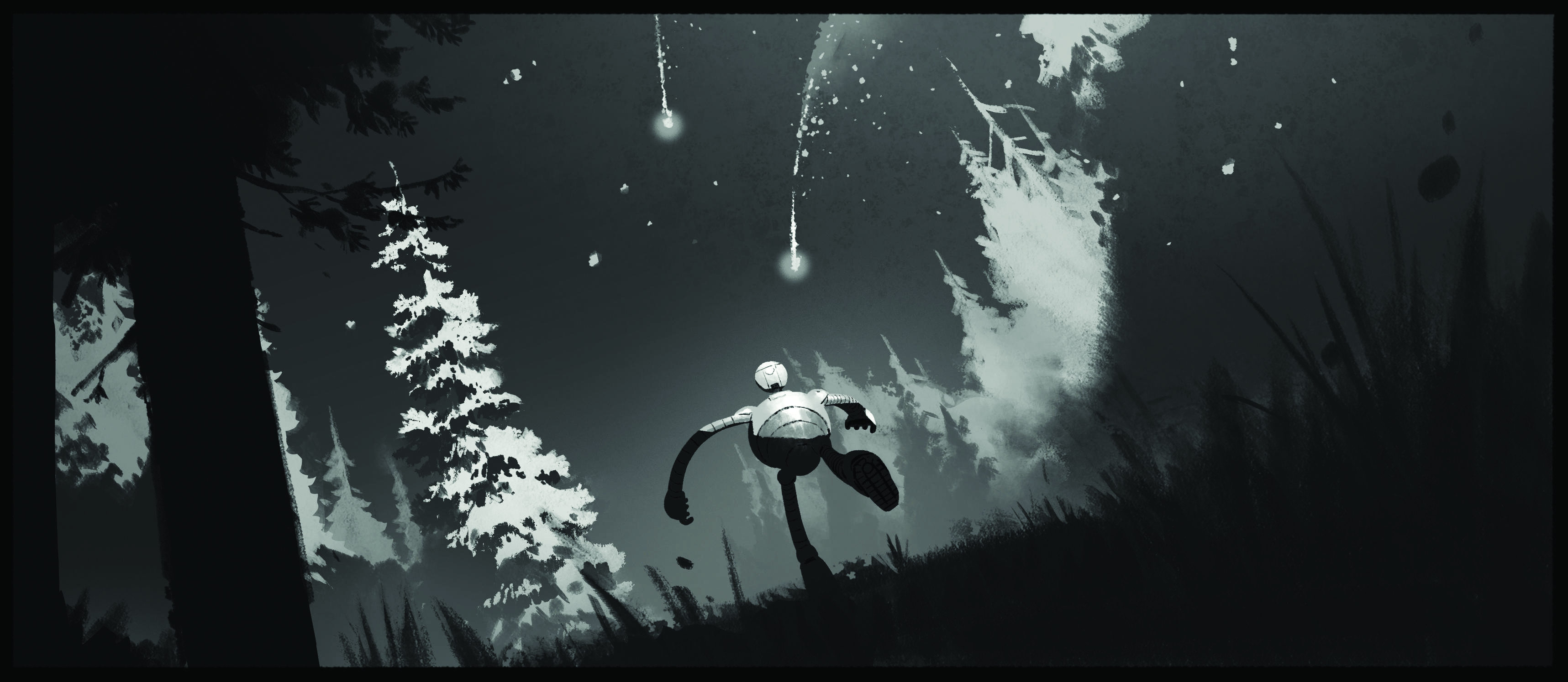
“The way that she builds relationships with the animals in the book is a bit simpler. In the film, we had to earn those relationships. There’s a scene I added called the Robot Graveyard. I realised that in the book there were a number of robots that had arrived and were destroyed. Roz’s crate was lucky. It was put up onto a rock by a wave and accidentally avoided destruction.
“I knew there were pieces of at least five more robots floating around in the tide pools around that island. I wanted to have Roz find those bits, assemble a robot, and communicate with it to try to figure out what’s going on. I used elements from the book to build into the movie and that gave us a less linear path. It changes the way that she sees her situation and evolves the story.”
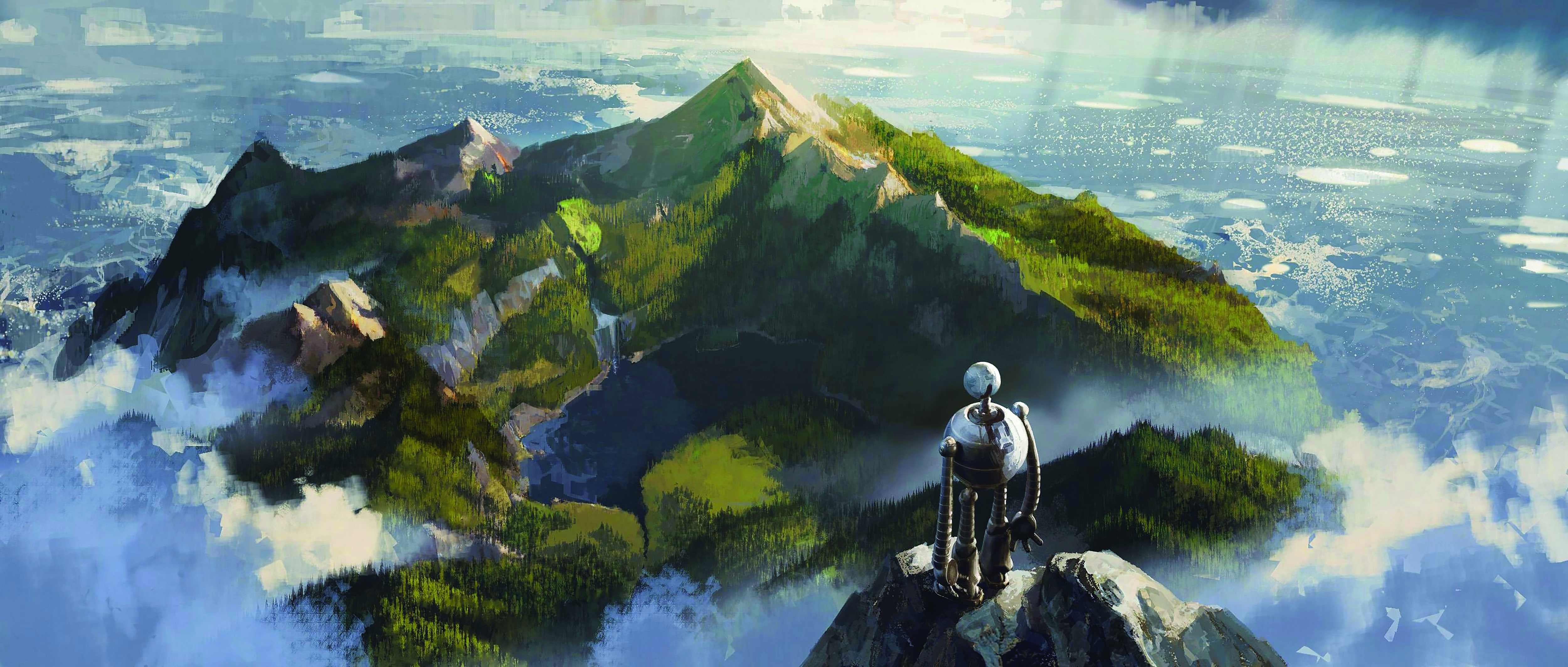
Easing the reliance on compositing was important. “It doesn’t make sense to create a realistic bush or tree and try to hammer it in compositing to make it look painterly,” notes visual effect supervisor Jeff Budsberg. “If you want a stylised-looking plant, you should draw the plant. We put in a lot of effort more upstream in the asset construction so that all the modellers and look development artists could draw their assets in 3D, which you could move and place in space.
“That was also important because we wanted a dynamic camera that was more handheld and nature photography or documentary style. We wanted to be able to rig and deform the assets, even though perhaps the leaves or flowers didn’t need to connect with sticks or branches because a painter doesn’t care about whether something is physically accurate. They want
it to be believable.”

Concept art was not only used as a reference for the shot design. Budsberg adds: “Historically the art keys are an inspiration for the lighting and shading, but on this film we literally wanted to make the art key. There are some times we put a frame up in dailies and I’m not quite sure if that’s the art or the rendered frame.”
The design of Roz was fascinating… we leant into her limitations”
Jeff Budsberg, visual effect supervisor, The Wild Robot
Atmospherics are everywhere to provide separation, depth and scale. “You look at the god rays in some of the shots or depth-based atmosphere, it’s not only the volume,” remarks Budsberg. “It actually has brushstrokes inside it, so you’ll see that we modulate the volume quite a bit with some sort of stroked texture or directionality. Those brushstrokes might affect the smoke or the atmosphere that’s there.
“In all of those they try to follow the principal curvature of the direction of the flow, because if you have this waterfall, you wouldn’t paint the strokes horizontally. You want them to be flowing with the volume so the curvature of the stroke will be following the flow of the billowing smoke or atmospheric. It comes back to putting a lot of thought into how these things are constructed and then modulating those traditional CG types of elements in ways that resemble what an illustrator would do.”
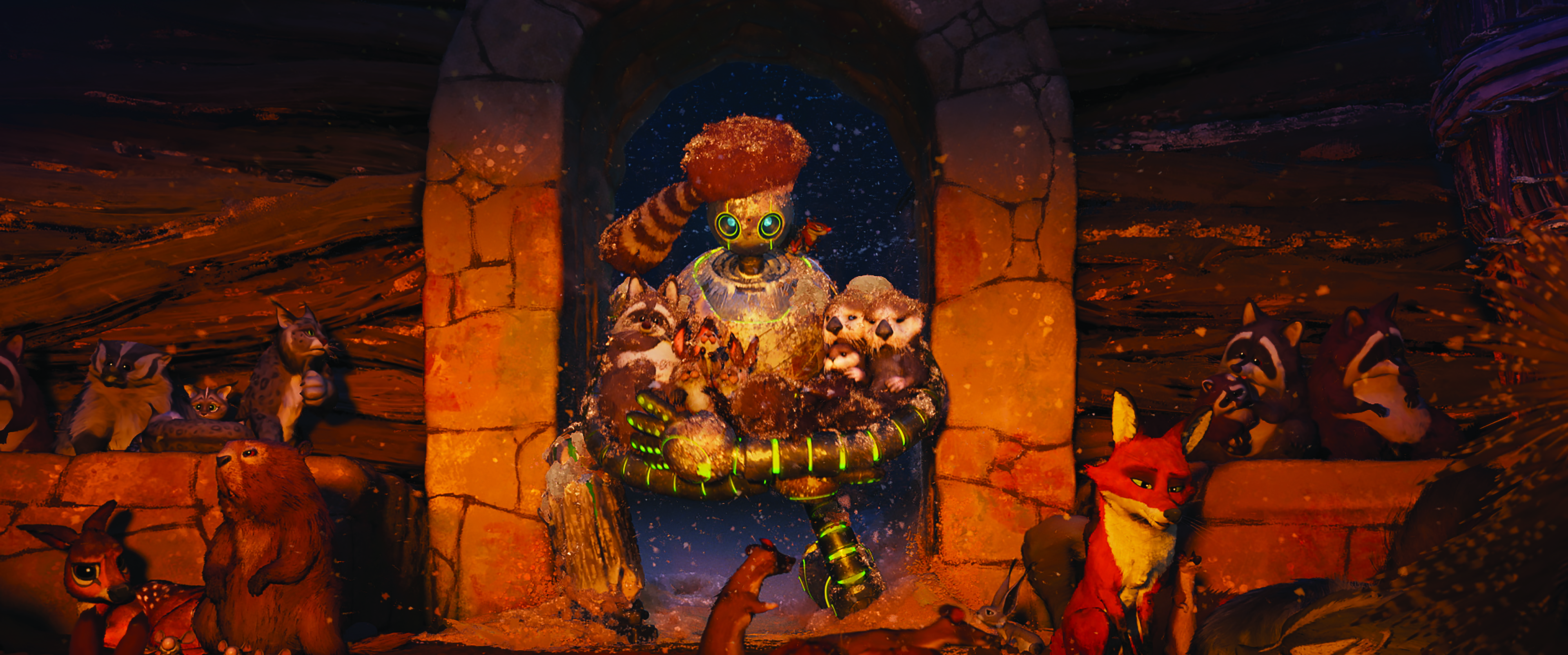
Representing how Roz views the world is a heads-up display (HUD). “The design of Roz was fascinating because we wanted to lean into the limitations of this robot,” Budsberg explains. “She doesn’t have a mouth and has limited facial structures. We wanted her design to feel futuristic but believable. That’s critical because you need to know that she can be damaged. Just watching the world through those eyes and seeing the mechanics
of something like a DSLR lens, the audience recognises that it’s a mechanical thing. Even some of the outlandish things she can do with her body are based in some sort of physicality. We wanted her to feel like something that could be manufactured.”
There are no throwaway elements in the frame. “It has been more so than any other film that I’ve worked on the entire image,” observes Jakob Jensen, the head of character animation. “The background characters play such a huge part with the emotional impact, especially in the migration scene. This is when Roz sees Brightbill off like a mother sending her child off to college; that’s the sort of emotional analogue.
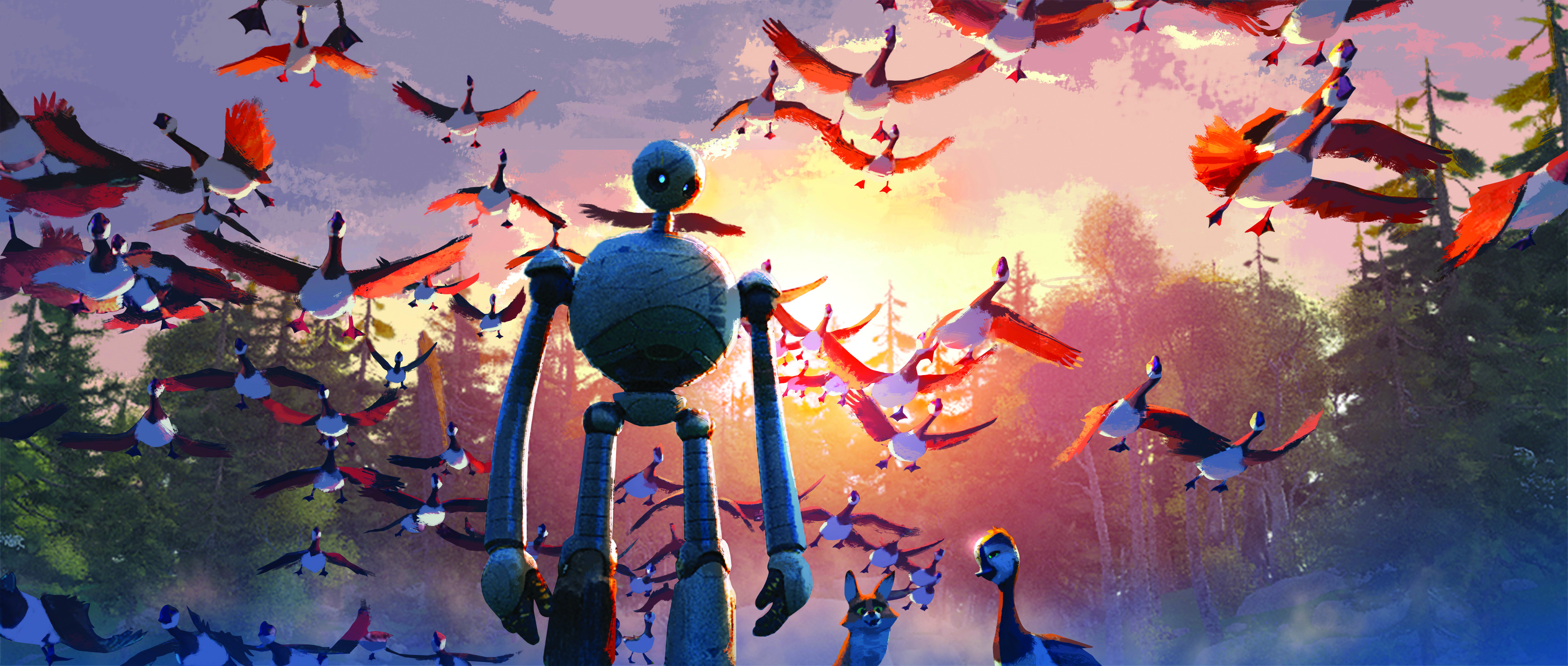
“The number of characters in those shots is insane. It’s not just having flocks of birds flying, but it’s also the behaviour in the background. We generated so many different bird cycles of interesting behaviour so that you could have something alive in the background that doesn’t upstage, but it still aids in getting a grounded performance.”
The performance demands influenced the character designs as well as modelling and rigging. “How do you make a quadruped also be a bipedal in some ways?” Jensen adds. “You have to choose your moments and then you have to make additional controls in an arm to bend the wrist in a way you wouldn’t typically see in a dog.
“Fink, the fox, is quite emotive and is anthropomorphised to a degree. We have a possum who moves around with seven babies on her back constantly, which was another challenge, as I’m sure you can imagine.”
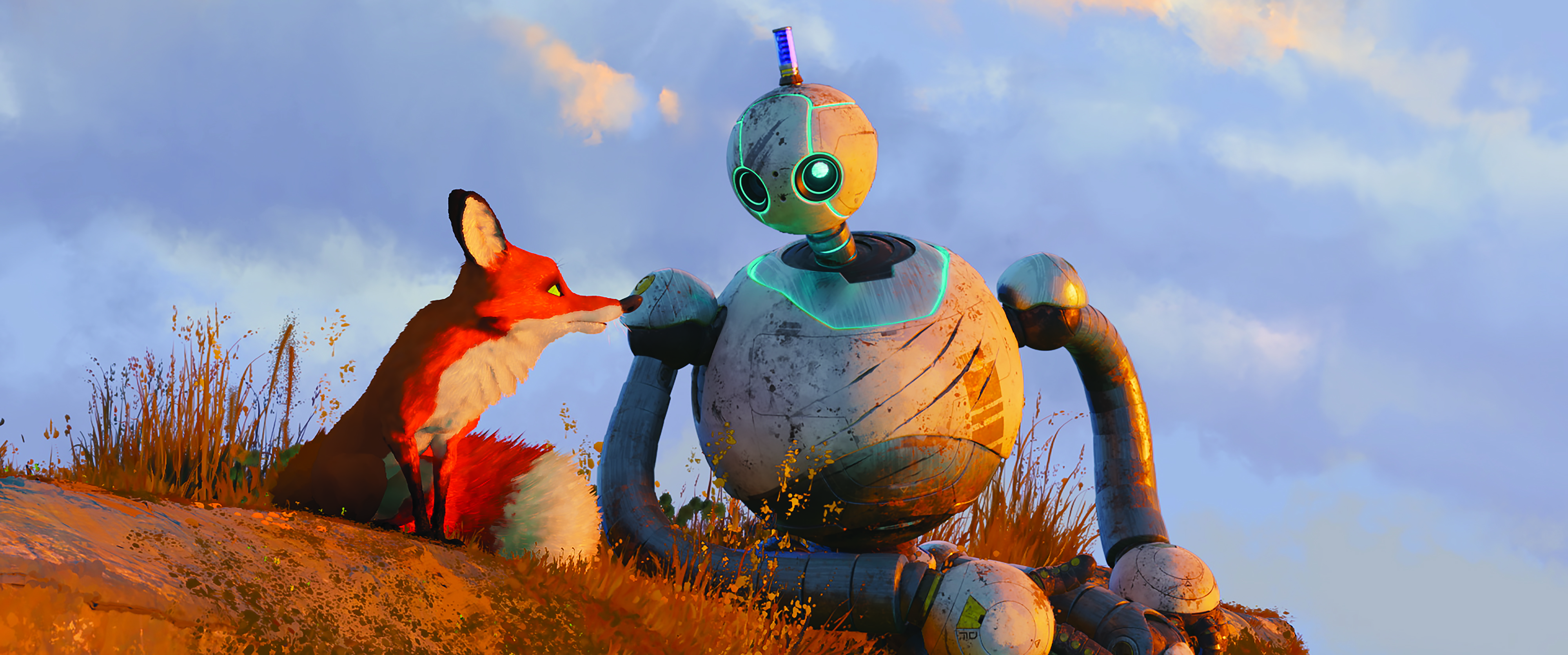
Simulations had an impact on the character animation. “At times when you finally realise how everything looks rendered in a furry creature like the bear, you go, ‘Oh my god! That doesn’t read,’” remarks Jensen. “The silhouette or pose that you created will take on an entirely different read when fully clothed or furred. We have access to the fur in our software so we can turn it on. Obviously, it makes the rig heavy when turning on all of that data, but we can see it in our software and get a good idea of how it reads.
This was a journey of figuring out how we do something that’s quite impressionistic
Jakob Jensen, head of character animation, The Wild Robot
“However, then we have the added complexity of our painterly rendering style, which made it tricky to make fur feel like fur, but at the same time feel as though it’s real. This was a journey of figuring out how we do something that’s quite impressionistic.
“When we were reviewing things with Chris Sanders and getting closer to that look, he kept saying, ‘It looks even more real than if you were to approach it in a photoreal way.’ That’s the same goal that the impressionists had when they were painting, so you get a glimpse into how they see the world and how it feels. That’s vastly different from photorealism.”
This content originally appeared in 3D World magazine, the world's leading CG art magazine. 3D World is on sale in the UK, Europe, United States, Canada, Australia and more. Limited numbers of 3D World print editions are available for delivery from our online store (the shipping costs are included in all prices). Subscribe to 3D World at Magazines Direct.

Thank you for reading 5 articles this month* Join now for unlimited access
Enjoy your first month for just £1 / $1 / €1
*Read 5 free articles per month without a subscription

Join now for unlimited access
Try first month for just £1 / $1 / €1

Trevor Hogg is a freelance video editor and journalist, who has written for a number of titles including 3D World, VFX Voice, Animation Magazine and British Cinematographer. An expert in visual effects, he regularly goes behind the scenes of the latest Hollywood blockbusters to reveal how they are put together.
