15 pro character design tips
Senior artist at Framestore Dan Mason talks through 2D and 3D techniques to create interesting and emotive character designs.

In this article, you'll learn my method for creating character concepts, such as Coal Troll. My experience with concept work has been within a production pipeline and, in this context, the concept is not the finished product but a guide for the other departments who will create the final image on screen.
Being flexible with your concept work is essential in this scenario, as clients will often change the brief before coming to a final decision on a design.
For this reason I focus on how to portray a character as efficiently as possible, using traditional illustrative methods, while also getting as many aspects of your concept image 'for free' by using 3D packages to help with perspective, lighting and layout.
01. Start with research
Begin your concept by finding reference imagery relating to your character, for inspiration. Think about what physical characteristics your character may have, and why. Look towards nature for help.
For example, a creature that lives in the dark may have very large eyes to take in small amounts of light, like an owl. This link with reality will make your character more believable, and will help tell their back story.
02. Consider the use of your concept
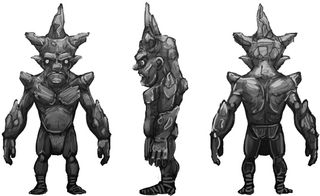
Consider how your concept will be used. Is it going to be a loose reference for another artist, or will it need to be a precise blueprint for modelling? This information will shape your approach. Consider whether you need orthographic views, or if you can take a looser, more artistic approach.
03. Be bold with sketch work
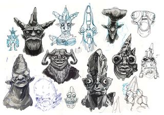
The sketch stage is a time for experimentation. Try to explore as many different looks as possible, and don't be afraid to go to town creatively. It's always possible to reign in a design if it goes too far in one direction, but it's not as easy to make a mundane design exciting.
Get the Creative Bloq Newsletter
Daily design news, reviews, how-tos and more, as picked by the editors.
Try drawing several quick versions of your character, changing the proportions of a certain aspect each time - for example, the position of the eyes, nose or mouth. After the first few drawings your design will start to become more original, as you force yourself to play around with scale and positioning past the normal proportions we are used to seeing.
04. Consider costume and characteristics
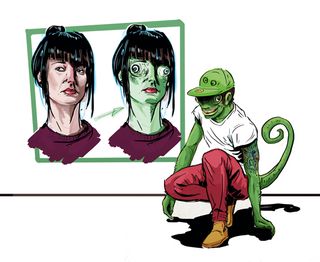
Costume can be extremely effective in telling the audience about a character. Think about the people you know, and how they express themselves with what they wear. Think about the clothes they wear and how they style their hair, and what these idiosyncrasies - no matter how small - say about them. Use this information in your designs.
05. Prioritise your UV space
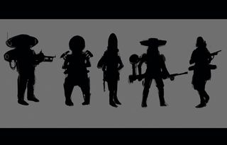
A really successful character should be identifiable by their silhouette alone. A strong silhouette can add a lot to the design's personality, as posture and proportions can give the viewer a real insight into a character.
Duplicating a silhouette and exaggerating various parts of its anatomy using the Liquify tool in Photoshop can be a very useful way of experimenting in a non-destructive way.
06. Refine successful elements
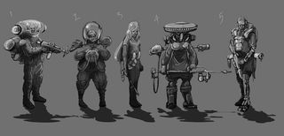
Take the successful elements of your design and try to hone in on a single concept. Add form to your silhouettes using varying tonal values. Start by filling your sketch or silhouette with a mid-grey tone.
Then add your shadows and highlights with dark and light grey to add basic form to your character. As an exercise, try duplicating your favourite silhouette and fi lling in the form in different ways to give you different characters.
07. Make use of 3D software
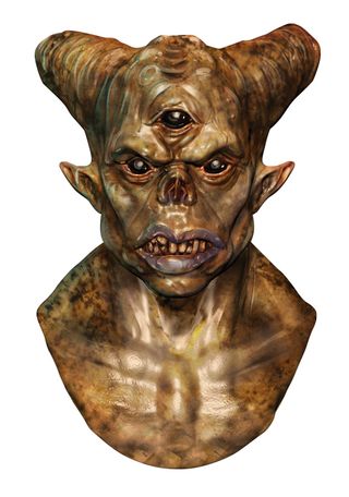
Mudbox and ZBrush are both great tools for creating your character in 3D. When sculpting in any package, make all of your big changes at a low level of subdivision before you get carried away with sculpting detail. Your levels of detail should correlate to your subdivision levels.
Start with large changes in form at a low subdivision level and work in stages. Create a new layer for each stage. Your layer with the highest polygon count should be the layer with the smallest details.
08. Add time-saving 3D elements
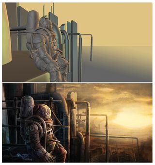
Using basic geometry in Mudbox or ZBrush to create landscapes or terrain will give you your perspective for free. Lights can also be added, and rendered as separate layers for use in lighting your character in Photoshop. Viewport filters can also be handy.
For example, Mudbox's Screen Distance viewport fi lter can be rendered out and used as a depth of field pass to add atmospheric haze to a Photoshop image.
09. Use camera framing to tell a story
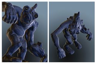
Another useful element of your basic 3D scene is the ability to create an easily adjusted camera to frame your image. Your image composition can be a useful tool in revealing your character's personality.
For example, looking up at a character can make them appear overpowering and menacing, while angling your camera downwards onto a subject can make them appear small and, as a consequence, vulnerable.
10. Play with colour
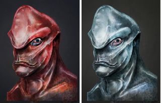
The colour of your character can help to portray their personality, based on our preconceptions. We subconsciously associate certain colours with being good and other colours with being bad.
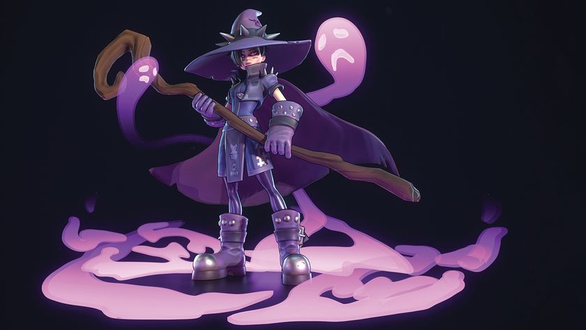
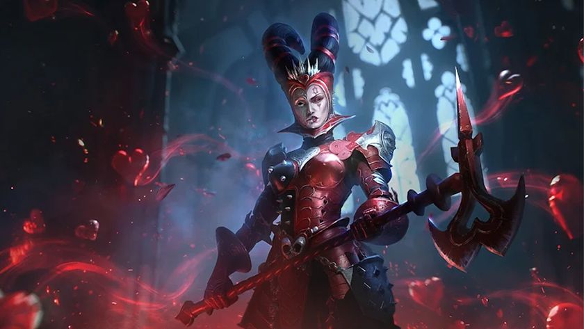
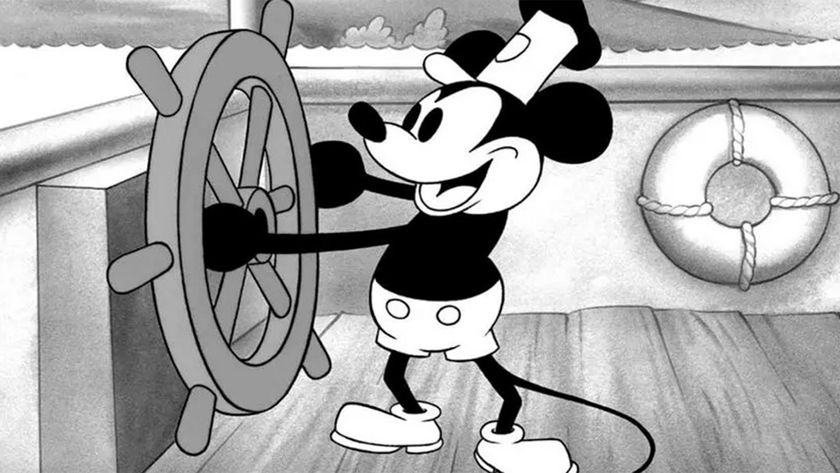
As a basic example, take a look at any Disney animation: villains are often clothes in black and red, while heroes usually wear lighter-coloured clothing. The images above illustrate the use of colour to hint at a character's personality.
11. Experiment with your lighting

Lighting in a scene is also very important. Keeping a reference library of film and game stills can be useful when deciding your lighting setup. As with the colour of your character, the colour of your lighting can cast a very different mood and atmosphere on your design. It can even signify your character's intentions: we often assume that a character largely hidden by shadow is up to no good, for example.
12. Create a simple colour palette
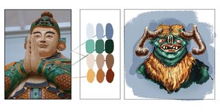
To create your palette, find an image that has the mood and colours you're looking to mimic. Select three or four of the image's most prominent mid-tone colours and copy them twice.
Darken the values of one duplicate and lighten the values of the other. You now have a concentrated palette of nine to 12 colours. Use your brush at close to full opacity to avoid the colour values merging and becoming muddy.
13. Add more detail using texture elements
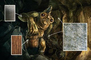
A quick and relatively painless way to add texture, detail and colour to your scene is by using photographic images. Photoshop's Overlay layer mode is particularly useful when adding texture layers as the detail underneath isn't lost, but you should also experiment with other layer modes, such as Color or Hard Light, for different results. This is where your research images will come in handy.
14. Refine the small details
When your image is close to completion, you should set about analysing each individual element of your design. Often the smallest of changes can make a big difference to how your character comes across. A slight squint of an eye or a raised lip can completely change the way we perceive the mood or personality of the character.
15. Critique your work
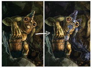
It's always helpful to have others critique your work. A fresh pair of eyes on a concept can often throw up issues that you may not have thought about. Get as many opinions as you can from forums: an alternate viewpoint at an early stage can push your work towards a very different and more successful result.
Words: Dan Mason
Dan Mason is a senior texture artist, concept artist, and modeller currently working at Framestore London. This article originally appeared in 3D World issue 179.
Related articles:

Thank you for reading 5 articles this month* Join now for unlimited access
Enjoy your first month for just £1 / $1 / €1
*Read 5 free articles per month without a subscription

Join now for unlimited access
Try first month for just £1 / $1 / €1
The Creative Bloq team is made up of a group of design fans, and has changed and evolved since Creative Bloq began back in 2012. The current website team consists of eight full-time members of staff: Editor Georgia Coggan, Deputy Editor Rosie Hilder, Ecommerce Editor Beren Neale, Senior News Editor Daniel Piper, Editor, Digital Art and 3D Ian Dean, Tech Reviews Editor Erlingur Einarsson and Ecommerce Writer Beth Nicholls and Staff Writer Natalie Fear, as well as a roster of freelancers from around the world. The 3D World and ImagineFX magazine teams also pitch in, ensuring that content from 3D World and ImagineFX is represented on Creative Bloq.
