How to create textures for realistic 3D eyes
Hugues Giboire talks through rendering a recyclable 3D eye to re-use from subject to subject.
Sign up to Creative Bloq's daily newsletter, which brings you the latest news and inspiration from the worlds of art, design and technology.
You are now subscribed
Your newsletter sign-up was successful
Want to add more newsletters?
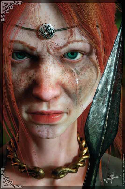
Most of my characters use the same eye model, recycled from one subject to another. So as to not change textures each time I begin a new project, I have spent some time creating a set of simple shaders that allow me to modify the aspect of the eye in a parametric manner.
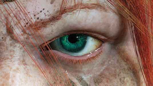
The obvious first thing is to be able to quickly alter the most identifiable aspect of the eye – the colour of the iris.
Win clients & work smarter with our FREE ebook: get it now!
If we want to get into more subtlety, we can also create parameters to alter other visible aspects, such as the shade of the sclera, its clarity, and even its vascularity. All of this is very simply achievable through some remapping methods that most of us are familiar with. The technique is entirely driven by a few textures that will remain the same from one character to another.
Article continues belowThe sole exception to this principle is if we intend to change the structure or shape of the veins or the pattern and fibres of the iris. For instance, if we want to create a new iris to make it more fibrous, all we have to do is create a new texture for it and replace the one currently in use in our scene. The structure of the shader itself does not have to change.
A key point to remember is that these textures should preferably be authored in greyscale, and should exploit the maximum range of values available to us. In other words, we need to go from black to white. The unmapped result may appear overly contrasted; this is by design.
It is the only way to ensure that once the remapping gradient is applied to our input image, that the maximum range of values will be put to use. This is good practice and will allow us to work in more subtlety with colours and contrasts further down the line.
01. Set up the mask
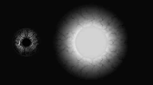
Keep in mind that all input textures are authored in greyscale levels. Here, I decide to create only a texture for the iris and the sclera, forming the compositing mask that will be used to mix the two final shaders. The sclera could be broken down into further elements and we could treat the scleral tissues and the veins as two separate textures, which could also be blended.
Sign up to Creative Bloq's daily newsletter, which brings you the latest news and inspiration from the worlds of art, design and technology.
02. Core technique
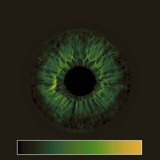
Input your image to a gradient node and start tweaking accordingly from dark to light, respectively from around the corolla to the iris. Here, the texture peaks in brightness in a circular crown, allowing us to add a nice accent of colours around the pupil. Have a look at reference images in order to find the tones that work the best and stay believable.
03. Colour correction
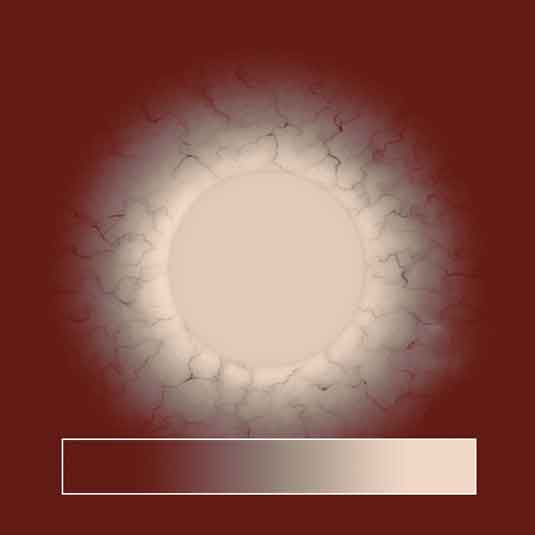
The same can be done for the sclera. Here, the veins are included so, in order to offer more control and make the veins pop even when the sclera is bright, I add a colour correction node to the network before the gradient node. This way, using the gamma correction parameter, we can increase the contrasts, keeping the veins relatively dark; allowing the surroundings to brighten up.
04. Bring it all together
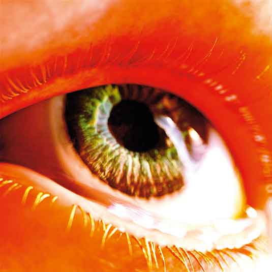
Now using a material mix and our compositing mask, it all comes together. Be sure to deal with the sclera and iris in separate shaders. We want to keep as much control on the rendering aspects of the eye as possible and both the iris and the sclera have very different optical aspects and features. By working in this way, we lose a bit in rendering time, but gain finesse.
Words: Hugues Giboire
Hugues Giboire is a 3D artist with more than 20 years’ experience in the CG industry. He’s a Bafta nominee for artistic achievement in video games. This article was first published in 3D World issue 187
Like this? Read these!
- How 3D technology is transforming your TV
- Download free textures: high resolution and ready to use now
- Discover what's next for Augmented Reality

The Creative Bloq team is made up of a group of art and design enthusiasts, and has changed and evolved since Creative Bloq began back in 2012. The current website team consists of eight full-time members of staff: Editor Georgia Coggan, Deputy Editor Rosie Hilder, Ecommerce Editor Beren Neale, Senior News Editor Daniel Piper, Editor, Digital Art and 3D Ian Dean, Tech Reviews Editor Erlingur Einarsson, Ecommerce Writer Beth Nicholls and Staff Writer Natalie Fear, as well as a roster of freelancers from around the world. The ImagineFX magazine team also pitch in, ensuring that content from leading digital art publication ImagineFX is represented on Creative Bloq.
