How to create a realistic 3D figure
This guide from artist Jeen Lih Lun reveals how to create a realistic figure full of movement.
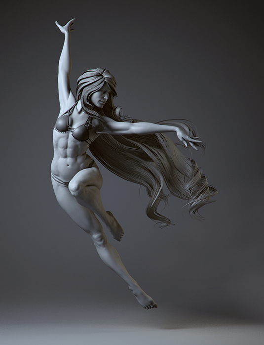
The title of this 3d art image is Lady in the Wind. I enjoyed every step when creating it, especially sculpting the torso and making the hair for this image. I set myself a four-week window for this project, but unfortunately I didn't have a lot of time left for detailing the fingers, feet and the face because I spent far too much time on the torso and experimenting with the hair.
For the body, I start with low subdivision to get the proportions and general landmarks right. When I am comfortable with the form, I increase the subdivision for adding details and subtleness. I use a lot of reference images and anatomy books to help me when I sculpt the body and I would recommend you do the same when working on a project like this.
Two anatomy books that I recommend are Artistic Anatomy by Paul Richer and Atlas of Human Anatomy for the Artist by Stephen Rogers Peck. (I also took an anatomy course by Scott Eaton, which helped me a great deal to understand the complicated human body). For reference when working on the face, I looked at Mastering Portraiture by Philippe Faraut.
Instead of using FiberMesh and Maya nHair, I used a 3D poly card for the final render. This was to speed up the rendering time and I wished to learn a new technique as it could be beneficial when it comes to making game characters in the future.
I use Maya, ZBrush and Photoshop primarily to create Lady in the Wind. I did some tests on the cloth with Marvelous Designer but didn't use that asset in the final render. I also used KeyShot to render a couple of full body renders from different angles and would always recommend experimenting with your projects.
01. Start with an A pose
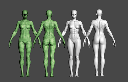
I start with a base model in the standard A pose. With the lowest subdivision I make sure that I get the general proportion, form and landmarks as accurate as possible. Next I sculpt a pass for muscle placement, I do this roughly and very boldly on the second subdivision, so when I pose her I will use this as a guide to ensure the continuity in the sculpt.
02. Finesse the pose
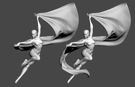
When I am comfortable with the form I move on to pose my character using Transpose Master. Always keep a reference photo to hand when working on this in order to ensure you get the pose looking good. I want to experiment with a veil to achieve the most dynamic result possible. I make this in Marvelous Designer and import it back into ZBrush as a base. I continue to alter the shape of the veil to get a dynamic silhouette.
Get the Creative Bloq Newsletter
Daily design news, reviews, how-tos and more, as picked by the editors.
03. Model and check
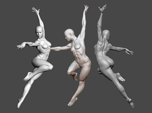
I continue to add volume, focusing on the anatomy that makes sense with this pose. I pay a lot of attention to the bone structure, such as the ribcage, clavicles, knees and fatty areas – don't just focus on the flexing and relaxing muscle areas. I frequently use different materials and lighting to review my model from all angles. Sometimes I also take screenshots and do a quick écorché pass on them to check if they are accurate.
04. Test ideas
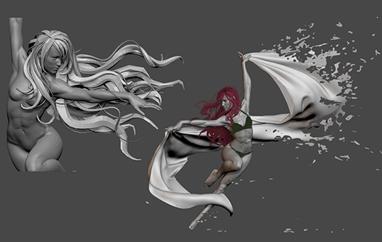
To create the clothing, I draw a mask on the body and extract the mesh. I use a combination of ZRemesher and the Maya Modelling Toolkit for retopologising. I take a screenshot of the character, and in Photoshop I paint over some hair and the veil for concept development. In the end I decide to flip the character around and discard the veil due to time limitations. I also make a quick concept sculpt in ZBrush for the hair that I didn't end up using.
05. Hair movement
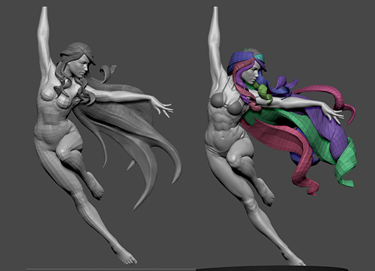
I want the image to look dynamic yet natural, therefore the flow and direction of the hair is crucial to the overall figure. Once comfortable with the flow of the hair I use the IMM_Hair brush I downloaded online to draw the hair's poly mesh over the second concept sculpt of the hair. Using the Move, Rotate and Scale tools I can make wavy, twisty forms to give the figure life. The IMM_Hair brush can be found at www.zbrushcentral.com under the thread called Insert Mesh Brush Repository.
06. Split the hair mesh
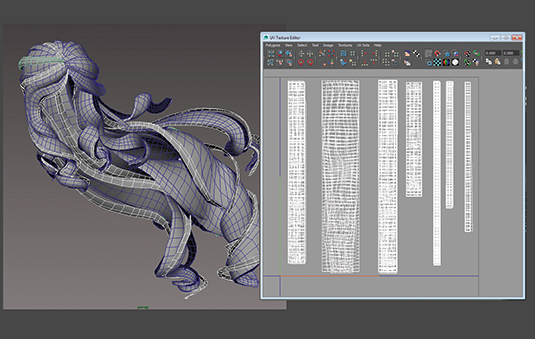
I export the hair mesh into Maya where I split up the mesh into smaller strands of hair. I unwrap the UVs using Utilize, Move and Sew UV Edges in order to create very clean UVs for each hair strand. I use Unfold with UV border pinned to relax the UV a little. I arrange the UVs vertically for the anisotropic to work correctly. I need six different variations of hair strips for the alpha, so I arrange the UVs into six groups.
07. Using FiberMesh
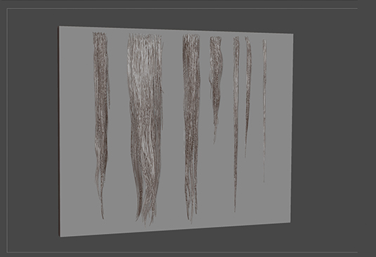
Instead of handpainting the hair like I did for the characters in DmC and Silent Hill: Shattered Memories, I want to use FiberMesh this time so it is more intuitive and I can bake the normal maps to increase the fidelity of the hair. I create six groups of hair with FiberMesh against a plane and I move them as close to the plane as possible. I make each hair group look different in terms of length, volume and clumping.
08. Create an occulsion
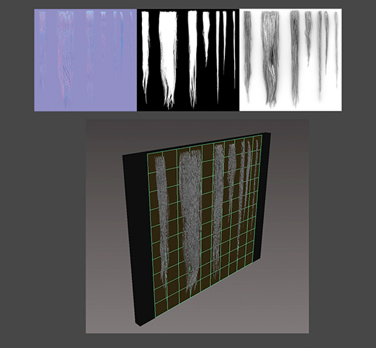
I export the FiberMesh and the plane to Maya and assign a black diffuse to the flat plane. I then create a low poly plane (square) and lay this on top of the FiberMesh and plane form to bake the normal map, diffuse map and ambient occlusion in 4kx4k textures. I consider creating coloured hair, and the occlusion map would be handy, but I decide to keep it simple so I don't use occlusion for the final image.
09. Experiment with the hair
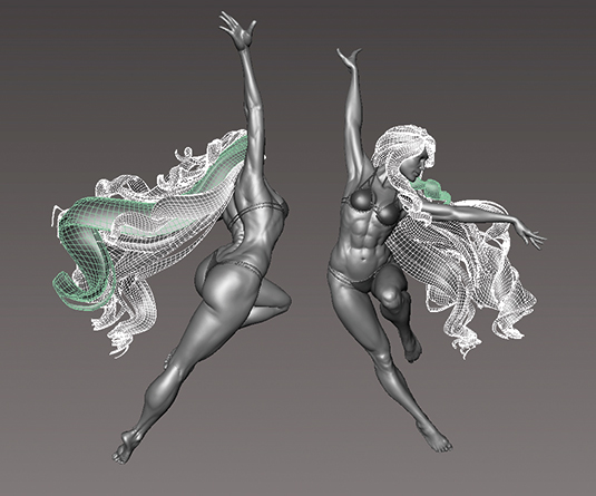
To get a better feel of the anisotropic I create another very smooth hair mesh in ZBrush and I use this to transfer its vertex normal to the hair poly mesh in Maya. However, I run into some rendering issues with this method because of the waviness and the length of the hair. As a rule, I think this method works best on short to medium hairstyles, but you never find these things out without trying, so keep experimenting.
10. Render test
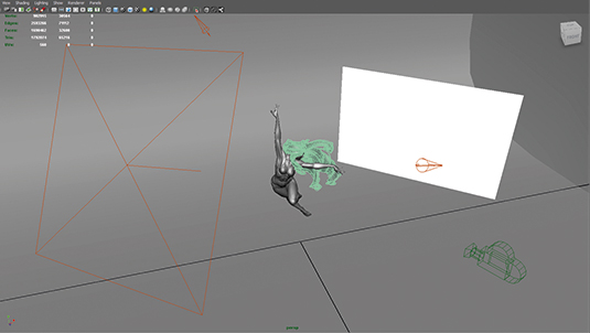
I use an anisotropic material for the hair and arrange the UVs so they match the texture. I increase the subdivision level for the hair with Smooth in Maya before I render the final image. Daniel Crossland, my lead at the time, kindly shares with me his render scene that uses mental ray.
With this as a starting point, I adjust the colour, direction, intensity of the light and bounce card to create the desired mood. I also use KeyShot to render a couple of images for comparisons. I downloaded some HDRI maps from the sIBL website to experiment.
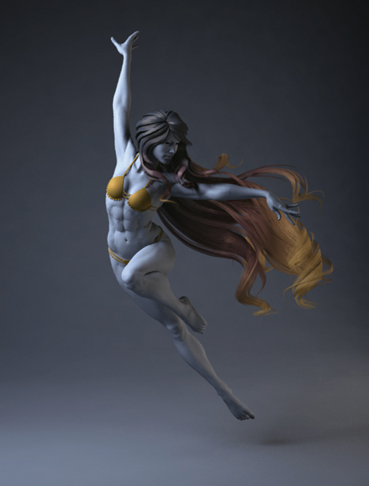
I particularly like the Ditch River and Alley map from this site. I render a beauty and an alpha pass, bringing them into Photoshop, where I can tweak the colour and add some subtle effects to complete the final image.
This article was originally published in 3D World magazine issue 206. Buy it here.

Thank you for reading 5 articles this month* Join now for unlimited access
Enjoy your first month for just £1 / $1 / €1
*Read 5 free articles per month without a subscription

Join now for unlimited access
Try first month for just £1 / $1 / €1
