Build a 3D mech in a futuristic scene
Saizen Media’s Davide Bianca and Andrea Mancuso share their insights on developing a post-apocalyptic illustration.
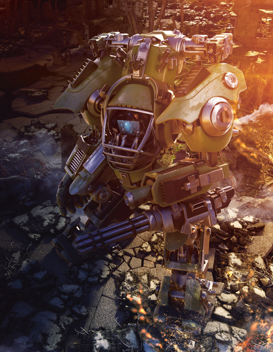
For this project, we wanted to go with a character that would convey a sense of honour and bravery, a character that clearly shows the pride in accepting that the faith of the whole planet has been placed in her hands, and that weight is on her shoulders – she has a soldier-like attitude and a love for her country and all that it stands for.
- Download the assets for this tutorial here
01. Mechanical surfaces
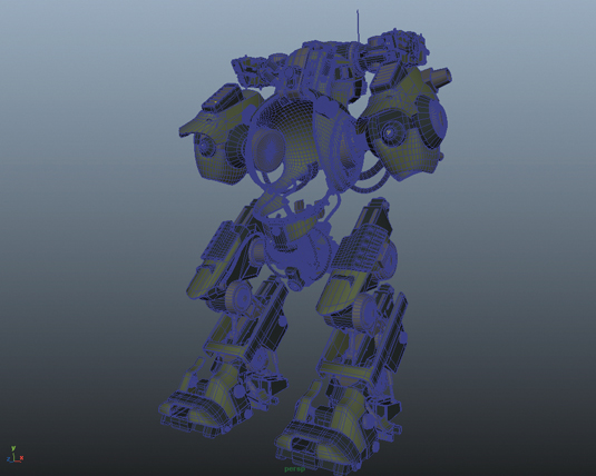
Epic scale and aggressive proportions are the common denominators for this armoured juggernaut mech. Using a combination of ZBrush and Maya hard-surface modelling, we start from Maya basic primitives and shape base meshes.
Using the Split Edge Ring tool enables multi-layered hard surfaces, which keeps edges smooth. Now import the base meshes into ZBrush to refine the surfaces, extract components and split shapes into sub shapes.
02. Back to Maya for details
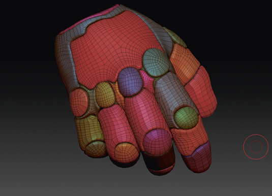
The more detail you have on the surface, the more realistic the final look will be. Once you have a satisfying overall look, use ZRemesher for the basic areas, then switch back to Maya and retopologise areas that need specific attention to detail.
There is no set approach that works universally across all sections, therefore each area is worked as needed in order to obtain the desired final look.
03. Setting the pose
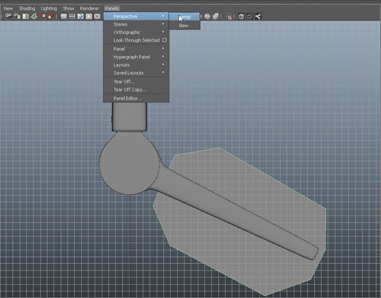
To convey a deep sense of dynamism you should choose a simple yet dramatic pose. Tension in the mechanical joints of arms and legs hints at imminent movement; combined with forced perspective and a camera view from above, allow us to emphasise the character's scale and weight.
Once the scene's destruction and fiery rubble, along with the relative proportions set by the pilot, is finally added the scene will come to life.
Get the Creative Bloq Newsletter
Daily design news, reviews, how-tos and more, as picked by the editors.
04. Defining the lighting
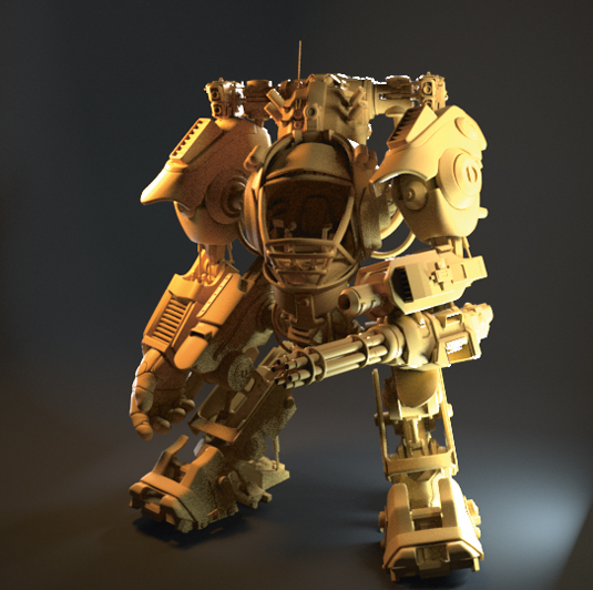
To create a vast and detailed environment such as the one created for this illustration you require a proper lighting setup that is just as sophisticated. We use four AI area lights as direct lighting on the juggernaut, a directional light to simulate environmental sunlight, and wrap everything within an AI sky dome to make the details really pop.
05. Blend mech and scene
You'll need to do a large amount of fine tuning and tweaking to obtain a believably lit shot that smoothly blends the character and environment together, while preserving the readability of the focal points and colour/tone values to correctly guide the viewer's eye to those key areas that you want to emphasise in your scene to tell a story.
Learning to unify your scenes with colour and light is essential to creating a believable illustration.
06. Creating the textures
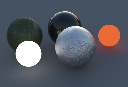
Arnold is our tool for texturing and rendering. While all textures are created with standard shaders, the flexibility it provides for shader customisation is what allows us to take this piece to a whole new level.
We modify the shaders to obtain a non-glossy, scratched aluminium look on external armour pieces, and combine them with fully chromed internal mechanical pieces. This is crucial to get visual variation and readability.
07. Get the chrome look
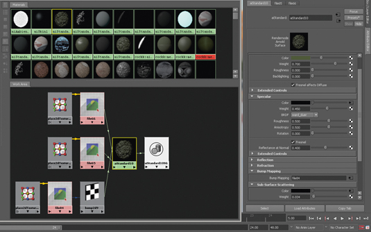
For realistic chromed components use a material with specular BRDF (bidirectional reflectance distribution function) set on WARD with high roughness, Anisotropy set at 0.1, and Rotation set at 0.25.
The roughness of the shell's paint scratches on the other hand is obtained by setting the BRDF to cook_torrace, which allows the reflectance distribution to have more specular weight.
08. Pilot design
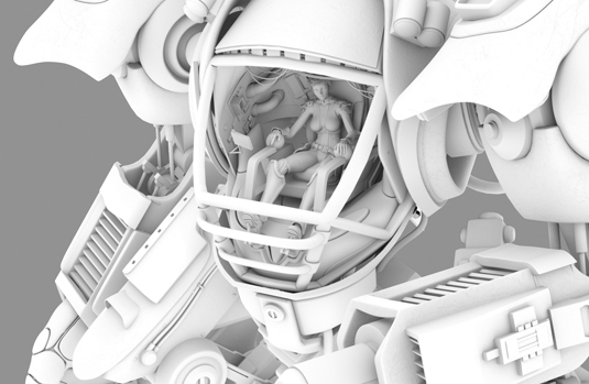
Hidden inside the shell of this colossal metallic monster is the real hero of our story: the pilot. The pilot suit is a mixture of wetsuit-like bio-engineered material and hard-surface metal plates.
The cockpit itself showcases a complex system of hi-tech equipment, controls and hydraulic pumps, topped off with a state-of-the-art holographic touchscreen heads-up display.
09. Devastated city
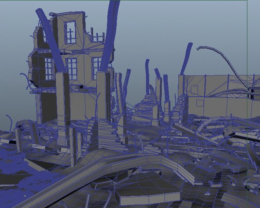
The environment a character lives in is also an essential element to the narrative. To create a complex battle scene environment characterised by destruction we have to do just that… build it, and then destroy it! We first create concrete plates to serve as ground building blocks and then use a plug-in, Pulldownit (www.pulldownit.com), to shatter each block into a specific amount of fractured pieces.
10. Simulate the fractures
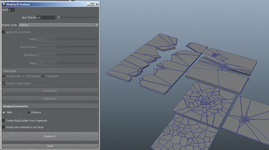
By combining fractured blocks, we create a much bigger set and carefully arrange fractured elements in a manner that naturally shows directionality of fracturing and a preserved variation in the orientation of the fractured pieces.
Ultimately we need to emulate the level of destruction generated by a heavy radial impact and shock wave, so a great amount of attention is put towards simulating the direction of fracturing force.
11. Start rendering
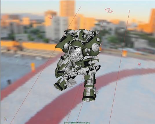
Arnold's combination of ray tracing and physically based shaders enables fast, high-detail renders. After converting textures into .tx files with the texture manager, carefully adjust Ray Depth to accommodate for proper diffuse, gloss, reflections and refractions.
Once again there's no 'by the book' approach, so a good amount of trial and error will be needed; ultimately the choices of settings are completely subjective and a matter of personal taste.
12. Develop and tweak

Finally, take the scene into Photoshop to composite all the necessary layers into one single master shot, and further adjust gamma curves, vibrance, luminosity and subtle tinting.
To add environmental elements such as smoke, fire and other particle systems, to further enhance the dramatic feel of the scene, and to add a cinematic twist to an otherwise static environment, we use Krakatoa, Fume FX, and After Effects. And it's done!
Words: Davide Bianca and Andrea Mancuso
This article originally appeared in 3D World issue 183.

Thank you for reading 5 articles this month* Join now for unlimited access
Enjoy your first month for just £1 / $1 / €1
*Read 5 free articles per month without a subscription

Join now for unlimited access
Try first month for just £1 / $1 / €1

The Creative Bloq team is made up of a group of art and design enthusiasts, and has changed and evolved since Creative Bloq began back in 2012. The current website team consists of eight full-time members of staff: Editor Georgia Coggan, Deputy Editor Rosie Hilder, Ecommerce Editor Beren Neale, Senior News Editor Daniel Piper, Editor, Digital Art and 3D Ian Dean, Tech Reviews Editor Erlingur Einarsson, Ecommerce Writer Beth Nicholls and Staff Writer Natalie Fear, as well as a roster of freelancers from around the world. The ImagineFX magazine team also pitch in, ensuring that content from leading digital art publication ImagineFX is represented on Creative Bloq.
