Play with perspective to create stunning art
Sergey Kolesov combines an eye for storytelling and a fresh perspective to breathe life into classic tropes

This is a personal piece of art, so there's no specific background message needed to enjoy it. I just wanted to produce a striking image and give the viewer plenty of room to think about what their looking at.
I decided to do this by playing with scale, and showing a fantasy creature, the mermaid, in a fresh light, and from a different perspective.
Once you've decided on your subject, you can work from there. Typically, mermaids are represented as a human-sized creature, and in most cases are pictured as beautiful figures in an idyllic underwater environment.
Although I wan to play with these presumption, my intentions are to maintain the sense of beauty in the image, but make it look weird at the same time. However, I don't want to depict a dark, oppressive scene; instead, I decide to make the composition bright and cheerful.
I'm happy to go with the idea that the mermaid could be alive or dead, which raises the question: has her hair has been cut, or her head? I have no answers to these questions.
Let's just say that my own interpretation is it's the end of a fairytale in this picture, but the end is a beautiful one…
01. Bird's-eye view
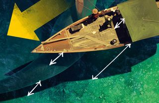
I'm keen to show the depth of the sea while maintaining the top-down composition. Well-defined shadows will help here, so I decide on strong sunlight as a light source.
The shadow placement informs the viewer how far the object is from the bottom. Rather than plan it out beforehand, I try to visualise this while I paint the scene. I think I achieve my goal.
02. Scale in the scene

I need to maintain the same sense of scale in the image. The solution is to use similar-sized brushes for detailing all the elements.
The mermaid's arm is detailed, while the fisherman looks sketchy in comparison. In fact I've used the same brush size on both elements. I believe this is the right way to show scale more realistically.
03. Water everywhere

I don't paint the water, as such. What you can see is mostly just the sea bed. Towards the end of the painting process I apply big strokes of light blue as a reflection on the surface/waves. These strokes inform the viewer that they're looking at a marine environment, rather than the calm surface of a boating lake.
04. Composition tricks
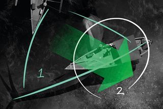
The triangular composition (1) brings more movement into the static bird's-eye view. The image's pivot point (2) stabilises the image.
Key elements are variable detailing, colour intensity and contrast (the green arrow), which supports the weak corner of the composition. The boats and mermaid face into the image to complete the triangle.
05. Painting the sea bed
The texture of the sea bottom is done very easily. I use two texture brushes as a base, then add shadows from the boats on a separate Multiply layer with soft texture brush strokes.
After this I add the colours using the Color and Overlay modes. To finish I introduce shadows to some of the rocks, to make them look more realistic.
Words: Sergey Kolesov
Sergey Kolesov grew up in Russia, where he was passionate about creating art as a child. He studied traditional art and design for nine years, and during this time developed a love of video game concept art. He now works in the games industry.
This article originally appeared in ImagineFX magazine issue 107.
Like this? Read these!
- Make manga with a touch of realism in 5 easy steps
- How to draw faces without reference
- Powerful painting app offers artists unique creative options

Thank you for reading 5 articles this month* Join now for unlimited access
Enjoy your first month for just £1 / $1 / €1
*Read 5 free articles per month without a subscription

Join now for unlimited access
Try first month for just £1 / $1 / €1
Get the Creative Bloq Newsletter
Daily design news, reviews, how-tos and more, as picked by the editors.
The Creative Bloq team is made up of a group of design fans, and has changed and evolved since Creative Bloq began back in 2012. The current website team consists of eight full-time members of staff: Editor Georgia Coggan, Deputy Editor Rosie Hilder, Ecommerce Editor Beren Neale, Senior News Editor Daniel Piper, Editor, Digital Art and 3D Ian Dean, Tech Reviews Editor Erlingur Einarsson, Ecommerce Writer Beth Nicholls and Staff Writer Natalie Fear, as well as a roster of freelancers from around the world. The ImagineFX magazine team also pitch in, ensuring that content from leading digital art publication ImagineFX is represented on Creative Bloq.
