These 2012 app design trends are a blast from the past
For our 10th anniversary, we revisit the last decade of design.
16. Icon labelling

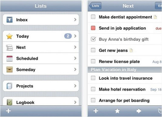
In contrast to the previous two trends, using icons along with labels to describe the function of a particular button is still highly popular – mainly because it adds a bit of visual interest to your app (particularly those that rely on a list-based approach) but also because you have to presume that people don't really read things that appear on the screen in any great detail. Presenting an icon next to your list item makes it easier for the user to quickly navigate to the option they want. Most to-do list apps do this very well, including Things.
17. Big buttons for tiny people

The iPhone and iPad have proved amazing tools for children – in both education and play (and both at the same time, naturally). When designing for children you have to keep interface elements super-simple, descriptive and generally, very big. Good examples include Bob the Builder's Playtime Fun, Postman Pat SDS and Fireman Sam – Junior Cadet, all designed by childrens' app specialist P2 Games.
18. Metro minimalism

Windows Phone 7 (and soon WP8) pares back the gloss that we've seen so prevalent in UI design over the last year and keeps things simple. Shiny icons are replaced with functional squares of flat colour. It's an intelligent, well thought out UI design, and although it has its quirks, it is undeniably slick and extremely usable. Apps on WP7 adhere to the Metro Design Language, giving the user experience across the board a solidarity and consistency not seen on a mobile device before.
19. Typographic navigation

Metro has introduced a typographic navigation that, up until now, has been hugely uncommon on mobile devices. Type spans across many screens - not only hinting at the screen you've just come from but also what comes next. We expect to see many designers bring this approach to apps outside of the Windows Phone 7/8 platform.
20 The 'bucking the trend' trend

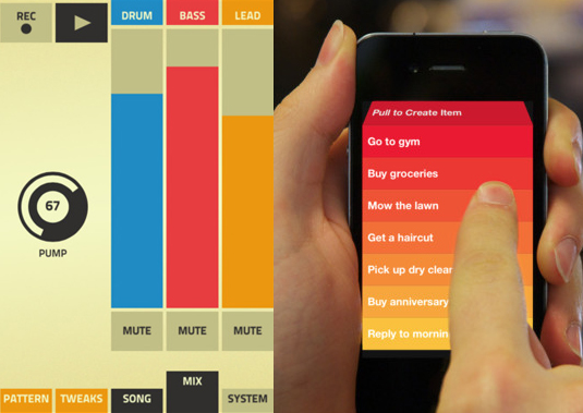
While Windows Phone is about adhering to the Metro Design system for consistency for the user, iOS and Android both offer huge opportunities to be original in your app designs. Sure, trends are trends because they work, and huge amounts of user testing is required for more 'out there' UI designs. But finding a unique approach can buck the trend while giving your user a unique experience that they'll keep coming back to. Take music app Figure and to-do app Clear – they defy the rules but are highly intuitive and a joy to use.
Read more:
- The hottest typography design trends for 2012: CB at 10
- The top 20 graphic design trends of 2012: CB at 10
- Creative Bloq Awards 2022: our shortlist is revealed
Get the Creative Bloq Newsletter
Daily design news, reviews, how-tos and more, as picked by the editors.

Thank you for reading 5 articles this month* Join now for unlimited access
Enjoy your first month for just £1 / $1 / €1
*Read 5 free articles per month without a subscription

Join now for unlimited access
Try first month for just £1 / $1 / €1

The Creative Bloq team is made up of a group of art and design enthusiasts, and has changed and evolved since Creative Bloq began back in 2012. The current website team consists of eight full-time members of staff: Editor Georgia Coggan, Deputy Editor Rosie Hilder, Ecommerce Editor Beren Neale, Senior News Editor Daniel Piper, Editor, Digital Art and 3D Ian Dean, Tech Reviews Editor Erlingur Einarsson, Ecommerce Writer Beth Nicholls and Staff Writer Natalie Fear, as well as a roster of freelancers from around the world. The ImagineFX magazine team also pitch in, ensuring that content from leading digital art publication ImagineFX is represented on Creative Bloq.
- Georgia CogganEditor
