These 2012 app design trends are a blast from the past
For our 10th anniversary, we revisit the last decade of design.
11. Fun illustrations
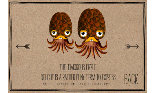
It's perhaps in game design where UI designers have more room for experimentation. We're sure we'll see more highly original UIs such as those in the likes of the gorgeous Whale Trail and the beautiful Sir Benfro's Brilliant Balloon. The latter is far from anything you've ever seen on the iPhone – a stunning interface with crazy characters littering the screen and fitting hand-drawn typography providing simple, yet classy navigation.
12. Photo-realistic icons

It's the way your users recognise your app on their home screen and is hugely important when designing your app. Icons that are highly realistic, yet stylised, defining the core function of the app, have become commonplace this year. Instagram is a great example, as is Facebook Camera and Physique – the latter icon designed by Roman Jusdado. See here for a tutorial on creating your own.
13. Notification boxes
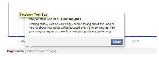
You know the kind – the square speech bubbles that pop up when you tap a button (or pop-up modal boxes as they're known). If there's one shape that's dominated UIs over the past year, and one that will continue to dominate, it's this. It's popular because it works, giving your app contextual information that is only shown when needed.
14. Buttonless design
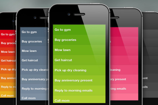
2012 may just be the beginning of a move to slicker, buttonless UI design. It's the complete opposite to Apple's skeuomorphic approach, embracing digital devices as just that, digital devices. A perfect example is Realmac Software's Clear, a to-do list app that uses simple gradated rectangular blocks along with common iOS gestures to great effect. Expect to see more minimalist, gesture-led apps such as Clear in the next year as designers and developers get bored of the often OTT skeuomorphic apps that have been commonplace since Apple decided it was the way to go.
15. New approaches to buttons
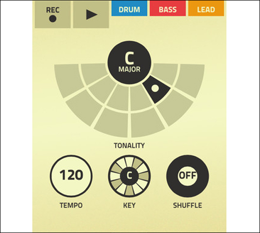
Similarly, UI designers are pushing apps in different directions when it comes to the designs of their buttons. We've all seen the skeuomorphic button approach a million times, but apps such as Figure (a music-making app) takes an app that 'needs' buttons but presents them in a flat, graphic, animated way that is both easy to use and visually appealing.
Get the Creative Bloq Newsletter
Daily design news, reviews, how-tos and more, as picked by the editors.

Thank you for reading 5 articles this month* Join now for unlimited access
Enjoy your first month for just £1 / $1 / €1
*Read 5 free articles per month without a subscription

Join now for unlimited access
Try first month for just £1 / $1 / €1

The Creative Bloq team is made up of a group of art and design enthusiasts, and has changed and evolved since Creative Bloq began back in 2012. The current website team consists of eight full-time members of staff: Editor Georgia Coggan, Deputy Editor Rosie Hilder, Ecommerce Editor Beren Neale, Senior News Editor Daniel Piper, Editor, Digital Art and 3D Ian Dean, Tech Reviews Editor Erlingur Einarsson, Ecommerce Writer Beth Nicholls and Staff Writer Natalie Fear, as well as a roster of freelancers from around the world. The ImagineFX magazine team also pitch in, ensuring that content from leading digital art publication ImagineFX is represented on Creative Bloq.
- Georgia CogganEditor
