These 2012 app design trends are a blast from the past
For our 10th anniversary, we revisit the last decade of design.
06. Wood textures

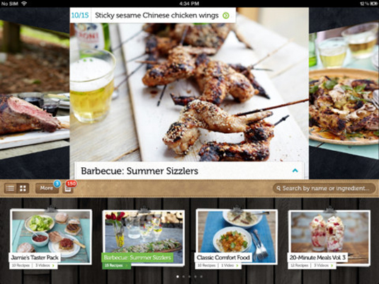
If there's one background texture that this year will be remembered for, it's wood .When complemented with familiar iOS buttons, slab serif type (think Jamie's Recipes by Zolmo) and some more subtle skeuomorphic design elements, this background texture can work extremely well. The Webr app, for example, juxtaposes a wood background with other, more slick elements rather nicely.
07. Pull to refresh

Users now seem to expect to be able to pull down the entire interface to refresh its content. This was made popular in Tweetie for iOS, which has since become the official Twitter app since the social media giant acquired it from atebits in 2010. And it's now pretty much a prerequisite in apps that contain streams of data that are constantly changing. It also features in Facebook's iOS app and indeed the new native Mail app in iOS6, which is due for release later this year.
08. Clean & considered

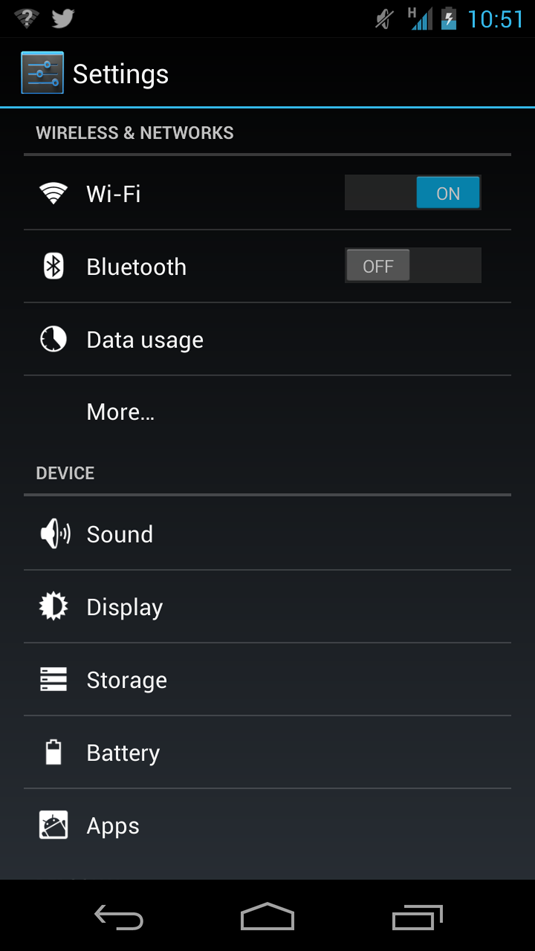
As mobile phone screens become better, with almost indiscernible pixels, the user interface designer has more control over the detail in the final design. This probably one reason that skeuomorphic designs have become wildly popular. But, as we've seen with the likes of Android 4.1 Jellybean, a clean, digital approach can be inspired. Take a look at the Settings icon for instance – and indeed the white on black options that follow. Or the Lock icon that pulsates under your finger as you choose between unlocking your phone to the home screen, camera or Google Now. Clean, structured and considered... and not a beveled edge or texture in sight.
09. Hidden navigation

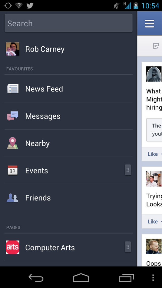
With only so much real estate on iPhone and other devices' screens, UI designers are constantly battling how to direct users to the content that matters to them. The solution may be hidden navigation. Take the Facebook app for instance – the main screen is taken up with your feed, but tap the navigation button top left and the nav menu shoots in, giving you access to your messages, events, friends, pages and so on. This navigation replaced the grid of icons in an earlier app. The same applies to Android and iOS – enabling you to drag notifications down from the top of the screen. Used correctly, hidden navigation can work brilliantly and focuses in your user to the main functionality of your app without anything getting in the way. Path is another app that does this well.
10. Tight focus

There have been a raft of apps that focus on doing one simple thing, and doing it well. The UIs for these kinds of apps obviously differ depending on the functionality of the app, but there's always one similarity – the app is one or two screens, with the main screen presenting itself whilst the app is performing its main function. Take AirCassette as an example. Although it's undoubtedly skeuomorphic in its approach, it does one thing – plays your music whilst displaying the track name on a retro cassette.
Get the Creative Bloq Newsletter
Daily design news, reviews, how-tos and more, as picked by the editors.

Thank you for reading 5 articles this month* Join now for unlimited access
Enjoy your first month for just £1 / $1 / €1
*Read 5 free articles per month without a subscription

Join now for unlimited access
Try first month for just £1 / $1 / €1

The Creative Bloq team is made up of a group of design fans, and has changed and evolved since Creative Bloq began back in 2012. The current website team consists of eight full-time members of staff: Editor Georgia Coggan, Deputy Editor Rosie Hilder, Ecommerce Editor Beren Neale, Senior News Editor Daniel Piper, Editor, Digital Art and 3D Ian Dean, Tech Reviews Editor Erlingur Einarsson, Ecommerce Writer Beth Nicholls and Staff Writer Natalie Fear, as well as a roster of freelancers from around the world. The ImagineFX magazine team also pitch in, ensuring that content from leading digital art publication ImagineFX is represented on Creative Bloq.
- Georgia CogganEditor
