These 2012 app design trends are a blast from the past
For our 10th anniversary, we revisit the last decade of design.
Creative Bloq is now ten years old! To celebrate a decade of design, we're looking back at what's been hot in design. Read on to rediscover the app design trends of a decade ago. What's still on trend now? What's changed in the last 10 years?
App user interface (UI) design, like web design, goes through many different stages. When the iPhone first appeared, many apps adhered tightly to Apple's Human Interface Guidelines. But as the device has become more widespread, and Apple itself has designed a number of apps for the device, UI design has gone off in numerous directions.
Whether it's the trend for skeuomorphism or the trend for clean, graphic interfaces, now is the time for user interface designers to get busy experimenting and developing new approaches to their creations, whilst making sure their apps remain inherently usable. We've scoured the App Store and elsewhere to find examples of trends in UI design from 2012...
01. Skeuomorphism
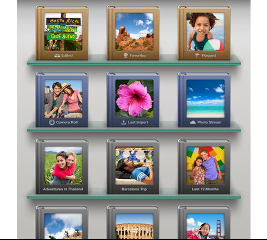
Whether you like it or loathe it, skeuomorphic UI design is on everyone's lips at the moment, mainly thanks to Apple's own iOS apps. The shelves and photo albums in Apple's iPhoto and the leather bound book of Find my Friends are prime examples, but other apps, such as Korg's iMS-20 iPad app take the concept even further (and to great effect). Brushed aluminium, tanned and textured leather and wooden shelves are all skeuomorphic favourites. Unfortunately, often skeuomorphic UI design is pushed too far and completely contrasts to the elegant devices that the apps run on. The recent Podcasts app by Apple is a prime example.
02. Retro/vintage
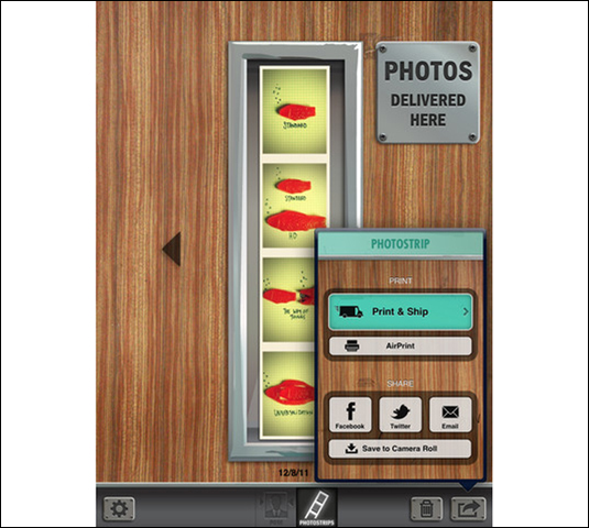
Probably the most famous retro/vintage app is Hipstamatic, but there are a raft of apps (CameraBag, Infinicam etc) that take their cue from the past through faux damage and aged interfaces – and retro devices that appear to have been sitting in the loft for a couple of decades seem to be a particular favourite. Of course, function defines form in many cases. Another retro interface that caught our eye is that of Pocketbooth – combining 50s-esque typography with pastel shades and wooden and metal textures to great effect. Oh, and LetterMpress and Flick Kick Soccer aren't bad examples, either.
03. Notebooks and pages
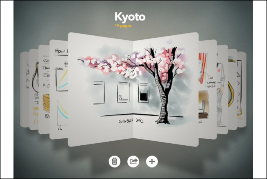
We could group this under skeuomorphism, but the recent Paper by FiftyThree app takes the concept of 'books' within your device to a slightly different, more minimal place. There are no leather or ring binders, just pages and sketchbooks that you navigate through using common iOS gestures. The same concept has been seen in such apps as Evernote and indeed Apple's own Pages – all of which let you navigate to your documents in much the same way.
04. Grid approach
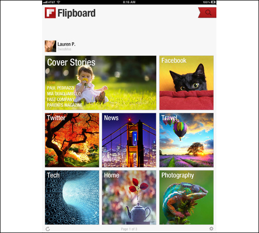
OK, it isn't exactly a new idea, but the grid approach to UI design remains as popular as ever in iPhone and iPad apps. Take the Explore tab of the Instagram app for instance – just a grid of inviting images to delve deeper into the app and its users. Or the magnificent Cool Hunting app or even Flipboard for iPhone. The news reader app Pulse is another great example of this approach.
Get the Creative Bloq Newsletter
Daily design news, reviews, how-tos and more, as picked by the editors.
05. The Instagram effect
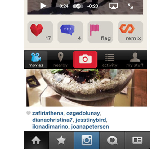
A clear trend has emerged recently to have tabs along the bottom of the interface, with a larger (or more defined) button in the middle that points to the app's main functionality. In Instagram's case it's the camera button. The number of apps that have adopted this approach is incredible – probably because it works so well. Think Pinterest, Path, Color, Foursquare, Foodspotting, Vyclone and many more.

Thank you for reading 5 articles this month* Join now for unlimited access
Enjoy your first month for just £1 / $1 / €1
*Read 5 free articles per month without a subscription

Join now for unlimited access
Try first month for just £1 / $1 / €1

The Creative Bloq team is made up of a group of design fans, and has changed and evolved since Creative Bloq began back in 2012. The current website team consists of eight full-time members of staff: Editor Georgia Coggan, Deputy Editor Rosie Hilder, Ecommerce Editor Beren Neale, Senior News Editor Daniel Piper, Editor, Digital Art and 3D Ian Dean, Tech Reviews Editor Erlingur Einarsson, Ecommerce Writer Beth Nicholls and Staff Writer Natalie Fear, as well as a roster of freelancers from around the world. The ImagineFX magazine team also pitch in, ensuring that content from leading digital art publication ImagineFX is represented on Creative Bloq.
- Georgia CogganEditor
