11 ways to transform architectural visualisation renders in Photoshop
Speed up your workflow and create better visualisations with these expert arch-viz tips.
01. The advantages of render elements
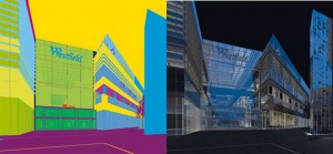
Whether you’re working on a still or an animation, setting up a series
of render elements is vital. The few minutes it takes to tick the list of extra passes you want will save you hours of post-production. When deadlines get tight – as they usually do – having the right elements will save your skin.
V-Ray does elements well. We use it in 3ds Max, but it’s available for Maya, Rhino and SketchUp. Taking the time to add specific wire colours to your geometry will be a godsend when you need masks later on and time is running out: you can use the colour of each object to mask it from the next.
At Uniform, we tend to use these elements for a typical still image: Wire Colour; Reflection; Refraction; Total Lighting; Shadows; ZDepth; Self Illumination; and Extra Tex.
02. VRayEdgesTex
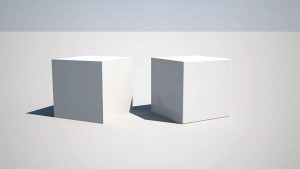
This addition to the V-Ray set of materials is brilliant. In life, no object has edges that come to an infinite crisp edge. When used in the bump slot for a material, VRayEdgesTex adds a small, user-controllable chamfer to every edge. It can add a subtle detail to your objects or be used for a distinctive chamfer if needed.
If you want to use a traditional bitmap bump as well, just place it in a Mix map and keep your Mix at 50%. Sometimes, when a deadline is approaching, you don’t have time to add the subtleties that your images really need. Manually chamfering everything would take an eternity, so it often gets forgotten about.
VRayEdgesTex’s small chamfers on the edges of your objects can help to pick out highlights and glints, and add that extra level of believability to your objects.
03. Modelled shops versus photographic shops
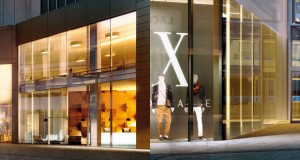
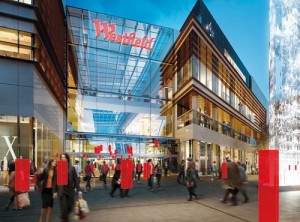
When producing images like the Westfield render, it’s important to strike the right balance between modelling detail in and using photos to achieve the level of detail required. In an ideal world, where no deadlines exist, you’d model everything, but back in the real world you’ll need to save time somewhere. The key is deciding which elements to model and which to use photos for.
Get the Creative Bloq Newsletter
Daily design news, reviews, how-tos and more, as picked by the editors.
In the Westfield render, the hotel lobby on the right was an important aspect of the shot: because it was relatively near the foreground, it was modelled and lit in 3D.
The shop on the far left was earmarked for a specific retailer, so photographs were taken of an existing store in similar light conditions to capture the right detail and feel. It would have been a waste of time modelling the mannequins!
The extra shop fronts further back in the shot are all partially covered by people, so photos were used for these as well. It would have taken days to model these, whereas shooting the right photo took a few hours. Crucially, saving time on the shop fronts meant we had more time in the project schedule to light the building and make sure the people sat in right.
04. Chromatic aberration
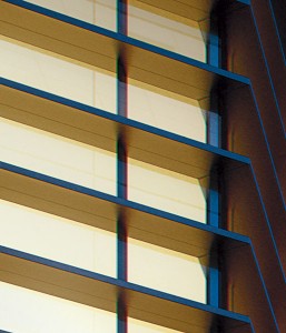
Chromatic aberration is the bane of digital photographers. It usually occurs towards the edges of photographs and is noticeable as the blurring of objects and a slight distortion of colours. Many photographers spend a lot of time trying to get rid of it in their photos – but CG artists can subtly add it into images to make them appear more ‘real’.
You can add the effect in Photoshop, but you can also achieve similar results in most 2D image editors or compositors. It’s best to add chromatic aberration as the final step in your workflow. In Photoshop, select Filter > Lens Correction and choose Custom rather than Auto Correction.
The values will change depending on your image, but it's good to take the Fix Red/Cyan Fringe down to, say, -15 and put the Fix Green/Magenta Fringe up to 15. This creates a nice colour offset towards the edges of the image. It’s subtle, but it will really make a difference.
05. Finishing touches with blending modes
A great (and quick) trick to give your images a bit more punch is to experiment with blending modes. All 2D photo editors and compositing tools will have blending modes. By duplicating a collapsed version of your image and changing its blending mode to either Soft Light or Hard Light, you’ll instantly get more contrast and punch. If you knock it back to a percentage that feels right, and mask it out in areas that don’t need it (usually the darkest parts of the image), it will quickly become a trick that you apply to all your images.
Sometimes, making the duplicated layer black-and-white helps, especially on areas such as grass and foliage. Try it out by going back to some of your past images and applying the style to see what effect it has.
06. Calculators within 3D software
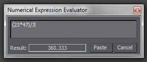
One lesser-known feature of 3ds Max is the built-in calculator. When you’re in any numerical input field, press [Ctrl]+[N] to pop up a calculator that enables you to get a result and paste it into your field.
07. Breaking up your reflections
An easy way of bringing your glazing to life is to add a subtle amount of random bump to the glazing panels. Start by giving each piece of glass a random material ID (the Material by Element modifier in 3ds Max), then apply a material that has a selection of sub-materials.
If you have, say, five different glass materials, each with a large noise map in the bump slot and a different strength, your reflections will distort and almost warp slightly on each piece of glass. This will break up the reflections across your facade so that it doesn’t look like one solid piece of glass.
This effect also looks nice in animations when you move past a wall of glass, because the reflections will change as you go by. Here, as elsewhere, the key to making your images look convincing is to mimic the imperfections you see in real life.
08. Accurate heights for 2D people
An immediate giveaway that an arch-viz image is CG is when the people in the image don’t quite look the right scale. It’s better to be safe than sorry, so use people markers.
Either add a box that’s 1,750mm high or, use a simple character model as a guide if you have one to hand. Place them all over your scene, create a render and take a screengrab. This will then give you accurate height markers when comping in your photographic people during the post-production phase.
09. Mixing up your materials
If you find your brick and stone maps are tiling over large areas, use a tile map to help take some of the obvious tiling out. With a tile map, you can replicate the number of bricks in your map, and add a subtle difference in colour to each brick. This will add a random variation and reduce the appearance of tiling.
10. Blurring your people
Another common error you tend to find in many dusk or evening architectural images is crisp people. Unless someone is standing still, you tend to get a subtle amount of motion blur on people walking through a scene in low lighting levels.
To get that punchy, colourful look to your buildings, a longer shutter exposure is needed, and that will mean blurred people. This isn’t a bad thing, though, and by blurring your people, your image will look more convincing as a photograph.
11. Composing your image
A quick way to help compose your images is to adjust your safe frame settings to act as guides in your viewport. For example, split your view into thirds for composing traditional arch-viz images, or make the safe frame into a small box that acts as a target in the centre of your view.
Words: Mark Lee, senior artist at Uniform.

Thank you for reading 5 articles this month* Join now for unlimited access
Enjoy your first month for just £1 / $1 / €1
*Read 5 free articles per month without a subscription

Join now for unlimited access
Try first month for just £1 / $1 / €1

The Creative Bloq team is made up of a group of art and design enthusiasts, and has changed and evolved since Creative Bloq began back in 2012. The current website team consists of eight full-time members of staff: Editor Georgia Coggan, Deputy Editor Rosie Hilder, Ecommerce Editor Beren Neale, Senior News Editor Daniel Piper, Editor, Digital Art and 3D Ian Dean, Tech Reviews Editor Erlingur Einarsson, Ecommerce Writer Beth Nicholls and Staff Writer Natalie Fear, as well as a roster of freelancers from around the world. The ImagineFX magazine team also pitch in, ensuring that content from leading digital art publication ImagineFX is represented on Creative Bloq.
